

01 / 03
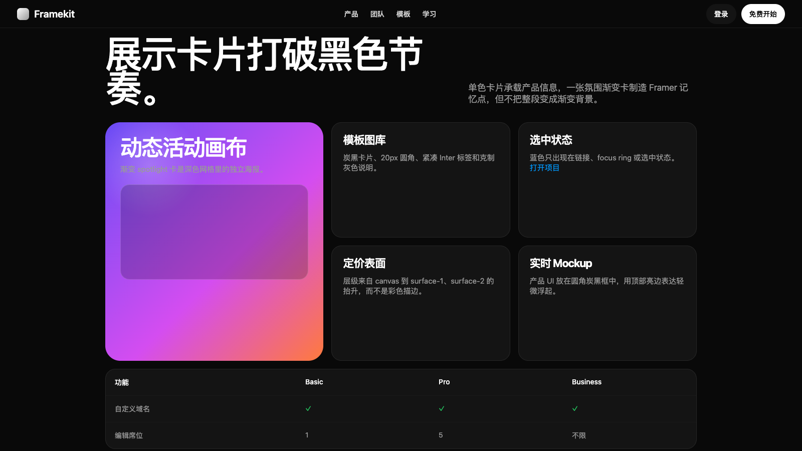
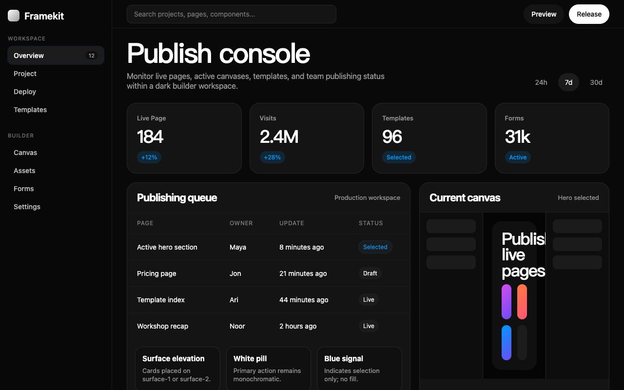

适合建站工具、作品集和视觉 SaaS,暗色画布配合大标题与高饱和渐变展示块,强调创作张力。
设计语言样张
---
version: alpha
name: "Framer"
description: "Framer 的 DESIGN.md 中文参考模板,保留原始 design token 与专业术语,覆盖 color system、typography、layout、components、motion 与 interaction states。"
language: zh-CN
sourceLanguage: en
---

## 概览
Framer 的 marketing canvas 是 near-pure black artboard。Dominant surface 是 `{colors.canvas}`,几乎 pure black,但带一丝 warmth;其上放置 oversized white display type,使用 **GT Walsheim Medium**,letter-spacing 被拉到极端 negative value(110px display 上 -5.5px,85px hero 上 -4.25px)。页面读起来像 poster:每个 band 一个 assertive statement,上下留出 generous breathing room。

唯一 accent 是 `{colors.accent-blue}`,使用克制,主要用于 hyperlink、selection halo,以及 focused input 上 subtle blue-tinted shadow ring。Brand chrome 本身是 monochrome:white pill button、charcoal card、gray secondary text。Framer 的辨识度来自 rhythm break:每隔几个 section,页面会放入一张 **vibrant gradient atmosphere card**:magenta-violet spotlight、sunset-orange wash、coral-pink panel。它们不是 section background,而是排列在 card grid 中的 individual card,每张都是展示 Framer 能力的小型 living poster。

Body type 是 **Inter Variable**,Framer 强烈使用 Inter 的 character variants(`cv01`、`cv05`、`cv09`、`cv11`、`ss03`、`ss07`、`dlig`);结果是 custom-tuned 的 body voice,带 single-storey “a”、straight-leg “l” 和 tabular figures。Marketing site 没有 light mode;brand 本身就是 dark。

**Key Characteristics:**
- Black-canvas marketing system:`{colors.canvas}` 同时作为 hero、body、pricing、FAQ 和 footer 的 surface,没有 light interlude。
- Display size 上 massive negative letter-spacing(-5.5px / -4.25px / -3.1px)创造 poster-grade headline cadence。
- White pill(`{components.button-primary}`)是全站唯一 primary CTA shape;secondary action 使用 charcoal pill(`{components.button-secondary}`)或 text link。
- Oversized **gradient spotlight card**(violet、magenta、orange、coral)作为 dark grid 内的 showcase tile;它们是 individual card,不是 section background。
- Body type 出现处都使用 Inter Variable 与 bespoke OpenType character variants(`cv01/05/09/11`、`ss03/ss07`、`dlig`),typographic voice 非常明确。
- Border radius scale 从 4px utility chip 到 100px pill 与 full circle;card 默认 15–20px,atmospheric gradient card 为 30px。
- 单一 chromatic accent `{colors.accent-blue}` 保留给 hyperlink、focus 与 selection,绝不 decorative。

## Colors

> Source pages: framer.com (home), /ai/, /startups/, /marketplace/templates/nudge/, /gallery/a16z-speedrun-×-tonik, /pricing.

### Brand & Accent
- **Pure White** ({colors.primary}): Brand primary surface。用于每个 primary CTA pill、每个 display headline、canvas 上的每一行 body。
- **Sky Blue** ({colors.accent-blue}): 唯一 chromatic accent。用于 hyperlink、focused-input ring,以及少量 selection state。绝不用于 background 或 brand fill。

### Surface
- **Canvas** ({colors.canvas}): 默认 page background,near-black 并带 faint warmth。Footer、pricing、hero 与 FAQ 都位于其上。
- **Surface 1** ({colors.surface-1}): 比 canvas 高一级,用于 pricing card、secondary button、mockup tile。
- **Surface 2** ({colors.surface-2}): 比 canvas 高两级,用于 featured pricing card、hero pill backdrop、selected pricing tab。
- **Hairline** ({colors.hairline}): Input group 与 comparison-table divider 上的 1px border。
- **Hairline Soft** ({colors.hairline-soft}): 更 subtle 的 divider,用于 FAQ row 之间和 footer column rule。
- **Inverse Canvas** ({colors.inverse-canvas}): Pure white,用作 light-on-dark pill CTA 的 surface,以及 showcase grid 内少量 light-mode template thumbnail。

### Text
- **Ink** ({colors.ink}): 所有 headline 与 emphasized body type,pure white。
- **Ink Muted** ({colors.ink-muted}): Secondary type,gray(#999999),用于 meta info、footer column、comparison-row label、deselected pricing tab。Dark canvas 上的 hierarchy 由 ink → ink-muted contrast 承担,而不是 weight change。

### Semantic Colors
- **Success Green** ({colors.semantic-success}): Pricing comparison-table checkmark。用于 glyph fill,不用于 surface。

### Brand Gradient (signature)
- **Gradient Magenta** ({colors.gradient-magenta}): Spotlight card variant。
- **Gradient Violet** ({colors.gradient-violet}): Spotlight card variant,最常见。
- **Gradient Orange** ({colors.gradient-orange}): Spotlight card variant,sunset wash。
- **Gradient Coral** ({colors.gradient-coral}): Spotlight card variant,coral/pink。

这四种 gradient 作为 oversized atmospheric tile 出现在 otherwise monochrome card grid 内;dark canvas 中放一两张 glowing spotlight card,是反复出现的 page signature。

## Typography

### Font Family

- **GT Walsheim Framer Medium** / **GT Walsheim Medium** — Framer 的 display typeface。Geometric、略 humanist,在大尺寸和 extreme negative tracking 下非常 confident。Fallback:`GT Walsheim Medium Placeholder` system font。
- **Inter Variable** — System body typeface。大量使用 OpenType character variants:`cv01`(alternate “1”)、`cv05`(alternate “g”)、`cv09`(alternate “i” / “l”)、`cv11`(alternate “0”)、`ss03` / `ss07` stylistic sets、`dlig` discretionary ligatures,以及 tabular context 中的 `tnum`。结果是无需 custom face 也感觉 bespoke 的 body voice。
- **Inter** — 选择性用于 `{typography.headline}`(22px / 20px tier)。Non-variable cut 可以覆盖 variable file 会 round 掉的小 tracking target。

### Hierarchy

| Token | Size | Weight | Line Height | Letter Spacing | 用途 |
|---|---|---|---|---|---|
| `{typography.display-xxl}` | 110px | 500 | 0.85 | -5.5px | 最大 hero headline(home、AI page) |
| `{typography.display-xl}` | 85px | 500 | 0.95 | -4.25px | Section opener headline |
| `{typography.display-lg}` | 62px | 500 | 1.00 | -3.1px | Sub-section opener |
| `{typography.display-md}` | 32px | 500 | 1.13 | -1.0px | Card title、小型 display |
| `{typography.headline}` | 22px | 700 | 1.20 | -0.8px | Pricing tier headline、FAQ category title |
| `{typography.subhead}` | 24px | 400 | 1.30 | -0.01px | Display headline 旁的 lead body |
| `{typography.body-lg}` | 18px | 400 | 1.30 | -0.18px | Hero subhead、lead paragraph |
| `{typography.body}` | 15px | 400 | 1.30 | -0.15px | Default body、card description |
| `{typography.body-sm}` | 14px | 500 | 1.40 | -0.14px | Pricing comparison row、dense data |
| `{typography.caption}` | 13px | 500 | 1.20 | -0.13px | Eyebrow、footer column、meta |
| `{typography.micro}` | 12px | 400 | 1.20 | -0.12px | Disclaimer、footnote |
| `{typography.button}` | 14px | 500 | 1.0 | -0.14px | Pill button |

### Principles

- **Letter-spacing 随 size 强烈缩放。** Display-xxl 拉到 -5.5px(size 的 5%);body 保持约 -1%(15px 上 -0.15px)。结果是:顶部像 poster,body 保持舒适阅读。
- **OpenType character variants 是品牌声音。** 关闭 `cv11`、`ss03` 等会明显改变 body voice;品牌依赖它们。
- **Weight 保持在窄区间。** Display 为 500,body 为 400,body-sm/caption 为 500。Hierarchy 由 size + tracking 承担,而不是 700/900 ramp。
- **到处都是 tight line-height。** 即使 body 也使用 1.30;Framer 的 editorial tone 比典型 SaaS marketing 更 dense。

### Font Substitutes

如果没有 GT Walsheim Medium,合适的 open-source substitute 包括 **Mona Sans**、**Geist**,或 weight 600–700 并手动收紧 tracking 的 **Inter**。Mona Sans 的 100–300 hairline weight 尤其接近 Framer 更干净的 section opener。Inter Variable 是 open-source,应原样保留并保留文档中的 OpenType variants。

## Layout

### Spacing System

- **Base unit**: 5px(Framer 使用非标准 5/10/15/20/30 increment,而不是更常见的 4/8/16/24)。
- **Tokens (front matter)**: `{spacing.hair}` 1px · `{spacing.xxs}` 4px · `{spacing.xs}` 8px · `{spacing.sm}` 12px · `{spacing.md}` 15px · `{spacing.lg}` 20px · `{spacing.xl}` 30px · `{spacing.xxl}` 40px · `{spacing.section}` 96px。
- Card interior padding:pricing card 使用 `{spacing.lg}` 20px;gradient spotlight card 使用 `{spacing.xl}` 30px。
- Pill button padding:10px vertical · 15px horizontal,即 `{components.button-primary}`。
- Section padding (vertical):home 上约 `{spacing.section}` 96px;pricing comparison 上更紧(约 64px)。

### Grid & Container

- Max content width 位于约 1199px breakpoint,desktop 上 side gutter 向 `{spacing.xl}` 缩放。
- Home gallery 的 card grid 在 desktop 为 2-up,低于 810px 时折叠为 1-up。
- Pricing tier grid 在记录的 breakpoint 上为 4-up;下方 comparison table 使用 fixed-width left column,并在窄宽度下让 tier column 横向滚动。

### Whitespace Philosophy

Dark canvas 本身就是 whitespace。较浅品牌用 white air 分隔 section,而 Framer 依赖大段 black,并让一个 oversized statement 悬浮在中间。Section 通过 mode change 分隔:一段 charcoal card,然后是一段带 gradient spotlight 的 black,再回到 charcoal,像 dark film 中的剪辑。

## Elevation & Depth

| Level | Treatment | 用途 |
|---|---|---|
| 0 (flat) | 无 shadow,无 border | Canvas 上 display type、FAQ row、footer 的默认层级 |
| 1 (charcoal) | Canvas 上使用 `{colors.surface-1}` lift | Pricing card、mockup tile、secondary button |
| 2 (light-edge) | `rgba(255,255,255,0.10)` 0.5px top edge + `rgba(0,0,0,0.25)` 0px 10px 30px drop | Floating product card、modal card |
| 3 (selected) | `rgba(0,153,255,0.15)` 0px 0px 0px 1px ring | Focused input、selected option |

Homepage 上反复出现四种 shadow signature:1px subtle drop、translucent blue ring、thick near-black 2px outline(作为 sub-nav 的 active-element marker),以及用于 floating card 的 layered light-edge + drop-shadow。

### Decorative Depth

- **Gradient spotlight card** 是主导 depth device;black canvas 上的 color saturation 替代 shadow-driven elevation。
- **Layered product mockup**(包含 live Framer-built site 的 browser frame)位于 `{colors.surface-1}` card 中,并使用 level-2 light-edge treatment。
- **Subtle blue ring(focus / selected)** 是唯一 chromatic depth signal;用于标记 input group 和 pricing tier toggle 的 active state,而不改变底层 surface。

## Shapes

### Border Radius Scale

Framer 提取出的 radius set 异常细(1px、4px、5px、6px、8px、10px、12px、15px、20px、30px、40px、100px)。下方 named scale 只选择 marketing surface 实际使用的层级。

| Token | Value | 用途 |
|---|---|---|
| `{rounded.xs}` | 4px | Small chip / utility radius |
| `{rounded.sm}` | 6px | Inline tag、badge |
| `{rounded.md}` | 10px | Form input、list item |
| `{rounded.lg}` | 15px | Template card thumbnail |
| `{rounded.xl}` | 20px | Pricing card、mockup tile |
| `{rounded.xxl}` | 30px | Gradient spotlight card、oversized panel |
| `{rounded.pill}` | 100px | 所有 primary text CTA |
| `{rounded.full}` | 9999px | Circular icon button、avatar circle |

### Photography & Illustration Geometry

- Embedded site mockup(Framer-built site 的 browser-chromed preview)位于 `{rounded.xl}` 20px tile 中,interior padding 为 `{spacing.md}` 15px。
- Gradient spotlight card 使用 `{rounded.xxl}` 30px corner,刻意比 20px content card 更柔和,让它们感觉像 atmospheric panel,而不是更紧的 UI。
- Icon glyph 与 sub-nav glyph 渲染在 `{rounded.full}` circle 内,尺寸为 32–40px。

## Components

### Buttons

**`button-primary`** — Dark canvas 上的 white pill。用于 home、pricing、AI 和 gallery page 的 primary CTA。
- Background `{colors.primary}`、text `{colors.on-primary}`、type `{typography.button}`、padding 10px 15px、rounded `{rounded.pill}`。
- Pressed state 位于 `button-primary-pressed`(live site 使用 transform-scale shrink,而不是 darkened fill)。

**`button-secondary`** — Charcoal pill。用于 secondary navigation action(“Sign in”、“Talk to sales”),也是 primary pill 的视觉 counterpart。
- Background `{colors.surface-1}`、text `{colors.ink}`、type `{typography.button}`、padding 10px 15px、rounded `{rounded.pill}`。

**`button-translucent`** — 用于 busy background(gallery hero、gradient card)上方的 translucent / lifted secondary。
- Background `{colors.surface-2}`、text `{colors.ink}`、type `{typography.button}`、rounded `{rounded.xxl}`、padding 8px 14px。

**`button-icon-circular`** — 40px circle,用于 inline icon action(carousel arrow、social link)。
- Background `{colors.surface-1}`、text `{colors.ink}`、rounded `{rounded.full}`、size 40px。

### Pricing Tabs

**`pricing-tab-default`** + **`pricing-tab-selected`** — `/pricing` 上切换 Basic / Pro / Business / Enterprise 的 pill-toggle。
- Default: `{colors.canvas}` background、`{colors.ink-muted}` text、rounded `{rounded.pill}`。
- Selected: `{colors.surface-2}` background、`{colors.ink}` text;selected = lift,不是 color。Surface depth 表达 “active”,无需 chromatic fill。

### Inputs & Forms

**`text-input`** + **`text-input-focused`** — `/pricing` 上的 form field(seat-count、currency switcher)与 in-product preview surface。
- Background `{colors.surface-1}`、text `{colors.ink}`、type `{typography.body}`、rounded `{rounded.md}`、padding 10px 14px。
- Focused state 保持相同 surface;focus ring 是 level-3 blue-tinted shadow:`rgba(0,153,255,0.15)` 0 0 0 1px。

### Cards & Containers

**`pricing-card`** — `/pricing` 上的每个 tier。
- Background `{colors.surface-1}`、text `{colors.ink}`、type `{typography.body}`、rounded `{rounded.xl}`、padding 24px。

**`pricing-card-featured`** — Pro tier(视觉强调)。
- Background `{colors.surface-2}`,其他结构相同。Lift 是 surface step up,没有 chromatic outline。

**`template-card`** — Home “Built with Framer” gallery 与 `/marketplace` 中的 thumbnail tile。
- Background `{colors.surface-1}`、text `{colors.ink}`、type `{typography.body-sm}`、rounded `{rounded.lg}`、padding 12px。

**`product-mockup-tile`** — 较大的 tile,用来框住 live product UI mock(Framer canvas、Workshop video、AI translate panel)。
- Background `{colors.surface-1}`、text `{colors.ink}`、type `{typography.body-sm}`、rounded `{rounded.xl}`、padding 16px。

### Gradient Spotlight Cards (signature)

Framer marketing 的 defining decorative surface:oversized atmospheric tile,被放入 otherwise monochrome card grid。Variant:

**`gradient-spotlight-card`** — violet ground(最常见)。
- Background `{colors.gradient-violet}`、text `{colors.ink}`、type `{typography.subhead}`、rounded `{rounded.xl}`、padding 32px。(On-site card 跨更宽 tile 时通常推到 `{rounded.xxl}` 30px。)

**`gradient-spotlight-card-magenta`** — magenta-pink ground。
- Background `{colors.gradient-magenta}`,其他相同。

**`gradient-spotlight-card-orange`** — sunset-orange wash。
- Background `{colors.gradient-orange}`,其他相同。

(Coral pink 使用相同 shape,并用 `{colors.gradient-coral}`。)

### Comparison & FAQ

**`feature-row`** + **`comparison-row`** — Pricing comparison table 内的单行。
- `feature-row`: `{colors.canvas}` background、`{colors.ink}` text。Header row。
- `comparison-row`: `{colors.canvas}` background、`{colors.ink-muted}` text。Data row,使用 `{typography.body-sm}` 和 1px `{colors.hairline-soft}` underline。

**`faq-row`** — Pricing-page FAQ 中的每条 accordion line。
- Background `{colors.canvas}`、text `{colors.ink}`、type `{typography.body}`、rounded `{rounded.md}`、padding 24px。

### Navigation

**`top-nav`** — `{colors.canvas}` 上的 sticky bar,左侧 Framer wordmark,中间 primary nav link,右侧 `button-secondary`(“Sign in”)+ `button-primary`(“Get started for free”)组合。
- Background `{colors.canvas}`、text `{colors.ink}`、type `{typography.body-sm}`、height 56px。
- Mobile:primary link 折叠进 hamburger;两个 pill CTA 折叠为 bar 上单个 primary pill。

### Footer

**`footer`** — `{colors.canvas}` 上的 dense link grid,左侧 Framer wordmark,右侧 5–6 列 caption-sized link。
- Background `{colors.canvas}`、text `{colors.ink-muted}`、type `{typography.caption}`、padding 64px 32px。

## Do's and Don'ts

### Do

- 将 `{colors.primary}`(white)与 `{colors.canvas}`(near-black)保留为系统的两个 anchor surface。页面每个 band 都选择其中之一。
- Display-size letter-spacing 要 aggressively negative;`{typography.display-xxl}` 的 -5.5px 是品牌 signature,不是 stylistic accident。
- `{colors.accent-blue}` 只用于 hyperlink、focus ring 和 selected indicator。绝不作为 background 或 button fill。
- 在 card grid 中放入一两张 `gradient-spotlight-card` variant;它们是品牌 atmosphere device。不要过度使用,同一 viewport 中三张以上会像 moodboard,而不是 system。
- 每个 CTA 都做成 pill(`{rounded.pill}`);secondary action 使用 charcoal pill,绝不使用 bordered ghost button。
- Body type 保持 Inter Variable,并启用 character variants `cv01`、`cv05`、`cv09`、`cv11`、`ss03`、`ss07`;品牌声音依赖它们。
- 在 dark 上用 surface lift(canvas → surface-1 → surface-2)标记 hierarchy,而不是改变 white type 的 opacity。

### Don't

- 不要发布 light-mode marketing page。Framer 的 identity 是 dark。
- 不要在 `{colors.ink-muted}` 之外引入 mid-tone gray text。Hierarchy 是 binary:`ink` 或 `ink-muted`。
- 不要把 `{colors.accent-blue}` 用作 brand fill(例如 blue CTA pill)。Blue 是 signal color,不是 surface。
- 不要把 CTA 做成 square。Pill(`{rounded.pill}`)或 full circle 才是品牌 vocabulary。
- 不要“为了 accessibility” 减少 display size 上的 negative letter-spacing。Compression 是 brand voice 固有部分;需要时降低 SIZE,但保持百分比。
- 不要给整个 section 应用 gradient background。Gradient 是 CARD,不是 section ground。
- 不要组合多个 chromatic accent。Palette 是 monochrome + one blue + gradient family,不是 “blue, green, and red”。

## Responsive Behavior

### Breakpoints

| Name | Width | 关键变化 |
|---|---|---|
| Desktop | 1199px | 默认 desktop layout |
| Tablet | 810px | Card grid 从 4-up → 2-up;nav 变为 hamburger |
| Mobile-Lg | 809px | Pricing comparison table 变为 per-tier accordion |
| Mobile-XS | 98px | 最小 documented breakpoint;全部 single-column |

### Touch Targets

- Pill button(`button-primary`、`button-secondary`)在所有 viewport 都保持最小 44px tap height;由 `{typography.button}` 14px line-height 与已记录 10px vertical padding 组合而成。
- Circular icon button(`button-icon-circular`)在 desktop 为 40px,在 touch viewport 增长到 44px。
- Pricing-tab pill 保持 ≥40px tap height;低于 810px 时可能折叠为 horizontal-scroll row,而不是 stacking。

### Collapsing Strategy

- **Nav**: horizontal nav,包含 centered link group + right-anchored pill pair,在 810px 以下折叠为 hamburger overlay。`button-primary` 保持在 bar 上可见。
- **Card grids**: gallery 与 template-card grid 从 desktop 的 2-up → mobile 的 1-up。Gradient spotlight card 在每个 viewport 都保持 `{rounded.xxl}` corner,不 bleed。
- **Pricing comparison table**: 在 810px 以下折叠为 per-tier accordion,避免 horizontal scroll。
- **Display type**: `{typography.display-xxl}` 110px 在 tablet 上缩小到 `{typography.display-lg}` 62px,在 mobile 上缩小到 `{typography.display-md}` 32px,同时保留 percentage-negative letter-spacing。

### Image Behavior

- Embedded product mockup(包含 live Framer-built site 的 browser frame)保持 aspect ratio,绝不 crop。
- Gradient spotlight card 跨 breakpoint 保持 gradient orientation;gradient direction 是 brand spec 的一部分。

## Iteration Guide

1. 一次只关注一个 component,并用它的 `components:` token name 引用(如 `{components.button-primary}`、`{components.gradient-spotlight-card}`)。
2. 在 dark canvas 上引入新 section 时,先决定它属于哪个 surface lift:hero/FAQ 用 `{colors.canvas}`,card 用 `{colors.surface-1}`,featured card 用 `{colors.surface-2}`。Depth choice 是最关键决定。
3. Body 默认使用 `{typography.body}`,并启用所有记录的 OpenType variants;只有 spotlight card 内才使用 `{typography.subhead}`。
4. 编辑后运行 `npx @google/design.md lint DESIGN.md`;`broken-ref`、`contrast-ratio` 与 `orphaned-tokens` warning 会自动标记问题。
5. 新 variant 作为独立 component entry 添加(`-pressed`、`-featured`、`-selected`),不要埋进 prose。
6. 将 `{colors.accent-blue}` 视为 single-shot signal color:hyperlink、focus、selection,仅此而已。如果你想要第二个 blue,说明品牌在漂移。
7. Gradient spotlight card 按设计就是稀缺的。长页面一两张是 spec;三张就是 moodboard。

## Known Gaps

- Spotlight card 的准确 gradient stop 来自 screenshot pixel,而不是 CSS variable;production gradient 很可能是在 individual element 上定义为 `linear-gradient` string,而不是 design token。将已记录的 `{colors.gradient-*}` hex value 视为 base anchor,而不是 exact gradient spec。
- Form-field validation / error styling 在已检查页面上不可见,因为 static screenshot 中没有 error state。
- Dark mode 是唯一 mode;未记录 light-mode adaptation,因为 marketing site 本身不提供。
- Marketplace template detail page 返回的 CSS variable data 比其他页面稀疏;该页面的 surface token 是从匹配的 home / gallery treatment 推断,而不是直接提取。


