

01 / 03
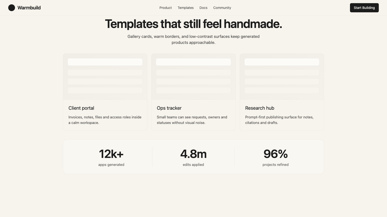
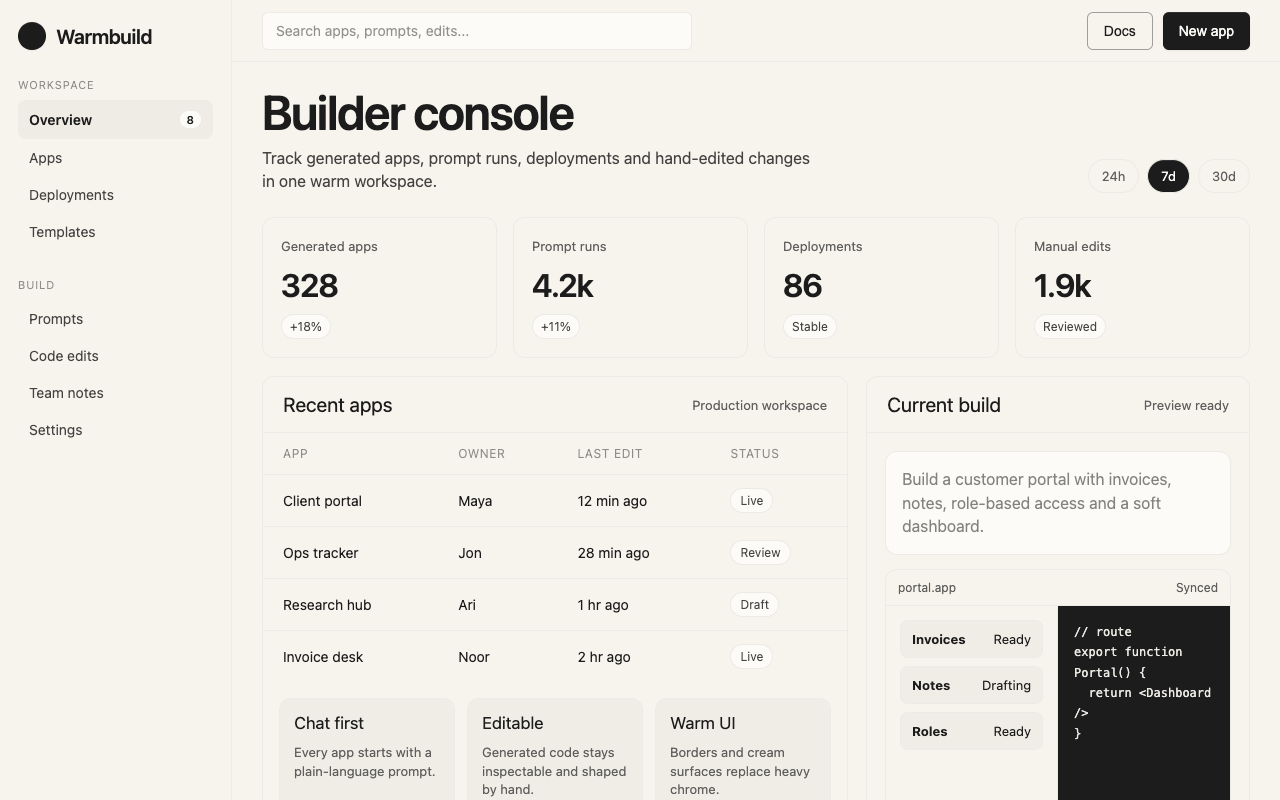

适合 AI 建站、原型生成和创作者工具,暖奶油纸感与低阴影边框让生成过程更亲和。
设计语言样张
暖奶油画布、charcoal 文字、低对比边框和暗色 inset 按钮。
正文像产品笔记一样轻、暖、好读,适合解释 AI 生成、编辑和协作流程。
400 for UI
600 for headings
12px image card + warm border
Low contrast, no heavy shadow
始终使用 #f7f4ed 暖奶油画布,营造纸张和笔记本的温度。
标题使用 Camera Plain Variable,60px 左右配 600 字重和负字距。
灰阶从 #1c1c1c 的透明度派生,保持统一的暖中性色。
卡片主要靠 #eceae4 的 1px 边框收住,不用重投影。
暗色按钮使用 6px 圆角和 inset shadow,形成轻微按压质感。
不要把页面底色改成纯白,Lovable 的温度来自 cream canvas。
不要加入饱和品牌色或彩色渐变作为主视觉。
不要使用 700 以上字重,层级靠尺寸、间距和 400/600 的克制对比。
不要给普通卡片加大投影,边框才是主要容器语言。
不要把 9999px pill 滥用到矩形按钮上,普通按钮保持 6px。
---
version: alpha
name: "Lovable"
description: "Lovable 的 DESIGN.md 中文参考模板,保留原始 design token 与专业术语,覆盖 color system、typography、layout、components、motion 与 interaction states。"
language: zh-CN
sourceLanguage: en
---

# 受 Lovable 启发的设计系统

## 1. 视觉主题与氛围

Lovable 的网站通过克制散发温暖。整个页面位于 creamy、parchment-toned background(`#f7f4ed`)上,立即区别于多数 developer tool site 的 cold-white convention。这不是为了 minimalism 而 minimalism,而是有意营造 approachable、近乎 analog 的感觉,像一本精心制作的 notebook。Near-black text(`#1c1c1c`)搭配 warm cream,形成对眼睛友好、同时保持清晰可读的 contrast ratio。

Custom Camera Plain Variable typeface 是系统的秘密武器。不同于传达 “tech company” 感的 geometric sans-serif,Camera Plain 具有 humanist warmth:略 rounded 的 terminal、organic curve,以及舒适的 reading rhythm。在 display size(48px–60px)上,weight 600 搭配 aggressive negative letter-spacing(-0.9px 到 -1.5px),把 headline 压缩成 confident、editorial statement。字体使用 `ui-sans-serif, system-ui` 作为 fallback,也承认 custom typeface 承载着 brand personality。

Lovable visual system 的独特之处在于 opacity-driven depth model。系统不是使用传统 gray scale,而是在不同 opacity(0.03、0.04、0.4、0.82–0.83)下调制 `#1c1c1c`,创造统一 tonal range。页面上的每一种 gray 在技术上都是同一 hue,只是透明度不同。这种 visual coherence 几乎无法通过任意 hex value 达成。Border system 也遵循同样逻辑:light division 使用 `1px solid #eceae4`,更强的 interactive boundary 使用 `1px solid rgba(28, 28, 28, 0.4)`。

**Key Characteristics:**
- Warm parchment background(`#f7f4ed`):不是 white,也不是 beige,而是手工挑选感的 deliberate cream。
- Camera Plain Variable typeface 具备 humanist warmth,并在 display size 使用 editorial letter-spacing。
- Opacity-driven color system:所有 gray 都从 `#1c1c1c` 的不同 transparency level 派生。
- Button 上的 inset shadow technique:`rgba(255,255,255,0.2) 0px 0.5px 0px 0px inset, rgba(0,0,0,0.2) 0px 0px 0px 0.5px inset`。
- Warm neutral border palette:subtle 使用 `#eceae4`,interactive element 使用 `rgba(28,28,28,0.4)`。
- Full-pill radius(`9999px`)大量用于 action button 与 icon container。
- Focus state 使用 `rgba(0,0,0,0.1) 0px 4px 12px` shadow,形成 soft、warm emphasis。
- shadcn/ui + Radix UI component primitive,搭配 Tailwind CSS utility styling。

## 2. Color Palette & Roles

### Primary
- **Cream** (`#f7f4ed`): Page background、card surface、button surface。基础色,warm、paper-like、human。
- **Charcoal** (`#1c1c1c`): Primary text、heading、dark button background。不是 pure black,而是带 organic warmth。
- **Off-White** (`#fcfbf8`): Dark background 上的 button text 与 subtle highlight。几乎与 pure white 无法区分。

### Neutral Scale (Opacity-Based)
- **Charcoal 100%** (`#1c1c1c`): Primary text、heading、dark surface。
- **Charcoal 83%** (`rgba(28,28,28,0.83)`): Strong secondary text。
- **Charcoal 82%** (`rgba(28,28,28,0.82)`): Body copy。
- **Muted Gray** (`#5f5f5d`): Secondary text、description、caption。
- **Charcoal 40%** (`rgba(28,28,28,0.4)`): Interactive border、button outline。
- **Charcoal 4%** (`rgba(28,28,28,0.04)`): Subtle hover background、micro-tint。
- **Charcoal 3%** (`rgba(28,28,28,0.03)`): 几乎不可见的 overlay、background depth。

### Surface & Border
- **Light Cream** (`#eceae4`): Card border、divider、image outline。Warm divider line。
- **Cream Surface** (`#f7f4ed`): Card background、section fill,与 page background 相同,形成 seamless integration。

### Interactive
- **Ring Blue** (`#3b82f6` at 50% opacity): `--tw-ring-color`,Tailwind focus ring。
- **Focus Shadow** (`rgba(0,0,0,0.1) 0px 4px 12px`): Focus 与 active state shadow,soft、warm、diffused。

### Inset Shadows
- **Button Inset** (`rgba(255,255,255,0.2) 0px 0.5px 0px 0px inset, rgba(0,0,0,0.2) 0px 0px 0px 0.5px inset, rgba(0,0,0,0.05) 0px 1px 2px 0px`): Dark button 上 signature multi-layer inset shadow。

## 3. Typography Rules

### Font Family
- **Primary**: `Camera Plain Variable`,fallback:`ui-sans-serif, system-ui`。
- **Weight range**: 400(body / reading)、480(special display)、600(heading / emphasis)。
- **Feature**: 带 continuous weight axis 的 variable font,允许 480 这种 fine-tuned intermediary weight。

### Hierarchy

| Role | Font | Size | Weight | Line Height | Letter Spacing | 说明 |
|------|------|------|--------|-------------|----------------|-------|
| Display Hero | Camera Plain Variable | 60px (3.75rem) | 600 | 1.00–1.10 (tight) | -1.5px | 最大 impact,editorial |
| Display Alt | Camera Plain Variable | 60px (3.75rem) | 480 | 1.00 (tight) | normal | 更轻的 hero variant |
| Section Heading | Camera Plain Variable | 48px (3.00rem) | 600 | 1.00 (tight) | -1.2px | Feature section title |
| Sub-heading | Camera Plain Variable | 36px (2.25rem) | 600 | 1.10 (tight) | -0.9px | Sub-section |
| Card Title | Camera Plain Variable | 20px (1.25rem) | 400 | 1.25 (tight) | normal | Card heading |
| Body Large | Camera Plain Variable | 18px (1.13rem) | 400 | 1.38 | normal | Introduction |
| Body | Camera Plain Variable | 16px (1.00rem) | 400 | 1.50 | normal | Standard reading text |
| Button | Camera Plain Variable | 16px (1.00rem) | 400 | 1.50 | normal | Button label |
| Button Small | Camera Plain Variable | 14px (0.88rem) | 400 | 1.50 | normal | Compact button |
| Link | Camera Plain Variable | 16px (1.00rem) | 400 | 1.50 | normal | Underline decoration |
| Link Small | Camera Plain Variable | 14px (0.88rem) | 400 | 1.50 | normal | Footer link |
| Caption | Camera Plain Variable | 14px (0.88rem) | 400 | 1.50 | normal | Metadata、small text |

### Principles
- **Warm humanist voice**: Camera Plain Variable 赋予 Lovable approachable personality。略 rounded terminal 与 organic curve,对比多数 developer tool 使用的 sharp geometric sans-serif。
- **Variable weight as design tool**: 字体支持 continuous weight value(例如 480),能在标准 weight stop 之外建立 nuanced hierarchy。60px 上的 weight 480 形成比 semibold 更轻、比 regular 更强的 display style。
- **Compression at scale**: Headline 使用 negative letter-spacing(-0.9px 到 -1.5px)制造 editorial impact。Body text 保持 normal tracking,确保舒适阅读。
- **Two weights, clear roles**: 400(body / UI / link / button)与 600(heading / emphasis)。狭窄 weight range 通过 size 与 spacing 建立 hierarchy,而不是依赖 weight variation。

## 4. Component Stylings

### Buttons

**Primary Dark (Inset Shadow)**
- Background: `#1c1c1c`
- Text: `#fcfbf8`
- Padding: 8px 16px
- Radius: 6px
- Shadow: `rgba(0,0,0,0) 0px 0px 0px 0px, rgba(0,0,0,0) 0px 0px 0px 0px, rgba(255,255,255,0.2) 0px 0.5px 0px 0px inset, rgba(0,0,0,0.2) 0px 0px 0px 0.5px inset, rgba(0,0,0,0.05) 0px 1px 2px 0px`
- Active: opacity 0.8
- Focus: `rgba(0,0,0,0.1) 0px 4px 12px` shadow
- 用途:Primary CTA(“Start Building”、“Get Started”)。

**Ghost / Outline**
- Background: transparent
- Text: `#1c1c1c`
- Padding: 8px 16px
- Radius: 6px
- Border: `1px solid rgba(28,28,28,0.4)`
- Active: opacity 0.8
- Focus: `rgba(0,0,0,0.1) 0px 4px 12px` shadow
- 用途:Secondary action(“Log In”、“Documentation”)。

**Cream Surface**
- Background: `#f7f4ed`
- Text: `#1c1c1c`
- Padding: 8px 16px
- Radius: 6px
- No border
- Active: opacity 0.8
- 用途:Tertiary action、toolbar button。

**Pill / Icon Button**
- Background: `#f7f4ed`
- Text: `#1c1c1c`
- Radius: 9999px (full pill)
- Shadow: same inset pattern as primary dark
- Opacity: 0.5 (default), 0.8 (active)
- 用途:Additional action、plan mode toggle、voice recording。

### Cards & Containers
- Background:`#f7f4ed`(匹配 page)。
- Border:`1px solid #eceae4`。
- Radius:12px(standard)、16px(featured)、8px(compact)。
- 默认无 box-shadow,border 定义 boundary。
- Image card:`1px solid #eceae4`,12px radius。

### Inputs & Forms
- Background:`#f7f4ed`。
- Text:`#1c1c1c`。
- Border:`1px solid #eceae4`。
- Radius:6px。
- Focus:ring blue(`rgba(59,130,246,0.5)`)outline。
- Placeholder:`#5f5f5d`。

### Navigation
- Cream background 上 fixed clean horizontal nav。
- Logo / wordmark 左对齐(128.75 x 22px)。
- Links:Camera Plain 14–16px weight 400,`#1c1c1c` text。
- CTA:Dark button,带 inset shadow,6px radius。
- Mobile:Hamburger menu,使用 6px radius button。
- Scroll 时使用 subtle border 或 no border。

### Links
- Color:`#1c1c1c`。
- Decoration:underline(default)。
- Hover:primary accent(通过 CSS variable `hsl(var(--primary))`)。
- Hover 不改变 color,decoration 承载 interactive signal。

### Image Treatment
- Showcase / portfolio image 使用 `1px solid #eceae4` border。
- 所有 image container 保持一致的 12px border radius。
- Hero content 背后使用 soft gradient background(warm multi-color wash)。
- Template / project showcase 使用 gallery-style presentation。

### Distinctive Components

**AI Chat Input**
- Large prompt input area,带 soft border。
- Suggestion pill 使用 `#eceae4` border。
- Voice recording / plan mode toggle button 使用 pill shape(9999px)。
- Warm、inviting input area,不是 clinical。

**Template Gallery**
- 展示 project template 的 card grid。
- 每个 card:image + title、`1px solid #eceae4` border、12px radius。
- Hover:subtle shadow 或 border darkening。
- Category label 作为 text link。

**Stats Bar**
- Large metric:48px+ weight 600 的 “0M+” pattern。
- 下方 descriptive text 使用 muted gray。
- Horizontal layout,spacing generous。

## 5. Layout Principles

### Spacing System
- Base unit:8px。
- Scale:8px、10px、12px、16px、24px、32px、40px、56px、80px、96px、128px、176px、192px、208px。
- Scale 在高端大幅扩展;section 使用 80px–208px vertical spacing,制造 editorial breathing room。

### Grid & Container
- Max content width:约 1200px(centered)。
- Hero:Centered single-column,带 massive vertical padding(96px+)。
- Feature section:2–3 column grid。
- Full-width footer,带 multi-column link layout。
- Showcase section:centered card grid。

### Whitespace Philosophy
- **Editorial generosity**: Lovable 在 section boundary 使用宽裕 spacing(80px–208px)。Warm cream background 让这些空白显得 cozy,而不是 empty。
- **Content-driven rhythm**: Card 内 tight internal spacing(12–24px)与宽 section gap 形成对比,创造 focused content 与 visual rest 交替的 reading rhythm。
- **Section separation**: Footer 使用 `1px solid #eceae4` border 与 16px radius container。Section 由 generous spacing 定义,而不是 border line。

### Border Radius Scale
- Micro(4px):Small button、interactive element。
- Standard(6px):Button、input、navigation menu。
- Comfortable(8px):Compact card、div。
- Card(12px):Standard card、image container、template。
- Container(16px):Large container、footer section。
- Full Pill(9999px):Action pill、icon button、toggle。

## 6. Depth & Elevation

| Level | Treatment | 用途 |
|-------|-----------|-----|
| Flat (Level 0) | 无 shadow,cream background | Page surface、大多数 content |
| Bordered (Level 1) | `1px solid #eceae4` | Card、image、divider |
| Inset (Level 2) | `rgba(255,255,255,0.2) 0px 0.5px 0px inset, rgba(0,0,0,0.2) 0px 0px 0px 0.5px inset, rgba(0,0,0,0.05) 0px 1px 2px` | Dark button、primary action |
| Focus (Level 3) | `rgba(0,0,0,0.1) 0px 4px 12px` | Active / focus state |
| Ring (Accessibility) | `rgba(59,130,246,0.5)` 2px ring | Input 上的 keyboard focus |

**Shadow Philosophy**: Lovable 的 depth system 有意保持 shallow。系统不使用 dramatic drop-shadow 让 card 漂浮,而是依靠 cream surface 上的 warm border(`#eceae4`)创造 gentle containment。唯一明显的 shadow pattern 是 dark button 上的 inset shadow:一种 subtle multi-layer technique,顶部边缘有 white highlight line,底部由 dark ring 与 soft drop 承担。这制造 tactile、pressed-into-surface 的感觉,而不是 hovering-above-surface。Warm focus shadow(`rgba(0,0,0,0.1) 0px 4px 12px`)有意 diffuse 且大,形成 soft glow,而不是 sharp outline。

### Decorative Depth
- Hero:Hero 背后有 soft、warm multi-color gradient wash(pinks、oranges、blues),atmospheric 且几乎不可见。
- Footer:Gradient background,warm tone 向底部过渡。
- 没有 harsh section divider;由 spacing 与 background warmth 处理 transition。

## 7. Do's and Don'ts

### Do
- 使用 warm cream background(`#f7f4ed`)作为 page foundation;这是品牌 signature warmth。
- Display size 使用 Camera Plain Variable,并设置 negative letter-spacing(-0.9px 到 -1.5px)。
- 所有 gray 都从不同 opacity level 的 `#1c1c1c` 派生,以保持 tonal unity。
- Dark button 使用 inset shadow technique,形成 tactile depth。
- Card containment 使用 `#eceae4` border,而不是 shadow。
- 保持狭窄 weight system:body / UI 为 400,heading 为 600。
- Full-pill radius(9999px)只用于 action pill 与 icon button。
- Active state 应用 opacity 0.8,提供 responsive tactile feedback。

### Don't
- 不要用 pure white(`#ffffff`)作为 page background;cream 是有意选择。
- 不要给 card 使用 heavy box-shadow;border 才是 containment mechanism。
- 不要引入 saturated accent color;palette 有意保持 warm-neutral。
- 不要使用 weight 700(bold);系统最大 weight 是 600。
- 不要在 rectangular button 上应用 9999px radius;pill 用于 icon / action toggle。
- 不要使用 sharp focus outline;系统使用 soft shadow-based focus indicator。
- 不要混用 border style;passive 使用 `#eceae4`,interactive 使用 `rgba(28,28,28,0.4)`。
- 不要增加 heading 的 letter-spacing;Camera Plain 被设计为在 scale 上 tight。

## 8. Responsive Behavior

### Breakpoints
| Name | Width | 关键变化 |
|------|-------|-------------|
| Mobile Small | <600px | Tight single column,padding 减少 |
| Mobile | 600–640px | 标准 mobile layout |
| Tablet Small | 640–700px | 2-column grid 开始 |
| Tablet | 700–768px | Card grid 扩展 |
| Desktop Small | 768–1024px | Multi-column layout |
| Desktop | 1024–1280px | Full feature layout |
| Large Desktop | 1280–1536px | Maximum content width,generous margin |

### Touch Targets
- Button:8px 16px padding,touch 舒适。
- Navigation:item 之间保持足够 spacing。
- Pill button:9999px radius 创造 large tap-friendly target。
- Menu toggle:6px radius button,并保持合适 sizing。

### Collapsing Strategy
- Hero:60px → 48px → 36px headline scaling,并按比例调整 letter-spacing。
- Navigation:horizontal links → 768px 处 hamburger menu。
- Feature card:3-column → 2-column → single column stacked。
- Template gallery:grid → stacked vertical card。
- Stats bar:horizontal → stacked vertical。
- Footer:multi-column → stacked single column。
- Section spacing:128px+ → mobile 上 64px。

### Image Behavior
- Template screenshot 在所有尺寸保持 `1px solid #eceae4` border。
- 12px border radius 在所有 breakpoint 保留。
- Gallery image 响应式缩放,并保持一致 aspect ratio。
- Hero gradient 在 mobile 上 soften / simplify。

## 9. Agent Prompt Guide

### Quick Color Reference
- Primary CTA:Charcoal(`#1c1c1c`)
- Background:Cream(`#f7f4ed`)
- Heading text:Charcoal(`#1c1c1c`)
- Body text:Muted Gray(`#5f5f5d`)
- Border:`#eceae4`(passive)、`rgba(28,28,28,0.4)`(interactive)
- Focus:`rgba(0,0,0,0.1) 0px 4px 12px`
- Button text on dark:`#fcfbf8`

### Example Component Prompts
- “创建 hero section:cream background(#f7f4ed)。Headline 使用 60px Camera Plain Variable weight 600、line-height 1.10、letter-spacing -1.5px、color #1c1c1c。Subtitle 使用 18px weight 400、line-height 1.38、color #5f5f5d。Dark CTA button(#1c1c1c bg、#fcfbf8 text、6px radius、8px 16px padding、inset shadow)与 ghost button(transparent bg、1px solid rgba(28,28,28,0.4) border、6px radius)。”
- “设计 cream(#f7f4ed)background 上的 card。Border: 1px solid #eceae4。Radius 12px。No box-shadow。Title 使用 20px Camera Plain Variable weight 400、line-height 1.25、color #1c1c1c。Body 使用 14px weight 400、color #5f5f5d。”
- “构建 template gallery:card grid,12px radius,1px solid #eceae4 border,cream background。每个 card:image 带 12px top radius,下方 title。Hover: subtle border darkening。”
- “创建 navigation:sticky on cream(#f7f4ed)。Link 使用 Camera Plain 16px weight 400、#1c1c1c text。右侧对齐 dark CTA button,带 inset shadow。Mobile: hamburger menu,6px radius。”
- “设计 stats section:large number 使用 48px Camera Plain weight 600、letter-spacing -1.2px、#1c1c1c。下方 label 使用 16px weight 400、#5f5f5d。Horizontal layout,32px gap。”

### Iteration Guide
1. 始终使用 cream(`#f7f4ed`)作为 base,绝不用 pure white。
2. Gray 应从 `#1c1c1c` 的 opacity level 派生,而不是使用不同 hex value。
3. Containment 使用 `#eceae4` border,而不是 shadow。
4. Letter-spacing 随 size 缩放:60px 为 -1.5px,48px 为 -1.2px,36px 为 -0.9px,16px 为 normal。
5. 只用两个 weight:400(heading 之外的一切)与 600(heading)。
6. Dark button 上的 inset shadow 是 signature detail,不要跳过。
7. Weight 480 的 Camera Plain Variable 只用于 special display moment。


