

01 / 03
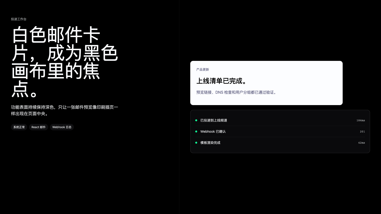
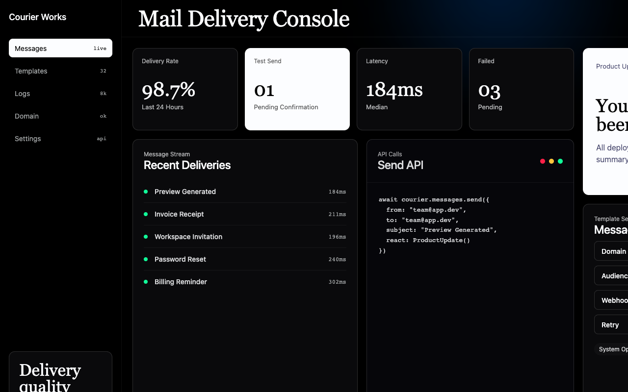

适合开发者控制台、消息流和基础设施页面,黑底、serif 大标题、代码窗口和低透明光感显得冷静专业。
设计语言样张
Domaine Display 大标题、白色小 CTA、12px 深色容器和低透明 glow 让开发者页面保持冷静、专业和有出版感。
await resend.emails.send({
  from: "updates@team.dev",
  subject: "上线准备完成",
  react: EmailTemplate()
}) import { Resend } from "resend"
await resend.emails.send({
to: "team@company.com"
}) ---
version: alpha
name: "Resend"
description: "Resend 的 DESIGN.md 中文参考模板,保留原始 design token 与专业术语,覆盖 color system、typography、layout、components、motion 与 interaction states。"
language: zh-CN
sourceLanguage: en
---
## 概览
Resend 像一个开发者工具,但拥有 editorial 的排版气质。每个页面都从 `{colors.canvas}` (`#000000`) 开始,画布上最响亮的元素不是按钮或品牌标记,而是 96px Domaine Display serif headline(如 "Email for developers"、"Email reimagined"),并启用 `ss01 / ss04 / ss11` stylistic alternates。这个排版决定确立了品牌语气:自信、克制、略带文学感,并以质量感而非新奇感定价。
支撑层则非常技术化。营销正文使用 **ABC Favorit**,UI label 使用 **Inter**,代码块使用 **Geist Mono** 并放在 `{component.code-window}` 壳层中,顶部带 hairline traffic-light dots。深度几乎完全由半透明白色构建:6% border、14% strong border、4% divider,覆盖在比 canvas black 略浅的 `{colors.surface-deep}` 之上。系统没有铺满整段的 gradient,只有低透明度的 **soft atmospheric glows**(orange、blue、green、red、yellow)锚定在部分 section 顶部。
页面节奏保持在单一暗色 register 中循环:hero stripe -> atmospheric section -> code window section -> email mockup section -> pricing 或 feature grid -> black footer。品牌几乎不切换到亮色 surface;即使是 email mockup,也只是黑色 canvas 中紧凑的白色 card,像黑边杂志页里的印刷 inset。
**关键特征:**
- 所有公开页面使用纯黑 canvas (`{colors.canvas}` — `#000000`);off-white 文本 (`{colors.ink}` — `#fcfdff`) 承担主要阅读。
- Serif 主导的字体系统:**Domaine Display** 用于 76–96px hero headline,**ABC Favorit** 用于营销正文,**Inter** 用于 UI,**Geist Mono** 用于 code。
- 六种 accent glow 只作为低透明度氛围 wash 使用(`{colors.accent-orange}`、`{colors.accent-blue}`、`{colors.accent-green}`、`{colors.accent-red}`、`{colors.accent-yellow}`),绝不作为 button 或实色 surface。
- 严格的 container 词汇:`{rounded.lg}` (12px) 用于 feature card、code well、email mockup;`{rounded.md}` (8px) 用于 button;`{rounded.full}` 用于 pill 与 avatar。
- 半透明白色 border(`{colors.hairline}` 6% / `{colors.hairline-strong}` 14%)完全替代 shadow;系统没有传统 drop-shadow elevation。
- `{component.button-primary}` 是黑色页面上白底黑字的小矩形,是页面中最亮的像素,也成为唯一视觉锚点。
## Colors
### Brand & Accent
- **Primary White** (`{colors.primary}` — `#fcfdff`): 品牌事实上的 accent。用于 `{component.button-primary}`、Domaine display headline 和 active text。白色在这个 canvas 上是最响亮的颜色,这就是 signature。
- **Primary On** (`{colors.primary-on}` — `#000000`): `{colors.primary}` surface 上的 label color。白色 pill 上的黑字是品牌 CTA pattern。
- **Surface Light** (`{colors.surface-light}` — `#f1f7fe`): 带轻微蓝调的 off-white,用于 `{component.button-primary}` 的 active/pressed state。
### Surface
- **Canvas** (`{colors.canvas}` — `#000000`): 默认页面背景。是真黑,不是 near-black。
- **Surface Card** (`{colors.surface-card}` — `#0a0a0c`): 标准 inset card surface,比 canvas 稍亮,用来表示一层 elevation。
- **Surface Elevated** (`{colors.surface-elevated}` — `#101012`): 第二层 elevation,用于 featured pricing tier 和 ghost button surface。
- **Surface Deep** (`{colors.surface-deep}` — `#06060a`): code window background,比 canvas 更冷、更暗,通过色温暗示深度。
- **Hairline** (`{colors.hairline}` — `rgba(255,255,255,0.06)`): 行间和 feature card 周围使用的柔和 1px 半透明白色 divider。
- **Hairline Strong** (`{colors.hairline-strong}` — `rgba(255,255,255,0.14)`): card、code well、form input 上的结构性 1px border。
- **Divider Soft** (`{colors.divider-soft}` — `rgba(255,255,255,0.04)`): footer column 之间的低对比 divider。
### Text
- **Ink** (`{colors.ink}` — `#fcfdff`): 深色 canvas 上的 primary text color,略带冷蓝,像印刷纸而不是纯白跳色。
- **Body** (`{colors.body}` — `rgba(252,253,255,0.86)`): 长正文,避免纯 ink 过锐。
- **Charcoal** (`{colors.charcoal}` — `rgba(252,253,255,0.7)`): caption、secondary nav label。
- **Mute** (`{colors.mute}` — `#a1a4a5`): supporting text 与 inactive label。
- **Ash** (`{colors.ash}` — `#888e90`): tertiary text、footer copy。
- **Stone** (`{colors.stone}` — `#464a4d`): disabled foreground。
- **On-Light** (`{colors.on-light}` — `#000000`): 少数 email-mockup 白色 card 内的 label color。
- **On-Light Mute** (`{colors.on-light-mute}` — `rgba(0,0,51,0.7)`): email mockup 内的 secondary text。
### Semantic Colors
- **Accent Orange** (`{colors.accent-orange}` — `#ff801f`) + glow (`{colors.accent-orange-glow}` — `rgba(255,89,0,0.22)`): 用于 "Email reimagined" / customer story section 的暖色氛围 wash;实色 orange 不作为 button 或 surface。
- **Accent Yellow** (`{colors.accent-yellow}` — `#ffc53d`): inline highlight stroke 和 "first-class developer experience" callout。
- **Accent Blue** (`{colors.accent-blue}` — `#3b9eff`) + glow (`{colors.accent-blue-glow}` — `rgba(0,117,255,0.34)`): inline link color,以及 "Integrate this weekend" section 的冷色 wash。
- **Accent Green** (`{colors.accent-green}` — `#11ff99`) + glow (`{colors.accent-green-glow}` — `rgba(34,255,153,0.18)`): success status dot 与 "delivery confirmed" feature glow。
- **Accent Red** (`{colors.accent-red}` — `#ff2047`) + glow (`{colors.accent-red-glow}` — `rgba(255,32,71,0.34)`): inline error red 与 "reach humans, not spam folders" 注意力 wash。
- **Link** (`{colors.link}` — `#3b9eff`): inline link color,与 accent blue 相同。
## Typography
### Font Family
Resend 使用四套字体:
- **Domaine Display** — 专有 editorial serif,只用于 76px+ hero headline,并启用 `ss01 / ss04 / ss11` stylistic sets,形成更紧、更像印刷杂志的质感。
- **ABC Favorit** — 专有人文 sans-serif,用于 marketing body copy、hero subtitle 和 pill label,带 `ss01 / ss03 / ss04` features。
- **Inter** — 开源 sans-serif,用于 button label、caption、card body、nav link 等 UI。
- **Geist Mono** — 开源 monospace,用于 code well。
如果无法授权专有字体,可用 **Söhne** 或 **Tiempos Headline** 替代 Domaine Display,用 **Geist** 或 **Inter Tight** 替代 ABC Favorit。Inter 与 Geist Mono 是开源字体,应直接使用。
### Hierarchy
| Token | Size | Weight | Line Height | Letter Spacing | Use |
|---|---|---|---|---|---|
| `{typography.display-xxl}` | 96px | 400 | 1.0 | -0.96px | Home hero ("Email for developers"),每页一个。 |
| `{typography.display-xl}` | 76.8px | 400 | 1.0 | -0.768px | Section opener ("Email reimagined", "Available today")。 |
| `{typography.display-lg}` | 56px | 400 | 1.2 | -2.8px | ABC Favorit display subtitle。 |
| `{typography.heading-md}` | 24px | 500 | 1.5 | -0.4px | Card title、section subtitle。 |
| `{typography.heading-sm}` | 20px | 500 | 1.3 | -0.3px | List header。 |
| `{typography.subtitle}` | 20px | 400 | 1.3 | 0 | Hero subtitle。 |
| `{typography.body-lg}` | 18px | 400 | 1.5 | 0 | Marketing prose。 |
| `{typography.body-md}` | 16px | 400 | 1.5 | -0.8px | ABC Favorit body。 |
| `{typography.body-sm}` | 14px | 400 | 1.43 | 0 | Caption、metadata。 |
| `{typography.button-md}` | 14px | 500 | 1.43 | 0 | Default button label。 |
| `{typography.button-sm}` | 14px | 500 | 1.43 | 0.35px | Pill label、inline link。 |
| `{typography.caption}` | 12px | 400 | 1.5 | 0 | Footer disclosure、copyright。 |
| `{typography.caption-emph}` | 14px | 600 | 1.0 | 0 | 强调型小 caption,Helvetica fallback。 |
| `{typography.code-md}` | 13px | 400 | 1.6 | 0 | Code block、inline code。 |
### Principles
- Display size 始终使用 `lineHeight: 1.0` 和负 letter-spacing,让 Domaine Display headline 形成密实的 typographic block,而不是松散正文。
- `{typography.body-lg}` 与 `{typography.body-md}` 保持 400 weight;层级由 serif/sans 字体切换承担,而不是加粗。
- ABC Favorit 始终启用 `ss01 / ss04 / ss11`;Inter 不带 OpenType features;Geist Mono code 不启用 ligature。
- Inline link 使用 `{typography.button-sm}`、正 letter-spacing (`0.35px`) 和 ABC Favorit,这个小幅 tracking 让交互正文更精确。
### Font Substitutes
当 Domaine Display 不可用时,明确 clamp `lineHeight` 到 1.0,并在替代 serif 上应用 `font-feature-settings: "ss01", "liga"` 来模拟 alternate glyph。Söhne 或 Tiempos Headline 最接近。ABC Favorit 替代字体(Geist、Inter Tight)通常 tracking 更松,应在 body size 上应用 -0.5% letter-spacing。
## Layout
### Spacing System
- **Base unit**: 4px,工作 scale 基于 4 / 8 / 16 的倍数。
- **Tokens**: `{spacing.xxs}` 2px · `{spacing.xs}` 4px · `{spacing.sm}` 8px · `{spacing.md}` 12px · `{spacing.lg}` 16px · `{spacing.xl}` 24px · `{spacing.xxl}` 32px · `{spacing.xxxl}` 48px · `{spacing.section}` 96px · `{spacing.band}` 128px。
- Section padding: band 之间垂直使用 `{spacing.section}` (96px);hero stripe 和收尾 footer transition 使用 `{spacing.band}` (128px)。
- Card internal padding: `{component.feature-card}`、`{component.pricing-tier}`、`{component.code-window}` 使用 `{spacing.xxl}` (32px)。
### Grid & Container
- **Max content width** ≈ 1200px。
- **Feature grid**: desktop 3 columns,tablet 2 columns,mobile 1 column。
- **Pricing**: desktop 居中 3-tier grid;center tier 升级为 `{component.pricing-tier-featured}`。
- **Code-story splits**: 2-up split,左侧 narrative copy,右侧 `{component.code-window}`,< 1024px 堆叠。
- **Email mockup band**: 单个白色 card(max 640px)居中放在 dark canvas 中,留出充足垂直 padding,像杂志 inset。
### Whitespace Philosophy
- Whitespace 具有 editorial 的宽松感,full-bleed section 以 96–128px 呼吸,让 Domaine Display headline 有足够空间。
- Card 内部 padding 保持 32px,让 feature copy 和 code well 与外层 grid 保持一致节奏。
- `{colors.hairline}` 与 `{colors.hairline-strong}` 承担亮色系统中 drop shadow 的角色;dark canvas 完全压低传统阴影深度。
## Elevation & Depth
| Level | Treatment | Use |
|---|---|---|
| 0 — flat | No shadow, no border | Default canvas、full-bleed band。 |
| 1 — surface card | `{colors.surface-card}` (`#0a0a0c`) + 1px `{colors.hairline-strong}` | Feature card、pricing tier、form input。 |
| 2 — elevated | `{colors.surface-elevated}` (`#101012`) + 1px `{colors.hairline-strong}` | Featured pricing tier、ghost button。 |
| 3 — code well | `{colors.surface-deep}` (`#06060a`) + 1px `{colors.hairline-strong}` | Code window、terminal shell。 |
| 4 — atmospheric glow | section 顶部锚定的低透明度 radial gradient (`{colors.accent-*-glow}`) | Section opener。 |
系统没有传统 drop shadow language。每个 surface 要么有半透明白色 hairline border,要么位于 atmospheric glow 中。深色 canvas 自然吸收 shadow;surface 通过色温和亮度变化表达深度。
### Decorative Depth
- **Atmospheric section glows** — 六种 accent color 都有配套 glow token。每个 section 只使用一个从顶部边缘展开的 radial wash,在约 600px 垂直距离内衰减到 canvas black。
- **Email card insets** — "Beyond experience" mockup band 将单个白色 email card 从黑色 canvas 中托出,是系统唯一真正的 light-on-dark contrast。Card 不用 shadow,contrast 本身就是 elevation。
- **Code window traffic lights** — `{component.code-window}` 顶部有三枚彩色 dot(red `{colors.accent-red}`、yellow `{colors.accent-yellow}`、green `{colors.accent-green}`),这是三种 semantic color 以实色同时出现的唯一位置。
## Shapes
### Border Radius Scale
| Token | Value | Use |
|---|---|---|
| `{rounded.none}` | 0px | Hero stripe、full-bleed band、footer。 |
| `{rounded.xs}` | 4px | Code well 内 inline tag。 |
| `{rounded.sm}` | 6px | Code tab、中等 chip。 |
| `{rounded.md}` | 8px | Button、form input。 |
| `{rounded.lg}` | 12px | Feature card、pricing tier、code well、email mockup。 |
| `{rounded.xl}` | 16px | 大型 feature panel。 |
| `{rounded.full}` | 9999px | Pill、status dot、contributor avatar。 |
### Photography Geometry
- 系统几乎不使用 photography,视觉兴趣来自 typography + atmospheric glow + code well + white email-card inset。
- Testimonial avatar 出现时为 circular (`{rounded.full}`) 32px,并与正文 inline 排列。
- Email mockup card 采用 4:5 portrait aspect,`{rounded.lg}` corners。
## Components
### Buttons
**`button-primary`** — white CTA
- Background `{colors.primary}`, label `{colors.primary-on}`, type `{typography.button-md}`, padding `8px 16px`, `rounded: {rounded.md}`, height 36px。
- Canvas 上最亮的像素,用于 "Get started"、"Sign up"、"Try Resend"。
- Pressed state 位于 `button-primary-pressed`(background `{colors.surface-light}`)。
**`button-ghost`** — translucent CTA
- Background `{colors.surface-elevated}`, label `{colors.ink}`, 1px `{colors.hairline-strong}`, type `{typography.button-md}`, `rounded: {rounded.md}`, height 36px。
- 与 `{component.button-primary}` 配对的等权重 secondary action。
**`button-outline`** — outlined CTA
- Background `{colors.canvas}`, label `{colors.ink}`, 1px `{colors.hairline-strong}`, type `{typography.button-md}`, `rounded: {rounded.md}`, height 36px。
- Tertiary action,通常单独出现或与 inline link 相邻。
### Cards & Containers
**`hero-stripe`** — full-bleed hero
- Background `{colors.canvas}`, text `{colors.ink}`, headline type `{typography.display-xxl}`, padding `96px 32px`, `rounded: {rounded.none}`。
- 仅用于 homepage hero band,承载 96px Domaine Display headline 和一个 `{component.button-primary}` CTA。Hero 内没有 photography 或 atmospheric glow;glow 出现在后续 section。
**`feature-card`** — feature highlight card
- Background `{colors.surface-card}`, text `{colors.ink}`, type `{typography.body-md}`, `rounded: {rounded.lg}`, padding `{spacing.xxl}` (32px)。
- 用于 home grid;默认无 outline,依赖 canvas black contrast。
**`feature-card-bordered`** — outlined feature card
- Background `{colors.surface-card}`, text `{colors.ink}`, 1px `{colors.hairline-strong}`, type `{typography.body-md}`, `rounded: {rounded.lg}`, padding `{spacing.xxl}`。
- 当 feature card 靠得较近、需要明确分隔时使用。
**`pricing-tier`** — pricing tier card
- Background `{colors.surface-card}`, text `{colors.ink}`, 1px `{colors.hairline-strong}`, type `{typography.body-md}`, `rounded: {rounded.lg}`, padding `{spacing.xxl}` (32px)。
- Tier name 使用 `{typography.heading-md}`,price 使用 `{typography.display-lg}`。
**`pricing-tier-featured`** — recommended tier
- Background `{colors.surface-elevated}`, text `{colors.ink}`, 1px `{colors.hairline-strong}`, type `{typography.body-md}`, `rounded: {rounded.lg}`, padding `{spacing.xxl}`。
- Center tier 通过 surface luminance 提升,而不是通过颜色。
**`code-window`** — code well
- Background `{colors.surface-deep}`, text `{colors.body}`, type `{typography.code-md}`, 1px `{colors.hairline-strong}`, `rounded: {rounded.lg}`, padding `{spacing.xl}` (24px)。
- 顶部包含 3-dot traffic-light row(`{colors.accent-red}` / `{colors.accent-yellow}` / `{colors.accent-green}`),下方是 tab strip。
**`code-tab`** — code language tab
- Background `{colors.surface-card}`, text `{colors.charcoal}`, type `{typography.code-md}`, `rounded: {rounded.sm}`, padding `6px 12px`。
- Active tab 将 text 提升为 `{colors.ink}`,并添加 subtle `{colors.hairline-strong}` underline。
**`email-mockup`** — email-card inset
- Background `{colors.surface-card}`(或作为 light-island inset 时罕见使用 `#ffffff`),text `{colors.ink}`(白色 inset 内用 `{colors.on-light}`),type `{typography.body-md}`, `rounded: {rounded.lg}`, padding 0。
- 用于 "Beyond experience" band,展示渲染后的 email output。
### Inputs & Forms
**`text-input`** — default input
- Background `{colors.surface-card}`, text `{colors.ink}`, type `{typography.body-sm}`, 1px `{colors.hairline-strong}`, `rounded: {rounded.md}`, padding `10px 14px`, height 40px。
- 用于 sign-up 与 waitlist email field。Focus state 将 border 加粗到 `{colors.ink}`,无独立 ring color。
### Navigation
**`nav-bar`** — top nav (desktop)
- Background `{colors.canvas}`, text `{colors.body}`, type `{typography.button-sm}`, height 64px,底部单条 `{colors.hairline}` hairline。
- 左侧 wordmark logo;中间 top-level nav ("Features", "Pricing", "Docs", "Customers");右侧 "Sign in" link + `{component.button-primary}`。
**`nav-bar`** (mobile)
- 同样 64px height,中间 nav 折叠为 hamburger icon。Logo 保持左侧,sign-in CTA 保持右侧。
**`sub-nav-pill`** — pill-style sub-nav
- 内容上方的横向 pill chip row(如 customers index),使用 `{component.sub-nav-pill}` styling。
### Signature Components
**`badge-pill`** — neutral pill
- Background `{colors.surface-elevated}`, text `{colors.body}`, type `{typography.caption}`, `rounded: {rounded.full}`, padding `4px 10px`。
- Hero copy 与 customer story header 内的 inline tag,如 "New"、"Beta"、"v3.0"。
**`status-dot`** — status indicator
- Background `{colors.accent-green}`, `rounded: {rounded.full}`, 8px square。
- Footer 或 system status reference 中 "Status: Operational" 旁的 inline indicator。
**`contributor-avatar`** — testimonial avatar
- Background `{colors.surface-card}` placeholder, `rounded: {rounded.full}`, 32×32px。
- 与 customer testimonial inline 使用。
**`footer`** — global footer
- Background `{colors.canvas}`, text `{colors.charcoal}`, type `{typography.body-sm}`, `rounded: {rounded.none}`, padding `64px 32px`。
- 多列 quick-link grid 位于单行 copyright row 之上,两者由 `{colors.divider-soft}` 分隔。
## Do's and Don'ts
### Do
- 使用 `{colors.canvas}`(真黑)作为默认页面背景;所有公开页面都在这里。
- 将 `{component.button-primary}`(white pill)保留为唯一 solid bright surface;每个 viewport 最多一个。
- Hero headline 使用 **Domaine Display** 76–96px、`lineHeight: 1.0`,并启用 `ss01 / ss04 / ss11`。
- **ABC Favorit** 用于 marketing body,**Inter** 用于 UI label,**Geist Mono** 用于 code,并保持职责边界清晰。
- 用半透明白色 hairline 构建 elevation,而不是 drop shadow。
- 将 `{colors.accent-*-glow}` token 作为低透明度 radial atmospheric wash,绝不作为实色 surface。
- Button/input 使用 `{rounded.md}` (8px),card/code well 使用 `{rounded.lg}` (12px),pill/avatar 使用 `{rounded.full}`。
- 谨慎使用白色 email-mockup inset;它是唯一刻意的亮色 surface,应像印刷 pull-quote。
### Don't
- 不要使用 near-black canvas;品牌基底是 `#000000`,不是 `#0a0a0a`。
- 不要把 atmospheric accent token 做成实色块;`{colors.accent-orange}` 只用于 inline highlight,它的 glow 版本才用于 backdrop。
- 不要给 feature card 或 code well 加 drop shadow;这个 canvas 上由半透明白色 border 承担深度。
- 不要把 body weight 提到 600 来强调;使用字体族变化(Inter -> ABC Favorit -> Domaine Display)。
- 不要在 `{component.code-window}` 之外渲染 code;即使 inline code 也使用 Geist Mono 和 `{colors.surface-card}` background。
- 不要放松 Domaine Display 的 `lineHeight` 超过 1.0;紧密堆叠是品牌结构。
- 不要引入 secondary brand accent。黑底上的白色就是品牌;accent 只做氛围。
- 不要让 photography 成为中心;品牌是 type-and-code,而不是 photography-led。
## Responsive Behavior
### Breakpoints
| Name | Width | Key Changes |
|---|---|---|
| Desktop XL | ≥ 1440px | Full max-width 1200 body,3-up feature grid,side-by-side code-story split。 |
| Desktop | 1280–1439px | Container 收窄,使用 xl side padding。 |
| Tablet Large | 1024–1279px | Feature grid 保持 3-up,code-story 保持 2-up。 |
| Tablet | 768–1023px | Feature grid 2-up,code-story 堆叠,pricing 垂直堆叠。 |
| Mobile Large | 426–767px | Feature grid 1-up;nav 折叠为 hamburger;hero `{typography.display-xxl}` clamp 到 56px。 |
| Mobile | ≤ 425px | 所有 grid 1-up,hero clamp 到 44px,section padding `{spacing.section}` 收缩到 64px。 |
### Touch Targets
- 所有 button desktop 最小 36px 高,mobile 通过 padding 调整到 44px,mobile 达到 WCAG AAA。
- `{component.text-input}` 高 40px,mobile 调整到 48px。
- `{component.sub-nav-pill}` desktop 36px,mobile 40px。
### Collapsing Strategy
- Top-level nav 在 < 1024px 折叠为 hamburger;wordmark 和 `{component.button-primary}` 保持锚定。
- Hero `{typography.display-xxl}` 按 96px -> 76px -> 56px -> 44px clamp。
- Pricing 3-up 在 < 1024px 垂直堆叠,featured tier 保持居中堆叠。
- Code-story split 在 < 1024px 从并排改为堆叠,code well 始终在第二位。
- Atmospheric glow 随 section width 缩放但保持相同 opacity,在小 viewport 中自然衰减。
### Image Behavior
- Email mockup card 在 mobile reflow 为 1:1 aspect,保证可读性。
- Atmospheric glow 是 CSS gradient,无 asset cost,也无 breakpoint variation。
- Customer testimonial avatar 始终保持 32px circular。
## Iteration Guide
1. 一次只关注 ONE component。多数 surface 使用 `{colors.surface-card}` 或 `{colors.surface-elevated}` 与 `{rounded.lg}`,只有 role-specific token(`{colors.primary}`、`{component.code-window}`)在 variant 间变化。
2. 直接引用 component name 和 token(`{colors.primary}`、`{component.button-primary-pressed}`、`{rounded.lg}`),不要改写。
3. 编辑后运行 `npx @google/design.md lint DESIGN.md`;orphaned-tokens warning 会捕捉未使用条目。
4. 新 variant 作为独立 entry 添加(`-pressed`、`-featured`、`-disabled`),不要埋在 prose 中。
5. 默认 body type 使用 `{typography.body-md}`;只有 hero subtitle 使用 `{typography.subtitle}`。
6. 保持 `{colors.primary}`(white)稀缺;如果每个 viewport 出现多个 solid white surface,应考虑将其中一个降级为 `{component.button-ghost}`。
## Known Gaps
- Pressed/active visual state 仅记录了 `button-primary-pressed`;其他组件依赖默认 focus-ring(browser default)提供 interactive feedback。
- Logged-in dashboard surface(API key、sending log、audience management)不在范围内;这里只记录公开 marketing canvas。
- Email-template editor surface 未提取;它们位于 authentication 之后。
- Atmospheric glow 使用 CSS radial gradient;具体 stops 和 angles 按 section 变化,没有标准化为 token,应按 section-specific design judgment 渲染。


