

01 / 03
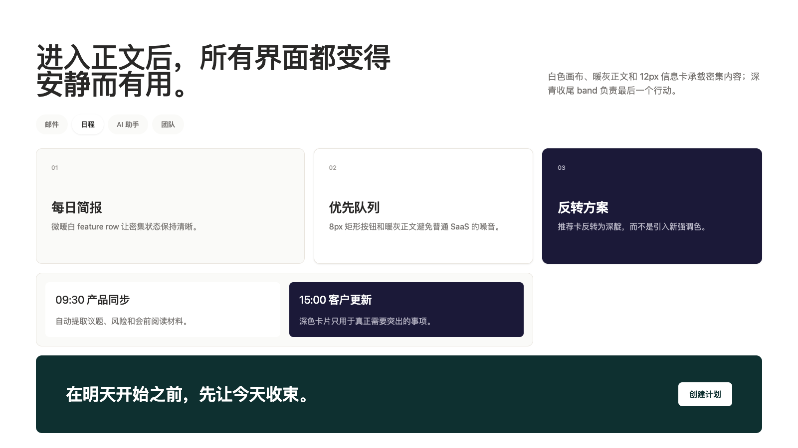
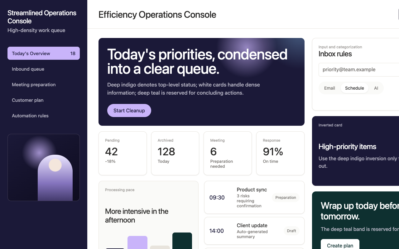

适合高端效率工具、私享服务和会员型产品页,深靛 hero、安静白色内容区和深青收尾营造克制精致感。
设计语言样张
---
version: alpha
name: "Superhuman"
description: "Superhuman 的 DESIGN.md 中文参考模板,保留原始 design token 与专业术语,覆盖 color system、typography、layout、components、motion 与 interaction states。"
language: zh-CN
sourceLanguage: en
---

## 概览
Superhuman 的 marketing page 以 editorial dark register 开场:deep indigo navy `{colors.primary}` (`#1b1938`) canvas,上面叠加柔和的 violet-and-sky atmospheric backdrop,以及一个 half-bleed portrait subject(通常是暮光中拍摄、看向画面外的人物)。Headline 使用 `{typography.display-xxl}`(Super Sans VF,64px / weight 540)并带 negative tracking,以白色落在 indigo 上。每个 band 只由一个 rounded-rectangle CTA button 锚定;从不出现两个或三个。

每个页面的 body 都切换为白色。Hero 下方由 `{colors.canvas}` (`#ffffff`) 接管,body type 使用 `{colors.ink}`(`#292827`,略暖的 dark grey,从不使用 pure black),feature row 在 white 与 `{colors.canvas-soft}`(几乎不可察觉的 off-white tint)之间交替。Pricing tier 位于这个 white surface 上;featured tier 反转为 indigo navy,完成品牌的二元 polarity。

每个页面都以 **deep-teal CTA band** (`{colors.surface-teal-deep}` — `#0e3030`) 收尾。Teal 是唯一的色彩插曲:丰富、近黑的 green-blue,打破原本只有 indigo/white 的页面。Teal band 始终包含 `{typography.display-lg}` 的 closing CTA,并搭配一个单独的 white-pill button。

Typography 使用 **Super Sans VF**,这是一套专有 variable display sans,并采用不常见的 mid-weight(460、540、600)。Variable axes 让品牌可以选择精确的 sub-default weight,使其比典型 400/500/700 SaaS scale 更温暖、更有人味。Display size 根据尺寸使用 -1.32px 到 -0.315px 的 negative letter-spacing;line-height 异常紧凑(48px display 上为 0.96)。

**Key Characteristics:**
- Three-canvas system:hero 使用 indigo navy (`{colors.primary}`),body 使用 white (`{colors.canvas}`),closing CTA 使用 deep teal (`{colors.surface-teal-deep}`)。
- Hero 中使用 half-bleed portrait subject 和 violet-sky atmospheric backdrop;品牌反复使用看向画面外的人物作为视觉母题。
- 每个 band 只有一个 CTA;marketing page 从不拥挤地堆叠行动。
- Super Sans VF 使用 sub-default weight(460、540、600),这是品牌的 typographic warmth signature。
- Display size 使用紧凑 line-height(0.96);通过垂直压缩形成 editorial density。
- Body ink 是 off-warm-grey (`#292827`);从不使用 pure black,这是品牌安静温暖感的一部分。
- Hero CTA 使用 pale violet (`{colors.surface-violet-soft}`) 的 pill shape;其它地方全部使用 rounded-rectangle CTA。

## Colors

> **Source pages:** home (`/`), `/products/go-ai-assistant`, `/contact-sales`, `/plans`.

### Brand & Accent
- **Primary Indigo Navy** (`{colors.primary}` — `#1b1938`): 品牌 primary surface 和 CTA color。用于 hero canvas、filled rounded-rectangle button、featured pricing tier。
- **Indigo Deep** (`{colors.primary-deep}` — `#0e0c1f`): Pressed-state lift / deeper navy,用于 hero gradient stop。
- **Surface Violet Soft** (`{colors.surface-violet-soft}` — `#c9b4fa`): Hero pill-button fill;indigo canvas 上的 pale violet。也出现在 atmospheric backdrop 中。
- **Surface Teal Deep** (`{colors.surface-teal-deep}` — `#0e3030`): 标志性的 closing-CTA band color。丰富的 green-blue,几乎接近黑色。
- **Surface Teal Mid** (`{colors.surface-teal-mid}` — `#155555`): 略微抬起的 teal,用于 band 内部 nested chrome。

### Surface
- **Canvas** (`{colors.canvas}` — `#ffffff`): 默认 body background。
- **Canvas Soft** (`{colors.canvas-soft}` — `#fafaf8`): 略暖的 off-white,用于交替 feature-row band。
- **Hairline** (`{colors.hairline}` — `#e8e4dd`): 1px border,略暖 grey。
- **Hairline Dark** (`{colors.hairline-dark}` — `#3f3a52`): Dark surface 上的 1px border。

### Text
- **Ink** (`{colors.ink}` — `#292827`): 默认 body text。Warm dark grey,从不使用 pure black。
- **Ink Mute** (`{colors.ink-mute}` — `#73706d`): Secondary text、caption。
- **Ink Faint** (`{colors.ink-faint}` — `#9a9794`): Tertiary / disabled text。
- **On Primary** (`{colors.on-primary}` — `#ffffff`): Dark navy / teal surface 上的文本。
- **On Dark Mute** (`{colors.on-dark-mute}` — translucent white): Dark 上的 secondary text。
- **On Dark Faint** (`{colors.on-dark-faint}` — translucent white): Dark 上的 tertiary text。

## Typography

### Font Family

Display 和 UI tier 使用 **Super Sans VF**,一套专有 variable sans(weight 有 variable axis,品牌使用 sub-default 460 / 540 / 600 weight)。Fallback chain 是系统字体栈。

替代方案使用 **Inter Variable**(开源),设置 weight 460 / 540 / 600;Inter 的 variable axes 与 Super Sans VF 行为非常接近。避免使用固定 weight 的 Inter 400 / 500 / 600;品牌特意选择中间 weight。

### Hierarchy

| Token | Size | Weight | Line Height | Letter Spacing | 用途 |
|---|---|---|---|---|---|
| `{typography.display-xxl}` | 64px | 540 | 0.96 | 0 | Hero headline |
| `{typography.display-xl}` | 48px | 460 | 0.96 | -1.32px | Light surface 上的 section opener |
| `{typography.display-lg}` | 28px | 540 | 1.14 | -0.63px | Sub-section / feature title |
| `{typography.display-md}` | 22px | 460 | 1.1 | -0.315px | Card title |
| `{typography.heading-lg}` | 20px | 460 | 1.2 | -0.4px | Compact card title |
| `{typography.body-lg}` | 18px | 540 | 1.5 | -0.135px | Marketing body lead |
| `{typography.body-md}` | 16px | 460 | 1.5 | 0 | Default UI body |
| `{typography.body-strong}` | 18.72px | 700 | 1.5 | 0 | Emphasized body |
| `{typography.button-md}` | 16px | 700 | 1.0 | 0 | Rounded-rectangle button label |
| `{typography.button-cap}` | 14px | 600 | 1.0 | 0 | Compact button label |
| `{typography.caption}` | 14px | 460 | 1.4 | 0 | Helper、footnote |
| `{typography.micro}` | 12px | 540 | 1.4 | 0 | Pill label、fine print |

### Principles
- **Sub-default weights。** 品牌选择 460 / 540 / 600,而不是 400 / 500 / 700;这种 typography 中的安静温暖感让它区别于默认 SaaS 系统。
- **Tight display leading。** 48–64px display 上使用 0.96;文字堆叠异常紧凑。
- **Display size 使用 negative tracking。** 48px 时 -1.32px,并按比例缩放;它把 variable letterform 收紧成 editorial density。

### Font Substitutes
推荐替代字体是 **Inter Variable**(Google Fonts 开源)。Display 设置 `font-variation-settings: "wght" 540`,body 设置 460;Inter 的 variable axes 可以匹配。避免 fixed-weight Inter;中间 weight 是品牌 signature。

## Layout

### Spacing System
- **Base unit**: 8px(带 2 / 4 / 12 sub-token,用于精细处理)。
- **Tokens**: `{spacing.xxs}` 2px · `{spacing.xs}` 4px · `{spacing.sm}` 8px · `{spacing.md}` 12px · `{spacing.lg}` 16px · `{spacing.xl}` 24px · `{spacing.xxl}` 32px · `{spacing.huge}` 64px。
- **Section padding**: 大多数 section 为 64–96px;closing teal band 使用 96–128px 来获得 editorial weight。
- **Card internal padding**: Pricing card 为 32px;交替 feature row 为 24px。

### Grid & Container
- Hero 横跨 full viewport width,violet-sky backdrop edge-to-edge;content 居中在约 960px column 中。
- Body content 居中在约 960–1100px。
- Pricing 在 1024 / 768 breakpoint 从 3-up → 2-up → 1-up 折叠。

### Whitespace Philosophy
品牌在两种 polarity 上都使用宽松 editorial whitespace:dark hero 与 white body。Section gap 通常接近 96px;teal closing band 的 vertical air 可达 128px。Whitespace 本身就是品牌“经过思考、节奏缓慢”感受的一部分。

## Elevation & Depth

| Level | Treatment | 用途 |
|---|---|---|
| 0 | Flat | 默认 surface |
| 1 | `box-shadow: 0 1px 3px rgba(0,0,0,0.08)` | Subtle card lift |
| 2 | `box-shadow: 0 8px 24px rgba(0,0,0,0.12)` | Floating panel、modal |
| 3 | Atmospheric backdrop(indigo 上的 violet-sky) | Hero 的 depth medium |

### Decorative Depth
Hero 的 depth 来自 **violet-sky atmospheric backdrop**,也就是位于 portrait subject 后方、从 indigo 到 violet 再到 sky-blue 的柔和 radial wash。可实现为 CSS radial gradient 或大幅背景图。Hero 下方 depth 极少;white canvas 是 flat 的。

## Shapes

### Border Radius Scale

| Token | Value | 用途 |
|---|---|---|
| `{rounded.xs}` | 4px | Hairline tag |
| `{rounded.sm}` | 6px | Form input |
| `{rounded.md}` | 8px | Button(品牌 signature button shape:rounded rectangle,从不是 pill) |
| `{rounded.lg}` | 12px | Pricing card、feature card |
| `{rounded.xl}` | 16px | Modal dialog、大型 feature card |
| `{rounded.full}` | 9999px | Feature row 中的 pill tab、hero CTA |

### Photography Geometry
Hero 使用 **half-bleed portrait subject**:暮光中拍摄、看向画面外的人物,占据 hero 右半部分。Portrait 在垂直方向 edge-to-edge 延展,水平方向停在画布中段;type 位于左侧。其它摄影很少出现;多数其它 illustration 需求由 product UI mockup 承担。

## Components

### Buttons

**`button-primary-dark`** — white surface 上的主导 rounded-rectangle CTA。
- Background `{colors.primary}`、text `{colors.on-primary}`、type `{typography.button-md}`、padding `{spacing.md} {spacing.xl}`(12px 20px)、rounded `{rounded.md}` 8px。
- Pressed state `button-primary-dark-pressed` 切换到 `{colors.primary-deep}`。

**`button-on-dark-pill`** — pale violet pill shape 的 hero CTA。
- Background `{colors.surface-violet-soft}`、text `{colors.primary}`、同样 typography、padding 12px 20px、rounded `{rounded.full}`。Pill shape 只出现在 hero;body CTA 使用 rounded rectangle。

**`button-secondary-outline`** — white 上的 outline alternative。
- Background `{colors.canvas}`、text `{colors.ink}`、1px solid `{colors.hairline-dark}` border,shape 与 `button-primary-dark` 相同。

**`button-on-teal`** — closing teal band 内部的 CTA。
- Background `{colors.canvas}`、text `{colors.surface-teal-deep}`、rounded-rectangle、同样 typography。

### Cards & Containers

**`card-feature-light`** — white 上的 feature card。
- Background `{colors.canvas}`、padding `{spacing.xxl}`、rounded `{rounded.lg}`、1px `{colors.hairline}` border。

**`card-pricing`** — 标准 pricing tier card。
- Background `{colors.canvas}`、padding `{spacing.xxl}`、rounded `{rounded.lg}`、1px `{colors.hairline}` border。

**`card-pricing-featured`** — 反转的 indigo featured tier。
- Background `{colors.primary}`、text `{colors.on-primary}`,其它与 `card-pricing` 相同。

**`card-teal-band`** — 每个页面的 closing CTA band。
- Background `{colors.surface-teal-deep}`、text `{colors.on-primary}`、padding `{spacing.huge}` 64px、rounded `{rounded.lg}` 12px(full-bleed 时实践中通常无 radius)。包含一个 `{typography.display-lg}` 的 closing headline 和一个 `button-on-teal`。

**`card-feature-row`** — body 中交替出现的 feature-row card。
- Background `{colors.canvas-soft}`、text `{colors.ink}`、padding `{spacing.xl}` 24px、rounded `{rounded.md}` 8px。以成对或三联形式用于解释 hero 下方功能。

### Inputs & Forms

**`text-input`** — 标准 form input。
- Background `{colors.canvas}`、text `{colors.ink}`、type `{typography.body-md}`、padding `{spacing.sm}+ {spacing.md}`(10px 12px)、rounded `{rounded.sm}` 6px、1px `{colors.hairline}` border。

### Navigation

**`nav-bar-dark`** — indigo hero 上方的 top nav。
- Background `{colors.primary}`、text `{colors.on-primary}`、padding `{spacing.lg} {spacing.xl}`。Logo 在左,nav 居中,右侧是 "Get Started" `button-on-dark-pill`。

**`nav-bar-light`** — body / pricing page 上的 top nav。
- Background `{colors.canvas}`、text `{colors.ink}`,其它结构相同,右侧使用 `button-primary-dark`。

### Pills, Tags, and Chips

**`pill-tab-light`** — feature-row tab selector。
- Background `{colors.canvas}`、text `{colors.ink}`、type `{typography.button-cap}`、padding `{spacing.sm} {spacing.lg}`、rounded `{rounded.full}`。用于 hero 下方的 feature category picker(Mail / Channels / Code / AI / Calendar 等)。

### Signature Components

**Half-Bleed Portrait Hero** — 暮光中拍摄的人物,占据 indigo hero 右半部分,背后是 violet-sky atmospheric backdrop。Type 和 CTA 位于左侧。Portrait 是品牌反复出现的 visual signature。

**Closing Teal Band** — 每个页面都以 `card-teal-band` 收尾,包含一个 `{typography.display-lg}` closing headline 和一个 `button-on-teal`。Teal 是页面的 resolving chord。

**`link-on-light`** — inline links on body.
- Text `{colors.ink}`,以 `{typography.body-md}` 渲染,并带 persistent underline。

**`footer-light`** — site-wide footer.
- Background `{colors.canvas}`、text `{colors.ink-mute}`、type `{typography.caption}`、padding `{spacing.huge} {spacing.xl}`(64px 24px)。包含 4 列 link group、social icon,以及一个小型 legal/copyright row。

## Do's and Don'ts

### Do
- 尽可能为每个 hero 配上 violet-sky atmospheric backdrop 和 half-bleed portrait subject。
- Display tier 使用 sub-default weight(460 / 540);这种温暖感是 typographic signature。
- 除 hero 外,所有地方都使用 8px radius 的 rounded-rectangle CTA(hero 中 pill-shaped 是规则)。
- 每个 marketing page 都用 deep-teal CTA band 收尾。
- Body text 使用 warm dark grey `{colors.ink}`,绝不使用 pure black。
- Display size 应用紧凑的 0.96 line-height;editorial compression 就是品牌。

### Don't
- 不要在页面 body 中使用 pill-shaped button;pill 只属于 hero。
- 不要把 display weight 提到 540 以上,除非使用 `body-strong` (700) 做 emphasized inline body。
- 不要用 pure black 渲染 body text;warm grey `#292827` 是品牌的一部分。
- 不要省略 closing teal band;每个 marketing page 都用它收尾。
- 不要引入 indigo、violet-soft、teal 和 off-warm-grey 之外的额外 accent color。

## Responsive Behavior

### Breakpoints

| Name | Width | 关键变化 |
|---|---|---|
| Wide | ≥ 1440px | Half-bleed portrait 保持 full scale;teal band 高 128px |
| Desktop | 1024–1440px | 默认 content max-width;pricing 3-up |
| Tablet | 768–1023px | Pricing 2-up;portrait crop 更紧 |
| Mobile | < 768px | Pricing 1-up;hamburger nav;display 从 64 降到 36px |

### Touch Targets
- Button 在 mobile 上通过 12px vertical padding × 16px line-height 达到 ≥ 44×44px。符合 WCAG AAA。
- Form field 保持 44px minimum height。

### Collapsing Strategy
- Display tier 阶梯变化为 64 → 48 → 36 → 28 → 22px。
- Half-bleed portrait 在 mobile 上裁切为 head-and-shoulders;atmospheric backdrop 简化。
- Pricing tier 阶梯变化为 3-up → 2-up → 1-up。
- Top nav 在 768px 以下折叠为 hamburger。
- Closing teal band 在 mobile 上将 vertical padding 从 128 降到 64px。

### Image Behavior
Hero portrait 使用 `srcset`,带 desktop / mobile crop;desktop 优先完整 half-bleed composition,mobile 裁切到 head-and-shoulders。

## Iteration Guide

1. 一次只聚焦一个 component。
2. 直接引用 component name 和 token。
3. 编辑后运行 `npx @google/design.md lint DESIGN.md`。
4. Default body 使用 `{typography.body-md}`;`{typography.body-lg}` 保留给 marketing lead。
5. 保持 three-canvas rhythm(indigo / white / teal);添加第四个 canvas color 会破坏系统。
6. Closing teal band 不可妥协;每个 marketing page 都在那里完成收束。


