

01 / 03
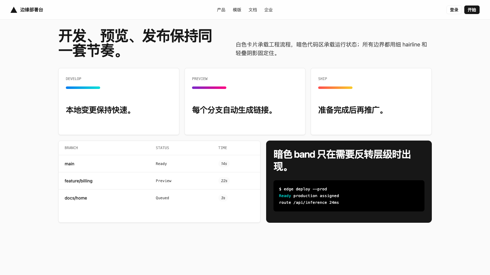
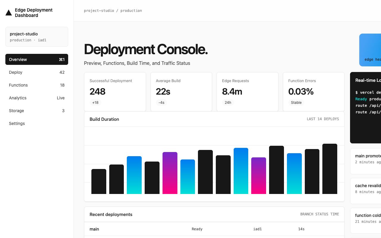
适合开发者平台、部署工具和技术官网,黑白极简,强调速度、结构和工程可信度。
设计语言样张
近白画布、黑色主行动和大面积 mesh gradient,让开发者平台保持工程感和速度感。
$ vercel deploy
Ready https://app-preview.vercel.app ---
version: alpha
name: "Vercel"
description: "Vercel 的 DESIGN.md 中文参考模板,保留原始 design token 与专业术语,覆盖 color system、typography、layout、components、motion 与 interaction states。"
language: zh-CN
sourceLanguage: en
---
## 概览
Vercel 是开发者平台品牌;页面像 deployment dashboard 的营销表面,面向已经熟悉语法的工程师。它用网页上最克制、最干净的 stark system 之一建立这种姿态:近白 `{colors.canvas-soft}` 作为 body background,墨黑 `{colors.ink}` 作为文本,200 阶灰度让每条 divider、border、disabled state 都有明确层级。品牌唯一在 marketing scale 引入色彩的地方,是多段 mesh gradient(`{colors.gradient-develop-start}` → `{colors.gradient-preview-end}` → `{colors.gradient-ship-start}` → cyan / magenta / amber),它漂浮在氛围背景里,从不缩小成普通色块。这个 gradient 就是完整的装饰系统。
字体是第二个决定性声音。品牌自定义 geometric sans(Geist)承担 display、body、button 等所有叙述文本:display 用 weight 600,buttons 用 500,body 用 400。匹配的 monospaced face(Geist Mono)承担技术标签:terminal mockups、code blocks,有时也用于 filename captions。标题采用 sentence-case,并带有强烈负 letter-spacing(48px hero 为 `-2.4px`);品牌不会使用正 tracking,也不会在 mono labels 之外使用 uppercase。
Surface 使用四级阶梯:`{colors.canvas}`(卡片纯白)、`{colors.canvas-soft}` 98%(页面 body)、`{colors.canvas-soft-2}` 95%(偶发 inset region)、`{colors.primary}`(深墨近黑,用作需要 dark mode treatment 的 polarity-flipped band)。阴影极其克制;每张 elevated card 都使用由 `0px 1px 1px #00000005` + `0px 2px 2px #0000000a` + inset border 组成的 stacked shadow。卡片从不漂浮在重 drop-shadow 上,而是被 hairline + soft glow 固定在页面表面。
**关键特征:**
- 单一黑墨 primary CTA `{colors.primary}` 承载所有 conversion target,并与 white-on-white `button-secondary` 配对作为次级动作。Marketing CTAs 使用 100px pill shape,in-app nav buttons 使用紧凑 6px 方角。
- 多段 mesh gradient(cyan-blue-magenta-amber)是唯一 decorative chrome;只在 hero scale 和 feature-band atmospheric backdrops 中使用。它就是品牌。
- 每个 section eyebrow 和 small label 使用 monospace face `{typography.caption-mono}` 或 `{typography.code}`;其他内容都使用 geometric sans。
- 细腻 stacked-shadow elevation:三个 offset 叠加 4-12% black opacity;从不使用单一重 drop-shadow。
- 系统 token 中存在完整 100–1000 gray + blue + red + amber + green + teal + purple + pink 色阶,但 marketing surface 只使用 `100`、`1000` 和 `700` 级色调;其余保留给 in-product surfaces。
- “Active CPU” pricing rhythm:pricing page 上 `pricing-card` 三列排布,中间 `pricing-card-featured`(Pro tier)反转为 `{colors.primary}`,与白色 sibling cards 形成对比。
## Colors
### Brand & Accent
- **Ink** (`{colors.primary}` — `#171717`): The single primary CTA color. Black-near-pure ink that carries every Sign Up pill, every footer CTA, the dark-band polarity-flip. Used as text color throughout the page on light surfaces. (Resolved from `--ds-gray-1000`.)
- **Cyan** (`{colors.cyan}` — `#50e3c2`): A signature mint-cyan used in the brand gradient and inside Geist-system spotlight tokens. Visible inside the hero gradient stops.
- **Highlight Pink** (`{colors.highlight-pink}` — `#ff0080`): The brand's highlight magenta, used as the high-saturation stop in the preview-gradient pair.
- **Violet** (`{colors.violet}` — `#7928ca`): The deep purple used as the start of the preview-gradient and inside developer-console highlights.
- **Link Blue** (`{colors.link}` — `#0070f3`): The brand's primary link color and the legacy `--geist-success` semantic.
### Surface
- **Canvas** (`{colors.canvas}` — `#ffffff`): The pure-white card / dialog / modal surface.
- **Canvas Soft** (`{colors.canvas-soft}` — `#fafafa`): The default page background — 98 % white. Almost every section sits on this tone.
- **Canvas Soft 2** (`{colors.canvas-soft-2}` — `#f5f5f5`): A slightly deeper inset surface for "code editor inner background", template-card hover states, and dropdown menus.
- **Hairline** (`{colors.hairline}` — `#ebebeb`): 1 px dividers — table rows, card borders, input borders.
- **Hairline Strong** (`{colors.hairline-strong}` — `#a1a1a1`): The 500-level gray, used as the slightly-stronger divider on light bands and as the deemphasised text color.
### Text
- **Ink** (`{colors.ink}` — `#171717`): Every heading and body paragraph on light surfaces.
- **Body** (`{colors.body}` — `#4d4d4d`): Secondary text — sub-headings, body captions, nav-link inactive text, footer column body.
- **Mute** (`{colors.mute}` — `#888888`): Lowest-priority text — placeholder text, fine print, low-key labels.
- **On Primary** (`{colors.on-primary}` — `#ffffff`): All text on `{colors.primary}` surfaces.
### Semantic Colors
- **Success / Link** (`{colors.success}` — `#0070f3`): The brand's legacy success indicator doubles as the primary link color. Visible underline-on-hover for inline body links.
- **Link Deep** (`{colors.link-deep}` — `#0761d1`): The pressed / visited tone for inline links.
- **Link Bg Soft** (`{colors.link-bg-soft}` — `#d3e5ff`): Soft pastel blue fill for "what's new" pill banners and informational badges.
- **Error** (`{colors.error}` — `#ee0000`): Validation red for destructive actions and form errors.
- **Error Soft** (`{colors.error-soft}` — `#f7d4d6`): Soft pastel red for destructive-state backgrounds.
- **Error Deep** (`{colors.error-deep}` — `#c50000`): Pressed / deep destructive state.
- **Warning** (`{colors.warning}` — `#f5a623`): Caution / pending status indicator.
- **Warning Soft** (`{colors.warning-soft}` — `#ffefcf`) / **Warning Deep** (`{colors.warning-deep}` — `#ab570a`): Background + pressed variants.
### Brand Gradient
品牌标志性装饰是三组 gradient stack:
- **Develop** (`{colors.gradient-develop-start}` `#007cf0` → `{colors.gradient-develop-end}` `#00dfd8`):blue-to-teal 组合,用于标记 "deploy" / "develop" 节奏。
- **Preview** (`{colors.gradient-preview-start}` `#7928ca` → `{colors.gradient-preview-end}` `#ff0080`):violet-to-pink 组合,用于 "preview" surfaces。
- **Ship** (`{colors.gradient-ship-start}` `#ff4d4d` → `{colors.gradient-ship-end}` `#f9cb28`):coral-to-amber 组合,用于 "ship" surfaces。
这三组颜色在作为 hero atmospheric backdrop 时会合并为单一 multi-color mesh gradient。应把 gradient 视为一个统一对象:不要裁成单色,不要重排 stops,也不要缩小成小装饰。它只用于 hero scale。
## Typography
### Font Family
两个 custom faces 承载整个系统:
1. **Custom geometric sans**(提取为 `Geist`)用于所有 display、body、button、link 和 label。Working set 是 weights 400 / 500 / 600;字体不会出现 700 或更重。Display sizes 使用强烈负 tracking(48px hero 为 `-2.4 px`,32px section 为 `-1.28 px`);body 保持 neutral 或轻微负 tracking。
2. **Custom monospaced face**(提取为 `Geist Mono`)用于 terminal mockups、code blocks 和 small mono-caption labels,也就是任何需要传达“technical”的内容。只在 12–13px 使用 weight 400。Tracking 保持 neutral。
Condensed display sans(`Space Grotesk`)作为第三字体加载,用于偶发 editorial moments,但在捕获的 surfaces 中没有作为 primary face 渲染。
### Hierarchy
| Token | Size | Weight | Line Height | Letter Spacing | Use |
|---|---|---|---|---|---|
| `{typography.display-xl}` | 48px | 600 | 48px | -2.4px | Hero headline ("Build and deploy on the AI Cloud."). |
| `{typography.display-lg}` | 32px | 600 | 40px | -1.28px | Section headlines ("Your frontend, delivered.", "A compute model for all workloads."). |
| `{typography.display-md}` | 24px | 600 | 32px | -0.96px | Card-cluster headlines, pricing-tier names. |
| `{typography.display-sm}` | 20px | 600 | 28px | -0.6px | Inline display micro-headings. |
| `{typography.body-lg}` | 18px | 400 | 28px | 0 | Lead paragraphs under section headlines. |
| `{typography.body-md}` | 16px | 400 | 24px | 0 | Default body paragraph. |
| `{typography.body-md-strong}` | 16px | 500 | 24px | 0 | Bolded inline body. |
| `{typography.body-sm}` | 14px | 400 | 20px | -0.28px | Secondary body, nav-link text, button-md labels. |
| `{typography.body-sm-strong}` | 14px | 500 | 20px | -0.28px | Nav CTA labels, table-row emphasis. |
| `{typography.caption}` | 12px | 400 | 16px | 0 | Footer secondary lines, badge labels. |
| `{typography.caption-mono}` | 12px | 400 | 16px | 0 | Section eyebrows and label captions that want a technical voice. |
| `{typography.code}` | 13px | 400 | 20px | 0 | Inline code, terminal mockups, command snippets. |
| `{typography.button-md}` | 14px | 500 | 20px | 0 | Small / nav-scale button labels. |
| `{typography.button-lg}` | 16px | 500 | 24px | 0 | Marketing-scale pill button labels. |
### 原则
- **负 tracking 是语气的一部分。** Display sizes 使用强烈的 `-2.4` 到 `-0.6` px tracking。恢复默认 tracking 会破坏品牌感。
- **标题使用 sentence-case,并以句号收尾。** 例如 "Build and deploy on the AI Cloud." 会刻意以句号结束;这个标点本身就是品牌声音的一部分。
- **Mono 只属于技术层。** Section eyebrows、code blocks、terminal mockups 可以用 mono;body paragraphs 永远不要用 mono。
- **Weight 600 是 display 上限。** Geometric sans 不出现 700 / 800。正因为如此,品牌读起来更冷静。
### Font Substitutes
The two primary faces are proprietary (custom-cut for the brand). Open-source substitutes:
- **Geometric sans** — *Inter* (400 / 500 / 600) is the closest stylistic match; `font-feature-settings: "ss01", "ss02"` enables the geometric alternates. *Satoshi* is a passable second choice.
- **Monospace** — *JetBrains Mono* (400) at 12 – 13 px matches the technical voice. *IBM Plex Mono* is the second-best option.
## Layout
### Spacing System
- **Base unit**:4px。品牌的 `--geist-space` token 正好是 4px,所有捕获值都是 4 的倍数。
- **Tokens**:`{spacing.xxs}` 4 px · `{spacing.xs}` 8 px · `{spacing.sm}` 12 px · `{spacing.md}` 16 px · `{spacing.lg}` 24 px · `{spacing.xl}` 32 px · `{spacing.2xl}` 40 px · `{spacing.3xl}` 48 px · `{spacing.4xl}` 64 px · `{spacing.5xl}` 96 px · `{spacing.6xl}` 128 px · `{spacing.section}` 192 px.
- **Section padding**:marketing bands 的 top/bottom 使用 `{spacing.4xl}` 到 `{spacing.5xl}`。Hero bands 拉伸到 `{spacing.section}`,给 mesh gradient 留出呼吸空间。
- **Card interior padding**:marketing cards 使用 `{spacing.lg}` 到 `{spacing.xl}`;template-grid cards 因处于更密集 grid 中,保持更紧的 `{spacing.md}`。
- **Inline gap**:button rows、nav rows 与 chip rows 在 siblings 之间使用 `{spacing.sm}` 到 `{spacing.md}`。品牌的 `--geist-gap` 正好是 24px。
### Grid & Container
- **Max width**:约 1400px(`--ds-page-width`);旧的 `--geist-page-width` 为 1200px,仍出现在部分 marketing surfaces。Desktop 上 content 以 `{spacing.lg}` 24px horizontal gutters 居中,mobile 上使用 `{spacing.md}` 16px。
- **Column patterns**:
- Three-feature row:desktop 为 3-up,mobile 为 1-up(如 "Web Apps / Composable Commerce / Multi-tenant Platforms")。
- Tab pill row:居中的 5-up `tab-ghost` pills。
- Template-grid cluster:desktop 为 5-up,逐步缩放到 mobile 1-up。
- Pricing tier grid:desktop 为 3-up,中间 tier 做 polarity-flipped。
- Logo strip:约 5 个 logos 宽,单行排列。
### 留白哲学
Mesh gradient 承担主要装饰重量,留白负责分隔 band。Section spacing 很慷慨;bands 之间使用 `{spacing.4xl}` 到 `{spacing.5xl}`,让 gradient 有呼吸空间。Card 内部的 headline/paragraph stack 很紧(`{spacing.xs}` 8px gap),到 CTA cluster 前再拉开更大的间距。页面读起来像经过工程化控制:大外距 + 紧内部,而不是反过来。
### Responsive Strategy
#### Breakpoints
| Name | Width | Key Changes |
|---|---|---|
| Mobile | < 600px | Hero stacks; nav collapses to hamburger; 3-up feature grids drop to 1-up; tab pill row enables horizontal scroll. |
| Tablet | 600–959px | 3-up grids drop to 2-up; nav still horizontal. |
| Desktop | 960–1199px | Full 3-up grids; pricing 3-up. |
| Wide | 1200–1399px | Container caps at 1400 px content width. |
| Ultra-wide | ≥ 1400px | Content stays centred at 1400 px; bands stretch edge-to-edge in colour but content holds the max-width. |
#### Touch Targets
`button-primary` pill 在 nav 中约 32px 高,在 marketing contexts 中约 48px 高。Marketing CTAs 在所有 breakpoints 都能轻松满足 WCAG AAA;nav buttons 在 mobile 上通过 `{spacing.xs}` padding 扩大触控区域,以满足 44 × 44px 下限。
#### 折叠策略
- **Nav**:desktop 为 full link row + Ask AI / Log In / Sign Up pills;mobile 折叠为 logo + hamburger,菜单以 full-overlay 打开。
- **Hero**:mesh gradient 保持居中;headline + body 在所有 breakpoints 都垂直堆叠(品牌不使用 split-hero pattern)。
- **Three-feature row**:按上方 breakpoints 从 3-up → 2-up → 1-up;cards 在所有 viewports 保持 `{rounded.md}` 8px shape。
- **Pricing card grid**:desktop 为 3-up,mobile 垂直堆叠,`pricing-card-featured` 始终位于中间。
- **Template grid**:5-up → 3-up → 2-up → 1-up。每个 `template-card` 的图片保持 16:9 aspect。
#### 图片行为
- **Mesh gradient**:渲染为 inline SVG 或 canvas-painted gradient;随 hero container 流体缩放;不裁切、不平铺。
- **Customer logos**:在 logo strip 中渲染为 monochrome SVGs;高度统一为 24px。
- **Code editor mockup**:dark `{colors.primary}` rectangle,内部渲染 mono text;在 layout level 被当作 image 处理。
- **Template thumbnails**:16:9 landscape,位于 `{rounded.md}` card chrome 内;lazy-loaded;placeholder state 使用统一 grayscale palette。
## Elevation & Depth
| Level | Treatment | Use |
|---|---|---|
| Level 0 — Flat | No shadow, no border. | Full-bleed hero bands and the polarity-flipped dark sections. |
| Level 1 — Inset Hairline | `0 0 0 1px #00000014` inset 1 px border. | Default card chrome — the brand's universal "you can see this card" cue. |
| Level 2 — Subtle Drop | `0px 1px 1px #00000005, 0px 2px 2px #0000000a` plus inset hairline. | Slightly elevated cards (template-grid, marketing-card). |
| Level 3 — Soft Stack | `0px 2px 2px #0000000a, 0px 8px 8px -8px #0000000a` plus inset hairline. | The "medium" elevation — feature-grid cards. |
| Level 4 — Float Stack | `0px 2px 2px #0000000a, 0px 8px 16px -4px #0000000a` plus inset hairline. | "Large" elevation — pricing cards, callout panels. |
| Level 5 — Modal | `0px 1px 1px #00000005, 0px 8px 16px -4px #0000000a, 0px 24px 32px -8px #0000000f` plus inset hairline. | Modal / dialog surfaces and dropdown menus. |
品牌使用 STACKED shadows:多个小 offset 叠加来模拟自然光,而不是单个 8px blur 的通用投影。Inset hairline rings 总会加入,确保 card edge 保持清晰。
### 装饰性深度
- **Mesh gradient 作为 atmospheric depth**:hero 的 multi-stop gradient 是品牌唯一的“atmospheric”效果;它是 flat 2-D backdrop,而不是 3-D illustration。
- **Polarity-flipped dark band 作为 section-depth**:surface 从 `{colors.canvas-soft}` 切换到 `{colors.primary}`(deep ink),是品牌在 bands 之间最主要的 depth cue。
- **Inset-shadow + drop-shadow combo**:cards 将 inset 1px ring 与 multi-stop drop 结合,产生“card sits on the page”的效果,但不会显得 material-heavy。
## Shapes
### Border Radius Scale
| Token | Value | Use |
|---|---|---|
| `{rounded.none}` | 0px | Full-bleed hero / footer bands. |
| `{rounded.xs}` | 4px | Tightest inline pill — the `nav-cta-signup` 6-px-radius button (mapped to `xs/sm`). |
| `{rounded.sm}` | 6px | The brand's `--geist-radius` token — base UI radius for in-app buttons, form inputs, dropdown menus. |
| `{rounded.md}` | 8px | The brand's `--geist-marketing-radius` token — feature cards, template cards. |
| `{rounded.lg}` | 12px | Slightly larger card chrome (pricing-card variants). |
| `{rounded.xl}` | 16px | Largest card chrome — when a card hosts a hero image cap. |
| `{rounded.pill-sm}` | 64px | Tab-ghost pills inside the "AI Apps / Web Apps / Ecommerce / Marketing / Platforms" row. |
| `{rounded.pill}` | 100px | The marketing CTA pill — `button-primary`, `button-secondary`, "Start Deploying" pill. |
| `{rounded.full}` | 9999px | Icon-button circular containers, nav-link ghost pills. |
### Photography Geometry
- **Mesh gradient**: full-bleed 2-D atmospheric backdrop, never cropped to a frame; treated as the page's wallpaper.
- **Customer logos**: monochrome SVG, consistent 24 px height in a flex row.
- **Code editor mockup**: 16:10 dark rectangle, `{rounded.md}` corners.
- **Template thumbnails**: 16:9 landscape inside `{rounded.md}` chrome.
- **Showcase imagery**: 2:1 or 16:9 inside `{rounded.lg}` to `{rounded.xl}` chrome with a stacked shadow.
## Components
### Buttons
**`button-primary`** — the canonical 100-px-radius black pill, marketing scale.
- Background `{colors.primary}`, text `{colors.on-primary}`, label set in `{typography.button-lg}`, padding `0px {spacing.sm}` 12 px, shape `{rounded.pill}` 100 px. Renders ~48 px tall when paired with the marketing flex layout.
**`button-secondary`** — the white pill paired with the black primary inside marketing bands.
- Background `{colors.canvas}`, text `{colors.ink}`, same typography + padding as `button-primary`, shape `{rounded.pill}`.
**`button-primary-sm`** — the smaller-scale primary pill used inside nav and pricing-card CTAs.
- Background `{colors.primary}`, text `{colors.on-primary}`, label set in `{typography.button-md}` (14 px / 500), shape `{rounded.pill}`.
**`button-secondary-sm`** — the smaller-scale white pill paired with `button-primary-sm`.
- Background `{colors.canvas}`, text `{colors.ink}`, same typography + shape as `button-primary-sm`.
**`tab-ghost`** — the centred-row tab pill ("AI Apps / Web Apps / Ecommerce / Marketing / Platforms").
- Background `{colors.canvas}`, text `{colors.ink}`, label set in `{typography.body-sm}`, padding `0px {spacing.md}`, shape `{rounded.pill-sm}` 64 px.
**`icon-button-circular`** — the circular icon container (often a "?" or arrow inside).
- Background `{colors.canvas}`, dark icon, 1 px solid hairline border, shape `{rounded.full}`.
**Nav CTAs:**
**`nav-cta-signup`** — the small black "Sign Up" button in the nav row.
- Background `{colors.primary}`, text `{colors.on-primary}`, label `{typography.body-sm-strong}`, padding `0px {spacing.xs}`, height 28 px, shape `{rounded.sm}` 6 px (the brand's `--geist-radius`).
**`nav-cta-login`** — the white "Log In" button in the nav.
- Background `{colors.canvas}`, text `{colors.ink}`, same typography / height / shape as `nav-cta-signup`.
**`nav-cta-ask-ai`** — the small "Ask AI" button with a faint border.
- Background `{colors.canvas}`, text `{colors.ink}`, 1 px solid `{colors.hairline}` border (extracted as `0px solid rgb(235, 235, 235)`), same typography / height / shape.
### Cards & Containers
**`card-marketing`** — the canonical marketing feature card (3-up section cards).
- Background `{colors.canvas}`, text `{colors.ink}`, padding `{spacing.lg}` 24 px, shape `{rounded.md}` 8 px (the `--geist-marketing-radius`). Carries Level 3 soft-stack shadow.
**`card-marketing-large`** — the larger marketing card used for "compute model" / "AI Gateway" callouts.
- Background `{colors.canvas}`, text `{colors.ink}`, padding `{spacing.xl}`, shape `{rounded.lg}` 12 px. Carries Level 4 float-stack shadow.
**`card-soft`** — the soft-tinted card used inside cluster groups (lighter than canvas-soft).
- Background `{colors.canvas-soft}`, text `{colors.ink}`, padding `{spacing.lg}`, shape `{rounded.md}`.
**`template-card`** — the deploy-template card in the "Deploy your first app" grid.
- Background `{colors.canvas}`, text `{colors.ink}`, padding `{spacing.md}` 16 px, shape `{rounded.md}` 8 px. Hosts a 16:9 thumbnail at the top.
**`code-editor-mockup`** — the dark code-preview surface inside marketing bands.
- Background `{colors.primary}`, text `{colors.on-primary}`, body in `{typography.code}` (13 px / Geist Mono), padding `{spacing.lg}` 24 px, shape `{rounded.md}` 8 px.
**`pricing-card`** — the default pricing-tier card.
- Background `{colors.canvas}`, text `{colors.ink}`, padding `{spacing.xl}` 32 px, shape `{rounded.lg}` 12 px. Inside: tier name in `{typography.display-md}`, price in `{typography.display-xl}`, feature list in `{typography.body-md}` rows, CTA at the bottom.
**`pricing-card-featured`** — the polarity-flipped "Pro" tier card.
- Background `{colors.primary}`, text `{colors.on-primary}`, same shape + padding as `pricing-card`. CTA inverts to `button-secondary-sm` (white pill on black card).
### Inputs & Forms
**`form-input`** — the canonical text input.
- Background `{colors.canvas}`, text `{colors.ink}`, 1 px solid `{colors.hairline}` border, body in `{typography.body-sm}` (14 px), padding `0px {spacing.sm}`, height 40 px (the brand's `--geist-form-height`), shape `{rounded.sm}` 6 px.
**`form-input-sm`** — small-height variant (32 px tall) for tight forms.
- Same as `form-input` but height 32 px (the `--geist-form-small-height`).
**`form-input-lg`** — large-height variant (48 px tall) for hero CTAs.
- Same as `form-input` but height 48 px (the `--geist-form-large-height`); body in `{typography.body-md}` 16 px.
### Navigation
**`nav-bar`** — the sticky top nav.
- Background `{colors.canvas}`, text `{colors.ink}`, height 64 px (the brand's `--header-height`), padding `{spacing.sm} {spacing.lg}`. Layout: logo left, link row centre, "Ask AI / Log In / Sign Up" cluster right.
**`nav-link`** — the centred link row inside `nav-bar`.
- Text `{colors.body}`, set in `{typography.body-sm}`, padding `{spacing.xs} {spacing.sm}`, shape `{rounded.full}` (ghost pill — visible only on hover or active, but the radius is documented).
**`footer`** — the bottom 4-column nav.
- Background `{colors.canvas}`, text `{colors.body}`, padding `{spacing.4xl} {spacing.lg}`. Eyebrow column labels in `{typography.caption-mono}` (uppercase mono effect); link rows in `{typography.body-sm}`.
### Signature Components
**`hero-band`** — 带 mesh gradient backdrop 的 white hero。
- Background `{colors.canvas}`(某些 surfaces 使用 `{colors.canvas-soft}`),text `{colors.ink}`,padding `{spacing.4xl} {spacing.lg}`。内部结构:headline 上方放 small mono badge,headline 使用 `{typography.display-xl}`(sentence-case,句号收尾),body lead 使用 `{typography.body-lg}`,随后是 `button-primary` + `button-secondary` 的 CTA row。Mesh gradient 位于背后,缩放到大约占据 band 上半部分。
**`feature-mesh-band`** — secondary section,承载 mesh-gradient atmospheric backdrop,并在其上放 feature copy。
- Background `{colors.canvas}`, text `{colors.ink}`, padding `{spacing.5xl} {spacing.lg}`。Section headline 使用 `{typography.display-lg}`;supporting body 使用 `{typography.body-md}`。
**`showcase-band-light`** — soft-canvas section("Deploy your first app in seconds")。
- Background `{colors.canvas-soft}`, text `{colors.ink}`, padding `{spacing.5xl} {spacing.lg}`.
**`showcase-band-dark`** — polarity-flipped dark band("A compute model for all workloads")。
- Background `{colors.primary}`, text `{colors.on-primary}`, padding `{spacing.5xl} {spacing.lg}`。Section headline 使用 `{typography.display-lg}`(white on black)。通常包含与 band 齐平的 `code-editor-mockup`。
**`logo-strip`** — the customer-logo wrapping row near the top of the page.
- Background `{colors.canvas}`, text `{colors.body}`, padding `{spacing.lg} {spacing.xl}`. Logos rendered as monochrome SVGs at consistent height.
**`badge-secondary`** — the small inline metadata pill ("New", "Beta", "Live").
- Background `{colors.canvas-soft}`, text `{colors.body}`, body in `{typography.caption}`, padding `0px {spacing.xs}`, shape `{rounded.full}`.
**`banner-marketing`** — 页面顶部的 "Introducing X" announcement pill。
- Background `{colors.canvas-soft}`, text `{colors.body}`, body in `{typography.body-sm}`, padding `{spacing.xs} {spacing.sm}`, shape `{rounded.full}`.
**`link-inline`** — body-copy inline links。
- Text `{colors.link}` (`#0070f3`),body 使用 `{typography.body-md}`,带 underline。
### Examples (illustrative)
> 自动派生的 kit-mirror demonstration surfaces(`scripts/derive-examples-block.mjs`)。每个 `ex-*` entry 都引用品牌原生 primitives,让下游 consumers(`/preview-design`、`/generate-kit`)能一致地重新 skin 同一组 10 个 surfaces。`TO_FILL` markers 表示缺失 primitives,需要在 LLM judgment pass 中解决。
**`ex-pricing-tier`** — 默认 Pricing tier card。复用 feature-card chrome,并使用 brand canvas-soft surface。
- Properties:`backgroundColor`, `textColor`, `borderColor`, `rounded`, `padding`
**`ex-pricing-tier-featured`** — Featured/highlighted tier,使用 polarity-flipped surface(light mode 中 dark fill + light text,dark mode 中 light fill + dark text)。
- Properties:`backgroundColor`, `textColor`, `rounded`, `padding`
**`ex-product-selector`** — What's Included summary card,可复用于 SaaS / B2B verticals(不是字面意义上的 product gallery)。
- Properties:`backgroundColor`, `rounded`, `padding`
**`ex-cart-drawer`** — Subscription summary,可复用于 SaaS / B2B(每个 add-on 是 line item,不是 literal cart)。
- Properties:`backgroundColor`, `rounded`, `padding`, `item-divider`
**`ex-app-shell-row`** — App Shell example 内的 sidebar nav row。Active state 使用 brand primary 作为 indicator。
- Properties:`backgroundColor`, `activeIndicator`, `rounded`, `padding`
**`ex-data-table-cell`** — 默认 data-table th + td chrome。Header 使用 mono-caps eyebrow typography;body 使用 body-sm。
- Properties:`headerBackground`, `headerTypography`, `bodyTypography`, `cellPadding`, `rowBorder`
**`ex-auth-form-card`** — Sign-in / sign-up card。复用 feature-card chrome,内部使用 text-input primitives。
- Properties:`backgroundColor`, `rounded`, `padding`
**`ex-modal-card`** — Modal dialog surface;与 feature-card 使用相同 chrome,并带 elevated shadow。
- Properties:`backgroundColor`, `rounded`, `padding`
**`ex-empty-state-card`** — Empty-state illustration frame。
- Properties:`backgroundColor`, `rounded`, `padding`, `captionTypography`
**`ex-toast`** — Toast notification surface,使用 feature-card shape + medium shadow。
- Properties:`backgroundColor`, `rounded`, `padding`, `typography`
## Do's and Don'ts
### Do
- 为页面中的 primary CTAs 保留 `{colors.primary}` (`#171717`)。Black ink 就是 conversion target。
- 每个 marketing-scale CTA 使用 `{rounded.pill}` 100px;nav-scale buttons 使用 `{rounded.sm}` 6px。这两种尺度有意共存。
- 每个 `{typography.display-*}` headline 都设为 weight 600、sentence-case,并常以句号收尾。强烈负 tracking 是语气的一部分。
- Brand mesh gradient 只作为 hero scale 的 atmospheric decoration;不要缩成 icon,也不要简化成单色。
- 使用 stacked shadows(多个小 offset + inset hairline),不要使用单个重 drop。品牌 elevation 比 Material 更冷静。
- 页面 surface 在 `{colors.canvas-soft}` → `{colors.canvas}` → `{colors.primary}` polarity-flipped bands 中循环;dark band 本身就是 depth cue。
- 每个 code block 和 technical eyebrow 使用 `{typography.code}` / `{typography.caption-mono}`。Mono 是平台的声音。
### Don't
- 不要引入第六种 accent colour。品牌依靠 ink + gray + 四组 gradient palette 运作;新 accent 会削弱语气。
- 不要把 headlines 渲染成 all-caps。Sentence-case + negative tracking 不可协商。
- 不要在 cards 上放单个重 drop-shadow。品牌 elevation 由 stacked small offsets + inset hairline rings 构成。
- 不要把 brand gradient 缩到 icon scale,也不要变成单色简化版。Gradient 只存在于 hero scale。
- 不要把 geometric sans 提升到 weight 700。品牌 display ceiling 是 600。
- 不要在同一屏混用 marketing 100px pill CTA shape 与 6px nav radius;选择一种尺度并保持一致。
- 不要用 mono face 排 body paragraphs。Mono 只用于 code + technical labels。


