

01 / 03

适合硬件、消费电子和高端产品发布页,以大留白、克制排版和产品聚焦营造高级感。
设计语言样张
---
version: alpha
name: "Apple"
description: "Apple 的 DESIGN.md 中文参考模板,保留原始 design token 与专业术语,覆盖 color system、typography、layout、components、motion 与 interaction states。"
language: zh-CN
sourceLanguage: en
---

## 概览

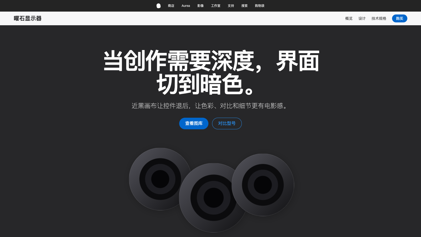
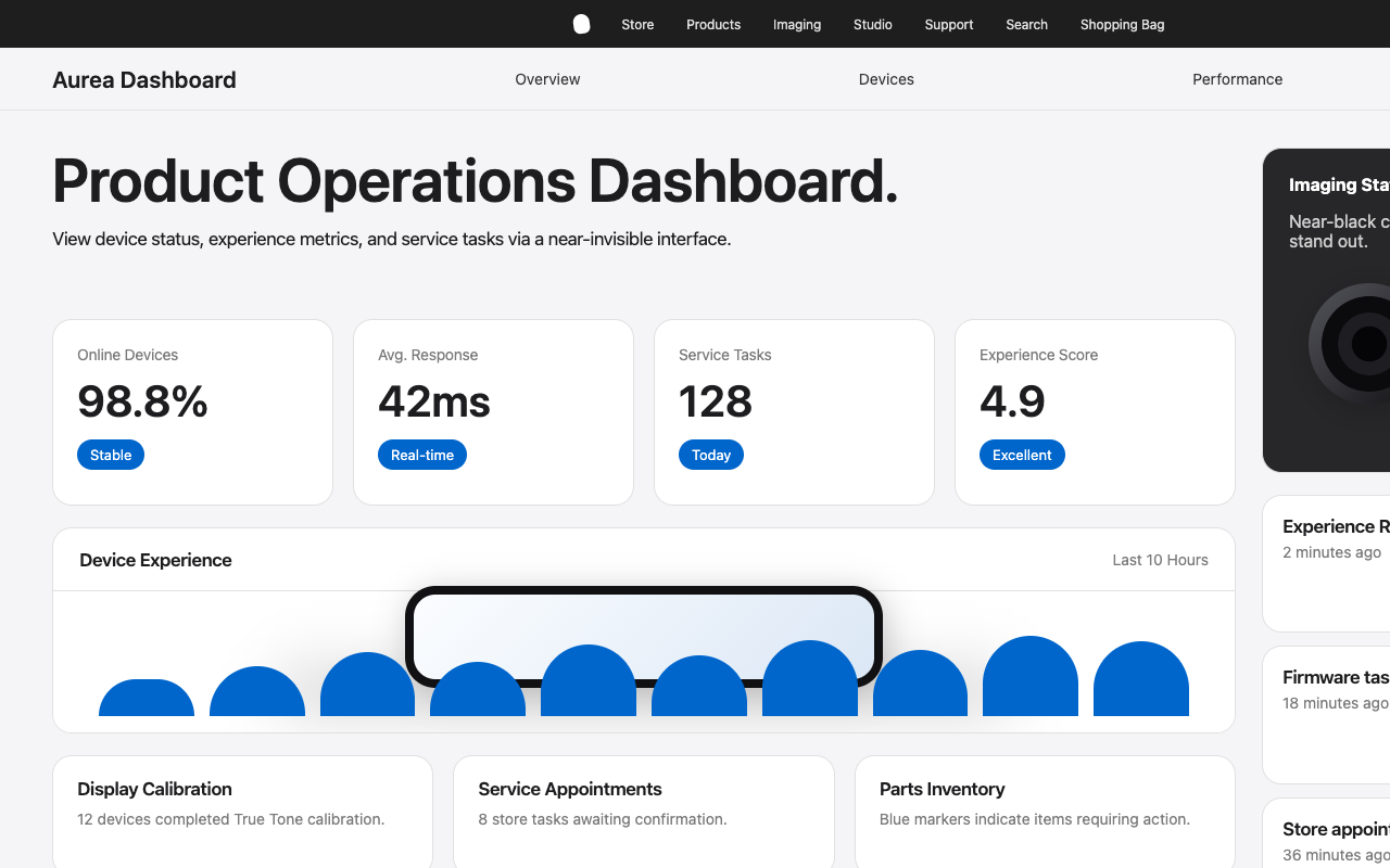
Apple 的 web 体验是“以近乎隐形的 UI 承托 product photography”的典型范式。页面由一组 edge-to-edge product tiles 组成,light canvas 与 dark canvas 交替出现,每个 tile 都围绕 hero headline、一句 tagline、两个细小的 blue pill CTA 和极其精细的 product render 展开。没有任何 UI 元素与 product 抢占注意力。Typography 自信但克制;color 要么是 pure white,要么是 off-white parchment,要么是 near-black tile;interactive elements 始终由一种安静的 blue 统一承载。

整体 density 即使放在现代 SaaS 标准里也非常低。每个 tile 大约占据一个 viewport,不使用 decorative chrome:没有 borders、没有 gradients、没有 decorative frames,也没有 headline shadow。Elevation 只在 product image “落在 surface 上”时出现:一层柔和的 `rgba(0, 0, 0, 0.22) 3px 5px 30px` drop-shadow 用来增加 product 的物理重量。最终效果更像一个 museum gallery:墙面退场,artifact 成为主角。

Store 与 shop surfaces 沿用同一套 chassis,但切换到更偏功能型的表达。iPhone 17 Pro configurator 和 accessories grid 使用紧凑的 white utility card grid,卡片采用 `{rounded.lg}` (18px) radius 和 thin border,并配合固定的 thin sub-nav strip。Environment 页面更暗、更 editorial。五个被分析的 surfaces 虽然音量不同,但 typographic system、spacing rhythm 和 single blue accent 始终一致。

**Key Characteristics:**
- Photography-first presentation;UI 退到背景,让 product 自己说话。
- Full-bleed tile sections 在 white/parchment 与 near-black 之间交替,surface color 本身就是 section divider。
- Single blue accent (`{colors.primary}` — #0066cc) 承载所有 interactive elements,不存在第二个 brand color。
- 两套 button grammar:小尺寸 blue pill CTA (`{rounded.pill}`) 与 compact utility rectangle (`{rounded.sm}`)。
- SF Pro Display + SF Pro Text,display sizes 使用 negative letter-spacing,形成标志性的 “Apple tight” headline 质感。
- 极轻的 elevation 只在 product image 需要“落地感”时使用;整个 system 只有一层 drop-shadow。
- 紧凑的双层 nav:细薄的 `{component.global-nav}` 加上 product-specific `{component.sub-nav-frosted}`,右侧持续保留 primary CTA。
- 跨页面 section rhythm:light hero → dark product tile → light utility tile → dark tile → parchment footer,形成可预期的节奏。

## Colors

> **Source pages analyzed:** homepage, environment, store, iPhone 17 Pro buy page, accessories index。五个 surface 使用同一套 color system,差异只体现在 surface mode 的组合方式上。

### Brand & Accent
- **Action Blue** (`{colors.primary}` — #0066cc): 唯一的 brand-level interactive color。所有 text links、blue pill CTA(“Learn more”、“Buy”)和 focus ring root 都使用它。这是 Apple 安静但普适的 “click me” signal。Press state 不是通过更换 hex,而是通过 active scale transform 与略深的视觉状态表达。
- **Focus Blue** (`{colors.primary-focus}` — #0071e3): Action Blue 的略亮版本,专用于 button 的 keyboard focus ring (`outline: 2px solid`)。
- **Sky Link Blue** (`{colors.primary-on-dark}` — #2997ff): 用在 dark surfaces 上的 in-copy links 与 inline callouts。Action Blue 在 dark tile 上会显得不够清晰,因此需要这个更亮的 blue。

### Surface
- **Pure White** (`{colors.canvas}` — #ffffff): 主导性的 canvas。用于 content、utility cards、store tiles、configurator grids。
- **Parchment** (`{colors.canvas-parchment}` — #f5f5f7): Apple 标志性的 off-white。用于交替的 light tiles、footer region,以及 store utility sections 的默认 page canvas。它与 white 的差异很小,但足以建立 rhythm。
- **Pearl Button** (`{colors.surface-pearl}` — #fafafc): 接近 white 的 secondary/ghost button fill。它比 parchment canvas 更亮,因此按钮在 `{colors.canvas-parchment}` 上仍然能被识别为 button。
- **Near-Black Tile 1** (`{colors.surface-tile-1}` — #272729): Homepage product grid 的主 dark-tile surface。
- **Near-Black Tile 2** (`{colors.surface-tile-2}` — #2a2a2c): 比 Tile 1 略亮一个 micro-step,用于相邻 dark tiles 之间制造极弱分隔。
- **Near-Black Tile 3** (`{colors.surface-tile-3}` — #252527): 比 Tile 1 略暗一个 micro-step,用于 stack 底部以及 embedded video/player frames。
- **Pure Black** (`{colors.surface-black}` — #000000): 只用于 true void:video player backgrounds、edge-to-edge photographic overlays、global nav bar background。
- **Translucent Chip Gray** (`{colors.surface-chip-translucent}` — #d2d2d7): 悬浮在 photography 上的 circular control button 的 base hex。生产中通常以约 64% alpha 使用,例如 `rgba(210, 210, 215, 0.64)`。

### Text
- **Near-Black Ink** (`{colors.ink}` — #1d1d1f): 所有 headline、body paragraph 以及 dark utility button fill 的主色。选择 near-black 而不是 pure black,是为了让页面保持 photographic 质感,而不是印刷感。
- **Body** (`{colors.body}` — #1d1d1f): 与 ink 相同的 hex。Apple 在 light surfaces 上使用同一 near-black 作为主要 text tone。
- **Body On Dark** (`{colors.body-on-dark}` — #ffffff): Dark tiles 和 global nav bar 上的所有 text。
- **Body Muted** (`{colors.body-muted}` — #cccccc): Dark tiles 上的 secondary copy;pure white 会太响,因此使用更柔和的 muted tone。
- **Ink Muted 80** (`{colors.ink-muted-80}` — #333333): White Pearl Button surface 上的 body text,比 pure black 更柔和。
- **Ink Muted 48** (`{colors.ink-muted-48}` — #7a7a7a): Disabled button text 与 legal fine-print。

### Hairlines & Borders
- **Divider Soft** (`{colors.divider-soft}` — #f0f0f0): Secondary buttons 的 “border” tone。它更像 ring shadow,而不是硬边线;生产中常以 `rgba(0, 0, 0, 0.04)` 使用。
- **Hairline** (`{colors.hairline}` — #e0e0e0): Store utility cards 和 configurator chips 上的 1px hairline border。

### Brand Gradient

**不使用 decorative gradients。** Product photography 中的 atmosphere depth(iPhone 17 Pro camera plate、Apple Watch bands、AirPods reflections)来自图像本身,而不是 CSS gradient overlay。Environment page 的 hero 使用 photographic atmosphere(dawn mountain vista),但没有定义 gradient token。Apple 是少数完全不依赖 gradient-based design token 的 luxury-brand site。

## Typography

### Font Family
- **Display**: `SF Pro Display, system-ui, -apple-system, sans-serif`。Apple 专有 display face,针对 ≥ 19px 的尺寸优化,定义所有 headline 的语气。
- **Body / UI**: `SF Pro Text, system-ui, -apple-system, sans-serif`。Text-optimized variant,用于 body copy、captions、buttons 和 20px 以下的 links。
- **OpenType features**: Numeric links(pricing tables、spec sheets)启用 `font-variant-numeric: numerator`。Display sizes 依赖 tight tracking,而不是 contextual ligatures。

### Hierarchy

| Token | Size | Weight | Line Height | Letter Spacing | Use |
|---|---|---|---|---|---|
| `{typography.hero-display}` | 56px | 600 | 1.07 | -0.28px | Hero headline;标志性的 “Apple tight” tracking |
| `{typography.display-lg}` | 40px | 600 | 1.10 | 0 | 每个 product tile 顶部的 tile headline |
| `{typography.display-md}` | 34px | 600 | 1.47 | -0.374px | Section heads(以 SF Pro Text 承载 display proportions) |
| `{typography.lead}` | 28px | 400 | 1.14 | 0.196px | Product tile subcopy |
| `{typography.lead-airy}` | 24px | 300 | 1.5 | 0 | Environment-page lead paragraphs,少见的 weight 300 |
| `{typography.tagline}` | 21px | 600 | 1.19 | 0.231px | Sub-tile tagline;sub-nav category name |
| `{typography.body-strong}` | 17px | 600 | 1.24 | -0.374px | Inline strong emphasis |
| `{typography.body}` | 17px | 400 | 1.47 | -0.374px | Default paragraph |
| `{typography.dense-link}` | 17px | 400 | 2.41 | 0 | Footer / store utility link lists,使用 relaxed leading |
| `{typography.caption}` | 14px | 400 | 1.43 | -0.224px | Secondary captions, button text |
| `{typography.caption-strong}` | 14px | 600 | 1.29 | -0.224px | Emphasized captions |
| `{typography.button-large}` | 18px | 300 | 1.0 | 0 | Store hero CTAs,少见的 weight 300 |
| `{typography.button-utility}` | 14px | 400 | 1.29 | -0.224px | Utility/nav button labels |
| `{typography.fine-print}` | 12px | 400 | 1.0 | -0.12px | Fine-print, footer body |
| `{typography.micro-legal}` | 10px | 400 | 1.3 | -0.08px | Micro legal disclaimers |
| `{typography.nav-link}` | 12px | 400 | 1.0 | -0.12px | Global nav menu items |

### Principles

- **Display sizes 使用 negative letter-spacing。** 17px 及以上的 headline 都有轻微 tracking tighten(`-0.12 → -0.374px`),形成标志性的 “Apple tight” cadence。12px 及以下不使用。
- **Body copy 是 17px,而不是 16px。** Apple 打破 SaaS 常规,将 paragraph text 设为 17px。多出的 1px 让页面读起来更像阅读,而不是快速扫描。
- **Weight 300 真实存在,但很少使用。** 只出现在少量大尺寸文本中,例如 `{typography.button-large}` 的 18px/300 与 `{typography.lead-airy}` 的 24px/300。它不是误差,而是让内容更 airy 的刻意选择。
- **Headline 使用 weight 600,而不是 700。** Apple 的 headline 保持在 600。Weight 700 只在 `{typography.tagline}` (21px) 等需要更强断言的场景中少量出现。
- **Line-height 按上下文定义。** Display sizes 使用 1.07–1.19 的 tight line-height;body 使用 1.47;footer/store 的 utility link stack 使用异常宽松的 2.41 (`{typography.dense-link}`)。2.41 不是错误,而是为了让 dense link columns 可扫描。
- **Weight 500 刻意缺席。** Scale 是 300 / 400 / 600 / 700。中等强调始终用 600。

### Font Substitutes

SF Pro 是 Apple 的 proprietary system font。跨平台构建时:

- Font stack 首位使用 `system-ui, -apple-system, BlinkMacSystemFont`,在 macOS/iOS/Safari 上会解析为真实 SF Pro。
- 非 Apple 平台上,**Inter**(Google Fonts variable)是最接近的 open-source substitute。Inter weight 600 搭配 `font-feature-settings: "ss03"` 可以近似 SF Pro 更圆润的 “a”。
- Display sizes 上将 `letter-spacing` 向下微调 `-0.01em`,以复刻 Apple tight feel;Inter 默认 tracking 比 SF Pro 稍宽。
- Body text 替换为 Inter 时,将 line-height 从 1.47 收紧到约 1.44;Inter 的 x-height 更高,不需要同等 leading。

## Layout

### Spacing System
- **Base unit:** 8px。2、4、5、6、7 这类 sub-base values 用于 tight typographic adjustments;结构性 layout 对齐到 8/12/16/20/24。
- **Tokens:** `{spacing.xxs}` 4px · `{spacing.xs}` 8px · `{spacing.sm}` 12px · `{spacing.md}` 17px · `{spacing.lg}` 24px · `{spacing.xl}` 32px · `{spacing.xxl}` 48px · `{spacing.section}` 80px。
- **Section vertical padding:** Product tile 内部使用 `{spacing.section}` (80px);tiles edge-to-edge 堆叠,gap 为 0,由 color change 形成分隔。
- **Card padding:** Utility grid cards 内部使用 `{spacing.lg}` (24px)。
- **Button padding:** 垂直 8–11px,水平 15–22px。
- **Universal rhythm constants:** 17px body line-height multiplier(约 25px 行高)和 21px tagline size 在所有分析页面中反复出现。

### Grid & Container
- **Max content width:** Text-heavy sections(environment)约 980px;product grids(store、accessories)约 1440px;homepage product tiles 为 full-bleed。
- **Column patterns:** Store/accessories 使用 3 到 5 column utility card grid;homepage 偶尔使用 2-column side-by-side tiles;product tile heroes 使用 single-column centered stack。
- **Gutters:** Utility grid 中 cards 间距为 20–24px。

### Whitespace Philosophy

Apple 的 whitespace 是 product 的 pedestal。每个 tile 的 headline 上方至少有 64px 空间,下方至少 48–64px。Product renders 永远不会显得拥挤;距离 product image 最近的内容也至少有 40px。Footer 是唯一例外:这里 Apple 刻意提高 density,让完整 information architecture 在一眼内可见。

## Elevation & Depth

| Level | Treatment | Use |
|---|---|---|
| Flat | No shadow, no border | Full-bleed tiles, global nav, footer, body sections |
| Soft hairline | 1px `rgba(0, 0, 0, 0.08)` border | Utility cards, sub-nav frosted-glass separator |
| Backdrop blur | `backdrop-filter: blur(N)` on Parchment 80% | Sub-nav and the iPhone buy floating sticky bar |
| Product shadow | `rgba(0, 0, 0, 0.22) 3px 5px 30px 0` | Product renders resting on a surface,system 中唯一真正的 shadow |

**Shadow philosophy.** Apple 只使用 **一层** drop-shadow,而且只应用在 photographic product imagery 上:不用于 cards、不用于 buttons、不用于 text。UI elevation 来自两件事:surface-color change(light tile ↔ dark tile)以及 sticky bars 上的 backdrop-blur。唯一的 shadow 用来给 product 增加重量,而不是建立 UI hierarchy。

### Decorative Depth
- Environment page 的 atmospheric imagery(dawn mountain vista)负责提供 mood;不使用 CSS gradient。
- Edge-to-edge tile alternation 不依赖 border 或 shadow,仅通过 color change 建立 rhythm。
- `{component.sub-nav-frosted}` 与 `{component.floating-sticky-bar}` 的 backdrop-filter blur 产生“浮在内容之上”的效果,这是功能性的,而非装饰性的。

## Shapes

### Border Radius Scale

| Token | Value | Use |
|---|---|---|
| `{rounded.none}` | 0px | Full-bleed product tiles,无 corner rounding |
| `{rounded.xs}` | 5px | Inline links 作为 subtle chips 时使用(少见) |
| `{rounded.sm}` | 8px | Dark utility buttons(Sign In, Bag),inline card imagery |
| `{rounded.md}` | 11px | White Pearl Button capsules |
| `{rounded.lg}` | 18px | Store utility cards, accessories grid cards |
| `{rounded.pill}` | 9999px | Primary blue pill CTAs, sub-nav buy button, configurator option chips, search input;标志性的 Apple pill |
| `{rounded.full}` | 9999px / 50% | Circular control chips floating over photography |

### Photography Geometry
- **Hero imagery:** Homepage 上为 full-bleed,约 21:9 或更高;environment 和 shop pages 上为 16:9。Product renders 具有 photographic-realistic 质感,通常拍摄在 tinted surface 上,该 surface 也成为 tile background。
- **Product renders:** 透明 PNG/WebP,放置在 surface tile 上,并承载 system shadow。
- **Accessory grid:** 1:1 square crop,`{rounded.lg}` (18px) radius,light neutral backgrounds,product 居中并保留 20–40px internal padding。
- **Hero tiles 不使用 rounded imagery。** Hero image 是 full-bleed rectangle。Rounding(`{rounded.sm}`、`{rounded.lg}`)只出现在 inline card imagery 上。
- 所有 breakpoints 使用 responsive `srcset` 与 `sizes`;CDN 优化为 WebP。

## Components

### Top Navigation

**`global-nav`** — 固定在页面顶部的 ultra-thin black nav bar。Background `{colors.surface-black}`,height 44px,text `{colors.on-dark}`,typography 为 `{typography.nav-link}`(12px / 400 / -0.12px tracking)。Links 安静地横向铺开,间距约 20px。右侧 cluster 为 Search 与 Bag icons,始终可见。Mobile 下约 834px 折叠为 hamburger,Apple logo 居中。

**`sub-nav-frosted`** — 当前 surface 的 product-specific nav,固定在 global nav 下方。Background 为 `{colors.canvas-parchment}` 80% opacity,并带 backdrop-filter blur,形成 frosted-glass effect。Height 52px。左侧为 product category name(如 “iPhone”、“Store”、“Accessories”),使用 `{typography.tagline}`(21px / 600);右侧为 `{typography.button-utility}` (14px) 的 inline nav links,并以持续存在的 `{component.button-primary}`(“Buy”)或 utility link 收尾。

### Buttons

**`button-primary`** — 标志性的 Apple action。Background `{colors.primary}`(Action Blue #0066cc),text `{colors.on-primary}`,typography 为 `{typography.body}`(SF Pro Text 17px / 400),rounded `{rounded.pill}`,padding 11px × 22px。Full-pill radius 本身就是 brand action signal。
- Active state: `{component.button-primary-active}` — `transform: scale(0.95)`,是 system-wide micro-interaction。
- Focus state: `{component.button-primary-focus}` — 2px solid `{colors.primary-focus}` outline。

**`button-secondary-pill`** — 当两个 blue pills 成对出现时(“Learn more” / “Buy”),作为第二 CTA 使用。Background transparent,text `{colors.primary}`,1px solid `{colors.primary}` border,rounded `{rounded.pill}`,padding 11px × 22px。读起来像一个 ghost pill。

**`button-dark-utility`** — Global nav actions(Sign In、Bag、language selector)。Background `{colors.ink}` (#1d1d1f),text `{colors.on-dark}`,typography 为 `{typography.button-utility}`(14px / 400 / -0.224px tracking),rounded `{rounded.sm}` (8px),padding 8px × 15px。Active state 通过 `transform: scale(0.95)` 收缩。

**`button-pearl-capsule`** — Product-card secondary button。Background `{colors.surface-pearl}` (#fafafc),text `{colors.ink-muted-80}`,typography 为 `{typography.caption}` (14px),3px solid `{colors.divider-soft}` border(作为 soft ring,而非明显边线),rounded `{rounded.md}` (11px),padding 8px × 14px。

**`button-store-hero`** — Store hero surfaces 上较大的 primary CTA。仍使用 Action Blue + Paper White,但 typography 为 `{typography.button-large}`(18px / 300,注意这是少见的 weight 300),padding 更大(14px × 28px)。只在 store landing 中少量使用。

**`button-icon-circular`** — 悬浮在 photography 上。44 × 44px,background 为 `{colors.surface-chip-translucent}` 约 64% alpha,icon 使用 `{colors.ink}`,rounded `{rounded.full}`。用于 carousel controls、close buttons、in-image controls(如 iPhone buy page 的 product image thumbnails)。

**`text-link`** — Inline body links,使用 `{colors.primary}`(Action Blue)。是否 underline 由上下文决定。

**`text-link-on-dark`** — Dark tiles 上的 inline body links,使用 `{colors.primary-on-dark}`(Sky Link Blue #2997ff)。Action Blue 在 `{colors.surface-tile-1}` 上对比不足,因此 dark tile 专用。

### Cards & Containers

**`product-tile-light`** — Full-bleed light tile。Background `{colors.canvas}`,text `{colors.ink}`,rounded `{rounded.none}`,vertical padding `{spacing.section}` (80px)。Centered stack:product name(`{typography.display-lg}` 40px / 600)→ one-line tagline(`{typography.lead}` 28px / 400)→ 两个 `{component.button-primary}` CTA(“Learn more” / “Buy”)→ product render 落在 surface 上并带 system shadow。

**`product-tile-parchment`** — 与 `{component.product-tile-light}` 相同,但使用 `{colors.canvas-parchment}` (#f5f5f7)。用于打断连续 white tiles。

**`product-tile-dark`** — Full-bleed dark tile。Background `{colors.surface-tile-1}` (#272729),text `{colors.on-dark}`,rounded `{rounded.none}`,vertical padding `{spacing.section}` (80px)。内容结构与 light tile 相同,但 inline copy 使用 `{component.text-link-on-dark}`,CTA 仍使用 `{component.button-primary}`(Action Blue 在 dark surface 上仍可工作)。Homepage product grid 中作为交替 dark band 使用。

**`product-tile-dark-2`** — 使用 `{colors.surface-tile-2}` (#2a2a2c) 的 variant。当 dark tile 与另一个 dark tile 相邻时,通过 lightness micro-step 建立极弱分隔。

**`product-tile-dark-3`** — 使用 `{colors.surface-tile-3}` (#252527) 的 variant。用于 stack 底部和 embedded video/player frames。

**`store-utility-card`** — 用于 store grid 和 accessories grid。Background `{colors.canvas}`,1px solid `{colors.hairline}` border,rounded `{rounded.lg}` (18px),padding `{spacing.lg}` (24px)。顶部为 product image(1:1 crop,inner image radius `{rounded.sm}` 8px);下方为 product name(`{typography.body-strong}` 17px / 600)、price(`{typography.body}` 17px / 400)和 `{component.text-link}`(“Buy” 或 “Learn more”)。默认无 card shadow;product render 自身带 system product-shadow。

**`configurator-option-chip`** — iPhone 17 Pro buy page 中的 pill-shaped tappable cell。Background `{colors.canvas}`,text `{colors.ink}`,typography `{typography.caption}`,rounded `{rounded.pill}`,padding 12px × 16px。内部包含小 product thumbnail、label、price delta,并以 4–5 options per row 的 grid 排列。

**`configurator-option-chip-selected`** — Selected state。Border 升级为 2px solid `{colors.primary-focus}`。Shape 与内容保持一致。

**`environment-quote-card`** — Environment page 专用的 photographic-canvas hero。Dark photographic backdrop(dawn mountain vista),fallback color 为 `{colors.surface-tile-1}`,中央为 white-text headline(`{typography.display-lg}` 40px),headline 上方是小型绿色 “Apple 2030” pictographic logo,下方是单个 `{component.button-primary}`。Padding `{spacing.section}` (80px)。

**`floating-sticky-bar`** — iPhone 17 Pro buy page 滚动时固定在 viewport 底部。Background `{colors.canvas-parchment}` 80% opacity,并带 `backdrop-filter: blur(N)`;height 64px,padding 12px × 32px。左侧是 running price total(`{typography.body}`),右侧是 `{component.button-primary}`(“Add to Bag”)。

### Inputs & Forms

**`search-input`** — Accessories search input。Background `{colors.canvas}`,text `{colors.ink}`,typography `{typography.body}` (17px),1px solid `rgba(0, 0, 0, 0.08)` border,rounded `{rounded.pill}`,padding 12px × 20px,height 44px。Leading icon 为 14px search glyph,使用 muted tint。

Error 与 validation states 未在分析页面中出现。

### Footer

**`footer`** — Background `{colors.canvas-parchment}` (#f5f5f7),text `{colors.ink-muted-80}`。Link columns 使用 `{typography.dense-link}`(17px / 400 / 2.41 line-height);宽松 leading 让 dense columns 保持可扫描。Column headings 使用 `{typography.caption-strong}`(14px / 600)。最底部 legal row 使用 `{typography.fine-print}`(12px / 400)和 `{colors.ink-muted-48}`。Vertical padding 64px。

## Do's and Don'ts

### Do
- 所有 interactive element 使用 `{colors.primary}`(Action Blue #0066cc):links、pill CTAs、focus signals。Single accent 不可破坏。
- Headlines 使用 `{typography.hero-display}` 或 `{typography.display-lg}`,并带 negative letter-spacing(`-0.28 → -0.374px`),获得标志性的 “Apple tight” cadence。
- Body copy 使用 `{typography.body}`(17px / 400 / 1.47 / -0.374px),不要使用 16px。多出的 1px 定义了 brand 的 reading pace。
- 用 `{component.product-tile-light}`(或 parchment)与 `{component.product-tile-dark}` 交替构建 full-bleed section rhythm。Color change 本身就是 divider。
- 将 `{rounded.pill}` 保留给 primary blue CTA 以及所有应被识别为 “action” 的元素(configurator chips、search input、sticky bar CTA)。
- 单一 product-shadow(`rgba(0, 0, 0, 0.22) 3px 5px 30px`)只用于落在 surface 上的 product renders,不用于 cards、buttons 或 text。
- 所有 button 的 active/press state 使用 `transform: scale(0.95)`,这是 system-wide micro-interaction。
- 保持 global nav 使用 `{colors.surface-black}`(true black)。这是多数页面上 pure black 出现的唯一位置。

### Don't
- 不要引入第二个 accent color;所有 “click me” signal 都是 `{colors.primary}`(Action Blue)。
- 不要给 cards、buttons 或 text 添加 shadow;shadow 只留给 product imagery。
- 不要使用 gradients 作为 decorative backgrounds;atmosphere 来自 photography。
- 不要将 body copy 设置为 weight 500;Apple 的 weight ladder 是 300 / 400 / 600 / 700,500 刻意缺席。Body 始终是 400,strong inline 是 600,display 是 600。
- 不要给 full-bleed tiles 加 rounded corner;tiles 是 rectangular 且 edge-to-edge,color change 就是 divider。
- 不要把 body copy line-height 收紧到低于 1.47;editorial leading 是 brand 的一部分。
- 不要混用 radius grammar:compact utility 使用 `{rounded.sm}`,utility cards 使用 `{rounded.lg}`,pills 使用 `{rounded.pill}`,不要插入中间值(少见的 `{rounded.md}` Pearl Button 除外)。
- 不要在 light surfaces 上使用 `{colors.primary-on-dark}`(Sky Link Blue);它是 dark-tile-only variant。Light surfaces 使用 Action Blue。

## Responsive Behavior

### Breakpoints

| Name | Width | Key Changes |
|---|---|---|
| Small phone | ≤ 419px | Single-column tiles;sub-nav 只保留 category name + primary CTA;hero typography 降到 28px |
| Phone | 420–640px | Single-column stack;product renders 缩放到 tile width 的 80%;hero h1 降到 34px |
| Large phone | 641–735px | Tiles 使用更紧的 padding(48px vertical,而不是 80px);fine-print 换行 |
| Tablet portrait | 736–833px | Global nav 折叠为 hamburger;sub-nav 隐藏 category chips,保留 primary CTA |
| Tablet landscape | 834–1023px | Global nav 恢复完整;3-column utility grids 变为 2-column |
| Small desktop | 1024–1068px | Product tiles 使用带 gutter 的 2/3 width;hero h1 保持 40px |
| Desktop | 1069–1440px | Full layout;store grids 为 4–5 column;content max 为 1440px |
| Wide desktop | ≥ 1441px | Content 锁定在 1440px,剩余空间由 margins 吸收 |

对 agents 最重要的 structural breakpoints:1440px(content lock)、1068px(small-desktop)、833px(tablet landscape switch)、734px(tablet portrait)、640px(phone)、480px(small phone)。

### Touch Targets
- Minimum 44 × 44px。`{component.button-primary}` 约为 44 × 100px,full-pill radius 让可点击区域比 label 看起来更宽裕。
- `{component.button-icon-circular}` 正好是 44 × 44px。
- Global nav utility links 更小(约 32 × 80px)。这些是 desktop precision actions;≤ 833px 时由 mobile hamburger 替代。

### Collapsing Strategy
- **Global nav**: Desktop 上是 full horizontal link row;834px 及以下折叠为 Apple logo + hamburger + bag icon。
- **Sub-nav**: Category name + inline links + primary CTA;mobile 下只保留 category name + primary CTA,inline links 移入 hamburger tray。
- **Product tiles**: 834px 从 2-column 转为 1-column;small-phone 下 vertical padding 从 80px 收紧到 48px。
- **Utility grids**(store、accessories): 5-col → 4-col (1440px) → 3-col (1068px) → 2-col (834px) → 1-col (640px)。
- **Hero typography**: `{typography.hero-display}` (56px) → `{typography.display-lg}` (40px) at 1068px → 34px at 640px → 28px at 419px。

### Image Behavior
- 所有 product imagery 使用 responsive `srcset`,并为不同 breakpoint 提供匹配 crops。
- Hero photography 在 mobile 上可能切换 art direction(例如 environment page 的 vista 裁成更高的 aspect ratio,重新框选主体)。
- Product renders 在 breakpoints 间保持 1:1 或 4:3 aspect ratio,只改变 scale。
- 默认 lazy-loading;above-fold hero eager loading。

## Iteration Guide

1. 一次只关注一个 component。直接引用它的 YAML key(如 `{component.product-tile-dark}`、`{component.search-input}`)。
2. Existing component 的 variants(`-active`、`-focus`、`-2`、`-3`)在 `components:` 中作为独立条目记录。
3. 始终使用 `{token.refs}`,不要 inline hex。
4. 不记录 hover。只记录 Default 与 Active/Pressed states。
5. Display headlines 保持 SF Pro Display 600,并使用 negative letter-spacing。Body 保持 SF Pro Text 400 at 17px。这条边界不能破坏。
6. 单一 drop-shadow(`rgba(0, 0, 0, 0.22) 3px 5px 30px`)只给 product photography 使用。
7. 拿不准 emphasis 时,优先切换 surface(light → dark tile),不要先添加 chrome。

## Known Gaps

- 分析页面中没有出现 form validation 与 error states;只记录了 neutral search input。
- Homepage 的 embedded video/player frame 使用 `{colors.surface-black}`;内部 player controls 属于 platform widget,不属于 web-design token,因此未记录。
- 部分 component imagery 是动态的(rotating product hero),具体 copy 会按 surface 变化;component spec 记录结构,而不是轮换内容。
- Store 与 accessories utility cards 的 dark-mode counterparts 未在分析页面中出现;当前 system 文档描述的是 Apple 默认发布的 daytime/light-dominant variant。
- Environment page 的 mountain vista atmosphere 是 content asset,不是 design token;`{component.environment-quote-card}` 只描述结构性 surface。
- `{component.sub-nav-frosted}` 与 `{component.floating-sticky-bar}` 的精确 backdrop-filter blur radius 与平台相关;生产 CSS 通常使用 `saturate(180%) blur(20px)` 作为 baseline,但该值未被正式 token 化。


