

01 / 03
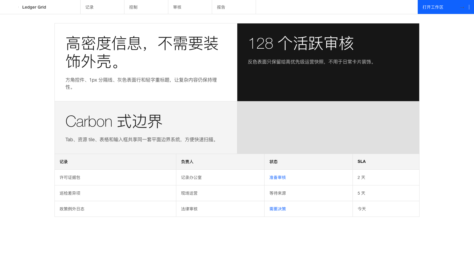
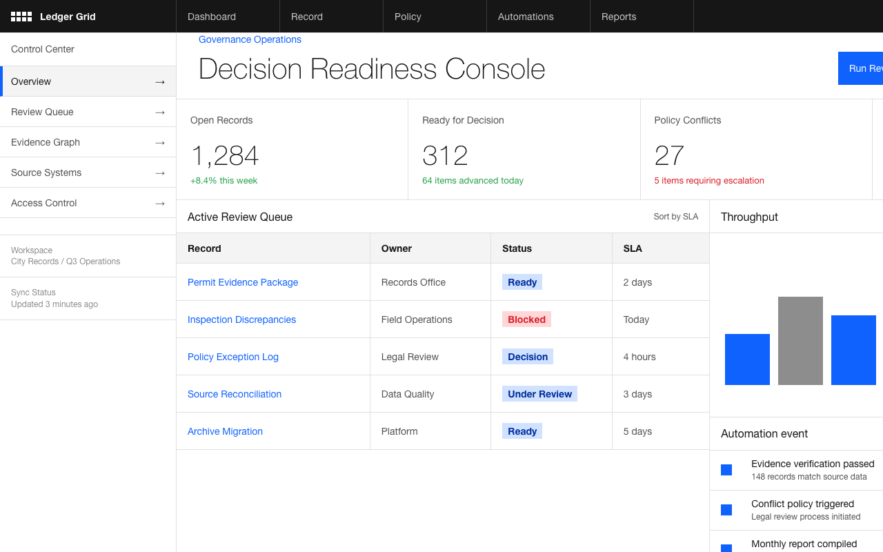

适合政企系统、数据治理和复杂工作台,Carbon 网格、零圆角和单一蓝色行动点让信息密集但有秩序。
设计语言样张
IBM Plex Sans 的 300 轻字重大标题建立企业级秩序;0px 方角、1px 分隔线和灰色 surface 让高密度内容保持可扫描。
---
version: alpha
name: "IBM"
description: "IBM 的 DESIGN.md 中文参考模板,保留原始 design token 与专业术语,覆盖 color system、typography、layout、components、motion 与 interaction states。"
language: zh-CN
sourceLanguage: en
---

## 概览
IBM 的 marketing system 是 **Carbon Design System** 的忠实应用;Carbon 是 IBM 的 open-source enterprise design system。Dominant surface 是 `{colors.canvas}` pure white,并用 `{colors.surface-1}` light gray 表达 elevation,charcoal `{colors.ink}`(#161616)用于 text,IBM Blue `{colors.primary}`(#0f62fe)作为唯一 brand accent。

定义性选择是 **flat geometry**:每个 CTA、card、input、container 都使用 square corner(`{rounded.none}` 0px)与 thin 1px border。没有 rounded pill、soft shadow 或 atmospheric gradient。系统是 engineered,而不是 stylized。

**IBM Plex Sans** 承载整个 type hierarchy。Display size(76 / 60 / 42px)使用 **300** weight,这是 IBM signature light display treatment,让 76px 比竞争品牌的 700-weight display 更 calm。Body type 使用 weight 400,带 `letter-spacing: 0.16px`(Carbon precision detail)和 1.50 line-height。声音读起来 careful、technical、trustworthy。

系统很少使用 color:IBM Blue 标记 link、primary CTA,以及少见的 full-bleed CTA banner。非 white 的其他 surface 由 charcoal 承担。结果是没有 enterprise stiffness 的 enterprise gravitas:rigorous、light-weighted,并且 intentionally restrained。

**Key Characteristics:**
- **Carbon Design System**:IBM marketing chrome 就是 Carbon。Button 是 square,input 是 square-with-bottom-rule,corner 保持 0px。
- **Light-weight display type**:42–76px headline 使用 Plex Sans weight 300,是品牌 typographic signature。
- **One accent color**:`{colors.primary}` IBM Blue 承载每个 link、primary CTA 和 CTA banner。没有第二个 brand color。
- White canvas + light gray(`{colors.surface-1}`)+ charcoal(`{colors.ink}`)覆盖 95% 的 surface。
- Footer 反转为 charcoal(`{colors.inverse-canvas}` #161616),是 page break 之上唯一 dark surface。
- Card hierarchy 由 1px hairline 与 surface change 承担,绝不用 drop shadow。
- Body 上的 `letter-spacing: 0.16px` 是 Carbon precision detail;小的 positive tracking 是 brand voice 的一部分。
- Page rhythm:utility bar → top nav → light-weight headline 的 hero → feature card grid → customer logo marquee → enterprise feature row → training section → newsletter / sign-in CTA → dark footer。

## Colors

> Source pages: ibm.com (home), /software/ai-productivity, /consulting, /products/cloud-pak-for-aiops, /products/bare-metal-servers, community.ibm.com.

### Brand & Accent
- **IBM Blue** ({colors.primary}): 唯一 brand accent。用于 link、primary CTA、CTA banner background、focus ring。
- **Blue 60** ({colors.blue-60}): Hovered link state。
- **Blue 80** ({colors.blue-80}): Pressed primary button。
- **Blue Hover** ({colors.blue-hover}): Primary button 的 hover state。

### Surface
- **Canvas** ({colors.canvas}): 默认 page background。
- **Surface 1** ({colors.surface-1}): Light gray(#f4f4f4),用于 input field、alternate-row stripe、subtle section band。
- **Surface 2** ({colors.surface-2}): 略深 gray(#e0e0e0),用于 disabled field,以及 separator 的 hairline-as-fill。
- **Hairline** ({colors.hairline}): Card、input、divider 上的 1px border。
- **Hairline Strong** ({colors.hairline-strong}): Focused input 上的 1px charcoal underline(Carbon signature focus treatment)。
- **Inverse Canvas** ({colors.inverse-canvas}): Charcoal #161616,footer surface。
- **Inverse Surface 1** ({colors.inverse-surface-1}): 比 inverse canvas 亮一级,用于 footer column divider、hovered footer item。

### Text
- **Ink** ({colors.ink}): 所有 headline 与 emphasized body type,charcoal #161616。
- **Ink Muted** ({colors.ink-muted}): #525252 的 secondary type,用于 meta、sub-headline、footer body。
- **Ink Subtle** ({colors.ink-subtle}): #8c8c8c 的 tertiary type,用于 disabled、helper text、caption。
- **Inverse Ink** ({colors.inverse-ink}): Charcoal 上的 white,用于 footer heading。
- **Inverse Ink Muted** ({colors.inverse-ink-muted}): Charcoal 上的 light gray,用于 footer body。

### Semantic Colors
- **Success Green** ({colors.semantic-success}): Carbon green-50,用于 success state。
- **Warning Yellow** ({colors.semantic-warning}): Carbon yellow-30,用于 warning state。
- **Error Red** ({colors.semantic-error}): Carbon red-60,用于 error state 与 danger button background。
- **Info Blue** ({colors.semantic-info}): 与 primary 相同,用于 informational badge。

## Typography

### Font Family

- **IBM Plex Sans** — IBM 的 open-source proprietary typeface(可免费用于任何用途)。Geometric、略 humanist,专为 enterprise UI 设计。Fallback:`Helvetica Neue, Arial, sans-serif`。

同一个 family 承载 display、body 与 caption;没有 display + body pairing。Hierarchy 由 **size + weight** 承担,而不是 family change。Plex Sans 也在 SIL Open Font License 下免费 / open-source,是此列表中最容易在 implementation 中替换的 custom face。

### Hierarchy

| Token | Size | Weight | Line Height | Letter Spacing | 用途 |
|---|---|---|---|---|---|
| `{typography.display-xl}` | 76px | 300 | 1.17 | -0.5px | 最大 hero headline |
| `{typography.display-lg}` | 60px | 300 | 1.17 | -0.4px | Section opener headline |
| `{typography.display-md}` | 42px | 300 | 1.20 | 0 | Sub-section headline、hero card title |
| `{typography.headline}` | 32px | 400 | 1.25 | 0 | Card collection heading、FAQ category |
| `{typography.card-title}` | 24px | 400 | 1.33 | 0 | Feature card title |
| `{typography.subhead}` | 20px | 400 | 1.40 | 0 | Display headline 旁的 lead body |
| `{typography.body-lg}` | 18px | 400 | 1.50 | 0 | Hero subhead、lead paragraph |
| `{typography.body}` | 16px | 400 | 1.50 | 0.16px | Default body |
| `{typography.body-sm}` | 14px | 400 | 1.29 | 0.16px | Card body、footer column |
| `{typography.body-emphasis}` | 14px | 600 | 1.29 | 0.16px | Selected tab label、emphasized body line |
| `{typography.caption}` | 12px | 400 | 1.33 | 0.32px | Caption、meta、utility bar |
| `{typography.button}` | 14px | 400 | 1.29 | 0.16px | 所有 button label |
| `{typography.eyebrow}` | 14px | 400 | 1.29 | 0.16px | Section eyebrow(Carbon 避免 strong eyebrow,使用 sentence case 14px) |

### Principles

- **Light-weight display 是品牌声音。** 76px headline 上的 Plex Sans weight 300 读起来 quietly authoritative;切换到 700 会像其他 enterprise site。
- **Carbon 的 body size `letter-spacing: 0.16px`** 是 precision detail。不要移除。
- **Marketing surface 不使用 mono**(Plex Mono 存在,但只用于 product surface)。
- **Eyebrow typography 使用 sentence case 14px**;Carbon 抵制其他 enterprise brand 常见的 all-caps tracked eyebrow。
- **Line-height 在 display 上收紧,在 body 上放松**:display-xl 为 1.17,body 为 1.50,按 size 成比例。

### Font Substitutes

IBM Plex Sans 是 **free and open-source**(SIL OFL license),并可在 Google Fonts 获取。推荐直接实现。若有扩展 typographic need,Plex family 还包含 Plex Mono 和 Plex Serif。

## Layout

### Spacing System

- **Base unit**: 4px(Carbon signature 4-pixel grid)。
- **Tokens (front matter)**: `{spacing.xxs}` 4px · `{spacing.xs}` 8px · `{spacing.sm}` 12px · `{spacing.md}` 16px · `{spacing.lg}` 24px · `{spacing.xl}` 32px · `{spacing.xxl}` 48px · `{spacing.section}` 96px。
- Card interior padding:feature card 使用 `{spacing.lg}` 24px;product card 使用 `{spacing.xl}` 32px;hero card 与 CTA banner 使用 `{spacing.xxl}` 48px。
- Button padding:12px vertical · 16px horizontal,Carbon spec。
- Form input padding:11px vertical · 16px horizontal。

### Grid & Container

- Desktop 使用 Carbon 16-column grid,tablet / mobile 缩放为 8 / 4 column。
- Max content width 约 1584px(Carbon max-grid breakpoint)。
- Card grid 在 desktop 为 4-up,tablet 为 2-up,mobile 为 1-up。
- Customer logo marquee 使用 flex row 中的 fixed-width tile,在较小 viewport 上横向滚动。

### Whitespace Philosophy

Carbon 将对 4-pixel grid 的精确对齐作为 whitespace system。Section 通过 thin gray row(`{colors.surface-1}`)分隔,而不是大 vertical gap。Content 按设计就是 dense;IBM 的客户期待在页面上看到大量信息,而不是大量空气。

## Elevation & Depth

| Level | Treatment | 用途 |
|---|---|---|
| 0 (flat) | 无 shadow,无 border | Body type、hero text、footer body 的默认层级 |
| 1 (hairline) | Canvas 上 1px `{colors.hairline}` border | Feature card、input、list item |
| 2 (surface lift) | Canvas 上使用 `{colors.surface-1}` background | Alternate-row banner、hovered card |
| 3 (focus ring) | 2px `{colors.primary}` outline + 1px `{colors.hairline-strong}` underline | Focused input、focused button |

Carbon 在 marketing 上抵制 drop shadow;depth 由 surface change 和 1px hairline 承担。例外是 product / app surface(Carbon 为 elevated panel 记录了 shadow token),但 marketing site 几乎不用。

### Decorative Depth

- **Soft blue gradient backdrop** 出现在部分 hero illustration 背后;faint blue-to-white wash 温暖 canvas,但不与 headline 竞争。
- **No atmospheric depth。** 没有 spotlight card、pastel section block、gradient panel。

## Shapes

### Border Radius Scale

| Token | Value | 用途 |
|---|---|---|
| `{rounded.none}` | 0px | 默认,用于每个 button、card、input、container |
| `{rounded.xs}` | 2px | Small badge(少见例外) |
| `{rounded.sm}` | 4px | Avatar circles squared、dropdown menu |
| `{rounded.md}` | 6px | 很少使用,记录以完整 |
| `{rounded.lg}` | 8px | 很少使用,记录以完整 |
| `{rounded.pill}` | 9999px | Product UI 中的 status pill、badge(marketing 上少见) |

品牌坚持 flat 0px corner。其他 token 存在于 product / mobile surface,但很少出现在 marketing 上。

### Photography & Illustration Geometry

- IBM 可互换使用 photography(people、hardware、sports cars)与 abstract illustration(geometric mesh、dotted pattern)。
- Image frame 是 flat 的,没有 rounded corner。
- Customer logo tile 位于 `{rounded.none}` 0px tile 上,并带 thin 1px border。

## Components

### Buttons

**`button-primary`** — Blue solid CTA。全站默认 primary。
- Background `{colors.primary}`、text `{colors.on-primary}`、type `{typography.button}`、padding 12px 16px、rounded `{rounded.none}`。
- Pressed state 位于 `button-primary-pressed`(background 切换到 `{colors.blue-80}`)。

**`button-secondary`** — Charcoal solid button,Carbon 的 “secondary” treatment。
- Background `{colors.ink}`、text `{colors.inverse-ink}`、type `{typography.button}`、padding 12px 16px、rounded `{rounded.none}`。

**`button-tertiary`** — White button,带 blue 1px border + blue text。用于 tertiary CTA。
- Background `{colors.canvas}`、text `{colors.primary}`、type `{typography.button}`、rounded `{rounded.none}`、padding 12px 16px。(Implementation 中 border 为 1px `{colors.primary}`。)

**`button-ghost`** — Plain text + chevron,hover 前无 background。
- Background `{colors.canvas}`、text `{colors.primary}`、type `{typography.button}`、rounded `{rounded.none}`、padding 12px 16px。

**`button-danger`** — Carbon 的 destructive variant。
- Background `{colors.semantic-error}`、text `{colors.on-primary}`、type `{typography.button}`、rounded `{rounded.none}`、padding 12px 16px。

### Cards & Containers

**`feature-card`** — Home 与 product page 上的默认 feature highlight tile。
- Background `{colors.canvas}`、text `{colors.ink}`、type `{typography.body}`、rounded `{rounded.none}`、padding 24px。带 1px `{colors.hairline}` stroke。

**`feature-card-elevated`** — `{colors.surface-1}` ground 上的相同 shape,用于 latest-content carousel 中的 “Recommended” card。
- Background `{colors.surface-1}`,其他结构相同。

**`product-card`** — 较大的 product showcase tile。
- Background `{colors.canvas}`、text `{colors.ink}`、type `{typography.body}`、rounded `{rounded.none}`、padding 32px。

**`hero-card`** — Hero composition card,带 light-weight title、body 与 CTA。
- Background `{colors.canvas}`、text `{colors.ink}`、type `{typography.display-md}`、rounded `{rounded.none}`、padding 48px。

**`cta-banner`** — 页面底部附近的 full-width blue CTA panel。
- Background `{colors.primary}`、text `{colors.on-primary}`、type `{typography.headline}`、rounded `{rounded.none}`、padding 48px。

**`resource-tile`** — 较小的 article / case-study tile。
- Background `{colors.canvas}`、text `{colors.ink}`、type `{typography.body-sm}`、rounded `{rounded.none}`、padding 16px。

**`customer-logo-tile`** — Home page customer marquee 中的单个 tile(Ferrari、Pfizer 等)。
- Background `{colors.canvas}`、text `{colors.ink-muted}`、type `{typography.caption}`、rounded `{rounded.none}`、padding 24px。带 1px hairline border。

### Inputs & Forms

**`text-input`** + **`text-input-focused`** + **`text-input-error`** — Carbon 的 input chrome。
- Background `{colors.surface-1}`、text `{colors.ink}`、type `{typography.body}`、rounded `{rounded.none}`、padding 11px 16px。
- Focus state 会把底部 1px hairline 替换为 2px `{colors.primary}` underline(Carbon signature focus treatment)。
- Error state 添加 2px `{colors.semantic-error}` bottom underline。

**`newsletter-input`** — Home page 上 “Stay connected” newsletter capture。
- Background `{colors.surface-1}`、text `{colors.ink}`、type `{typography.body}`、rounded `{rounded.none}`、padding 11px 16px。相邻 submit 使用 `button-primary`。

### Tabs

**`product-tab`** + **`product-tab-selected`** — Product page 与 home “Recommended” carousel 上的 horizontal tab strip。
- Default:`{colors.canvas}` background、`{colors.ink-muted}` text、rounded `{rounded.none}`、padding 16px 20px。底部 1px hairline。
- Selected:`{colors.canvas}` background、`{colors.ink}` text、`{typography.body-emphasis}` weight、底部 2px `{colors.primary}` underline。Padding / rounding 相同。

### Navigation

**`top-nav`** — Sticky white bar:左侧 IBM logomark,中间 nav categories,右侧 search / sign-in icons。
- Background `{colors.canvas}`、text `{colors.ink}`、type `{typography.body-sm}`、height 48px。底部 1px hairline。

**`utility-bar`** — Top nav 上方的 slim gray ribbon,包含 location switch、contact、search shortcuts。
- Background `{colors.surface-1}`、text `{colors.ink-muted}`、type `{typography.caption}`、height 32px。

### Footer

**`footer`** — Charcoal footer(`{colors.inverse-canvas}`),左侧 IBM wordmark,5–6 列 caption-sized links。它是 page break 之上唯一的 inverted surface。
- Background `{colors.inverse-canvas}`、text `{colors.inverse-ink-muted}`、type `{typography.body-sm}`、padding 64px 32px。

## Do's and Don'ts

### Do

- 在每个 CTA、card、input 与 container 上使用 `{rounded.none}` 0px。Flat-square aesthetic 就是品牌。
- Display sizes(42px+)使用 Plex Sans weight 300,body 使用 weight 400。避免把 headline 加粗。
- 将 `{colors.primary}` IBM Blue 保留给 primary CTA、link、focused-input underline 与 CTA banner。不要把它用作 card background 或 eyebrow color。
- 在 body sizes 上应用 `letter-spacing: 0.16px`。这是 Carbon precision detail,也是 typographic voice 的一部分。
- 用 surface change(`canvas` → `surface-1`)与 1px hairline 建立 card hierarchy。跳过 drop shadow。
- Eyebrow 与 section label 坚持 sentence case;Carbon 抵制 all-caps tracking。
- 只在 footer 反转到 `{colors.inverse-canvas}`;页面其他部分保持 light。

### Don't

- 不要给 button、card 或 input 加 rounded corner。即使 4px rounded corners 也会破坏 Carbon look。
- 不要加粗 display headline。Weight 300 的 Plex Sans 是 brand voice;weight 700 会变得 generic。
- 不要在已记录的 soft-blue hero gradient 之外添加 atmospheric depth(gradient backdrop、drop shadow、atmospheric overlay)。
- 不要引入第二个 brand color。IBM Blue 是唯一 chromatic accent;status semantic 使用已记录的 green / yellow / red。
- 不要在没有保留 `letter-spacing: 0.16px` 与 weight-300 display treatment 的情况下,用 Inter 或 Helvetica 替换 IBM Plex Sans。
- 不要使用 pill-shaped button。Carbon 使用 square corner;pill 会读成另一个品牌。
- 不要写 all-caps tracked eyebrow。Carbon 的 eyebrow 是 14px sentence case。

## Responsive Behavior

### Breakpoints

| Name | Width | 关键变化 |
|---|---|---|
| Max | 1584px | Carbon max grid;gutter 扩展 |
| Desktop-XL | 1312px | 默认 desktop layout |
| Desktop | 1056px | 保持 card grid 4-up |
| Tablet | 672px | Card grid 4-up → 2-up;nav 变为 hamburger |
| Mobile | 320px | Single-column;display-xl 从 76px 缩放到约 32px |

### Touch Targets

- Carbon spec:最小 tap target 为 48px。Button 与 input 在 touch viewport 上保持 48px。
- Top-nav link 在 touch 上从 36px 增长到 48px tap height。
- Tab strip row 保持 48px tap height。

### Collapsing Strategy

- **Top nav**:672px 以下 link 折叠为 hamburger overlay。Logomark 与 search icon 保留在 bar 上。
- **Utility bar**:672px 以下隐藏,回收 vertical space。
- **Card grid**:1056px 处 4-up → 2-up,672px 以下 → 1-up。
- **Display type**:`{typography.display-xl}` 76px 在 mobile 上缩放到 42px 左右,同时保留 weight-300 treatment。
- **Footer**:6-column link grid → tablet 上 3-column → mobile 上 1-column。

### Image Behavior

- Marquee 中的 customer logo 保持 aspect ratio,并可在 672px 以下折叠为 2-row scroll。
- Hero illustration 按比例缩放;672px 以下可堆叠到 headline 上方,而不是并排放置。

## Iteration Guide

1. 一次只聚焦一个 component,并通过其 `components:` token name 引用。
2. 默认 body 使用 `{typography.body}`、weight 400,并带 `letter-spacing: 0.16px`。不要移除 tracking。
3. 引入新 section 时,先决定它位于 `{colors.canvas}`(default)还是 `{colors.surface-1}`(alternate band)。Two-surface rhythm 就是整体节奏。
4. 编辑后运行 `npx @google/design.md lint DESIGN.md`。
5. 将新 variant 作为独立 component entry 添加(`button-primary-pressed`、`text-input-error`、`text-input-focused`)。
6. 把 IBM Blue 当作稀缺资源:link、primary CTA、CTA banner、focus underline。超出这些就会 drift。
7. 抵制 rounded corner。如果设计师推动 4px rounding,品牌就已经偏离 Carbon。

## Known Gaps

- IBM 的 product surface(cloud-pak、watson、datacap)有更丰富的 Carbon component usage(data table、graph cell、breadcrumb、contextual menu),但这些没有出现在已检查的 marketing page 中;它们属于 Carbon documentation,而不是本次 marketing extraction。
- Form-field error 与 validation styling 已记录在 Carbon docs 中;已检查页面没有渲染 error state。
- Dark mode 在 Carbon 中记录为 Gray-100 theme,但没有暴露在这些 marketing page 上;只有 footer 反转。完整 dark theme 是另一套 Carbon palette,这里未提取。
- `community.ibm.com` sub-domain 使用不同 chrome(community-platform white-label),近似 Carbon 但并不严格;本文记录的 system 适用于正式 `ibm.com`。


