

01 / 03
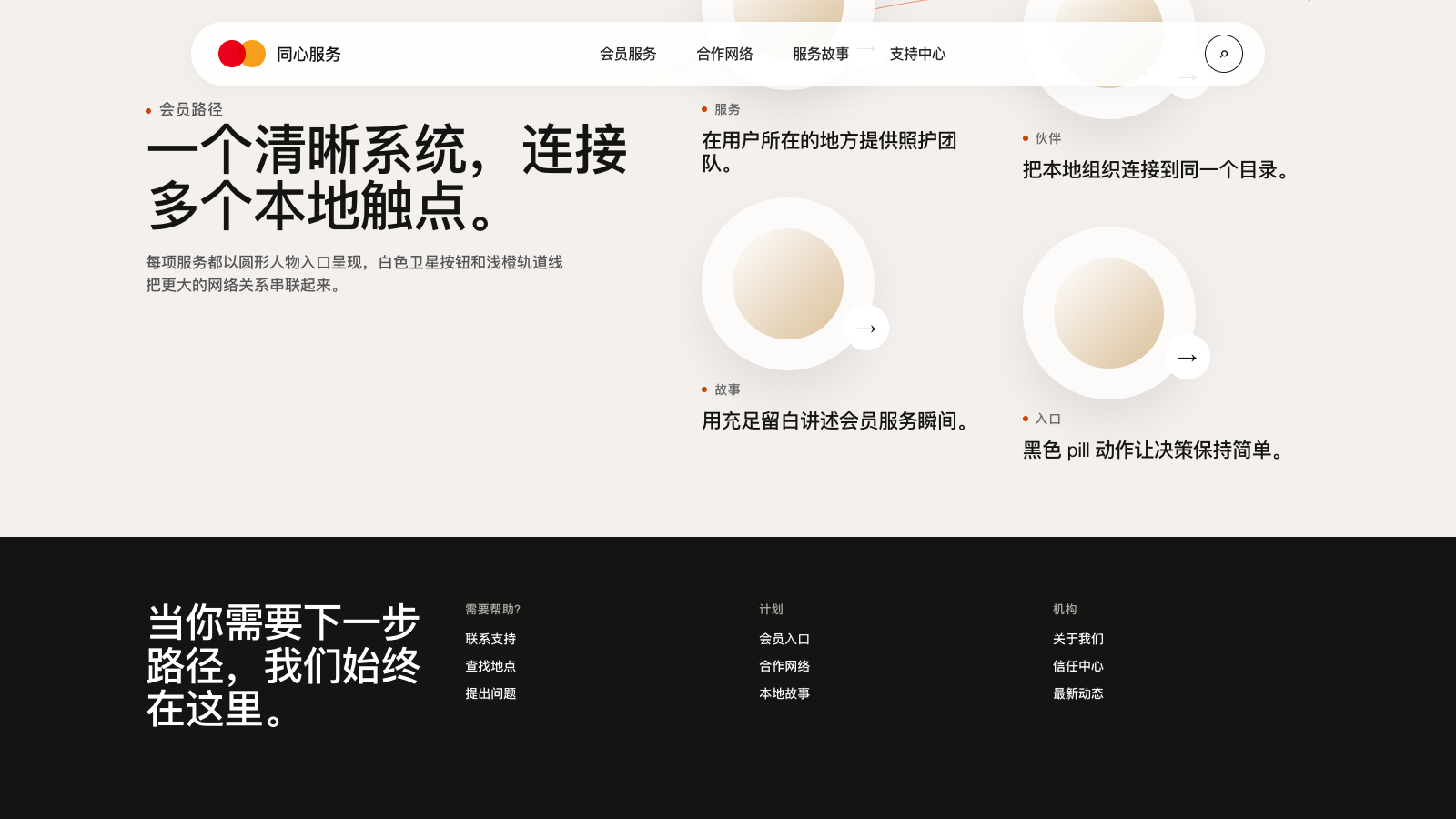
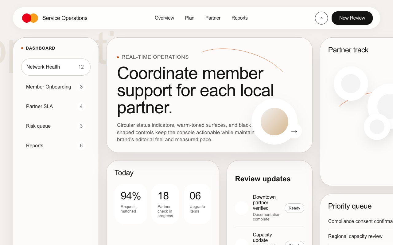

适合服务网络、会员权益和品牌叙事页,暖奶油画布、圆形肖像、轨道线与黑色 pill CTA 呈现柔和编辑感。
设计语言样张
---
version: alpha
name: "Mastercard"
description: "Mastercard 的 DESIGN.md 中文参考模板,保留原始 design token 与专业术语,覆盖 color system、typography、layout、components、motion 与 interaction states。"
language: zh-CN
sourceLanguage: en
---

# Mastercard 风格设计系统

## 1. 视觉主题与氛围

Mastercard 的体验像一本温暖的 editorial magazine,由 soft stone 与 signal orange 构成。画布是柔和的 putty-cream(#F3F0EE):不是白,也不是灰,而像高级年报用纸。其上所有关键元素都被塑造成 stadium、pill 或 perfect circle。最主要的视觉动作是 oversized radius:hero 使用 40px 圆角,卡片几乎完全 pill-shaped,服务图片被裁成 circular orbit,按钮要么是完整 pill,要么以 20px 圆角紧贴内容。页面里几乎没有尖锐直角。

第二个动作是 orbit and trajectory。圆形 image mask 不是静止摆放,而是由细而像手绘的 orange arc 连接,横跨整个 viewport,暗示一组服务星座,而不是普通列表。每个圆形旁都有一个小型 “satellite”:白色 micro-CTA 内含 arrow icon,像月亮一样停靠在圆周边缘。这是当前 Mastercard 设计语言里最独特的部分:即使页面静止,圆形也带有运动感。

Typography 完全使用 MarkForMC。Headline 采用 500 medium weight,并带紧凑 negative letter-spacing(-2%),因此自信但不吼叫。Body copy 使用同一家族的 450 weight,这在 Web 上少见,比 400 更柔和、又不显单薄。warm cream surface、pill shape、circular portrait、traced-orange orbit、black CTA 共同形成一种既 institutional(60 年支付网络)又 editorial(现代品牌杂志)的张力,这正是 Mastercard 希望保持的气质。

**关键特征:**
- Warm cream canvas(#F3F0EE)取代传统 white,所有 surface 都带 tint,不显 sterile
- 极端 border-radius 作为设计语言:40px、99px、1000px 占主导;方形基本只属于 cookie-banner 第三方模块
- Circular image portrait 带白色 satellite-CTA,并由 traced-orange orbital path 连接
- Ghost watermark headline 以 heading scale 的 cream-on-cream text 叠在 circle portrait 后方
- Body 区域 primary CTA 使用 black,20px radius;cookie-banner orange 仅用于 consent flow
- Floating pill-shaped navigation 位于 viewport 顶部下方,带圆润肩部
- Eyebrow label 使用 tiny accent dot + uppercase bold tracking,作为 section-category signal
- Dark warm-black footer(#141413)使用四栏 link layout 和大号 conversational headline

## 2. 色彩调色板与角色

### 主色
- **Mastercard Red**(#EB001B):Mastercard 标志左侧圆,只用于 brand logo,不作为 UI color。
- **Mastercard Yellow**(#F79E1B):Mastercard 标志右侧圆,只用于 brand logo,不作为 UI color。
- **Ink Black**(#141413):温暖 near-black,用于 primary CTA、cream surface 上的 headline text 与 footer surface;它比纯黑更贴合 warm canvas。

### 辅助色与强调色
- **Signal Orange**(#CF4500):burnt/rust CTA orange,用于 consent action 与 eyebrow dot。它是页面里唯一强攻击性的颜色,必须克制使用。
- **Light Signal Orange**(#F37338):更浅的 carrot orange,用于 carousel active indicator 与 decorative orbital arc,始终作为 attention cue。
- **Clay Brown**(#9A3A0A):深 rust,用于 secondary link-style button,例如 cookie details。

### 表面与背景
- **Canvas Cream**(#F3F0EE):默认 page canvas,温暖、putty-toned,所有 editorial section 都建立在它之上。
- **Lifted Cream**(#FCFBFA):比 canvas 亮一级,用于像纸叠纸一样的 nested raised section。
- **White**(#FFFFFF):保留给 floating nav pill、modal card、secondary button fill,以及附着在 portrait 上的 satellite-CTA circle。
- **Soft Bone**(#F4F4F4):少数组件子区域使用的 cool-gray alternative surface。

### 中性色与文本
- **Ink Black**(#141413):light surface 上的 primary headline 与 body text。
- **Charcoal**(#262627):更柔和的 black text alternative。
- **Slate Gray**(#696969):muted secondary text、eyebrow alternative、disabled state 与 privacy bottom-row text。
- **Granite**(#555555)和 **Graphite**(#565656):用于 inline body accent 与 link alternate。
- **Dust Taupe**(#D1CDC7):极弱 cream-gray,用于 disabled 或 whisper text;contrast 很低,只能用于弱化内容。

### 语义色与品牌资产
- **Link Blue**(#3860BE):深而略灰的 blue,用于 inline link 与 informational callout。
- **Priceless Red + Yellow**:全彩 Mastercard logo mark 是 red/yellow 同时出现的唯一位置,用于锁定 identity,而不是 UI palette。

### 渐变系统
Mastercard core UI 不使用程序化 gradient。所谓 gradient 感主要来自两处:一是 circular image portrait 的暖色照片边缘与 cream canvas 融合;二是 elevated content 上的大半径柔和 shadow(rgba(0,0,0,0.08) 0px 24px 48px),在 pill media 下形成 halo。

## 3. 字体规则

### 字体家族
- **Primary**: `MarkForMC` — Mastercard's proprietary geometric sans. Every headline, body paragraph, button, nav link, and footer link on the page.
- **Secondary**: `MarkOffcForMC` — an "Official" cut used in a minority of contexts (legal text, some forms).
- **Fallback stack**: `SofiaSans, Arial, sans-serif` — Sofia Sans is a reasonable open-source stand-in; Arial is the final web-safe fallback.

### 层级

| 角色 | 尺寸 | 字重 | 行高 | 字距 | 备注 |
|------|------|--------|-------------|----------------|-------|
| H1 (hero) | 64px | 500 | 64px | -1.28px (-2%) | Set to `1:1` line-height for very tight vertical rhythm on multi-line hero |
| H2 (section) | 36px | 500 | 44px | -0.72px (-2%) | Used in ghost-watermark headline treatments and section titles |
| H3 (card title) | 24px | 500 | 28.8px (1.2) | -0.48px (-2%) | Titles inside service/solution cards |
| H4 (subhead) | 14px | 700 | 18.2px (1.3) | normal | Rarely used in marketing surfaces |
| Eyebrow (H5) | 14px | 700 | 14px | 0.56px (+4%) | Uppercase, paired with a tiny accent dot (e.g., "• SERVICES") |
| Body paragraph | 16px | 450 | 22.4px (1.4) | normal | The half-step 450 weight is MarkForMC's signature — softer than 500, firmer than 400 |
| Nav link / Button label | 16px | 500 | 16px | -0.48px (-3%) | Tight, compact, no text-transform |
| 页脚 link | 14px | 450 | ~20px | normal | Lighter weight on dark footer for airier density |
| 页脚 column header | 12–14px | 700 | 14px | 0.56px (+4%) | Uppercase, muted gray, short tracking |

### 原则
- **Weight 450 is load-bearing**. Most brands use 400/500/700; Mastercard uses 450 for body copy, which creates an unusually soft reading tone. Replacing it with 400 flattens the identity.
- **Tight negative tracking on headlines** (-2%) gives display 文本 its editorial density — the words lock together rather than breathe.
- **Uppercase tracking only on the eyebrow scale** (14px / 700 / +4% tracking). Don't use uppercase anywhere else; no shouty section titles.
- **One-font system**. Resist the urge to add a second typeface for contrast. The contrast comes from scale, weight, and letter-spacing, not from a serif or display accent.
- **Line-height ratio drops with size**. H1 is 1:1, H3 is 1.2, body is 1.4. Tight display, comfortable reading.

### 字体替代方案
MarkForMC is proprietary and licensed. When rebuilding a matching aesthetic without access to the original:
- **Sofia Sans** (Google Fonts) is the closest open-source match — it's already in Mastercard's declared fallback stack.
- **Inter** at weights 450/500/700 works as a generic stand-in; expect slightly taller x-height and looser letter shapes.
- **Neue Haas Grotesk** or **Geist** can approximate the geometric feel for commercial projects.
- Whichever substitute is used, preserve the **-2% letter-spacing on headlines** and the **450 body weight** (use `font-weight: 450` with variable fonts, or substitute `font-weight: 400` and tighten the letter-spacing by ~-0.5% to compensate).

## 4. 组件样式

### 按钮

**Primary — Ink Pill**
- Background: Ink Black (`#141413`)
- Text: Canvas Cream (`#F3F0EE`) — not pure white
- Border: 1.5px solid Ink Black (same as bg, creates crisp edge)
- Radius: 20px
- Padding: 6px 24px
- Font: MarkForMC 16px / weight 500 / letter-spacing -0.32px
- Default: as above; solid warm-black pill on cream canvas
- Active / pressed: subtle inward-shrink or 2px offset (not a hover variant)
- 用于: all marketing CTAs in the page body ("Learn more", "Explore", "Discover")

**Secondary — Outlined Pill**
- Background: White (`#FFFFFF`)
- Text: Ink Black (`#141413`)
- Border: 1.5px solid Ink Black
- Radius: 20px
- Padding: 6px 24px
- Font: MarkForMC 16px / weight 450 / line-height 20.8px
- Default: white-on-cream pill with crisp ink outline
- Active / pressed: subtle compression
- 用于: secondary actions paired with a primary, or standalone utility CTAs

**Consent / Signal — Orange Pill**
- Background: Signal Orange (`#CF4500`)
- Text: White (`#FFFFFF`)
- Border: 0
- Radius: 24px
- Padding: 1px 30px (very tight vertical, wide horizontal)
- Font: MarkForMC 13px / weight 400 / letter-spacing 0.13px
- Default: as above; bright rust pill with white text
- 用于: cookie consent, privacy preference, and other legally-distinct confirmations. **Do not** use this orange for marketing CTAs — it reads as a compliance color.

**Satellite — Circular Micro-CTA**
- Background: White (`#FFFFFF`)
- Icon: Ink Black arrow (`→`) at ~20px
- Border: none
- Radius: 50% (perfect circle)
- Size: ~50–60px diameter
- Shadow: none or very subtle (the portrait's shadow carries the elevation)
- Default: docks onto the bottom-right edge of a circular portrait, protruding partway outside the portrait's circle
- 用于: the primary entry point into service/solution cards; always paired with a circular portrait

**Icon-Only Circle Button (carousel, play/pause)**
- Background: transparent or white
- Icon: 10–20px centered
- Border: 1px solid Ink Black (when on cream) or none (when over media)
- Radius: 50%
- Size: 40px diameter minimum for carousel controls; 80px for hero video play
- 用于: carousel pagination/play-pause, hero video play, search toggle

### 卡片与容器

**Hero Media Frame (Stadium)**
- Background: Dark video or full-bleed imagery (typically black `#000000` or `#2B2B2B` behind video)
- Radius: 40px all corners (creates a stadium shape on wide viewports)
- Width: ~full viewport minus ~48px gutter on each side
- Height: ~60–70% of viewport
- Shadow: none (sits directly on canvas)
- Corners: the extreme 40px radius on a media element is the most iconic Mastercard gesture — do not round less

**Service / Solution Portrait Card**
- Shape: Perfect circle (radius 50%) or ellipse (radius 999px / 1000px)
- Diameter: 260–340px desktop; ~220px mobile
- Image crop: square source, cropped to circle
- Attached element: White satellite circular CTA (see above) docked bottom-right, ~40% outside the portrait
- Eyebrow below: accent dot + uppercase label (e.g., "• SERVICES", "• SOLUTIONS")
- Title below: H3 (24px / weight 500 / -2% tracking), 1–2 lines max
- Decorative orbit: thin ~1px Light Signal Orange curved line spanning from this card outward to the next, implying connection

**Pill Carousel Card**
- Radius: 1000px (full pill) or 40px corners (rounded stadium)
- Width: ~40–60% of viewport
- Height: ~380–420px (portrait-pill orientation)
- Content: full-bleed photography with small overlaid chip labels
- Chip inside: White pill (~ 999px radius), Ink Black text, padding 8px 20px, used for category tags like "Story"
- Large inline CTA inside: Ink Pill button, oversized (padding 16px 40px, radius 40px)

**Ghost Watermark Text Block**
- Font: MarkForMC 72–128px / weight 500 / tight -2% tracking
- Color: Canvas Cream slightly darkened (`#E8E2DA` or similar — cream-on-cream)
- Position: layered behind portrait circles, bleeding off the viewport edge
- Purpose: sets section theme without competing with foreground copy

### 输入与表单
Minimal form surface on the marketing page. The search input in the nav header is:
- Initial state: a 48px circular button with a magnifier icon
- Expanded state: horizontal input field, border `1px solid` Ink Black at ~50% opacity, radius 999px, padding 12px 24px, white background

**Country/language selector (footer)**
- Background: Ink Black (same as footer)
- Text: White
- Border: 1px solid `rgba(255,255,255,0.4)`
- Radius: 999px (full pill)
- Icon: downward chevron on the right

### 导航

**Floating Nav Pill (desktop)**
- Container: white-to-translucent-white pill floating below the very top of the viewport with a ~24px top margin
- Radius: 999px / 1000px (full pill)
- Padding: ~16px 40px internal
- Shadow: very soft (`rgba(0, 0, 0, 0.04) 0px 4px 24px 0px`) — just enough to lift it off the cream canvas
- Content: Mastercard logo left, primary link group center ("For you", "For business", "For the world", "For innovators", "News and trends"), search icon right
- Link spacing: ~48–56px gap between primary links
- Link style: Ink Black, weight 500, 16px, no underline, no pill surround until active

**Mobile Nav**
- The same pill shape but collapsed to: logo + hamburger menu button + search icon only
- Menu opens into a full-screen overlay with the primary links stacked vertically

### 图像处理

- **Aspect ratios used**: 1:1 (all service portraits — cropped to circle), ~3:4 or ~4:5 (carousel pill cards), 16:9 or wider (hero video frame)
- **Full-bleed vs padded**: Hero is viewport-wide with gutters; service portraits are always centered in their column with generous whitespace around; footer imagery is rare
- **Masking**: Aggressive circular masking is the defining treatment — square source images are cropped to perfect circles of matching diameter. Never use rectangular service imagery.
- **Lazy loading**: Standard `loading="lazy"` with a soft blur-up transition from a cream-tinted placeholder, preserving the warm palette during load

### Decorative Orbital Lines

A signature motif: thin (~1–1.5px) single-weight curved lines in Light Signal Orange (`#F37338`) tracing arcs between circular portraits. These lines:
- Imply connection between service cards without literal arrows
- Span widths from ~200px up to full-viewport arcs
- Feel hand-drawn (subtle irregularity) rather than perfect CSS curves
- Appear only in sections with circular portrait content — never on pill sections, never in the footer

### 页脚

- Background: Ink Black (`#141413`)
- Text: White
- Padding: 48px horizontal 100px / bottom 148px (very tall bottom space)
- Structure: large conversational H2 ("We're always here when you need us") left-aligned, then a 4-column link grid below
- Column headers: uppercase, muted, weight 700, letter-spacing +4%
- Link rows: white, weight 450, 14px; entries prefixed with a small icon (support bubble, card, map pin, question mark) for the "NEED HELP?" column
- External link marker: a small upper-right arrow (`↗`) after link text
- Bottom row (below a 1px white-at-opacity divider): copyright + privacy small-print + country-language pill dropdown + four social icons (LinkedIn, Facebook, X, YouTube)

## 5. 布局原则

### 间距系统
- **Base unit**: 8px (confirmed by dembrandt extraction and computed styles)
- **Scale**: 8 / 16 / 24 / 32 / 48 / 64 / 96 / 128 (powers of 8)
- **Section vertical padding**: ~96–128px between major sections on desktop; ~48–64px on mobile
- **Card internal padding**: 32–40px on desktop, ~24px on mobile
- **Nav top margin**: ~24px from viewport top (the pill floats, doesn't touch)

### 网格与容器
- **Max content width**: ~1200–1280px centered, with ~48–100px horizontal gutter
- **Column pattern**: 12-column implied, but practical layouts use 2-up asymmetric (large headline left, supporting 文本 right), 1-up full-bleed (hero, video), or staggered single-portrait placement (service cards sit in varying grid positions creating the "constellation" feel)
- **页脚 grid**: 4 equal columns on desktop, collapses to single column accordion on mobile

### 留白理念
Mastercard treats whitespace as structure, not absence. A typical service section has:
- A ghost headline occupying the top ~40% of the section (mostly empty cream)
- A single circular portrait positioned ~60% down, asymmetric to left or right
- ~300–500px of blank canvas between the portrait and the next section
This deliberate emptiness tells the eye "slow down, read one thing at a time" — the opposite of dense dashboard UIs.

### 圆角尺度

| Radius | 用途 |
|--------|-----|
| 3–6px | Tiny decorative elements, cookie banner micro-chips |
| 20px | Primary and secondary body CTAs (the signature button radius) |
| 24px | Consent/orange pill buttons, modal inner chips |
| 40px | Hero media frames, large section container corners, H2 pill labels |
| 50% | Circular portraits, icon-only buttons, satellite CTAs |
| 99px / 999px / 1000px | Full pill shapes — navigation, carousel cards, footer country selector, primary inline chips |

The scale is unusual: most systems use 4/8/12/16. Mastercard skips those and commits to **either small (≤6), medium-large (20–40), or full-pill (99+)**. The middle ground of 8–12 is absent, which is why the UI feels either "precise and utility" or "soft and editorial" with no in-between.

## 6. 深度与层级

| 层级 | 处理方式 | 用途 |
|-------|-----------|-----|
| 0 | 无阴影 | The default — 95% of surfaces sit directly on cream canvas |
| 1 | `rgba(0, 0, 0, 0.04) 0px 4px 24px 0px` | Floating nav pill — barely-there lift |
| 2 | `rgba(0, 0, 0, 0.08) 0px 24px 48px 0px` | Hero media frames, elevated cards — a soft large-radius halo rather than a hard drop |
| 3 | `rgba(0, 0, 0, 0.25) 0px 70px 110px 0px` | Rare; dramatic elevation on a feature tile |

### 阴影理念
Mastercard uses shadows as **atmospheric cushioning**, not directional light. The Level 2 shadow has a 48px spread and only 8% opacity — it barely exists as dark pixels but creates a "the card is breathing above the canvas" feel. There are almost no hard-edged, tight shadows anywhere in the system. Border lines are preferred over shadows for functional delineation (form inputs, footer divider).

### 装饰性深度
- **Orbital arcs** (Light Signal Orange, ~1px): trace connective paths across sections
- **Ghost watermark headlines**: cream-on-cream 文本 gives sections an almost-pressed-paper quality
- **Circle-image fade**: warm-toned photography at the edge of circular portraits dissolves into the canvas, implying soft atmospheric depth

## 7. 使用准则

### 应该
- 使用 Canvas Cream(#F3F0EE)作为默认 body background,避免纯白破坏 warm editorial tone
- 服务与功能图像必须裁成 perfect circle,而不是 rectangle 或 rounded rectangle
- 每个 circular portrait 的右下角都附着白色 satellite CTA
- Headline 使用 MarkForMC 500 weight 与 -2% letter-spacing
- Body paragraph 使用 450 weight,而不是普通 400
- Primary CTA 保持 Ink Black pill(20px radius)与 cream text
- Signal Orange 仅用于 consent、legal 或 compliance action
- Navigation 应作为 rounded white pill 悬浮在 viewport 顶部下方,而不是贴齐 y=0
- 页面节奏由 canvas cream、lifted cream、ink footer 三种 surface tone 构成
- 使用细 Light Signal Orange arc 在 service card 间暗示连接

### 不要
- 不要用 pure white 作为页面背景;这会破坏 warm editorial tone
- 不要把 image frame 做成 8–16px 圆角;Mastercard 要么 full-pill、40px,要么 full-circle
- 不要用 Signal Orange 做 marketing CTA,它会被读成 cookie-consent orange
- 不要混用字体;不要添加 serif accent、script 或 secondary display font
- 不要让 nav 超过六个 top-level link,pill 需要保持 airy
- 不要使用硬边重阴影;所有 elevation 应使用 48px+ spread 且 opacity ≤10%
- 不要在 14px eyebrow label 以外使用 uppercase
- 不要省略 eyebrow 前的 tiny accent dot,这是身份识别的一部分
- 不要把 circular portrait 放进死板网格;它们的魅力来自 asymmetric placement

## 8. 响应式行为

### 断点

| 名称 | 宽度 | 关键变化 |
|------|-------|-------------|
| Mobile | ≤ 767px | Nav pill shows logo + menu + search only; primary links hide behind hamburger; service portraits stack single-column centered; hero headline drops from 64px to ~40px; footer columns collapse into a vertical accordion |
| Tablet | 768–1023px | Nav pill shows 2–3 primary links truncated; service portraits arrange 2-up; hero headline ~48px |
| Desktop | ≥ 1024px | Full nav with 5 primary links centered; service portraits asymmetrically placed with decorative orbital lines; hero headline 64px |
| Wide | ≥ 1440px | Content max-width caps at ~1280px; gutters grow symmetrically; orbital lines extend further |

### 触控目标
All interactive elements comfortably exceed 44×44px. The satellite CTA (circle + arrow) is ~50–60px. The nav pill buttons are ~48px tall. Mobile hamburger and search are 48×48px. No link or button drops below 40px in any breakpoint.

### 折叠策略
- **Nav**: full pill → compact pill with hamburger. Pill shape is preserved across breakpoints — always rounded, always floating.
- **Service grid**: asymmetric constellation → 2-up → 1-up stack. Orbital arcs are removed on mobile (they only work with asymmetric placement).
- **Spacing**: section vertical padding compresses from 128px to 48px on mobile.
- **Content**: two-column hero (headline left / supporting 文本 right) becomes stacked (headline on top, supporting 文本 below).
- **页脚**: 4 columns → 1 column accordion with chevron toggles per section.

### 图像行为
Circular portraits scale proportionally (maintaining the perfect circle at every size). Hero video frames maintain their 40px radius at every breakpoint, but the frame itself shrinks with the viewport. Lazy loading is standard with a cream-tinted blur-up placeholder, preserving the palette during load.

## 9. Agent 提示指南

### 快速颜色参考
- Primary CTA:Ink Black(#141413),用于 primary pill button 与 footer
- Background:Canvas Cream(#F3F0EE),warm putty body canvas,永远不要使用 pure white
- Lifted surface:Lifted Cream(#FCFBFA),用于 nested section
- Heading text:Ink Black(#141413)
- Body text:Ink Black(#141413),weight 450
- Muted text:Slate Gray(#696969)
- Signal / Consent:Signal Orange(#CF4500),保留给 cookie consent 与 legal action
- Accent arc:Light Signal Orange(#F37338),只用于 orbital decorative line
- Border / Outline:pill button 使用 1.5px Ink Black;其他位置使用低 opacity 1px
- Footer:Ink Black(#141413)配 White text

### 示例组件提示
- 创建直径 300px 的 circular portrait card,把方形照片裁成 perfect circle;右下附着 56px white satellite button,dark arrow icon 居中,并让它约 40% 突出圆形边缘。
- 设计 primary CTA:Ink Black(#141413)背景、Canvas Cream(#F3F0EE)文本、20px border-radius、6px vertical 与 24px horizontal padding,MarkForMC 16px weight 500,letter-spacing -2%。
- 构建 floating navigation pill:white background,shadow rgba(0, 0, 0, 0.04) 0px 4px 24px 0px,999px border-radius,内部 padding 约 16px vertical / 40px horizontal,距离 viewport top 24px 居中悬浮。
- 创建 hero media frame:四角 40px border-radius,宽度为 full viewport 减 48px gutter,高度约 60% viewport,直接放在 cream canvas 上,不加 shadow。
- 设计 footer:Ink Black(#141413)背景、white text、四栏 link grid、uppercase muted column header(14px weight 700 +4% tracking),并加入 conversational H2、divider、legal small-print 与 social icons。

### 迭代指南
1. 一次只聚焦一个组件,不要并行重设计多个 surface。
2. 同时引用 color name 与 hex code。
3. 用 “warm putty cream”、“stadium pill”、“circular portrait with satellite CTA” 等自然语言描述视觉感觉。
4. 同时描述情绪(editorial、soft、institutional)与测量值。
5. 不确定时优先使用三个 radius:20px(button)、40px(hero/stadium)、999px(pill/nav)。
6. 默认 background 使用 Canvas Cream(#F3F0EE),而不是 white。

### 已知缺口
- Live page 使用专有授权字体 MarkForMC;Sofia Sans 是最接近的开源替代,并出现在 Mastercard 自身 fallback stack 中。
- Tablet breakpoint(768–1023px)根据 desktop 与 mobile capture 推断,中间布局可能因 section 而异。
- Ghost-watermark headline 的 whisper cream tone 在 capture 中介于 #E8E2DA 与 #D1CDC7,精确值会随 section 变化。
- 第三方 consent orange(#CF4500)是 consent signal,不应与 marketing CTA color 混淆。
- Mastercard logo mark(red #EB001B + yellow #F79E1B)是 brand asset,不是 UI palette entry。


