
01 / 03
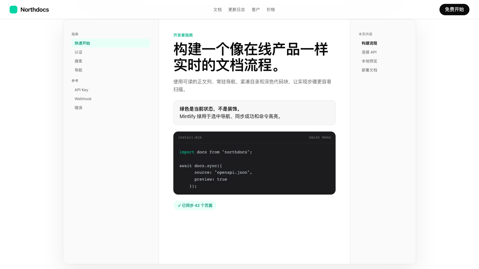
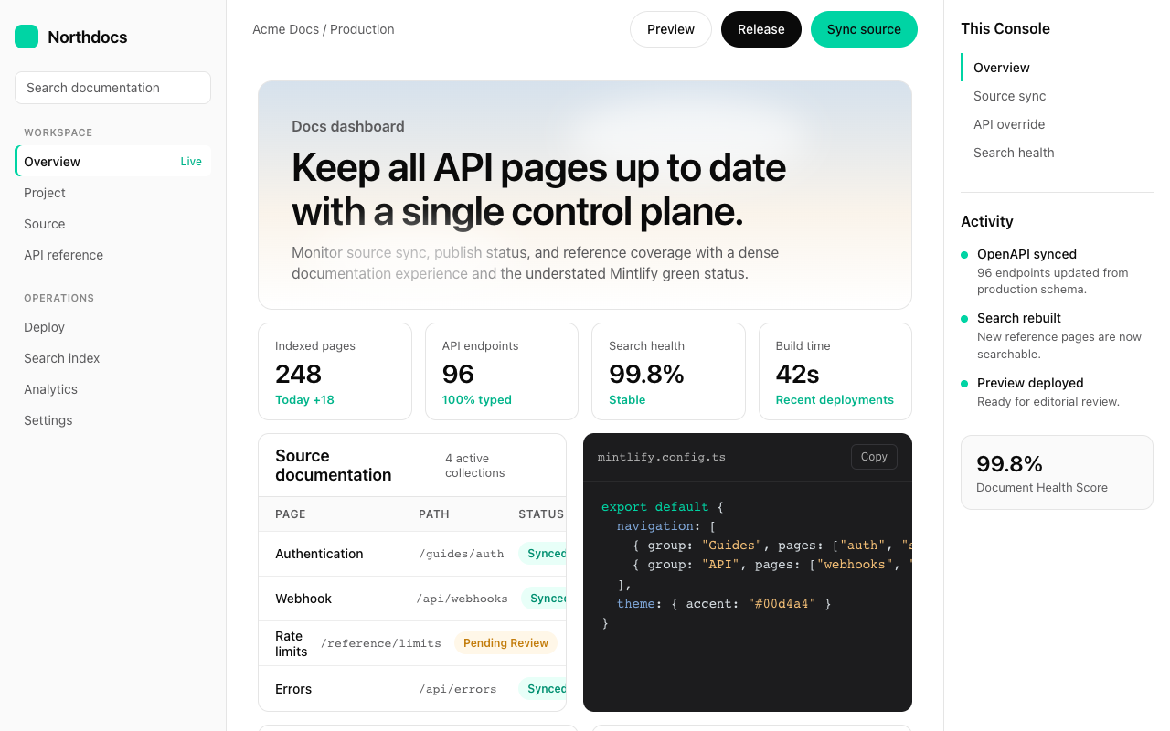

适合文档中心、开发者门户和 API 产品,天空渐变营销区连接三栏文档界面,黑色 pill 与绿色状态让阅读路径清楚。
设计语言样张
把 API 文件和 Markdown 连接成开发者门户。
npx docs dev
✓ 已索引页面
npm install sdk
---
version: alpha
name: "Mintlify"
description: "Mintlify 的 DESIGN.md 中文参考模板,保留原始 design token 与专业术语,覆盖 color system、typography、layout、components、motion 与 interaction states。"
language: zh-CN
sourceLanguage: en
---

## 概览
Mintlify 位于精致 marketing presentation 与 developer-grade documentation density 的交界处。Home 和 startups 页面以电影化 atmospheric hero 开场:首页是柔和 sky-gradient backdrop 与 cloud illustration,startups 页面则是 dark teal-to-mint gradient 加 rocket launch,整体更像成熟 SaaS landing aesthetic,而不只是 developer tool。进入更深层页面后,pricing comparison 与 live documentation 会收束为高信息密度布局:Inter body type 以 14–16px 承载长文 prose、syntax-highlighted code block 和三栏 documentation grid。

品牌签名 mint green({colors.brand-green})使用克制但果断:hero “Get started” pill button、feature list 中的绿色 checkmark、featured pricing tier border,以及 docs UI 内的 active indicator。Black-pill primary button 主导 marketing flow;dark hero band 上则使用 white-on-dark inversion。Inter(body、headings)与 Geist Mono(code blocks、inline references、type signatures)的组合强化了 developer-tool DNA,同时不需要引入第三套字体。

**关键特征:**
- atmospheric gradient hero band(首页 sky-blue to cream;startups teal-to-mint)带来电影化 marketing presentation
- Mintlify mint green({colors.brand-green})只用于 accent CTA、active state 和 feature confirmation
- Black-pill primary button({colors.primary} + {rounded.full})用于 marketing CTA
- Inter 用于全部 UI prose;Geist Mono 用于 code block、inline code 与 type/property signature
- 三栏 documentation layout(sidebar / prose / TOC),以密集 14px body 支撑长篇 developer reading
- 严格 radius scale:marketing 使用 {rounded.lg}(12px),pill button 使用 {rounded.full},没有随意的中间圆角
- 高饱和 testimonial card({colors.testimonial-orange})有意打破色彩节奏,制造情绪重点

## 色彩

> 来源页面:mintlify.com/(homepage)、/startups、/pricing、/docs/components/tabs。四个页面的 token 覆盖一致。

### 品牌与强调色
- **Mintlify Mint**({colors.brand-green}):signature accent,用于 hero “Get started” pill、feature list checkmark、featured pricing tier border 与 docs sidebar active indicator dot。
- **Deep Mint**({colors.brand-green-deep}):mint accent 的 pressed/active variant。
- **Soft Mint**({colors.brand-green-soft}):success state 与 confirmation surface 的 subtle background tint。
- **Brand Tag**({colors.brand-tag}):documentation tag 与 reference color,用于 <Tabs> JSX-style annotation 和 code-tag chip。
- **Brand Annotate**({colors.brand-annotate}):twoslash code annotation system 中的 inline code annotation green。
- **Brand Warn**({colors.brand-warn}):deprecated / caution 的 code warning highlight。
- **Brand Error**({colors.brand-error}):required-field label、input border 与 error highlight 使用的 red。
- **Testimonial Orange**({colors.testimonial-orange}):Cursor testimonial card 与 warm callout surface 的 coral-orange。

### 表面
- **Canvas White**({colors.canvas}):primary page 与 card background。
- **Canvas Dark**({colors.canvas-dark}):promo banner、dark inversion surface 与 code editor wrapper。
- **Surface**({colors.surface}):subtle section background、search-pill rest、code-inline background 与 sidebar active state。
- **Surface Soft**({colors.surface-soft}):FAQ accordion 与 quiet section background。
- **Surface Code**({colors.surface-code}):dark code-block wrapper background。
- **Hairline / Hairline Soft**:1px border、primary divider、table-row divider 与 secondary break。

### Hero Atmospheric
- **Hero Sky From / To**({colors.hero-sky-from}、{colors.hero-sky-to}):homepage hero 的 sky-blue 到 soft cream gradient。
- **Hero Dark From / To**({colors.hero-dark-from}、{colors.hero-dark-to}):startups hero 的 dark teal 到 mint gradient。

### 文本
- **Ink**({colors.ink}):primary headline 与 CTA text。
- **Charcoal**({colors.charcoal}):body text 与 code-inline foreground。
- **Slate / Steel / Stone / Muted**:用于 secondary metadata、table header/sidebar inactive、caption/twoslash cursor 与 disabled text。
- **On Dark / On Dark Muted**:dark surface 上的 white 与 reduced-opacity white。

### 语义色
Error tone 来自 {colors.brand-error},用于 input border、required-field label 与 validation messaging。

## 字体

### 字体家族
**Inter**(primary):为 UI legibility 优化的 variable typeface,用于所有 UI surface,包括 body、heading、navigation、button label 与 caption。Fallbacks: -apple-system, BlinkMacSystemFont, 'Segoe UI', sans-serif。

**Geist Mono**(code):monospace typeface,用于 code block、inline code reference、type signature(例如 string、number、boolean)以及 API documentation 中的 property name。Fallbacks: 'SF Mono', Menlo, Consolas, 'Geist Mono Fallback', monospace。

品牌不使用 italic variant;强调来自 weight(500/600)、color shift,或 code reference 中的 background highlighting。

### 层级

| Token | 尺寸 | 字重 | 行高 | 字距 | 用途 |
|---|---|---|---|---|---|
| {typography.hero-display} | 72px | 600 | 1.05 | -2px | Marketing hero display(“The intelligent Knowledge Platform”) |
| {typography.display-lg} | 56px | 600 | 1.10 | -1.5px | Major section opener(“Built for the intelligence age”) |
| {typography.heading-1} | 48px | 600 | 1.10 | -1px | Page-level headline(“Pricing on your terms”) |
| {typography.heading-2} | 36px | 600 | 1.20 | -0.5px | Section headline(“Apply to the Mintlify startup program”) |
| {typography.heading-3} | 28px | 600 | 1.25 | 0 | Subsection header、Tabs docs page title |
| {typography.heading-4} | 22px | 600 | 1.30 | 0 | Card title、较大 feature header |
| {typography.heading-5} | 18px | 600 | 1.40 | 0 | 小型 feature header、FAQ question title |
| {typography.subtitle} | 18px | 400 | 1.50 | 0 | Hero subtitle、lead body |
| {typography.body-md} | 16px | 400 | 1.50 | 0 | 主要正文 |
| {typography.body-md-medium} | 16px | 500 | 1.50 | 0 | 正文强调 |
| {typography.body-sm} | 14px | 400 | 1.50 | 0 | 次级正文、table cell、navigation |
| {typography.body-sm-medium} | 14px | 500 | 1.50 | 0 | Active sidebar nav、button label、tab label |
| {typography.caption} | 13px | 400 | 1.40 | 0 | Helper text、fine print、code-block header |
| {typography.caption-bold} | 13px | 600 | 1.40 | 0 | Badge label |
| {typography.micro} | 12px | 500 | 1.40 | 0 | Footer microcopy、label chip |
| {typography.micro-uppercase} | 11px | 600 | 1.40 | 0.5px | Sidebar section header、REQUIRED label |
| {typography.button-md} | 14px | 500 | 1.30 | 0 | Pill button label |
| {typography.code-md} | 14px | 400 | 1.50 | 0 | Code block content |
| {typography.code-sm} | 13px | 400 | 1.40 | 0 | Smaller code、type signature |
| {typography.code-inline} | 13px | 500 | 1.30 | 0 | Body 中的 inline <Tabs> reference |

### 原则
- **紧凑 hero leading**(1.05)让 72px hero 形成 magazine-grade display headline。
- **Negative letter-spacing** 随尺寸反向递进:display size 使用 -2px 到 -1.5px,小标题回到 0。
- **Documentation-grade body**:14–16px 文本使用 1.50 line-height,保证 dense docs surface 中的长文阅读舒适。
- **Inter / Geist Mono pairing**:Inter 用于其他所有内容,Geist Mono 精确用于 code reference;二者的对比就是品牌的 developer-respect signal。
- **Uppercase micro label** 搭配 +0.5px letter-spacing,用于 sidebar section header 与 REQUIRED annotation tag。

## 布局

### 间距系统
- **Base unit**:4px(主要增量为 8px)。
- **Tokens**:{spacing.xxs}(4px)· {spacing.xs}(8px)· {spacing.sm}(12px)· {spacing.md}(16px)· {spacing.lg}(20px)· {spacing.xl}(24px)· {spacing.xxl}(32px)· {spacing.xxxl}(40px)· {spacing.section-sm}(48px)· {spacing.section}(64px)· {spacing.section-lg}(96px)· {spacing.hero}(120px)。
- **Section rhythm**:Marketing 页面主要 band 之间使用 {spacing.section-lg}(96px);pricing comparison 收紧到 {spacing.section}(64px);documentation surface 的 subsection 间距为 {spacing.xxl}(32px)。
- **Card internal padding**:compact card 使用标准 {spacing.xl}(24px);pricing card 与 feature panel 使用 {spacing.xxl}(32px);testimonial card 为了 hero-card presence 扩展到 {spacing.section}(64px)。

### 网格与容器
- Marketing 页面使用 1280px max-width 与 32px gutter。
- Hero 与 feature band 经常采用两栏 split:左侧 text,右侧 illustration / mockup。
- Pricing 页面 desktop 下呈现 3 个 tier card(FREE / Lift Off / Custom),下方是完整 feature comparison table。
- Documentation 页面使用严格三栏:左 sidebar nav(约 240px)、中间 prose(max-width 约 720px)、右 TOC(约 200px)。
- Logo wall 使用 6-up customer logo row,每个 logo 高度约 80–100px。

### 留白理念
Marketing surface 给内容充分 breathing room;{spacing.hero}(120px)above-the-fold 让 atmospheric gradient backdrop 能被清楚感知。Documentation 则显著收紧:section gap 降到 {spacing.xxl}(32px),table row 压到 {spacing.md}(16px),sidebar nav 使用 {spacing.xs}(8px)vertical rhythm。

## 层级与深度

系统整体以 flat 为主,只在关键位置使用 atmospheric depth。

| 层级 | 处理方式 | 用途 |
|---|---|---|
| 0 (flat) | 无阴影;{colors.hairline} border | Default card、table row、form input |
| 1 (subtle) | rgba(0, 0, 0, 0.04) 0px 1px 2px 0px | Hover-elevated tile、subtle highlight |
| 2 (card) | rgba(0, 0, 0, 0.08) 0px 4px 12px 0px | Standard feature card |
| 3 (mockup) | rgba(0, 0, 0, 0.12) 0px 24px 48px -8px | Hero product mockup framing,尤其是 homepage hero docs preview 的深扩散投影 |
| 4 (brand-tinted) | rgba(0, 212, 164, 0.08) 0px 8px 24px | Featured pricing tier glow |

### 装饰性深度
- Homepage hero 使用 atmospheric photographic backdrop(sky-gradient 上的 cloud illustration)形成深度;不需要额外 shadow,imagery 本身承担层次。
- Startups hero 采用类似处理,但 rocket-launch illustration 会切过 dark teal gradient,制造更强的动势。
- Code block 依靠 dark surface 上的 syntax-highlighting color hierarchy 形成内部深度,不额外使用 shadow。

## 形状

### 圆角尺度

| Token | 值 | 用途 |
|---|---|---|
| {rounded.xs} | 4px | Inline code chip、micro tag |
| {rounded.sm} | 6px | Sidebar nav item、type badge |
| {rounded.md} | 8px | Input、search pill、code block、secondary card |
| {rounded.lg} | 12px | Standard card、pricing tier、hero mockup、FAQ item |
| {rounded.xl} | 16px | Larger feature panel |
| {rounded.xxl} | 24px | Featured product showcase tile |
| {rounded.full} | 9999px | All buttons、pill tab、badge |

Radius scale 非常克制:同一 component family 不会在 {rounded.md}(8px)与 {rounded.lg}(12px)之间随意选择中间值。Pill button 统一使用 {rounded.full};rectangular card 则稳定使用 {rounded.lg}(12px)。

### 图像几何
- Hero illustration(cloud、rocket)放在 full-bleed gradient backdrop 上,不加内部 frame。
- Customer logo wall 使用 1:1 ratio cell,不做圆角处理,logo 以 inline wordmark 呈现。
- Testimonial photo 使用 1:1 aspect,并以 {rounded.md}(8px)轻微 softened。
- Code editor mockup hero image 使用 {rounded.lg}(12px)圆角、hairline border 与 deep diffuse drop shadow。

## 组件

> 根据 no-hover policy,不记录 hover 状态;仅记录默认与 pressed/active 状态。

### 按钮

**button-primary** — Black pill primary CTA,是所有 surface 上的主导 action。
- Background {colors.primary},text {colors.on-primary},typography {typography.button-md},padding 10px 20px,rounded {rounded.full}。
- Pressed state button-primary-pressed 提升到 {colors.charcoal}。
- Disabled state button-primary-disabled 使用 {colors.hairline} background 与 {colors.muted} text。

**button-accent-green** — Mint green pill,用于品牌强调 CTA(hero “Get started”、featured pricing CTA)。
- Background {colors.brand-green},text {colors.primary},typography {typography.button-md},padding 10px 20px,rounded {rounded.full}。

**button-on-dark** — Dark hero band 上使用的 white pill(startups 页面 “Get started”)。
- Background {colors.on-dark},text {colors.primary},typography {typography.button-md},padding 10px 20px,rounded {rounded.full}。

**button-secondary** — Secondary action 使用的 outlined pill。
- Background transparent,text {colors.ink},border 1px solid {colors.hairline},typography {typography.button-md},padding 10px 20px,rounded {rounded.full}。

**button-ghost** — 更安静的 rectangular ghost button,用于 sidebar action 与 tertiary nav。
- Background transparent,text {colors.ink},typography {typography.button-md},padding 8px 12px,rounded {rounded.md}。

**button-link** — 行内文本链接,呈现为 subtle button。
- Background transparent,text {colors.ink},typography {typography.body-sm-medium},padding 0;激活时出现 underline。

**button-icon-circular** — 32×32px circular utility button(close、copy、arrow)。
- Background {colors.canvas},text {colors.ink},border 1px solid {colors.hairline},rounded {rounded.full}。

### 卡片与容器

**`card-base`** — Standard documentation/feature card.
- 背景 `{colors.canvas}`, rounded `{rounded.lg}`, padding `{spacing.xl}`, border `1px solid {colors.hairline}`.

**`card-feature`** — Feature panel on light gray surface.
- 背景 `{colors.surface}`, rounded `{rounded.lg}`, padding `{spacing.xxl}`.

**`card-help`** — "Need help?" CTA cards below the pricing comparison ("Quickstart guide", "Guide to technical writing", "Founder", "Sales").
- 背景 `{colors.canvas}`, rounded `{rounded.lg}`, padding `{spacing.xl}`, border `1px solid {colors.hairline}`.

**`card-startup-perk`** — Startup-program perk grid item ("Discounts and credits", "Priority support", "Startup pack", "Founder community").
- 背景 `{colors.canvas}`, rounded `{rounded.lg}`, padding `{spacing.xl}`, border `1px solid {colors.hairline}`. Carries an icon at top, heading `{typography.heading-5}`, description `{typography.body-sm}` `{colors.steel}`.

**`pricing-card`** — Standard 定价层级 card.
- 背景 `{colors.canvas}`, rounded `{rounded.lg}`, padding `{spacing.xxl}`, border `1px solid {colors.hairline}`.
- Title `{typography.heading-3}`, price `{typography.display-lg}`, feature list `{typography.body-sm}` with green checkmark icons.

**`pricing-card-featured`** — Highlighted 定价层级 (Lift Off / featured plan).
- 背景 `{colors.canvas}`, rounded `{rounded.lg}`, padding `{spacing.xxl}`, border `2px solid {colors.brand-green}`, soft brand-tinted shadow `rgba(0, 212, 164, 0.08) 0px 8px 24px`.

**`testimonial-card-feature`** — Bright orange large testimonial card with photo + quote ("Cursor — Every YC batch we consistently see the top performing startups use Mintlify to build their docs.").
- 背景 `{colors.testimonial-orange}`, 文本 `{colors.on-dark}`, rounded `{rounded.lg}`, padding `{spacing.section}`. Photo on right, large quote in `{typography.heading-3}` left, attribution below in `{typography.body-sm-medium}`.

**`testimonial-card-quote`** — Smaller white testimonial card on the startups page.
- 背景 `{colors.canvas}`, rounded `{rounded.lg}`, padding `{spacing.xxl}`, border `1px solid {colors.hairline}`.

**`founder-quote-card`** — Cursor founder testimonial card variant on the orange surface.
- 背景 `{colors.testimonial-orange}`, 文本 `{colors.on-dark}`, rounded `{rounded.lg}`, padding `{spacing.xxl}`. Carries the specific founder portrait + quote treatment.

**`startup-program-card`** — Larger application/program card containing perks grid + apply CTA.
- 背景 `{colors.canvas}`, rounded `{rounded.lg}`, padding `{spacing.xxl}`, border `1px solid {colors.hairline}`.

### 输入与表单

**`text-input`** — 标准文本字段.
- 背景 `{colors.canvas}`, 文本 `{colors.ink}`, border `1px solid {colors.hairline}`, rounded `{rounded.md}`, padding `{spacing.sm} {spacing.md}`, height 40px.

**`text-input-focused`** — 激活状态.
- Border switches to `2px solid {colors.brand-green}` — focus uses the brand mint as the activation signal.

**`search-pill`** — 文档 top-bar search.
- 背景 `{colors.surface}`, 文本 `{colors.steel}`, typography `{typography.body-sm}`, rounded `{rounded.md}`, height 36px, border `1px solid {colors.hairline}`.

### 标签页

**`segmented-tab`** + **`segmented-tab-active`** — Underline-style tab navigation (used inside docs Tabs component for "First tab / Second tab / Third tab").
- Inactive: 文本 `{colors.steel}`, transparent background, padding `{spacing.sm} {spacing.md}`. Active: 文本 `{colors.ink}`, 2px bottom border in `{colors.ink}`.

**`pill-tab`** + **`pill-tab-active`** — Pill-style tab nav (top of pricing page: "定价 / Roadmap").
- Inactive: background `{colors.canvas}`, 文本 `{colors.steel}`, border `1px solid {colors.hairline}`, padding `8px 16px`, rounded `{rounded.full}`.
- Active: background `{colors.primary}`, 文本 `{colors.on-primary}`, no border.

**`toggle-monthly-yearly`** — Two-state pill toggle (Monthly / Annual on pricing page).
- 背景 `{colors.surface}`, rounded `{rounded.full}`, padding `4px`. Active state moves a white pill thumb to the selected position.

### 徽章与状态

**`badge-discount`** — Small green "Save 20%" badge attached to annual toggle.
- 背景 `{colors.brand-green}`, 文本 `{colors.primary}`, typography `{typography.caption-bold}`, rounded `{rounded.full}`, padding `2px 8px`.

**`badge-required`** — Red "REQUIRED" label on documentation property rows.
- 背景 `{colors.brand-error}`, 文本 `{colors.on-dark}`, typography `{typography.micro-uppercase}`, rounded `{rounded.sm}`, padding `2px 6px`.

**`badge-type`** — Type signature chip in documentation (e.g. `string`, `number`, `boolean`).
- 背景 `{colors.surface}`, 文本 `{colors.steel}`, typography `{typography.code-sm}`, rounded `{rounded.sm}`, padding `2px 6px`.

**`badge-tag`** — 文档 tag chip (e.g. `<Tabs>` reference highlighted in body text).
- 背景 `rgba(55, 114, 207, 0.15)`, 文本 `{colors.brand-tag}`, typography `{typography.caption-bold}`, rounded `{rounded.sm}`, padding `2px 8px`.

**`promo-banner`** — Sticky black promo strip ABOVE the top nav (when present).
- 背景 `{colors.canvas-dark}`, 文本 `{colors.on-dark}`, typography `{typography.body-sm-medium}`, padding `{spacing.sm} {spacing.md}`.

### 代码

**`code-block`** — Syntax-highlighted code container.
- 背景 `{colors.surface-code}`, 文本 `{colors.on-dark}`, typography `{typography.code-md}`, rounded `{rounded.md}`, padding `{spacing.md}`.

**`code-block-header`** — Header bar above the code with language label + copy button.
- 背景 `{colors.surface-code}`, 文本 `{colors.on-dark-muted}`, typography `{typography.caption}`, padding `{spacing.xs} {spacing.md}`, bottom border `1px solid {colors.hairline-dark}`.

**`code-inline`** — Inline `<Tabs>` reference in body prose.
- 背景 `{colors.surface}`, 文本 `{colors.charcoal}`, typography `{typography.code-inline}`, rounded `{rounded.xs}`, padding `2px 6px`, border `1px solid {colors.hairline}`.

**`copy-code-button`** — "Copy code" button in code-block header.
- 背景 transparent, 文本 `{colors.on-dark-muted}`, typography `{typography.caption}`, rounded `{rounded.sm}`, padding `{spacing.xxs} {spacing.xs}`, border `1px solid {colors.hairline-dark}`.

### 文档组件

**`property-row`** — API property documentation row (e.g. `defaultIndex` on the Tabs page).
- 背景 transparent, 文本 `{colors.ink}`, typography `{typography.body-sm}`, padding `{spacing.md} 0`, bottom border `1px solid {colors.hairline-soft}`.
- Layout: property name in `{typography.code-inline}` + type badge + optional REQUIRED badge + description below in `{typography.body-sm}` `{colors.steel}`.

**`feature-comparison-table`** — Detailed pricing-page 功能对比表.
- 背景 `{colors.canvas}`, 文本 `{colors.ink}`, typography `{typography.body-sm}`, rounded `{rounded.md}`, border `1px solid {colors.hairline}`.

**`feature-comparison-row`** — Individual row inside the comparison table.
- 背景 `{colors.canvas}`, 文本 `{colors.ink}`, padding `{spacing.md} {spacing.lg}`, bottom border `1px solid {colors.hairline-soft}`. Section dividers in `{typography.micro-uppercase}` `{colors.steel}`.

**`sidebar-nav-item`** + **`sidebar-nav-item-active`** — 文档 left rail link entries.
- Inactive: background transparent, 文本 `{colors.steel}`, typography `{typography.body-sm}`, rounded `{rounded.sm}`, padding `{spacing.xs} {spacing.md}`.
- Active: background `{colors.surface}`, 文本 `{colors.ink}`, typography `{typography.body-sm-medium}`.

**`sidebar-section-header`** — Uppercase section header inside sidebar (e.g. "COMPONENTS", "PRIMITIVES").
- 背景 transparent, 文本 `{colors.steel}`, typography `{typography.micro-uppercase}`, padding `{spacing.md} {spacing.md} {spacing.xs}`.

**`doc-toc-item`** + **`doc-toc-item-active`** — Right-rail table-of-contents links.
- Inactive: background transparent, 文本 `{colors.steel}`, typography `{typography.body-sm}`, padding `{spacing.xxs} 0`.
- Active: 文本 `{colors.ink}`, typography `{typography.body-sm-medium}`, optional left-border accent in `{colors.brand-green}`.

### 导航

**顶部导航(Marketing)** — Sticky white bar with logo, link list, and right-side CTAs.
- 背景 `{colors.canvas}`, height ~64px, bottom border `1px solid {colors.hairline-soft}`.
- Left: Mintlify wordmark + horizontal link list (Solutions, 定价, Customers, 文档, Changelog).
- Right: secondary "Talk to sales" + black-pill "Get Started".

**顶部导航(文档)** — Compressed nav with center search-pill and right-side account/upgrade CTAs.
- 背景 `{colors.canvas}`, height ~56px. Search-pill at center, "文档 / Guides / API Reference / Changelog" links + "Talk to us" + green "Get started" right.

### 标志性组件

**`hero-band-sky`** — Homepage hero with atmospheric sky-blue to cream gradient and cloud illustrations.
- 背景 gradient `linear-gradient(180deg, {colors.hero-sky-from} 0%, {colors.hero-sky-to} 100%)`, 文本 `{colors.on-dark}` (early portion of gradient) shifting to `{colors.ink}` further down, padding `{spacing.hero}`.
- Layout: centered hero headline in `{typography.hero-display}`, centered subtitle in `{typography.subtitle}`, centered button row (`button-accent-green` "Get started" + `button-secondary` "Talk to us"), product mockup below the buttons.

**`hero-band-dark`** — Startups hero with dark teal-to-mint gradient and rocket launch illustration.
- 背景 gradient `linear-gradient(135deg, {colors.hero-dark-from} 0%, {colors.hero-dark-to} 100%)`, 文本 `{colors.on-dark}`, padding `{spacing.hero}`.
- Layout: hero headline left in `{typography.hero-display}` `{colors.on-dark}`, illustration right (rocket cutting across the gradient), button row uses `button-on-dark` (white pill) + ghost link.

**`hero-product-mockup`** — Code-editor mockup framed inside the homepage hero.
- 背景 `{colors.canvas}`, rounded `{rounded.lg}`, border `1px solid {colors.hairline-soft}`, deep shadow `rgba(0, 0, 0, 0.12) 0px 24px 48px -8px`.
- Carries a documentation page preview inside (sidebar on left, prose body, mock UI controls).

**`logo-wall-item`** — Customer logo cell in 6-up trust-row grids ("Anthropic / Cognition / Mintlify / Vercel / react / Lovable", "Stripe / Block / PayPal / Compound / Auth").
- 背景 transparent, 文本 `{colors.steel}`, typography `{typography.body-md-medium}`, padding `{spacing.lg}`.
- Logos rendered as wordmarks with consistent vertical centering.

**`faq-accordion-item`** — Frequently-asked-questions panel item (visible on pricing page).
- 背景 `{colors.canvas}`, rounded `{rounded.md}`, padding `{spacing.xl}`, border `1px solid {colors.hairline-soft}`.
- Question in `{typography.heading-5}`, expanded answer in `{typography.body-md}` `{colors.steel}`, chevron icon in `{colors.steel}` 16px.

**`footer-region`** — Multi-column site footer.
- 背景 `{colors.canvas}`, top border `1px solid {colors.hairline}`, padding `{spacing.section} {spacing.xxl}`.
- 5 column groups (Explore / Resources / Company / Legal + brand mark column).
- Section headers in `{typography.body-sm-medium}` `{colors.ink}`, link items in `{typography.body-sm}` `{colors.steel}`.

**`footer-link`** — Individual link entry in the footer.
- 背景 transparent, 文本 `{colors.steel}`, typography `{typography.body-sm}`, padding `{spacing.xxs} 0`.

## 使用准则

本节用于约束 Mintlify 的实现取舍:mint green 是高价值 signal,documentation density 是核心体验,代码字体与正文排版的边界必须清晰。所有新增组件都应先判断属于 marketing surface、documentation surface 还是 pricing comparison,再套用对应 token。

### 应该
- 严格使用本文定义的 brand color、surface token、typography token 与 rounded token,不要临时创造视觉规则
- 将 primary CTA 保持在品牌最有识别度的颜色或按钮形态上,并让 secondary action 明显退后
- 根据组件角色选择正确圆角:button、card、badge、tab 各自遵循本文的 radius scale
- 真实产品 UI mockup、code mockup、logo wall 与 feature card 应使用对应组件 token,而不是重新发明样式
- 在 responsive breakpoint 中保持 hero typography、grid column 与 footer layout 的收缩节奏
- 引用 component id 与 token 名称时保持原样,便于实现时直接映射

### 不要
- 不要把品牌强调色扩展到 body text 或大面积背景,除非该品牌明确把它作为 surface color
- 不要混用不属于该品牌的圆角语言,例如把矩形按钮改成 pill,或把 pill button 改成 square
- 不要引入未记录的新 accent color、重阴影或第二套字体
- 不要在 flat documentation card 上使用过重 elevation;阴影应保留给 mockup、modal 或明确的 featured surface
- 不要删除品牌标志性组件,例如 hero mockup、sunset stripe、workspace card、product matrix 或 footer band

## 响应式行为

### 断点
| 名称 | 宽度 | 关键变化 |
|---|---|---|
| Mobile(小) | < 480px | 单列. Hero scales to 36px. Pill nav collapses to hamburger. 定价 tiers stack 1-up. 页脚 1-column accordion. |
| Mobile(大) | 480 – 767px | Same as small but feature tiles render 2-up. Hero scales to 44px. |
| Tablet | 768 – 1023px | 2-column feature grids. Pill-tab nav returns. 文档 sidebar collapses to drawer. Hero scales to 56px. |
| Desktop | 1024 – 1279px | Full 3-column docs grid (sidebar / body / TOC). 3-tier pricing card row. Hero at 72px. |
| Wide Desktop | ≥ 1280px | Wider hero gutters, larger product mockup, fixed 240px sidebar. |

### 触控目标
- Pill buttons render at 36–40px effective height — bumps to 44px on mobile via padding override
- Circular icon buttons: 32×32px desktop → 44×44px mobile
- Form inputs render at 40px height; bumps to 44px mobile
- Sidebar nav items render at ~32px tall — bump to 44px mobile drawers

### 折叠策略
- **Promo banner** stays full-width; truncates at < 480px
- **Top nav** below 1024px collapses to hamburger; horizontal links move into drawer
- **Hero band**: 2-column hero (文本 + mockup) collapses to stacked at < 1024px; mockup rendered below 文本 on mobile
- **文档 grid**: 3-column desktop → sidebar-drawer at < 1024px → single-column at < 768px
- **定价 comparison**: 3-column tiers → 1-column stacked at < 768px; comparison table becomes horizontal-scroll
- **Hero typography**: `{typography.hero-display}` (72px) → 56px tablet → 44px mobile-large → 36px mobile-small
- **Customer logo wall**: 6-up → 3-up at tablet → 2-up at mobile
- **页脚**: 5-column desktop → 2-column tablet → accordion at mobile

### 图像行为
- Hero illustrations (cloud, rocket) lazy-load with the hero band; remain crisp at all breakpoints (SVG-based)
- Product mockup retains its aspect ratio across breakpoints; scales proportionally
- Customer logos use SVG wordmarks; remain crisp on retina displays

## 迭代指南

1. 一次只聚焦一个组件,避免同时重写多个 surface。
2. 直接引用 component name 与 token(例如 {colors.primary}、{component-name}-pressed、{rounded.full}),不要改写标识符。
3. 修改后运行 npx @google/design.md lint DESIGN.md,检查 broken refs、contrast 与结构问题。
4. 新增状态时用单独 variant 表达,例如 -pressed、-disabled、-focused、-active。
5. 正文默认使用 {typography.body-md};强调文本、hero display 与 caption 按本文 hierarchy 向下选择。
6. 品牌主色只用于它被授权的角色;如果出现在 generic surface 上,需要重新确认是否合理。
7. 保持按钮圆角、卡片圆角、badge 圆角与 responsive typography 的品牌节奏。

## 已知缺口

- 部分 dark-mode token 没有在公开页面中完整暴露,不能推断为正式 palette。
- animation / transition timing 未全部抽取;一般建议 150–200ms ease,并根据组件语境微调。
- form validation success / error 的完整样式没有覆盖所有场景,应按现有 semantic color 与 badge pattern 实现。
- 个别 feature tint、category color 或 code syntax palette 来自页面观察,正式设计库中可能还有更细的映射。


