
01 / 03
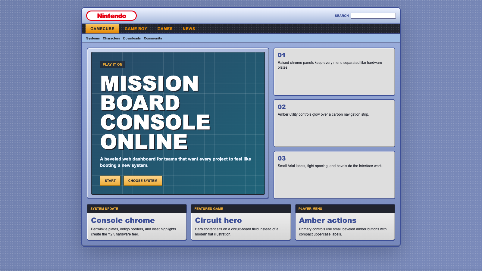
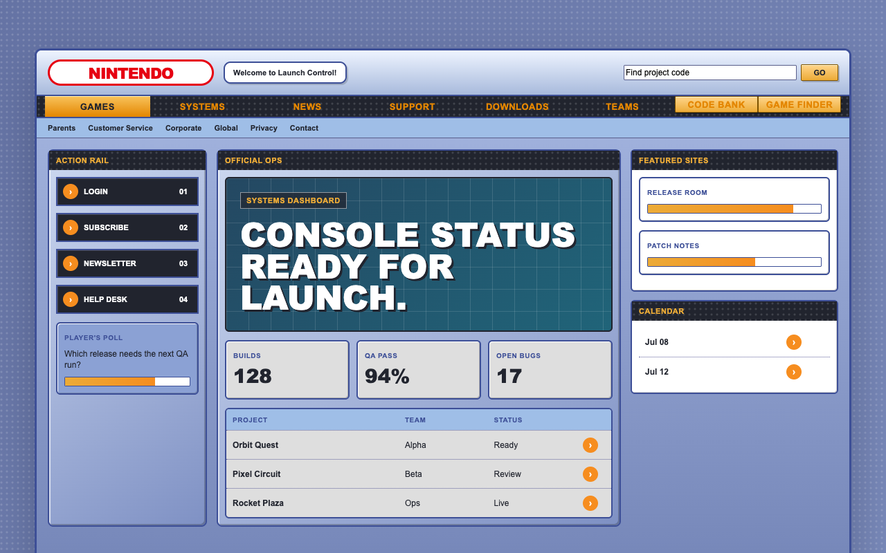
适合游戏、娱乐和复古互动页面,色彩鲜明,带早期掌机与网页的怀旧趣味。
设计语言样张
44px / 900 / line-height 1,用于主视觉标题,必须有游戏硬件海报感。
11-13px,大写、紧凑、0.5px 字距,用于导航、标签、按钮和面板标题。
12px / 1.4,正文只放在金属面板内部,不放大成现代说明文字。
主体是 2-6px 的硬边金属板;圆形只用于 logo pill、radio dot 和箭头提示。
把页面当作 assembled console faceplate,而不是现代流式网页。
使用 periwinkle / indigo chrome plate 表达结构层级。
warm color 只承担方向提示:amber 是工具,signal orange 是前进。
保持小字号 Arial label、紧凑间距和密集模块。
不要把 Nintendo Red 扩展成大面积背景色。
不要把所有面板软化成现代大圆角卡片。
不要加入柔和 blur shadow;depth 来自 bevel、硬边和 texture。
不要让布局过度留白,空隙应该像机器面板之间的接缝。
---
version: alpha
name: "Nintendo 2001"
description: "Nintendo 2001 的 DESIGN.md 中文参考模板,保留原始 design token 与专业术语,覆盖 color system、typography、layout、components、motion 与 interaction states。"
language: zh-CN
sourceLanguage: en
---

## 概览
2001 年左右的 Nintendo.com 像是把 web 渲染成了 **console hardware**。同一时代多数网站要么使用 grunge texture,要么使用 corporate gradients,而这个 interface 则由 **brushed-periwinkle metal plates** 组装而成:每个区域都是独立 beveled panel,顶部有更亮的 edge-light,底部有 `{colors.chrome-indigo}` shadow line,仿佛与 Game Boy 一样由 injection-molded plastic 冲压出来。整页读起来像一个 machine faceplate:`{colors.canvas}` periwinkle chrome 的 body 承载 inset modules,最大 panel 的 corner 被物理 **chamfered**(45° 切角)而不是 rounded,强化 manufactured-object feeling。

系统运行在紧密的 three-voice contrast 上。Structural voice 是 cool periwinkle-to-indigo chrome(`{colors.canvas}`、`{colors.periwinkle}`、`{colors.chrome-indigo}`)。Authority voice 是 `{colors.carbon}` carbon-navy:top navigation bar、right-rail action button 与 footer 都是 near-black slab,并印着 faint **halftone dot-matrix texture**,让人联想到 speaker grille。Energy voice 是 warm,并且只保留给一个任务:告诉你去哪里。`{colors.nav-gold}` 点亮 primary menu words,`{colors.amber}` 填充 utility chips 与 badges,`{colors.signal}` orange 标记每个 “forward” cue,包括 round arrow button、每个 headline 旁的 chevron chip、Submit button。这个系统里 warmth 始终意味着 *action*;cool chrome 从不承载它。

Atmosphere 来自 **hero fields**:它们用 textured backdrop 上的 full-bleed product photography 打破 periwinkle 的平静。Systems 是 circuit-board cyan,Games 是 motion-blurred racetrack red,Home 是 soft lavender wash;每个 hero 上方都有 chunky `{typography.display}` wordmark,以 white 渲染并带 heavy outline 与 hard drop shadow,这是 game-box cover type 的 visual signature。一个 pixel-eared Mario 从 masthead 探入,带着 “Welcome to Nintendo.com!” speech bubble,将整台 machine 锚定到品牌 playful character voice 上。

**Key Characteristics:**
- 每个 UI region 都是 `{colors.canvas}` periwinkle 中的 **beveled metal plate**,顶部 edge-lit,底部有 `{colors.chrome-indigo}` shadow-line;页面是 assembled,而不是 laid out。
- 最大 module 使用 **Chamfered (cut-corner) panel geometry**;多数 chrome 是 sharp-edged(`{rounded.none}`),rounding 只保留给 logo pill、radio dots 与 circle-arrow badges(`{rounded.full}`)。
- 带 halftone-dot texture 的 **carbon-navy command layer**(`{colors.carbon}`)承载 top nav、right-rail buttons 与 footer。
- Warmth 只作为 **directional signal** 分配:`{colors.nav-gold}` 用于 menu words,`{colors.amber}` 用于 utility chips / badges,`{colors.signal}` 用于每个 forward / Submit cue。
- **Photographic hero fields** 在 outlined `{typography.display}` box-art wordmark 下循环 page-specific accent tint(`{colors.lavender}` home → `{colors.systems-teal}` systems → `{colors.games-red}` games)。
- Dense 的 **modular grid**:masthead、dual nav bars、hero,然后是 two-thirds content column 的 stacked list / feature panel,旁边是 one-third right action rail,整体 whitespace 极少。
- **Character-led**:Mario mascot speech-bubble masthead 与 ESRB badge 用 brand personality 和 regulatory trust marks 包住 chrome。

## Colors

Palette 是 **cool metallic chassis with rationed warm signal**。可以读成三层:构成一切的 periwinkle chrome、carbon command slabs,以及 steady-state interface 中唯一 saturated color 的 warm wayfinding accents。

### Brand & Accent
- **Nintendo Red** (`{colors.primary}` — #e60012): Racetrack logo wordmark 与品牌 anchor hue。谨慎作为 pure brand identity 使用,并兼作 validation / alert color。除 logo plate 外绝不用作 surface fill。
- **Signal Orange** (`{colors.signal}` — #f68d1f): “Go forward” color。填充每个 round arrow button、headline 旁的每个 chevron chip、Submit button,以及 “Play It On” platform badge。如果某物推动你前进,它就是 orange。
- **Amber** (`{colors.amber}` — #ecab37): Utility energy。填充 Code Bank / Game Finder / Go chips、info-box header tabs、sweepstakes stars 与 ESRB Privacy-Certified badge。它比 Signal Orange 更 golden,并保留给 *tools and marks*,而不是 *forward motion*。
- **Nav Gold** (`{colors.nav-gold}` — #e48600): 更深的 orange-gold,只保留给 carbon bar 上发光的 primary navigation words(Games、Systems、News、Nsider、Downloads)。

### Surface
- **Periwinkle Metallic** (`{colors.canvas}` — #7a8aba): Primary interface body,也就是每个 module inset 进去的 brushed-metal chrome。
- **Light Periwinkle** (`{colors.periwinkle}` — #8ba1d4): Raised mid panels(poll panel、system tiles),比 canvas 亮一级,用于 elevation。
- **Pale Sky** (`{colors.sky}` / `{colors.canvas-soft}` — #9fbee7): Secondary-nav strip 与 light inset panel fill。
- **Pale Lavender** (`{colors.lavender}` — #acace7): Home hero field 与 side promo cards。
- **Pale Ice** (`{colors.ice}` — #c0d5e6): News hero panel field。
- **Chrome Indigo** (`{colors.chrome-indigo}` — #3d4f97): 每个 plate 下方的 beveled border / shadow line,以及 nav tab 的 leading angled edge。
- **Muted Indigo** (`{colors.muted-indigo}` — #60619c): Inactive tab 与 recessed chrome。
- **Platinum Gray** (`{colors.platinum}` — #dedede): List-row 与 inset content surface;news headline 与 archive row 位于这个 cool platinum 上。
- **White** (`{colors.surface}` — #ffffff): Content card、form field、logo pill 与 list-row highlight。

### Text
- **Carbon Navy** (`{colors.ink}` — #21242e): Light chrome 上的 primary text,也是 dark command layer(nav bar、rail buttons、footer)的 fill。
- **Chrome Indigo** (`{colors.ink-soft}` — #3d4f97): Secondary text 与 small-caps chrome labels。
- **White** (`{colors.on-primary}` — #ffffff): Carbon、red 与 orange chrome 上的 text。

### Semantic Colors
- **Error / Alert** (`{colors.error}` — #e60012): Validation 与 destructive state 复用 brand red。
- **Systems Teal** (`{colors.systems-teal}` — #206479): Page-accent tint,即 Systems hero 的 circuit-board cyan field。
- **Games Red** (`{colors.games-red}` — #a7282b): Page-accent tint,即 Games hero 的 motion-blurred racetrack field。

## Typography

### Font Family
这个时代的 web-safe reality 全程是 **Arial / Helvetica**,没有 webfont。系统的 character 不是来自 typeface choice,而是来自 *treatment*:每个 chrome label 上的 tight uppercase tracking,以及模拟 console box-art logotype 的 heavy outlined-and-shadowed display style。Body copy 是普通 small Arial;link 使用同一 family 的 bold weight,颜色为 `{colors.ink-soft}`。

Micro-label(vertical left-rail tabs、footer fine print)带有该时期 small bitmap-rendered Arial 的 soft pixelation 特征。为了忠实复现,可在 10–11px label size 上将 Arial 与 **Silkscreen** 或 **VT323** 这类 pixel face 搭配。

### Hierarchy

| Token | Size | Weight | Line Height | Letter Spacing | 用途 |
|---|---|---|---|---|---|
| `{typography.display}` | 44px | 900 | 1 | 0 | Hero box-art wordmark(white,heavy outline + hard drop shadow) |
| `{typography.hero-tagline}` | 15px | 700 | 1.3 | 0 | Hero supporting line(“Gorgeous graphics, great sound…”) |
| `{typography.nav-link}` | 13px | 700 | 1 | 0.5px | Primary nav menu words,uppercase |
| `{typography.ui-label}` | 11px | 700 | 1.1 | 0.5px | Section header label、panel title、button text,uppercase |
| `{typography.link}` | 12px | 700 | 1.4 | 0 | News headline link、“Read More” |
| `{typography.body}` | 12px | 400 | 1.4 | 0 | Description、poll text、info-box copy |
| `{typography.micro}` | 10px | 400 | 1.3 | 0 | Footer copyright、calendar cell、fine print |

### Principles
- **Uppercase + tracking 是 chrome voice。** 每个 structural label,包括 nav words、panel headers(“Official News”、“Featured Sites”、“Player's Poll”)、button text,都是 uppercase Arial Bold,并带半像素 tracking。它读起来像 controller 上的 silkscreened legends。
- **Display type 是 outlined,绝不 flat。** Hero wordmark 始终带 thick contrasting outline 与 hard offset shadow,让它从 photographic field 上跳出来,这是 box-art convention。
- **Body 保持小且安静。** 12px 的 descriptive copy 从不与 chrome 竞争;hierarchy 完全由 label 与 photography 承担。

### Font Substitutes
Arial 在系统中广泛可用,不需要替代。若要重现该时期 micro-label 的 bitmap rendering,可在 10–11px 上叠加 pixel font(**Silkscreen**、**VT323**,或最 chunky 的 **Press Start 2P**),并关闭 anti-aliasing。Display wordmark 是 bespoke logotype;最接近的开放替代是 **Archivo Black**(italicized)或 **Arial Black**,搭配 CSS text-stroke outline 与 `text-shadow` offset。

## Layout

### Spacing System
- **Base unit**: 8px(`{spacing.sm}`),用于 list row 与 grid cell 之间的 gutter rhythm。
- **Tokens**: `{spacing.xxs}` 2px · `{spacing.xs}` 4px · `{spacing.sm}` 8px · `{spacing.md}` 12px · `{spacing.lg}` 16px · `{spacing.xl}` 24px · `{spacing.xxl}` 32px · `{spacing.section}` 48px。
- Panel 使用 **12px interior padding**(`{spacing.md}`);较大的 content module 使用 **16px**(`{spacing.lg}`)。Inter-module gap 为 16–24px。Layout 有意 dense;whitespace 是 plate 之间的 structural seam,而不是 luxury。

### Grid & Container
- **Fixed-width canvas** 约 780–830px wide(desktop-era fixed table layout,centered)。没有 fluid scaling;interface 像 application 一样按单一 target window 尺寸设计。
- **Masthead row**: Mario mascot + speech bubble(左)与 search module(右)漂浮在 chrome 上方。
- **Dual nav bars**: Carbon primary bar(logo + 5 个 section words + Code Bank / Game Finder utility chips)叠在 periwinkle secondary strip(Parents、Customer Service、Corporate、Global、Privacy、Store、Contact)上方。
- **Body**: Full-width hero panel,随后是 **two-column split**:约 two-thirds content column,包含 stacked panels(Official News list、Featured Sites 2×2 grid 等),旁边是约 one-third **right action rail**(Login / Subscribe / Newsletter / Help buttons、info box、side promo card)。
- **Left rail**: 一条 thin vertical strip,包含 rotated tabs(Top Ten、Top Rentals、Player's Choice、ESRB Ratings),被 clip 到 chrome edge。

### Whitespace Philosophy
Empty space 是 **engineered seam**,不是 breathing room。Module 彼此紧贴,只由 thin `{colors.chrome-indigo}` bevel line 与几像素 canvas 分隔,因此眼睛会读到 grouped plates。这种 density 是有意的:它让页面像一个 packed control panel,所有东西都在一键距离内。

### Responsive Strategy

#### Breakpoints
| Name | Width | 关键变化 |
|---|---|---|
| Desktop (only) | ~780–830px fixed | Native 且唯一 target:fixed-width application-style layout |
| Narrow window | < 780px | Horizontal scroll(无 reflow);table layout 不 collapse |

这是一个 **pre-responsive, fixed-canvas** design。它为单一 desktop window size 编写,不会 reflow。忠实的 *modern* re-implementation 应在 desktop 保留 fixed chrome metaphor,并在约 720px 以下将 right action rail 堆叠到 content column 下方,同时把 dual nav bars 折叠成带 disclosure toggle 的 single carbon bar。

#### Touch Targets
原始设计中不考虑 touch target(mouse-only era);button 与 chip 高 18–28px。现代移植必须把 `{components.button-primary}`、`{components.button-icon-arrow}` 与 `{components.radio-option}` 的 hit area 扩大到至少 44×44px。

#### Collapsing Strategy
现代 narrow viewport 上:dual nav bars → single carbon bar + menu disclosure;two-column body → single stacked column,并把 right rail 移到 content 下方;left rotated-tab strip → horizontal scroll chip row 或移除;fixed hero → fluid full-bleed hero,并保留 outlined wordmark。

#### Image Behavior
Hero field 是 **full-bleed photographic plates**,被 clip 到 panel 的 beveled rectangle 内;featured-site 与 game tile 是 tight grid 中的 fixed-pixel thumbnail(约 95×60px)。没有 lazy loading(时代早于它)。Product render 位于 textured backdrop 上,而不是 transparent cutout。

## Elevation & Depth

这个系统里的 depth 是 **physical bevel simulation**,不是 soft shadow。没有 blurred drop-shadow vocabulary;相反,每个 plate 都被赋予 raised molded plastic 的错觉。

| Level | Treatment | 用途 |
|---|---|---|
| 0 — Inset | Recessed into canvas;较暗 `{colors.chrome-indigo}` top edge,较亮 bottom edge | List row、form field、canvas body 本身 |
| 1 — Plate | Flush panel;较亮 top highlight,底部 `{colors.chrome-indigo}` shadow line | Content panel、system tile、info box |
| 2 — Raised chip | Beveled button,带 bright top edge + hard bottom shadow | Utility chip、Go / Submit button、nav tab |
| 3 — Command slab | `{colors.carbon}` near-black,带 halftone texture,位于 chrome “上方” | Top nav bar、right-rail button、footer |

### Decorative Depth
Depth 也由 **texture and photography** 承担:carbon slab 上的 halftone dot-matrix 读作 recessed speaker grille;hero field 使用 motion-blur、circuit-board pattern 与自带 cast shadow 的 product render 创造 literal pictorial depth;outer chrome 上的 chamfered corner 暗示 machined faceplate edge。Left-rail rotated tab 看起来 tuck *behind* main chrome,是小但有效的 layered cue。

## Shapes

### Border Radius Scale

| Token | Value | 用途 |
|---|---|---|
| `{rounded.none}` | 0px | 默认值:nav bar、footer、大多数 chrome plate(sharp / chamfered,不 rounded) |
| `{rounded.xs}` | 2px | Utility button、form field、badge |
| `{rounded.sm}` | 4px | Small panel、featured tile、list row |
| `{rounded.md}` | 6px | Content panel、hero panel |
| `{rounded.lg}` | 10px | Outer section panel、mascot bubble |
| `{rounded.full}` | 9999px | Logo racetrack pill、radio dot、circle-arrow badge |

Signature 是 **sharpness with rationed roundness**。Chrome 是 hard-edged,并且经常 *chamfered*(corner 以 45° 切掉,而不是 curved),这就是 manufactured-faceplate look。Roundness 只在表示 physical control 的位置出现:fully-pill logo、round radio button 与 round Signal-Orange arrow badge。现代复现时应抵制 softening every corner 的冲动;sharp plate 与少量 pill element 之间的张力就是全部 character。

### Photography Geometry
Hero photography 以约 4:1(banner)与 16:9 比例填充 beveled rectangle,并在 panel 内 full-bleed。Featured-site 与 game thumbnail 是接近 4:3 的 fixed tile(约 95×60px),由 1–2px `{colors.chrome-indigo}` edge 与 `{rounded.sm}` corner framing。Mascot 是 overlapping masthead 的 transparent cutout,用 personality 打破 rectangular grid。

## Components

> 不记录 hover state。下面每个 spec 只覆盖 Default 与(提取到时的)Pressed / Active。Variant 作为独立 `components:` entry 存在。

### Navigation

**`nav-bar`** — Primary top navigation。
- `{colors.carbon}` slab,带 faint halftone-dot texture,约 28px tall。左侧承载 `{components.logo-pill}`,中间是五个 `{colors.nav-gold}` section words,使用 `{typography.nav-link}` uppercase;右侧是 amber Code Bank / Game Finder utility chips。Sharp corners(`{rounded.none}`),`{spacing.sm}` padding。

**`subnav-strip`** — Secondary navigation。
- `{colors.canvas-soft}` pale-sky strip,直接位于 nav bar 下方,承载 utility links(Parents、Customer Service、Corporate、Global、Privacy、Store、Contact),使用 `{typography.ui-label}` `{colors.ink}`,由 thin divider 分隔。Sharp,`{spacing.xs}` padding。

**`left-rail-tab`** — Rotated section tabs。
- 一条 thin vertical strip,由 `{colors.carbon}` tabs(Top Ten、Top Rentals、Player's Choice、ESRB Ratings)组成,内部是 vertically-rotated `{typography.ui-label}` text,颜色 `{colors.canvas-soft}`,并 clip 到 left chrome edge。Sharp corners,`{spacing.xs}` padding。

### Brand & Masthead

**`logo-pill`** — Nintendo racetrack logo。
- `{colors.primary}` red wordmark 位于 white `{rounded.full}` racetrack pill 内,并带 outline。位于 nav bar 左侧。`{spacing.xs}` padding。

**`mascot-bubble`** — Mario welcome speech bubble。
- White `{rounded.lg}` rounded-rectangle speech bubble,带 tail,内部以 `{typography.micro}` `{colors.carbon}` 承载 “Welcome to Nintendo.com!”,并与 masthead 中的 Mario cutout 搭配。`{spacing.sm}` padding。

### Buttons

**`button-primary`** — Amber utility / Go chip。
- `{colors.amber}` fill,`{colors.carbon}` text 使用 `{typography.ui-label}`,`{rounded.xs}` corners,`{spacing.md}` padding,并带 beveled top highlight。日常 tool button(Code Bank、Game Finder、Go)。
- Pressed state 位于 **`button-primary-pressed`**,fill 加深为 `{colors.nav-gold}`。

**`button-submit`** — Forward / Submit。
- `{colors.signal}` orange fill,`{colors.on-primary}` white text 使用 `{typography.ui-label}`,`{rounded.xs}`、`{spacing.lg}` padding。用于 “commit” action(poll Submit、archive 上的 Go)。

**`button-secondary`** — Right-rail action button。
- `{colors.carbon}` near-black slab,`{colors.on-primary}` white text 使用 `{typography.ui-label}`,sharp `{rounded.none}` corners,`{spacing.md}` padding,并带 small leading icon。用于 right rail 中的 Login / Subscribe / Newsletter / Help。

**`button-icon-arrow`** — Round forward arrow。
- 22px `{colors.signal}` orange `{rounded.full}` disc,带 white chevron,是 hero panel 与 section link 上的 primary “go” affordance。

**`button-arrow-chip`** — Headline chevron chip。
- 18px `{colors.signal}` orange `{rounded.xs}` chip,带 white forward chevron,位于每个 `{components.news-row}` 右端,用于进入 article。

### Inputs & Forms

**`search-field`** — Masthead search input。
- White `{colors.surface}` field,`{colors.ink}` text 使用 `{typography.body}`,`{rounded.xs}` corners,1px `{colors.hairline}` border,约 20px tall,搭配 “All” category dropdown 与 amber Go chip。

**`text-input`** — Generic text field。
- 与 `search-field` 相同 chassis:white fill、`{colors.ink}` text、`{rounded.xs}`、`{colors.hairline}` 1px border、`{spacing.xs}` padding。用于 Login form(Username / Password / E-mail)、news-archive keyword 与 date fields。

**`select-dropdown`** — Native select(“Click to choose”)。
- White `{colors.surface}` field,`{colors.ink}` text 使用 `{typography.body}`,`{rounded.xs}` corners,并带 hard 1px `{colors.carbon}` border(比 input 更 sharp),右侧边缘由 beveled native dropdown-chevron button 收尾。约 24px tall,`{spacing.xs}` padding。用于 Register form 的 Month / Year pickers。

**`field-label`** — Inline form label。
- Bold `{colors.ink}` label,使用 `{typography.link}`(Arial Bold 12px),位于对应 input 左侧(Username、Password、E-mail、Month、Year)。`{rounded.none}`、`{spacing.xxs}` padding。

**`radio-option`** — Poll radio button。
- 12px white `{rounded.full}` radio dot,带 `{colors.hairline}` ring,搭配 `{typography.body}` option text。用于 Player's Poll。

**`form-panel`** — Form container(Login / Register)。
- `{colors.platinum}` light-gray `{rounded.md}` panel,承载 form,并由 `{components.section-label-bar}` header(≡ LOG IN / ≡ REGISTER)封顶。`{spacing.lg}` interior。Login page 上两个并排。

**`dotted-divider`** — Dotted hairline rule。
- 1px dotted `{colors.muted-indigo}` separator rule,用于 form sub-section 之间(“Note:” line、“Forgot Your Password?”)。这是反复出现的 Y2K-chrome detail:dotted 而不是 solid。

### Cards & Panels

**`hero-panel`** — Photographic hero plate。
- `{rounded.md}` beveled rectangle,在 page-tinted field(`{colors.lavender}` / `{colors.systems-teal}` / `{colors.games-red}`)上填充 full-bleed product photography,上方有 outlined `{typography.display}` wordmark 与 `{components.button-icon-arrow}` call-to-action。`{spacing.lg}` interior。

**`section-label-bar`** — Panel header。
- `{colors.canvas}` header strip,带 small grid / list glyph 与 uppercase `{typography.ui-label}` title(“Official News”、“Featured Sites”、“Player's Poll”)。Sharp corners,`{spacing.sm}` padding。封住每个 content module 顶部。

**`news-row`** — Headline list row。
- `{colors.platinum}` `{rounded.sm}` row,带 small category icon、`{typography.link}` headline(颜色 `{colors.ink-soft}`)与 trailing `{components.button-arrow-chip}`。`{spacing.sm}` padding。堆叠进 Official News / Other Headlines lists。

**`featured-tile`** — Featured-site thumbnail。
- `{colors.carbon}`-framed `{rounded.sm}` tile(约 95×60px),承载 screenshot thumbnail 与 `{typography.micro}` URL caption(例如 www.pokemon.com)。Tight `{spacing.xxs}` padding,排列为 2×2 grid。

**`poll-panel`** — Player's Poll module。
- `{colors.periwinkle}` raised `{rounded.md}` panel,提出 question,列出 `{components.radio-option}` choices,并以 `{components.button-submit}` 收尾。`{spacing.md}` interior。

**`info-box`** — “What Is” explainer card。
- White `{colors.surface}` `{rounded.sm}` card,带 amber header tab(“What Is — Game Finder”)与 `{typography.body}` explanatory copy。`{spacing.md}` padding。位于 right rail。

**`promo-card`** — Side product promo。
- `{colors.lavender}` `{rounded.sm}` card,在 small product render 上承载 outlined product wordmark(例如 Game Boy Advance),位于 right rail。`{spacing.md}` padding。

**`system-tile`** — Hardware grid tile(Systems page)。
- `{colors.periwinkle}` `{rounded.sm}` tile,在 circuit-board backdrop 上承载 console render 与 outlined system name(Nintendo 64、Super Nintendo、Game Boy)。`{spacing.sm}` padding,排列为 2×3 grid。

**`link-row-card`** — Utility link card(Systems page)。
- White `{rounded.sm}` card,带 amber label tab(Technical Help、Store Locator、Online Store)、character icon 与一行 `{typography.body}` description。`{spacing.sm}` padding。

**`calendar-widget`** — Month calendar(News page)。
- White `{rounded.sm}` grid calendar,使用 `{typography.micro}`,带 `{colors.carbon}` caption header(例如 “June 01”)、highlighted event dates 与 month-select dropdown。`{spacing.sm}` padding。

### Badges & Footer

**`esrb-badge`** — ESRB Privacy-Certified mark。
- Small `{colors.amber}` `{rounded.xs}` badge,以 `{typography.micro}` `{colors.carbon}` 显示 “ESRB — Privacy Certified”,固定在 footer 中。

**`esrb-rating-square`** — Game content-rating square。
- 20px white `{rounded.xs}` square,在每个 game card 上用 `{typography.ui-label}` `{colors.carbon}` stamping content-rating letter(E、T)。

**`footer-bar`** — Page footer。
- `{colors.carbon}` chamfered slab,包含 `{typography.micro}` `{colors.canvas-soft}` 的 “©1997–2001 Nintendo…” copyright、ESRB badge 与 privacy link。Sharp corners,`{spacing.lg}` padding。

### Examples (illustrative)

> Kit-mirror demonstration surfaces。每个 `ex-*` entry 都引用 brand-native primitive,让 downstream consumer(`/preview-design`、`/generate-kit`)能一致地 re-skin 同一组 10 个 surface。

**`ex-pricing-tier`** — Default Pricing tier card。复用 feature-card chrome,并使用 brand canvas-soft surface。
- Properties: `backgroundColor`, `textColor`, `borderColor`, `rounded`, `padding`

**`ex-pricing-tier-featured`** — Featured / highlighted tier,polarity-flipped surface(light mode 中 dark fill + light text,dark mode 中 light fill + dark text)。
- Properties: `backgroundColor`, `textColor`, `rounded`, `padding`

**`ex-product-selector`** — What's Included summary card,re-purposed for SaaS / B2B vertical(不是 literal product gallery)。
- Properties: `backgroundColor`, `rounded`, `padding`

**`ex-cart-drawer`** — Subscription summary,re-purposed for SaaS / B2B(每个 add-on 一行 line item,不是 literal cart)。
- Properties: `backgroundColor`, `rounded`, `padding`, `item-divider`

**`ex-app-shell-row`** — App Shell example 内的 sidebar nav row。Active state 使用 brand primary 作为 indicator。
- Properties: `backgroundColor`, `activeIndicator`, `rounded`, `padding`

**`ex-data-table-cell`** — Default data-table th + td chrome。Header 使用 mono-caps eyebrow typography;body 使用 body-sm。
- Properties: `headerBackground`, `headerTypography`, `bodyTypography`, `cellPadding`, `rowBorder`

**`ex-auth-form-card`** — Sign-in / sign-up card。复用 feature-card chrome,内部使用 text-input primitive。
- Properties: `backgroundColor`, `rounded`, `padding`

**`ex-modal-card`** — Modal dialog surface,与 feature-card 使用相同 chrome,并带 elevated shadow。
- Properties: `backgroundColor`, `rounded`, `padding`

**`ex-empty-state-card`** — Empty-state illustration frame。
- Properties: `backgroundColor`, `rounded`, `padding`, `captionTypography`

**`ex-toast`** — Toast notification surface,feature-card shape + medium shadow。
- Properties: `backgroundColor`, `rounded`, `padding`, `typography`

## Do's and Don'ts

### Do
- 将每个 region 构建为 **beveled plate**:`{colors.canvas}` body,顶部更亮 edge,底部有 `{colors.chrome-indigo}` shadow line。“assembled machine” 感依赖这一点。
- Warm color 只保留给 **wayfinding**:`{colors.nav-gold}` 用于 nav words,`{colors.amber}` 用于 utility / badges,`{colors.signal}` 用于 forward / Submit。Cool chrome 从不承载 action color。
- Structural label 保持 **uppercase Arial Bold with 0.5px tracking**(`{typography.ui-label}`);这是整个系统的 silkscreen-legend voice。
- Hero wordmark 在按页面 tint 的 full-bleed photographic field 上渲染为 **outlined + drop-shadowed `{typography.display}`**。
- 对 **command layer**(nav、right rail、footer)使用带 halftone texture 的 `{colors.carbon}`,将 “system controls” 与 “content” 分离。
- 让 panel 通过 thin bevel seam **butt together**;density 是预期 texture。
- Corner 默认 **sharp / chamfered**(`{rounded.none}`);roundness 只花在 logo pill、radio dots 与 circle-arrow badges 上。

### Don't
- 不要 soften every corner;把 sharp chrome 变成统一 rounded card system 会抹掉 manufactured-faceplate identity。
- 不要引入 **soft blurred drop-shadow** elevation language;这里的 depth 是 hard bevel 与 pictorial photography,不是 Material elevation。
- 不要让 `{colors.signal}` 与 `{colors.amber}` 漏到 decorative use;warm color 必须始终表示 “act here”。
- 不要在 page-tint hero(`{colors.systems-teal}`、`{colors.games-red}`)之外添加 accent color;steady-state chrome 严格是 cool periwinkle + carbon。
- 不要把 body copy 或 whitespace 拉宽成 airy modern layout;packed、fixed-canvas density 就是品牌。
- 不要把 dual-nav structure(金色 primary words 位于 pale secondary strip 上方)flatten 成一个 bar;layered command hierarchy 是 signature。
- 不要把 hero 或 system wordmark 渲染为 flat text;没有 outline + shadow,它们会彻底失去 box-art reference。


