

01 / 03
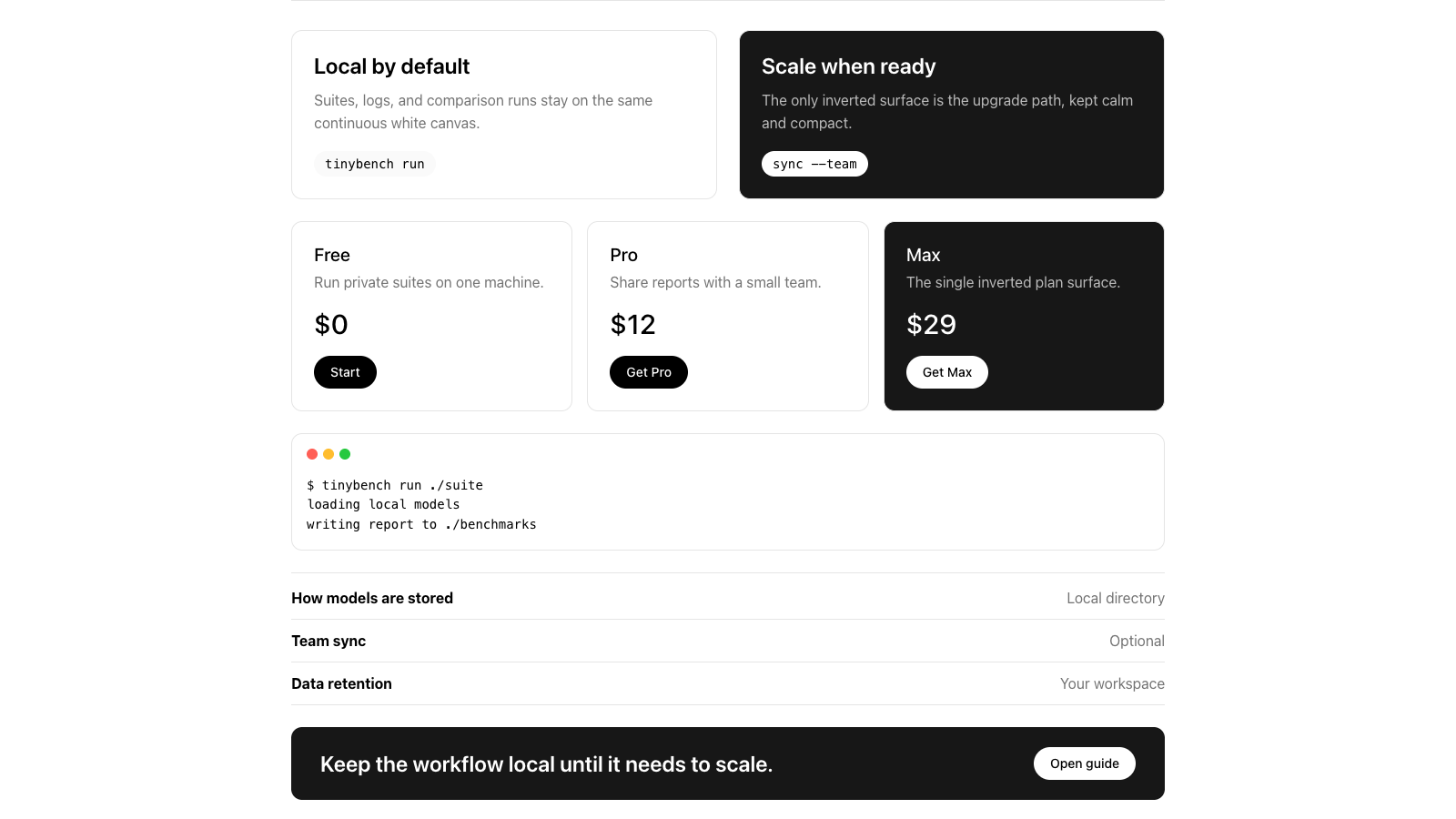
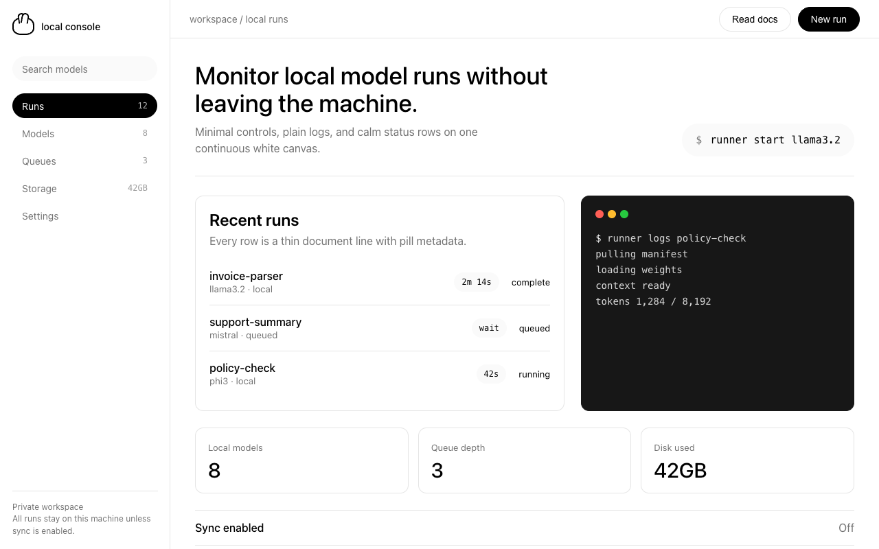

适合本地工具、开源项目和轻量文档页,白底 README 感、圆润标题、黑色 pill 和命令行胶囊让产品显得克制直接。
设计语言样张
页面像被认真排版的 README:圆润标题、命令行胶囊、黑色 Download pill 和手绘 mascot 承担全部识别。
$ ollama run llama3.2
白底、12px、1px hairline。
唯一深色升级表面。
model.pull("llama3.2")---
version: alpha
name: "Ollama"
description: "Ollama 的 DESIGN.md 中文参考模板,保留原始 design token 与专业术语,覆盖 color system、typography、layout、components、motion 与 interaction states。"
language: zh-CN
sourceLanguage: en
---
## 概览
Ollama 的 site 是 AI tooling 领域最激进的 under-designed marketing surface,而这正是它的重点。Home page 像一个被细心渲染的 Markdown README:36px center-aligned heading 下方是放在 soft-gray pill 里的 inline `curl` install snippet,一个 black “Download” CTA,以及唯一装饰物 hand-drawn llama mascot。其他所有内容,包括 automate-your-work block、“Start local. Scale cloud.” pricing pair、“Your data stays yours” guarantee strip、`/pricing` 上的 FAQ wall,都位于同一张 paper-white canvas(`{colors.canvas}`)上,由安静的 `{colors.body}` neutral 承载 prose。System 就是 documentation,documentation 就是 system。
Design philosophy 是 geometric:每个 interactive element 都归并到 `{rounded.full}`(9999px):button、search pill、install-snippet pill、text input,以及 terminal-traffic-light dot。没有 decorative drop shadow,没有 gradient,也没有 llama 之外的 hero illustration。少见的 card(位于 `/pricing`)使用 soft `{rounded.lg}`(12px)和 1px hairline。整个系统里唯一 inverted moment 是 dark “Max” pricing tier,即 `{colors.surface-dark}` 搭配 white text;它是 otherwise studiously flat layout 中唯一吸引注意力的 surface。
Typography 将 SF Pro Rounded(display heading,weight 500–600)与 operating system default sans(body 使用 `ui-sans-serif`)以及 code 使用的 `ui-monospace` 搭配。Heading face 的 roundness 是 chrome 承载的唯一“personality”,它轻柔呼应 `{rounded.full}` button geometry,但并不装饰化。
**Key Characteristics:**
- Paper-white `{colors.canvas}` 从头到尾贯穿,没有 surface alternation;整页是一张连续 sheet。
- Center-aligned hero 使用 `{typography.display-xl}` SF Pro Rounded headline,没有 eyebrow,除了 llama 下方一行很小的 “Power OpenClaw with Ollama” 之外没有 subhead。
- 到处都是 pill geometry:每个 button 与 pill input 都是 `{rounded.full}`;card 使用 `{rounded.lg}`;除 section divider 外没有 sharp-cornered 元素。
- Single-color CTA system:pure black `{colors.primary}` pill 承载每个 action;pricing card 内的 “Get Pro” / “Get Max” 是仅有 variation。
- Inline `curl` install snippet 以 `{typography.code-md}` pill 渲染,是最 signature 的元素,直接位于 hero headline 下方。
- Terminal-mockup card 带 macOS traffic-light dots 与 inline `ollama launch openclaw` example,是 home page 唯一的 “product preview”。
- 最高 tier “Max” plan 使用 inverted dark `{component.pricing-card-dark}`,每页只打破 flat-white rhythm 一次。
## Colors
> **Source pages:** `/` (home) and `/pricing`. The chrome palette is identical across both — only content changes.
### Brand & Accent
- **Pure Black** (`{colors.primary}` — `#000000`): 品牌本身。每个 primary CTA、每个 black pill、nav 中每个 link,以及每个 solid icon 都使用它。没有其他 “brand color”。
- **Ink Deep** (`{colors.ink-deep}` — `#090909`): Primary pill 的 pressed-state black,比 pure black 低一档。
### Surface
- **Canvas** (`{colors.canvas}` — `#ffffff`): 页面本身,系统中几乎每个 surface。
- **Soft Surface** (`{colors.surface-soft}` — `#fafafa`): Install-snippet pill background、search pill、secondary chip background,以及需要时的 alternating row fill。
- **Surface Dark** (`{colors.surface-dark}` — `#171717`): Dark “Max” pricing card 与 dark CTA strip。系统里唯一 inverted surface。
- **Hairline** (`{colors.hairline}` — `#e5e5e5`): 1px card border、footer 上方 divider line、FAQ row 之间 divider。
- **Hairline Strong** (`{colors.hairline-strong}` — `#d4d4d4`): 少见的更强 divider,用于需要额外 separation 的位置(例如不相关 FAQ group 之间)。
### Text
- **Ink** (`{colors.ink}` — `#000000`): 所有 headline、primary nav link、light surface 上的 button text、pricing card 上的 price。
- **Charcoal** (`{colors.charcoal}` — `#525252`): List-item text 与 disabled-state secondary copy。
- **Body** (`{colors.body}` — `#737373`): Paragraph copy、FAQ answer、footer link text 的 default body color,是 pure black 之后最常用的 text color。
- **Mute** (`{colors.mute}` — `#a3a3a3`): Caption text、terminal mockup 内 command-line “comment” gray、lowest-emphasis utility text。
- **On Dark** (`{colors.on-dark}` — `#ffffff`): `{colors.surface-dark}` 上的 primary text。
- **On Dark Mute** (`{colors.on-dark-mute}` — `rgba(255,255,255,0.7)`): Dark “Max” pricing card 内的 secondary copy。
### Semantic Colors
系统在 public marketing surface 上实际上没有 error / success / warning palette:没有 validation state,没有 destructive flow,也没有 banner。唯一“semantic” color 是 terminal mockup 内的 macOS terminal traffic lights:
- **Terminal Red** (`{colors.terminal-red}` — `#ff5f56`): Close-window dot。
- **Terminal Yellow** (`{colors.terminal-yellow}` — `#ffbd2e`): Minimize dot。
- **Terminal Green** (`{colors.terminal-green}` — `#27c93f`): Zoom dot。
这些只出现在 `{component.terminal-card}` 内,没有其他用途。
### Focus States
- **Focus Ring** (`{colors.focus-ring}` — `rgba(59,130,246,0.5)`): Interactive element 周围的 translucent blue browser-default focus ring。系统中唯一的 blue。
## Typography
### Font Family
- **SF Pro Rounded**(display headings)— Apple 的 rounded geometric sans,用 weight 500 与 600 承载从 `{typography.display-xl}`(36px)到 `{typography.heading-lg}`(24px)的 headline。Fallback 为 `system-ui` → `-apple-system`。
- **ui-sans-serif**(body、links、buttons、captions)— Operating system default sans-serif。承载 12–20px 的所有 non-display text role。通过 `system-ui` 与 platform emoji families fallback。
- **ui-monospace**(code、install snippet、command tags)— OS default monospace。用于 terminal mockup、inline `curl` install pill,以及任何 inline `<code>` formatting。Fallback 为 SFMono-Regular → Menlo → Monaco → Consolas。
SF Pro Rounded display + system sans body + system mono code 的搭配刻意保持 “stock Apple”;设计决策就是不做显眼的 typography decision。Branded display face 会与系统的 documentation feel 竞争。
### Hierarchy
| Token | Size | Weight | Line Height | Letter Spacing | 用途 |
|---|---|---|---|---|---|
| `{typography.display-xl}` | 36px | 500 | 1.11 | 0 | Hero headline(“The easiest way to build with open models”) |
| `{typography.display-lg}` | 30px | 500 | 1.2 | 0 | Major section headline(“Pricing”、“Frequently asked questions”) |
| `{typography.heading-lg}` | 24px | 600 | 1.33 | 0 | Body 内的 section subheading(“Automate your work”、“Start local. Scale cloud.”) |
| `{typography.heading-md}` | 20px | 500 | 1.4 | 0 | Pricing tier name(“Free”、“Pro”、“Max”)、card title |
| `{typography.heading-sm}` | 18px | 500 | 1.56 | 0 | FAQ question label、in-card subtitle |
| `{typography.body-md}` | 16px | 400 | 1.5 | 0 | Default body、FAQ answer、paragraph copy |
| `{typography.body-strong}` | 16px | 500 | 1.5 | 0 | Inline emphasis、primary-nav link |
| `{typography.body-sm}` | 14px | 400 | 1.43 | 0 | Feature bullet(“Access larger models on data-center-grade hardware”)、footer link |
| `{typography.body-sm-strong}` | 14px | 500 | 1.43 | 0 | Button label、pricing-card eyebrow(“Solve harder tasks, faster”) |
| `{typography.caption-sm}` | 12px | 400 | 1.33 | 0 | Footer copyright row、最小 meta text |
| `{typography.code-md}` | 16px | 400 | 1.5 | 0 | Install-snippet `curl` line、in-terminal command |
| `{typography.code-sm}` | 14px | 400 | 1.43 | 0 | Terminal output line、inline `<code>` chip |
| `{typography.button-md}` | 14px | 500 | 1 | 0 | 系统中每个 button label |
### Principles
Typography 是为 flat-white canvas 上小尺寸可读性而建。SF Pro Rounded 在 heading face 上的 softened terminals 几乎承担全部 brand expression;20px 以下全部回到 operating system default sans,渲染效果与 docs.ollama.com 以及 Ollama CLI 自身 help text 在 terminal 中出现的方式一致。几乎没有 letter-spacing variation,没有 display-only weight,没有 italic;heading-to-body ratio 紧密压缩(36 → 30 → 24 → 20 → 16),因此页面读起来像单一 readable column,而不是 marketing pyramid。
### Font Substitutes
SF Pro Rounded 是 Apple-licensed,只随 macOS / iOS 提供。在其他系统上 fallback 到 `system-ui`(根据平台可能是 Segoe UI / Roboto / DejaVu Sans);Ollama 明确接受 heading face 在 Windows / Linux 上略有不同。最接近的 open-source substitute 是 **Nunito**(rounded geometric sans,weights 500/600)。Body face 可用 **Inter** 近似匹配 `system-ui` rendered metrics。Code 可用 **JetBrains Mono** 或 **Fira Code** 作为 `ui-monospace` 的 canonical open-source substitute。
## Layout
### Spacing System
- **Base unit:** 8px(tight inline gap 可使用更细的 2 / 4 / 6px step)。
- **Tokens (front matter):** `{spacing.xxs}` (2px) · `{spacing.xs}` (4px) · `{spacing.sm}` (8px) · `{spacing.md}` (12px) · `{spacing.lg}` (16px) · `{spacing.xl}` (24px) · `{spacing.xxl}` (32px) · `{spacing.section}` (88px)。
- **Universal section rhythm:** 每个页面都用 `{spacing.section}`(88px)作为 major content block 之间的 vertical gap(hero → automate → start local/scale cloud → your data stays yours → get-started footer call)。这是系统中单个最大的 spacing token,并且大量使用。
- **Card internal padding:** Pricing card 四周使用 `{spacing.xxl}`(32px);FAQ row 使用 `{spacing.lg}`(16px)vertical,无 horizontal padding。
### Grid & Container
- **Max width:** Home page 使用约 720px content column(整页作为单一 narrow reading column 布局,特定 section 内可选 2-column split)。
- **Pricing grid:** Desktop 上 3-up card,max content width 约 960px;768px 以下折叠为 1-up。
- **Automate-your-work split:** Desktop 为 50/50 left-text / right-terminal-mockup;mobile 垂直堆叠,terminal 位于 text 下方。
- **FAQ:** Single-column stacked row,在 720px content column 内 full-width。
- **Footer:** Small body-sm link 的 single-row,desktop 居中;narrow screen 上 wrap 为两行。
### Whitespace Philosophy
Whitespace 就是整个 layout。Section 之间由 88px plain white air 分隔,绝不用 decorative divider,也不用 colored band。Section 内部 content 位于 tight reading column,没有 decorative column、callout box 或 lifted card。Site 把页面当作 long-form Markdown document;section 之间的空气相当于 Markdown source 中的一行空行。
## Elevation & Depth
| Level | Treatment | 用途 |
|---|---|---|
| 0 — Flat | 无 border,无 shadow | Hero、automate-your-work、your-data-stays-yours、footer,是整页 dominant treatment |
| 1 — Hairline border | 1px solid `{colors.hairline}` | Pricing card、FAQ row divider、terminal mockup card |
| 2 — Inverted dark | `{colors.surface-dark}` fill | Dark “Max” pricing card 与 dark CTA strip;系统唯一 “elevated” surface 使用 color,而不是 shadow |
系统完全没有 drop-shadow elevation。没有东西 lift、float 或 layer。除了 hairline border 之外,唯一 depth cue 是 highest-tier pricing card 上用于吸引注意力的单一 dark surface。
### Decorative Depth
Site 在传统意义上几乎没有 decorative depth。“Depth” 完全来自两个反复出现的装置:
- **Hand-drawn llama mascot**:在 hero 顶部出现一次,在每个 pricing card 顶部出现一次,在 “Your data stays yours” section 的 lock icon 旁出现一次。它是系统中唯一 illustration。
- **Single line-drawn lock icon**:用于 data-privacy section。Stroke-only、no fill,以 `{colors.ink}` 绘制。
## Shapes
### Border Radius Scale
| Token | Value | 用途 |
|---|---|---|
| `{rounded.none}` | 0px | Nav、footer、FAQ row divider,flat structural line |
| `{rounded.sm}` | 6px | Inline code chip、command tag |
| `{rounded.md}` | 8px | 少见 medium-radius surface(例如 dropdown panel) |
| `{rounded.lg}` | 12px | Pricing card、terminal mockup card |
| `{rounded.full}` | 9999px | 每个 button、每个 pill input、install-snippet pill、search pill、traffic-light dot |
Dominant shape vocabulary 只有两个值:所有 interactive element 使用 pill(`{rounded.full}`),系统中少量 card 使用 12px(`{rounded.lg}`)。没有 medium-radius “soft card”;surface 要么是 pill,要么是 corner 足够大、能读作 deliberate soft 的 rectangle。
### Photography Geometry
没有 photography。唯一 image-like element 是:
- **Llama mascot**:hand-drawn line illustration,在 hero 上约 80–120px,作为 pricing-card eyebrow icon 出现时约 32–48px。
- **Lock icon**:privacy section 中的 single stroke line drawing。
- **macOS traffic-light dots**:terminal mockup card 内三个 12px filled circle(`{rounded.full}`)。
## Components
> 根据 system policy,**不记录 hover state**。每个 spec 只覆盖 Default 与 Active / Pressed。
### Buttons
**`button-primary`** — 通用 Ollama CTA。
- Background `{colors.primary}`、text `{colors.on-primary}`、type `{typography.button-md}`、padding `8px 20px`、height `36px`、rounded `{rounded.full}`。
- 用于 “Download”(top nav)、“Sign in”(top nav,与 Download 搭配)、“Create account”、“Get Pro”、“Get Max”,也就是系统中的每个 primary action。
- Pressed state 位于 `button-primary-active`,background 降为 `{colors.ink-deep}`。
**`button-secondary`** — Light canvas 上的 outline alternative。
- Background `{colors.canvas}`、text `{colors.ink}`、1px solid `{colors.hairline-strong}`、type `{typography.button-md}`、padding `8px 20px`、height `36px`、rounded `{rounded.full}`。
- 用作 secondary affordance,例如 top nav 中与 black “Download” pill 搭配的 “Sign in” pill,以及 compact form 中的 “See more apps →” arrow link。
**`button-pill-on-dark`** — Dark surface 上的 white pill。
- Background `{colors.canvas}`、text `{colors.ink}`、type `{typography.button-md}`、rounded `{rounded.full}`。
- 位于 dark “Max” pricing card 内,作为 “Get Max” CTA;它反转 standard primary,让 dark card 本身成为 visual anchor,而 white pill 读作 CTA。
**`button-disabled`**
- Background `{colors.surface-soft}`、text `{colors.mute}`、rounded `{rounded.full}`,flat soft gray。
### Inputs & Forms
**`search-pill`** + **`search-pill-focused`**
- Default:background `{colors.surface-soft}`、text `{colors.ink}`、type `{typography.body-sm}`、padding `8px 16px`、height `36px`、rounded `{rounded.full}`。锚定在 primary nav 中央,带 small magnifier icon prefix 与 “Search models” placeholder。
- Focused:background 切换为 `{colors.canvas}`,并出现 browser-default `{colors.focus-ring}` translucent blue ring。
**`text-input`** + **`text-input-focused`**
- Default:background `{colors.canvas}`、1px solid `{colors.hairline}`、type `{typography.body-md}`、padding `8px 16px`、height `40px`、rounded `{rounded.full}`。
- Focused:1px ink border + browser-default focus ring。
**`install-snippet`** — Signature install pill。
- Background `{colors.surface-soft}`、text `{colors.ink}`,以 `{typography.code-md}` 渲染,padding `12px 20px`、height `48px`、rounded `{rounded.full}`。
- 包含 literal `curl -fsSL https://ollama.com/install.sh | sh` install command,右侧边缘带 small copy-icon。直接位于 hero headline 下方,是页面最突出的 “CTA”。
**`command-tag`** — Small inline command chip。
- Background `{colors.surface-soft}`、text `{colors.ink}`,使用 `{typography.code-sm}`,padding `6px 12px`、rounded `{rounded.full}`。
- 用于 “Automate your work” section 内的 `ollama launch openclaw` example chip,以及类似 inline-command demo。
### Cards & Containers
**`terminal-card`** — Home page 唯一的 “product preview”。
- Container:background `{colors.canvas}`、1px solid `{colors.hairline}`、padding `{spacing.lg}`(16px)、rounded `{rounded.lg}`。
- Header:三个 `{component.terminal-traffic-lights}` dots(red / yellow / green,12px),锚定在 card 左上角。
- Body:terminal output 使用 `{typography.code-sm}` 渲染,comment 用 `{colors.mute}`,active command 用 `{colors.ink}`。
**`terminal-traffic-lights`**
- 三个 12px filled circle,使用 `{rounded.full}`:`{colors.terminal-red}`、`{colors.terminal-yellow}`、`{colors.terminal-green}`。在 terminal card header 内以三点一行排列,dot 之间使用 `{spacing.xs}` gap。
**`pricing-card`** — Free / Pro tiers。
- Container:background `{colors.canvas}`、1px solid `{colors.hairline}`、padding `{spacing.xxl}`(32px)、rounded `{rounded.lg}`。
- Layout:顶部 small llama mascot icon(约 32px),tier name 使用 `{typography.heading-md}`,一行 tier description,large price 使用 `{typography.display-lg}`(`$0` / `$20`),单个 `{component.button-primary}` CTA,divider,`{typography.body-sm-strong}` “Everything in Free, plus:” header,以及 `{component.feature-bullet}` row list。
**`pricing-card-dark`** — Max tier(inverted)。
- Layout 与 `pricing-card` 相同,但使用 `{colors.surface-dark}` background、`{colors.on-dark}` text、`{colors.on-dark-mute}` secondary text,以及 `{component.button-pill-on-dark}` CTA。这个 inversion 是系统唯一 “look here” cue。
**`feature-bullet`** — Pricing card list item。
- Inline `✓` checkmark 使用 `{colors.ink}`,后接 `{typography.body-sm}` text,颜色为 `{colors.charcoal}`。无 background、无 border,只是用 `{spacing.sm}` 间隔的 stacked row。
**`faq-row`** — `/pricing` FAQ entry。
- Container:background `{colors.canvas}`、padding `16px 0`、1px bottom border `{colors.hairline}`。
- Question:`{typography.heading-sm}`(18px / 500),颜色 `{colors.ink}`。
- Answer:`{typography.body-md}`(16px / 400),颜色 `{colors.body}`,直接位于 question 下方,带 `{spacing.xs}` gap。始终 expanded,无 accordion collapse。
**`cta-strip-dark`** — 少见的 dark CTA band。
- Background `{colors.surface-dark}`、text `{colors.on-dark}`,使用 `{typography.heading-lg}`,padding `24px 32px`、rounded `{rounded.lg}`。谨慎用于 section 之间。
### Inline Elements
**`link-inline`** — Body-prose anchor link。
- `{colors.ink}` text 带 underline。Default decoration 是 `text-decoration: underline`。
**`link-mute`** — Long-form prose 中的 secondary anchor。
- `{colors.body}` text 默认带 underline;用于 FAQ answer(“see [hello@ollama.com](mailto:)”)与 footer。
### Navigation
**`primary-nav`**
- Background `{colors.canvas}`、text `{colors.ink}`、height 56px、type `{typography.body-sm-strong}`、rounded `{rounded.none}`。
- Layout(desktop):左侧 llama icon,后接 “Models · Docs · Pricing” text links;中间为 `{component.search-pill}`;右侧 cluster 是 “Sign in” + black `{component.button-primary}` “Download”。
**Top Nav (Mobile)**
- 左侧 llama icon,右侧 hamburger drawer trigger。Search pill 触发后扩展为 full-width。Drawer 以 vertical stack 列出 “Models · Docs · Pricing · Sign in · Download”,row gap 为 `{spacing.lg}`。
### Footer
**`footer-section`**
- Background `{colors.canvas}`、1px top border `{colors.hairline}`、padding `32px 24px`、type `{typography.caption-sm}` `{colors.body}`。
- Single horizontal row,包含 small links:“Download · Blog · Docs · GitHub · Discord · X · Contact · Privacy · Terms”,右侧边缘是 “© 2026 Ollama” copyright。Narrow screen 上 wrap 为两行。
## Do's and Don'ts
### Do
- 把页面当作 Markdown document:single reading column,section 之间有大量 `{spacing.section}` 空气,不使用 decorative divider。
- 每个 primary action 都使用 `{component.button-primary}`(black pill)。没有 green、没有 blue、没有 brand-tinted CTA。
- 任何 interactive element 默认使用 `{rounded.full}`。Card 使用 `{rounded.lg}`(12px),这是唯一例外。
- Hero headline 使用 `{typography.display-xl}` SF Pro Rounded,其他一切使用 `{typography.body-md}` system sans。避免 intermediate display size。
- `{component.pricing-card-dark}`(inverted dark surface)每页只保留给一个 “look here” moment,绝不使用两次。
- Install command 与 CLI example 放在 `{component.install-snippet}` 或 `{component.terminal-card}` 中,并使用 `{typography.code-md}` / `{typography.code-sm}`。Code 是 first-class component。
- 让 llama mascot 成为系统中唯一 illustration。它就是品牌。
### Don't
- 不要引入 gradient、drop shadow 或 atmospheric background。Canvas 是纯 `{colors.canvas}`。
- 不要添加 brand color。系统就是 `{colors.canvas}`(white)上的 `{colors.primary}`(black),并搭配 `{colors.body}`(gray)text。仅此而已。
- 不要 soften pill 或 sharpen card;pill 保持 `{rounded.full}`,card 保持 `{rounded.lg}`。不要给 button 引入 `{rounded.md}`,也不要给 card 使用 `{rounded.full}`。
- 不要用 shadow lift card。使用 1px `{colors.hairline}` border,或反转到 `{colors.surface-dark}`;这是仅有的两种 card treatment。
- 不要用 branded display body face 替换 `ui-sans-serif`。系统依赖 `system-ui` rendering 来获得 native 感。
- 不要用 marketing chrome 填满 long-form page。FAQ answer 保持 `{colors.body}` body-md prose,不加 decorative container。
## Responsive Behavior
### Breakpoints
| Name | Width | 关键变化 |
|---|---|---|
| desktop-large | 1280px+ | 默认 desktop:720px content column,3-up pricing grid |
| desktop | 1024px | Layout 相同;nav 保持 horizontal |
| tablet | 850px | Pricing 从 3-up 折叠为 2-up + 1;nav search pill 压缩 |
| tablet-narrow | 768px | Pricing 折叠为 1-up stacked;primary nav 变为 hamburger |
| mobile | 640px | Hero headline 从 `{typography.display-xl}`(36px)降到约 28px;install-snippet 换行;section padding 收紧 |
### Touch Targets
所有 interactive element 在 36–40px height range 内满足 WCAG AA。`{component.button-primary}` 与 `{component.button-secondary}` 高 36px,带 20px horizontal padding,形成约 36×80px 的有效 tappable area,并通过 inline padding 超过 44×44px AAA threshold。`{component.text-input}` 高 40px。`{component.search-pill}` 高 36px,带 16px padding。Footer link 使用 `{typography.caption-sm}`(12px),但获得约 12px line-height + 约 8px vertical padding,形成约 32–36px 的 tappable row。
### Collapsing Strategy
- **Primary nav:** Desktop horizontal → 768px 的 tablet-narrow hamburger drawer。Black “Download” CTA 在所有宽度保持可见,绝不折叠进 menu。
- **Search pill:** Desktop fixed width 约 360px → tablet 压缩到约 240px → mobile 折叠为 icon-only,tap 后出现 full-width overlay。
- **Pricing grid:** 在 850px、768px 及以下依次 3-up → 2+1 → 1-up stacked。Dark “Max” card 在每个 breakpoint 都保持 inverted treatment。
- **Automate-your-work split:** Desktop 50/50 → tablet 垂直堆叠,text 位于 terminal mockup 上方。
- **Hero headline:** Desktop 上 `{typography.display-xl}`(36px),mobile 缩放到约 28px,line-height 保持约 1.15。
- **Section spacing:** `{spacing.section}`(88px)desktop → 64px tablet → 48px mobile。
- **Install-snippet pill:** Narrow screen 上 `curl` text 换到第二行,而不是 truncate;copy-icon 保持锚定在右侧边缘。
### Image Behavior
唯一 image asset 是 llama mascot(多分辨率 raster PNG:16 / 32 / 48 / 64 / 180 / 192 / 512px)。它在 hero 与 pricing card 上以 fixed pixel size 渲染,而不是响应式缩放;brand asset 被当作 logo,而不是 hero image。
## Iteration Guide
1. 一次只聚焦一个 component。从 front matter 拉取它的 YAML entry,并确认每个 property 都能 resolve。
2. 直接引用 component name 与 token(`{colors.primary}`、`{component.button-primary-active}`、`{rounded.full}`),不要 paraphrase。
3. 编辑后运行 `npx @google/design.md lint DESIGN.md`;`broken-ref`、`contrast-ratio`、`orphaned-tokens` warning 会自动标记问题。
4. 将新 variant 作为独立 component entry 添加(`-active`、`-disabled`、`-focused`),不要埋在 prose 里。
5. 默认 body 使用 `{typography.body-md}`;footer / utility text 使用 `{typography.body-sm}`;`{typography.display-xl}` 严格保留给 page-top headline。
6. 每个 viewport 内保持 `{colors.primary}` 稀缺;每个 fold 最多一个 black pill(nav、hero CTA 与 pricing-card CTA 合并计算)。这种 restraint 就是设计。
7. 引入新 component 时,先问它是否能用现有 pill + flat-card + terminal-mockup vocabulary 表达,再添加新 token。系统的强度在于它几乎从不需要新 token。
## Known Gaps
- **Mobile screenshot 未捕获**:responsive behavior 根据 desktop evidence 与提取的 breakpoint stack,综合 Ollama 已知 mobile pattern(hamburger drawer、1-up pricing stack、install-snippet wrap)。
- **Hover state 未记录**,遵循 system policy。
- **Form field styling** 除 search 与 install-snippet 外没有出现在 captured surface 中;home 或 pricing page 上没有 visible long-form form。
- **Authenticated chrome**(account dropdown、billing settings、model dashboard)不在 captured page 中。
- **Models / Docs page** 不在 captured set 中;这些 surface 可能会添加 sidebar 与 docs typography tier,本文未描述。


