

01 / 03
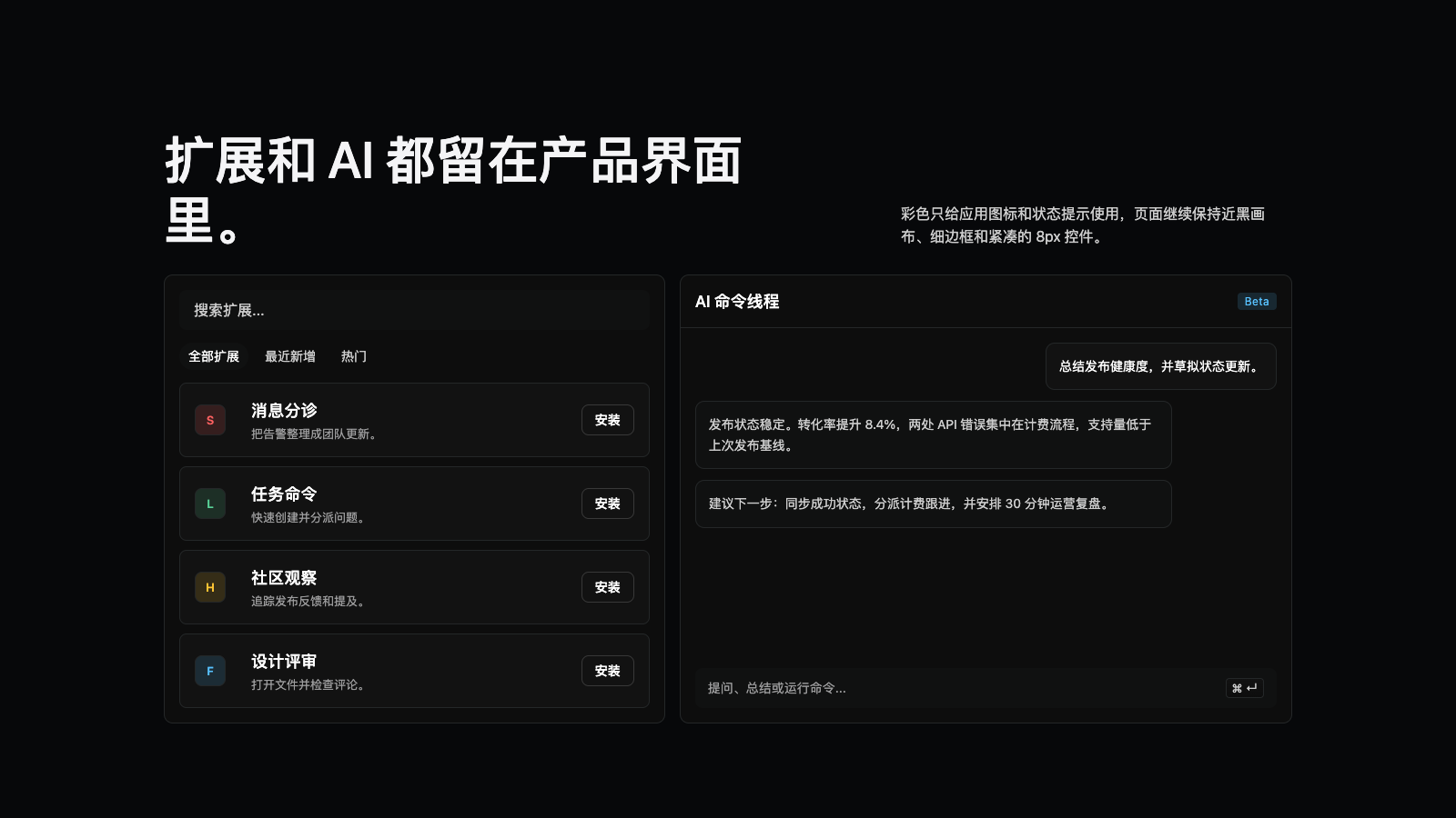
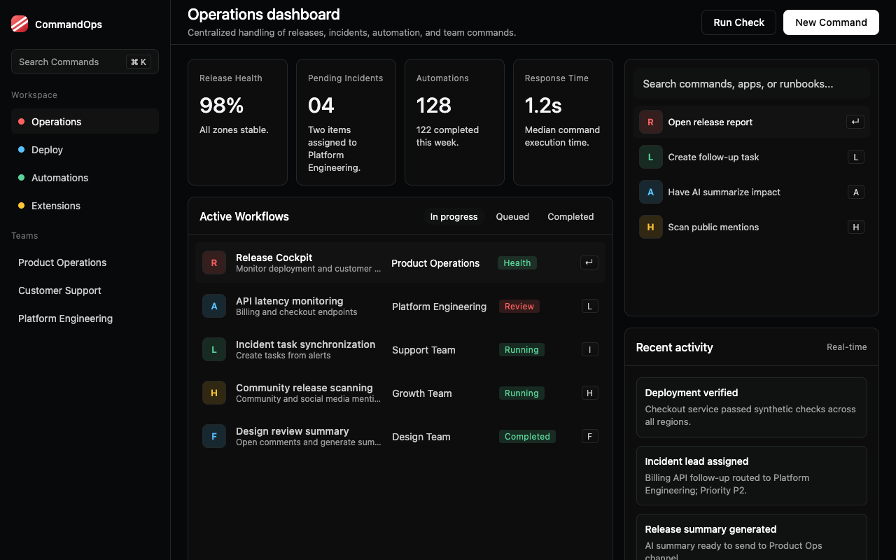
适合命令中心、自动化工具和开发者工作台,连续暗色画布、命令面板和白色 CTA 营造高效克制感。
设计语言样张
近黑画布贯穿全页,命令面板、列表和扩展卡就是主要视觉。
---
version: alpha
name: "Raycast"
description: "Raycast 的 DESIGN.md 中文参考模板,保留原始 design token 与专业术语,覆盖 color system、typography、layout、components、motion 与 interaction states。"
language: zh-CN
sourceLanguage: en
---

## 概览
Raycast 的 marketing site 像一张延展成页面的 product screenshot。Chrome 本身就是放大到 marketing scale 的 in-product command palette:pure near-black canvas(`{colors.canvas}` - `#07080a`)、hairline 1px border(`{colors.hairline}` - `#242728`)、command-palette-style card、6-16px 的圆角、Inter typography,并在全站启用 **ss03 stylistic set**。这个单一字符替换(alternate `g`)给 Raycast typography 带来微妙但可识别的品牌差异。一个 white CTA pill 锚定所有 primary action,少量饱和 accent 只保留给 category illustration。

系统几乎只有一个 surface mode:dark。它通过微弱的四级 surface ladder(`{colors.canvas}` -> `{colors.surface}` -> `{colors.surface-elevated}` -> `{colors.surface-card}`)承载 card、in-card panel 与 key-cap glyph background。最具标识性的装饰是 home page hero 顶部的 **red diagonal-stripe gradient band**,作为 launch-banner motif 位于 headline 后方;这是 saturated red 唯一出现在 chrome 上的地方。除此之外,chrome 中的 color 只用于 extension 与 feature illustration 内的 category accent,例如 Hacker News yellow、Slack red、Linear green、info blue。

设计哲学是 "the marketing page is the product"。区块 rhythm 宽松(`{spacing.section}` 96px),但页面从不打破 tonal continuity:整站处于连续 dark mode,full-bleed product UI screenshot 展示真实 Raycast command palette / store / AI chat surface,typography ligature settings(`ss03`)继承自 in-product app 的 文本 rendering。

**Key Characteristics:**
- Single dark surface mode,四级 surface ladder:`{colors.canvas}` (#07080a) -> `{colors.surface}` (#0d0d0d) -> `{colors.surface-elevated}` (#101111) -> `{colors.surface-card}` (#121212)。
- White CTA pill(`{colors.primary}` - #ffffff)是 universal primary action,其余 chrome 保持 monochrome dark。
- Inter typography 全站启用 `font-feature-settings: "calt", "kern", "liga", "ss03"`;ss03 alternate `g` 是 brand voice 的一部分。
- Hairline 1px border(`{colors.hairline}` - #242728)承载所有 card edge;系统没有 drop shadow。
- Multi-radius vocabulary:`{rounded.sm}` (6px) 用于 keycap,`{rounded.md}` (8px) 用于 button / small card,`{rounded.lg}` (10px) 用于 feature card,`{rounded.xl}` (16px) 用于 hero command-palette mockup container。
- Saturated category accent 只出现在 extension tile imagery 中,绝不用于 chrome。
- Signature red diagonal-stripe gradient band 位于 hero 顶部,每页最多使用一次。

## Colors

> **Source pages:** `/`、`/store`、`/core-features/ai`、`/pricing`、`/thomas/hacker-news`。五个页面的 chrome palette 一致:dark surface ladder、hairline border、white CTA 与 ss03 typography 在所有页面保持相同。

### Brand & Accent
- **White** (`{colors.primary}` - `#ffffff`): universal primary CTA pill background。用于 "Download"、"Install Extension"、"Get Pro" 等 primary action。
- **White Pressed** (`{colors.primary-pressed}` - `#e8e8e8`): primary pill pressed-state,比 white 暗一档。
- **On Primary** (`{colors.on-primary}` - `#000000`): white CTA 上的 pure black text,是系统中 black 文本 唯一出现的位置。

### Surface
- **Canvas** (`{colors.canvas}` - `#07080a`): dominant near-black page background。
- **Surface** (`{colors.surface}` - `#0d0d0d`): card 与 elevated panel background,比 canvas 亮一档。
- **Surface Elevated** (`{colors.surface-elevated}` - `#101111`): button-tertiary fill、text-input fill、store-search-bar fill、pill-tab-active fill。
- **Surface Card** (`{colors.surface-card}` - `#121212`): app-icon-tile background、keycap fill、command-palette row active background。
- **按钮 FG (in-card)** (`{colors.button-fg}` - `#18191a`): featured pricing tier card 内的 rare deep-card variant。
- **Hairline** (`{colors.hairline}` - `#242728`): universal 1px card border。
- **Hairline Soft** (`{colors.hairline-soft}` - `rgba(255,255,255,0.08)`): translucent overlay 上更轻的 border。
- **Hairline Strong** (`{colors.hairline-strong}` - `rgba(255,255,255,0.16)`): regular hairline 过弱时使用的 stronger divider。

### Text
- **Ink** (`{colors.ink}` - `#f4f4f6`): dark canvas 上的 primary headline,略 off-white。
- **Body** (`{colors.body}` - `#cdcdcd`): default paragraph 与 inline-link color。
- **Charcoal** (`{colors.charcoal}` - `#d3d3d4`): body 太软时使用的稍亮 text。
- **Mute** (`{colors.mute}` - `#9c9c9d`): metadata、footer link、secondary caption。
- **Ash** (`{colors.ash}` - `#6a6b6c`): disabled-state 文本 与 lowest-emphasis utility。
- **Stone** (`{colors.stone}` - `#434345`): least-emphasis caption 与 disabled icon color。
- **On Dark** (`{colors.on-dark}` - `#ffffff`): interactive-state primary text。
- **On Dark Mute** (`{colors.on-dark-mute}` - `rgba(255,255,255,0.72)`): dark surface 上的 translucent secondary text。

### Semantic Colors
- **Accent Blue** (`{colors.accent-blue}` - `#57c1ff`) + **Soft** (`{colors.accent-blue-soft}` - `rgba(87,193,255,0.15)`): info badge 与 feature illustration。
- **Accent Red** (`{colors.accent-red}` - `#ff6161`) + **Soft** (`{colors.accent-red-soft}` - `rgba(255,97,97,0.15)`): destructive/error indicator 与 Slack/Apple category accent。
- **Accent Green** (`{colors.accent-green}` - `#59d499`) + **Soft** (`{colors.accent-green-soft}` - `rgba(89,212,153,0.15)`): success state 与 productivity category accent。
- **Accent Yellow** (`{colors.accent-yellow}` - `#ffc533`) + **Soft** (`{colors.accent-yellow-soft}` - `rgba(255,197,51,0.15)`): warning semantic 与 Hacker News orange-yellow。

### Brand Gradient
- **英雄区 Stripe Gradient**:home page hero 顶部三条 diagonal red stripe,从 `{colors.hero-stripe-start}` (`#ff5757`) 到 `{colors.hero-stripe-end}` (`#a1131a`) 渐隐。它是 chrome 上唯一 chromatic gradient,每页最多一次。
- **Keycap Gradient**:key-glyph 背景 使用 `{colors.key-bg-start}` (`#121212`) 到 `{colors.key-bg-end}` (`#0d0d0d`) 的 subtle linear-gradient,形成轻微 3D-key feel。

## Typography

### Font Family
**Inter** 是系统 primary face,并加载 `Inter Fallback` system fallback variant。Raycast 关键地在全站启用 `font-feature-settings: "calt", "kern", "liga", "ss03"`;**ss03 stylistic set** 将 Inter 的 `g` 替换为 single-story open `g`,是品牌 signature typographic detail。Standard ligature(`liga`)、kerning(`kern`)与 contextual alternate(`calt`)也开启。Display tier 额外启用 `ss02` 与 `ss08` 并禁用 standard `liga`,用于渲染 hero "Raycast Pro" wordmark 的几何构造。

Marketing page 除 inline `<code>` chip 外不使用 monospace;整体都用 Inter。

### Hierarchy

| Token | Size | Weight | Line Height | Letter Spacing | 用途 |
|---|---|---|---|---|---|
| `{typography.display-xl}` | 64px | 600 | 1.1 | 0 | 英雄区 headline,带 `liga: 0`, `ss02`, `ss08` |
| `{typography.display-lg}` | 56px | 500 | 1.17 | 0.2px | 区块 headline、store hero |
| `{typography.heading-xl}` | 24px | 500 | 1.6 | 0.2px | Sub-section heading、pricing-tier name |
| `{typography.heading-lg}` | 22px | 500 | 1.15 | 0 | Mid-section feature heading |
| `{typography.heading-md}` | 20px | 500 | 1.4 | 0.2px | 卡片 group title、in-card heading |
| `{typography.heading-sm}` | 18px | 500 | 1.4 | 0.2px | Small heading、extension card title |
| `{typography.body-lg}` | 18px | 400 | 1.6 | 0 | Pricing tier description、hero subtitle |
| `{typography.body-md}` | 16px | 400 | 1.6 | 0 | Default body、paragraph 文本 |
| `{typography.body-strong}` | 16px | 500 | 1.4 | 0.2px | Inline emphasis、primary nav link |
| `{typography.body-sm}` | 14px | 400 | 1.6 | 0 | 卡片 description、secondary copy |
| `{typography.body-sm-strong}` | 14px | 500 | 1.6 | 0.2px | In-card label、table-header 文本 |
| `{typography.caption-md}` | 13px | 400 | 1.4 | 0.1px | Caption、metadata |
| `{typography.caption-sm}` | 12px | 400 | 1.5 | 0.4px | Small utility text、badge label |
| `{typography.link-md}` | 16px | 500 | 1.4 | 0.3px | Inline body anchor link |
| `{typography.button-md}` | 14px | 500 | 1.6 | 0.2px | Standard button label |

### Principles
Hierarchy 在 body 上使用 1.6 line-高度 ladder,在 display/heading 上使用 1.1-1.4 ladder。Letter-spacing 稳定为 positive(0.1-0.4px),让 dark canvas 中的 chrome 在 body size 上仍有空气感。`ss03` 是最有辨识度的 typography detail;没有它,body face 会像默认 Inter,失去 Raycast signature rendering。

### Font Substitutes
Inter 是开源并可从 Google Fonts 加载,应直接使用。为保留品牌外观,必须在 body element 上启用 `font-feature-settings: "calt", "kern", "liga", "ss03"`。若无法加载 Inter,fallback 为 `Inter Fallback` -> `system-ui`。需要 inline code chip 时可用 **JetBrains Mono** 或 **Geist Mono**。

## Layout

### Spacing System
- **Base unit:** 8px,并有 2/4/12px 用于 tight inline gap。
- **Tokens:** `{spacing.xxs}` (2px) · `{spacing.xs}` (4px) · `{spacing.sm}` (8px) · `{spacing.md}` (12px) · `{spacing.lg}` (16px) · `{spacing.xl}` (24px) · `{spacing.xxl}` (32px) · `{spacing.section}` (96px)。
- **Universal section rhythm:** major content block 之间使用 `{spacing.section}` (96px)。卡片 grid 使用 `{spacing.lg}` (16px) gutter;feature card internal 内距 为 `{spacing.xl}` (24px),store extension card 为 `{spacing.lg}` (16px)。

### Grid & Container
- **Max width:** desktop content area 约 1240px,gutter 24px,ultrawide 约 48px。英雄区 command-palette mockup 更宽(约 1080px),page 背景 full-bleed。
- **Store extension grid:** desktop 2-up,mobile 1-up;每个 card 横向布局,左侧 large square app icon,右侧 copy + Install button。
- **Pricing tier grid:** desktop 3-up(Free / Pro / Pro+Advanced AI),mobile 1-up。
- **Featured extension card grid:** store page 顶部 "Featured" row 为 desktop 3-up。
- **Comparison table:** pricing page tier card 下方 full-width 5-column table。
- **Footer:** desktop 6-column link grid,tablet 2-up,mobile 1-up。

### Whitespace Philosophy
Whitespace 宽松,canvas 不被打断。区块 间距 96px,中间没有 decorative divider;dark canvas 从 hero 连续延伸到 footer。区块 内 copy 左对齐并保持紧凑 column,command-palette mockup imagery 通常占 home feature row 右侧 50-60%。Signature red stripe gradient 只出现在首个 hero band;第二个 section 之后页面保持 monochrome dark。

## Elevation & Depth

| Level | Treatment | 用途 |
|---|---|---|
| 0 - Flat | No border, no shadow | Canvas-on-canvas block、hero text、footer body |
| 1 - Hairline 边框 | 1px solid `{colors.hairline}` | `{colors.surface}` 上所有 card、store extension card、pricing tier card |
| 2 - Hairline strong | 1px solid `{colors.hairline-strong}` | Inline divider、comparison table row separator |
| 3 - Surface ladder elevation | `{colors.canvas}` -> `{colors.surface}` -> `{colors.surface-elevated}` -> `{colors.surface-card}` | 用 background-color ladder 创建无 shadow elevation |

系统完全没有 drop-shadow elevation。Depth 只由 dark scale 上逐级变亮的 surface color 构成,每一档更亮都读作离用户更近。

### Decorative Depth
- **英雄区 stripe gradient**:三条 diagonal red stripe(`{colors.hero-stripe-start}` -> `{colors.hero-stripe-end}`)叠在 home hero band 上,形成 launch-banner / motion-blur 感,是 signature decorative moment。
- **Command-palette mockups**:全保真 Raycast in-product UI screenshot(Spotlight-style overlay、圆角 keycap、command row、accent glyph)位于 hero 与 feature row 中,是真正的品牌装饰。
- **App icon tiles**:48-64px rounded-corner tile 展示真实 app icon(Slack、Spotify、Figma、Notion、Linear、Hacker News)。
- **Keycap glyphs**:inline keyboard shortcut 使用 subtle gradient-filled 圆角 keycap(如 `⌘ K`),模拟 physical key surface。

## Shapes

### Border Radius Scale

| Token | Value | 用途 |
|---|---|---|
| `{rounded.none}` | 0px | 英雄区 band、primary nav、footer、full-bleed surface |
| `{rounded.xs}` | 4px | Keycap glyph、badge-pro chip、small inline tag |
| `{rounded.sm}` | 6px | Command-palette row、inline button、micro chip |
| `{rounded.md}` | 8px | Standard button、文本 input、store search bar、app-icon tile、store extension card |
| `{rounded.lg}` | 10px | Feature card、command-palette mockup card、pricing tier card |
| `{rounded.xl}` | 16px | Large hero command-palette mockup container、oversized feature panel |
| `{rounded.full}` | 9999px | Pill-tab chip、avatar circle |

Radius vocabulary 集中在 4-16px,多数 chrome 位于 6-10px。卡片 从不完全 flat,也不超过 16px,除 fully-圆角 pill 外。

### Photography Geometry
没有传统 photography。Visual element 限于:
- **Command-palette mockups**:full-fidelity Raycast UI screenshot,16:9 或 4:3,位于 `{rounded.xl}` container。
- **App icon tiles**:48-64px square,`{rounded.md}` (8px),展示真实 app icon。
- **Avatar circles**:32-40px,`{rounded.full}`,用于 author attribution。
- **英雄区 stripe gradient**:full-bleed wash,无 aspect ratio。

## Components

> 按 system policy 不记录 hover state。每个 spec 只覆盖 Default 与 Active/Pressed。

### Buttons

**`button-primary`** — universal Raycast CTA。
- 背景 `{colors.primary}` (white),文本 `{colors.on-primary}` (black),字体 `{typography.button-md}`,内距 `8px 16px`,高度 约 36px,圆角 `{rounded.md}`。
- 用于 "Download"、"Get Pro"、"Install" 等所有 primary action。
- 按下状态 `button-primary-pressed` 将 背景 降到 `{colors.primary-pressed}`。

**`button-secondary`** — transparent 文本 button。
- 背景 transparent,文本 `{colors.on-dark}`,字体 `{typography.button-md}`,内距 `8px 16px`,高度 约 36px,圆角 `{rounded.md}`。
- 用于 "Sign in"、"Learn more ->"、"View on GitHub" 等低强调 action。

**`button-tertiary`** — soft surface button。
- 背景 `{colors.surface-elevated}`,文本 `{colors.on-dark}`,字体 `{typography.button-md}`,内距 `8px 16px`,高度 约 36px,圆角 `{rounded.md}`。
- 用于 card 内的 "Watch demo"、"View extension"、"Manage"。

**`button-disabled`**
- 背景 `{colors.surface-elevated}`,文本 `{colors.ash}`。

**`install-button`**
- 背景 transparent,1px solid `{colors.hairline-strong}` border,文本 `{colors.on-dark}`,字体 `{typography.button-md}`,内距 `6px 14px`,圆角 `{rounded.md}`。
- 位于 store extension card 右侧,label 为 "Install Extension"。

### Filter & Tab Chips

**`pill-tab`** + **`pill-tab-active`**
- 默认: transparent background,文本 `{colors.body}`,字体 `{typography.body-sm}`,内距 `4px 10px`,圆角 `{rounded.full}`。
- 激活: 背景 `{colors.surface-elevated}`,文本 `{colors.on-dark}`,chip 通过上升一个 surface notch 表示 active。

**`badge-pro`**
- 背景 `{colors.surface-elevated}`,文本 `{colors.on-dark-mute}`,字体 `{typography.caption-sm}`,内距 `2px 6px`,圆角 `{rounded.xs}`。
- 用于 pricing tier card 内的 "Pro" / "Pro+" / "Free" tier indicator。

**`badge-info-soft`**
- 背景 `{colors.accent-blue-soft}`,文本 `{colors.accent-blue}`,字体 `{typography.caption-sm}`,内距 `2px 8px`,圆角 `{rounded.xs}`。
- 少量用于 "New" / "Beta" inline tag。

### Inputs & Forms

**`text-input`** + **`text-input-focused`**
- 默认: 背景 `{colors.surface-elevated}`,文本 `{colors.on-dark}`,1px solid `{colors.hairline}`,字体 `{typography.body-md}`,内距 `8px 12px`,高度 约 36px,圆角 `{rounded.md}`。
- 聚焦: surface 不变;边框 变为 `{colors.hairline-strong}`,通过轻微变亮而不是 colored ring 表示 focus。

**`store-search-bar`**
- 背景 `{colors.surface-elevated}`,文本 `{colors.on-dark}`,字体 `{typography.body-md}`,内距 `10px 16px`,高度 约 44px,圆角 `{rounded.md}`。
- 位于 store page hero 顶部,左侧 magnifier icon,placeholder 为 "Search the store..."。

### Cards & Containers

**`command-palette-card`**
- 容器: 背景 `{colors.surface}`,1px solid `{colors.hairline}`,内距 0,圆角 `{rounded.lg}` 或 `{rounded.xl}`。
- 布局: 顶部 macOS traffic-light dots + search input row,body 为 `{component.command-palette-row}` stack,bottom-right 为 keycap hint cluster。

**`command-palette-row`** + **`command-palette-row-active`**
- 默认: transparent background,文本 `{colors.on-dark}` in `{typography.body-md}`,内距 `6px 10px`,圆角 `{rounded.sm}`。
- 激活: 背景 `{colors.surface-card}`,比 surrounding palette card 亮一档。
- 每行包含 app-icon tile + label + 右侧 optional keycap shortcut。

**`feature-card-dark`**
- 容器: 背景 `{colors.surface}`,1px solid `{colors.hairline}`,内距 `{spacing.xl}`,圆角 `{rounded.lg}`。
- 用于 home 与 feature page 的 2-up / 3-up grid,配 product mockup 或 app-icon row 与 `{component.button-secondary}`。

**`feature-card-elevated`**
- Chrome 同 `feature-card-dark`,但 背景 切到 `{colors.surface-elevated}`,用于 alternating feature row 中打破 visual rhythm。

**`store-extension-card`**
- 容器: 背景 `{colors.surface}`,1px solid `{colors.hairline}`,内距 `{spacing.lg}`,圆角 `{rounded.md}`。
- 布局: 左侧 48px `{component.app-icon-tile}`,中间 name + by-author metadata + 1-line description,右侧 `{component.install-button}`。

**`pricing-tier-card`**
- 容器: 背景 `{colors.surface}`,1px solid `{colors.hairline}`,内距 `{spacing.xl}`,圆角 `{rounded.lg}`。
- 布局: tier name `{typography.heading-xl}`,price 使用较大 `{typography.display-lg}` numeric,description `{typography.body-lg}`,CTA 为 `{component.button-primary}` 或 free tier 的 `{component.button-secondary}`,feature checklist 使用 `✓` glyph。

**`pricing-tier-card-featured`**
- Chrome 相同,但 背景 切到 `{colors.surface-elevated}`,这是中间 "Pro" featured tier 与周围 card 的唯一视觉区别。

**`hero-stripe-band`**
- 背景 `{colors.canvas}`,顶部半区叠三条 diagonal red stripe(`{colors.hero-stripe-start}` -> `{colors.hero-stripe-end}`)。
- Padding `{spacing.section}` 96px vertical / 48px horizontal,圆角 `{rounded.none}`。
- 承载 hero headline `{typography.display-xl}` 与单个 `{component.button-primary}` "Download" CTA。

### Decorative

**`app-icon-tile`**
- 背景 `{colors.surface-card}`,内距 0,圆角 `{rounded.md}`,size 48x48。
- 用于 command-palette row 与 store extension card。

**`app-icon-tile-large`**
- 同上但为 64x64,用于 featured store card 与 home hero illustration row。

**`keycap`**
- 背景 `{colors.surface-card}`,带 `{colors.key-bg-start}` -> `{colors.key-bg-end}` subtle linear gradient,文本 `{colors.body}` in `{typography.caption-md}`,内距 `1px 6px`,高度 约 20px,圆角 `{rounded.xs}`。
- Inline 渲染 shortcut hint,如 `⌘ K`、`⏎`、`Esc`,是 flat dark canvas 上的 signature physical-key feel。

### 导航

**`primary-nav`**
- 背景 `{colors.canvas}`,文本 `{colors.on-dark}`,高度 约 56px,字体 `{typography.body-sm-strong}`,圆角 `{rounded.none}`,底部 1px `{colors.hairline}` rule。
- Desktop layout: 左侧 Raycast wordmark,中间 nav cluster,右侧 Sign in link + white `{component.button-primary}` "Download" CTA pill。

**Top Nav (Mobile)**
- 左侧 hamburger,中央 Raycast wordmark,右侧 "Download" white CTA pill。Primary nav 折叠为从左侧滑入的 full-screen drawer。

### Footer

**`footer-section`**
- 背景 `{colors.canvas}`,文本 `{colors.body}` in `{typography.body-sm}`,内距 `64px 48px`,顶部 1px `{colors.hairline}` rule。
- 布局: 6-column link grid,column header 使用 `{typography.body-sm-strong}` `{colors.on-dark}`,link list 使用 `{typography.body-sm}` `{colors.body}`。
- Bottom row: 小 Raycast wordmark + subscribe newsletter input,右侧 `{component.button-primary}` "Subscribe"。
- 页脚 顶部有 faint red stripe-gradient repeat,是 hero diagonal stripe motif 的更小回声。

### Inline Elements

**`link-inline`**
- Body-prose anchor link 使用 `{colors.on-dark}` text,默认无 underline,focus 时 underline。Inline link 用 full-white 而不是 tinted accent,以保持 dark canvas tonally pure。

## 使用建议与禁忌

### 应该
- 整站渲染为连续 dark mode;系统没有 light variant。
- 所有 primary CTA 使用 `{colors.primary}` white pill;没有第二 primary color。
- Elevation 通过 surface-color ladder(`{colors.canvas}` -> `{colors.surface}` -> `{colors.surface-elevated}` -> `{colors.surface-card}`)建立,不用 drop shadow。
- 在 body element 上启用 `font-feature-settings: "calt", "kern", "liga", "ss03"`;ss03 alternate `g` 是 brand identity。
- 英雄区 的 load-bearing visual 使用真实 `{component.command-palette-card}` mockup。真实 Raycast UI 就是品牌。
- 用 `{component.keycap}` glyph 表示 keyboard shortcut;`{colors.key-bg-start}` -> `{colors.key-bg-end}` subtle gradient 是唯一 depth decoration。
- `{colors.hero-stripe-start}` -> `{colors.hero-stripe-end}` red gradient 每页只用于 hero band 一次。
- Saturated category accent 只用于 extension / feature illustration,不用于 chrome button 或 text。

### 不要
- 不要引入 light mode;系统设计上 dark-only。
- 不要给 card 添加 drop shadow;elevation 来自 surface ladder。
- 不要用 tinted accent 替换 `{colors.primary}` white primary CTA。
- 不要把 saturated accent color 用在 text、button 或 chrome surface;它们属于 extension illustration。
- 不要在 top hero band 之外重复 hero stripe gradient。
- 不要在未启用 `ss03` 的情况下使用 Inter,否则 chrome 会失去 signature voice。
- 不要给 card 全边使用 32px+ padding;系统 in-card 内距 主要为 16-24px。

## Responsive Behavior

### Breakpoints

| Name | Width | Key Changes |
|---|---|---|
| ultrawide | 1920px+ | Content max-width 保持 1240px;outer gutter 增至约 80px |
| desktop-large | 1440px | 默认 3-up pricing grid、2-up store extension grid |
| desktop | 1280px | 同 layout,但 outer gutter 更窄 |
| desktop-small | 1024px | 3-up pricing 收为 2+1;primary nav 保持 horizontal |
| tablet | 768px | Pricing 1-up stacked;primary nav 变为 hamburger drawer |
| mobile | 480px | 全部单列;hero `{typography.display-xl}` 从 64px 缩到约 36px |
| mobile-narrow | 320px | 区块 内距 收紧到 48px |

### Touch Targets
所有 interactive element 满足 WCAG AA 36px+。`{component.button-primary}` 与 `{component.button-tertiary}` 高 36px;`{component.text-input}` 高 36px;`{component.store-search-bar}` 高 44px(高于 AAA);`{component.pill-tab}` 约 24-28px 高,通过 10px 内距 扩展到 36-40px tappable;`{component.install-button}` 约 32px 高。

### Collapsing Strategy
- **Primary nav:** desktop horizontal cluster -> tablet 768px hamburger drawer。White "Download" CTA 全 breakpoint 保持可见。
- **英雄区 command-palette mockup:** desktop 为 left copy + right mockup 的 2-column;tablet 垂直堆叠;mobile mockup 缩到约 80% width。
- **Store extension grid:** tablet 收为 1-up。
- **Pricing tier grid:** desktop 3-up -> desktop-small 2+1 -> tablet 1-up。
- **Comparison table:** desktop full 5-column -> tablet horizontal scroll -> mobile vertical card stack。
- **Footer:** 6-up link columns -> tablet 3-up -> mobile-landscape 2-up -> mobile 1-up。
- **区块 padding:** `{spacing.section}` 96px desktop -> 64px tablet -> 48px mobile。
- **英雄区 headline:** `{typography.display-xl}` 64px desktop,按 56px / 44px / 36px 下探。

### Image Behavior
系统 imagery 只包含 in-product Raycast UI screenshot 与 small app-icon asset:
- **Command-palette mockups** 随 container 流式缩放;in-product UI 本身针对 breakpoint 重渲染。
- **App-icon tiles** 在所有 breakpoint 固定 48-64px,并在窄宽度下 flexible row wrap。
- **英雄区 stripe gradient** 在所有 breakpoint 保持位于 hero band 顶部,并保持 stripe angle。

## Iteration Guide

1. 一次只聚焦 ONE component。读取其 YAML entry 并验证所有 property 可解析。
2. 直接引用 component name 与 token(`{colors.primary}`, `{component.button-primary-pressed}`, `{rounded.md}`),不要改写。
3. 修改后运行 `npx @google/design.md lint DESIGN.md`;`broken-ref`、`contrast-ratio`、`orphaned-tokens` warning 会暴露问题。
4. 新 variant 作为独立 component entry 添加(`-pressed`, `-disabled`, `-active`),不要埋在 prose 内。
5. 正文 默认 `{typography.body-md}` (16px / 400 / 1.6);emphasis 使用 `{typography.body-strong}`;`{typography.display-xl}` 严格保留给 hero band。
6. 每个 viewport 保持 `{colors.primary}` white CTA pill 稀缺,最多一个 solid white pill per fold。
7. 新增 component 前先判断是否能用现有 surface-ladder + 8px-radius + ss03-Inter vocabulary 表达。系统强项是几乎不需要新 token。

## Known Gaps

- **Mobile screenshots not captured**:responsive behavior 基于 Raycast mobile pattern(hamburger drawer、single-column grid、hero downscale)与 breakpoint stack 推断。
- **Hover states not documented**:符合 system policy。Raycast in-product app 的 command-palette row 有丰富 hover behavior,但本文不记录。
- **In-product app chrome**:真实 macOS Raycast launcher 虽在 marketing screenshot 中出现,但未作为单独 UI system 记录;本文记录 marketing site。
- **Dark mode is the only mode**:捕获 surface 中不存在 light variant。
- **Form validation states**:除 focused-input 边框 treatment 外未捕获。
- **Authenticated chrome**(account dashboard、billing settings、team management)不在捕获页面中。


