

01 / 03
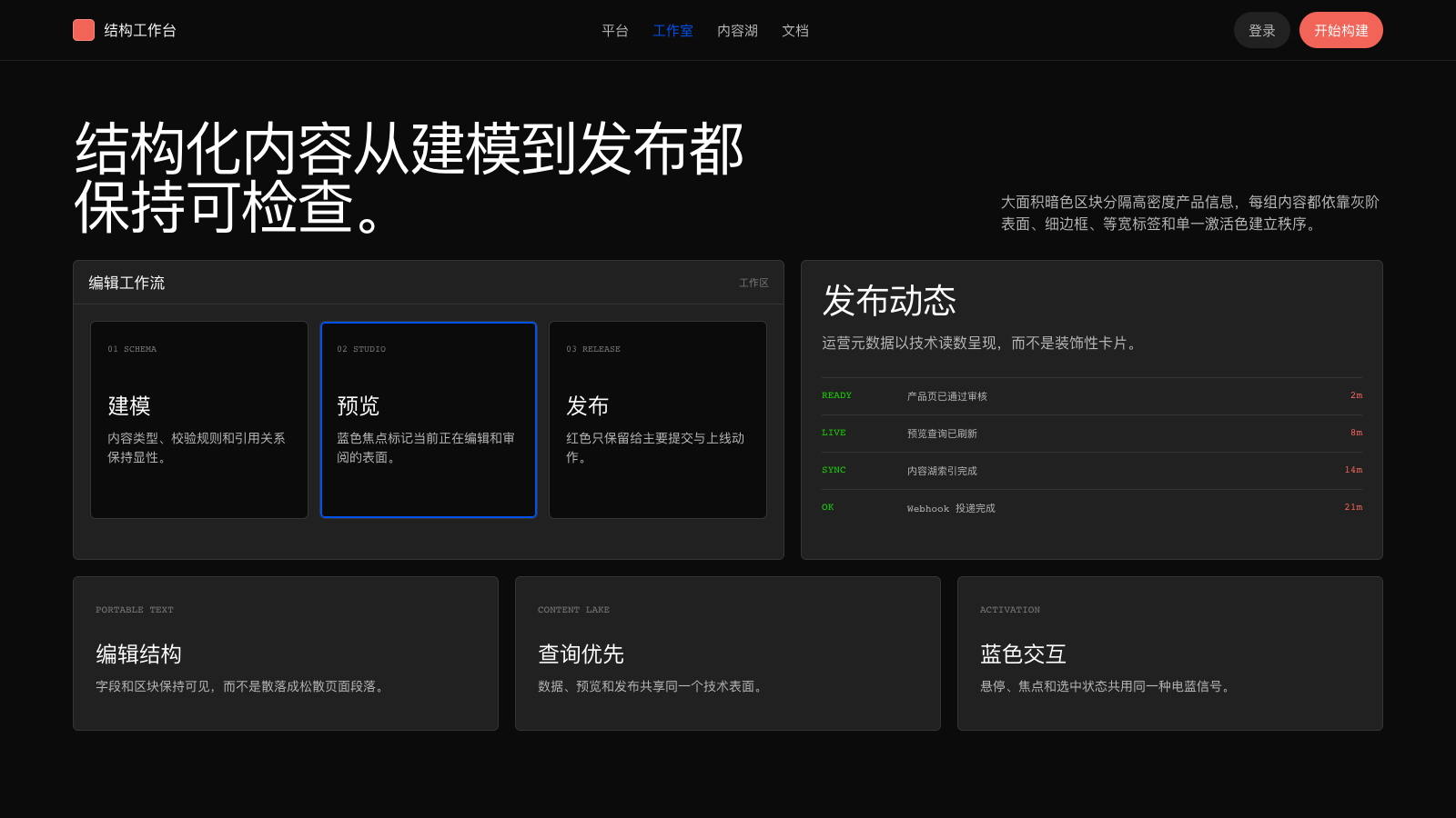
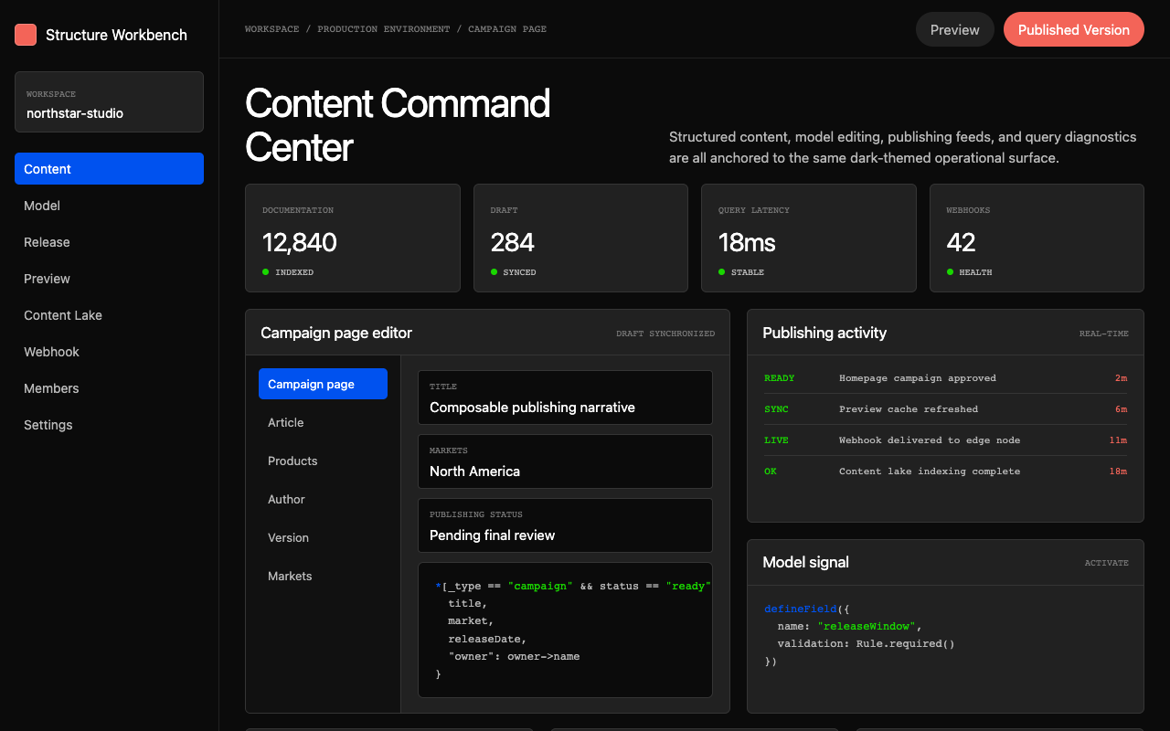

适合内容平台、CMS 和开发者工具,暗色命令中心搭配代码化标签,突出结构化内容与发布控制。
设计语言样张
defineType({ name: 'campaign', fields: [title, release] }) defineField({
name: 'releaseWindow'
}) 就绪 内容湖索引完成
---
version: alpha
name: "Sanity"
description: "Sanity 的 DESIGN.md 中文参考模板,保留原始 design token 与专业术语,覆盖 color system、typography、layout、components、motion 与 interaction states。"
language: zh-CN
sourceLanguage: en
---

# 受 Sanity 启发的设计系统

## 1. 视觉主题与氛围

Sanity 的网站像一个开发者内容平台被渲染成夜间指挥中心:深色、精确、结构感很强。整个体验建立在 near-black canvas (`#0b0b0b`) 上;它不像一个“dark mode toggle”,更像是为终端用户打造的工具本应拥有的自然状态。多数 CMS marketing pages 会选择友好的粉彩和柔和插画,而 Sanity 选择拥抱自身产品的重力:structured content 值得一个同样 structured 的舞台。

标志性的字体声音是 waldenburgNormal:一种有辨识度、略带 geometric 的 sans-serif,在 display sizes 使用紧密负 letter-spacing(-0.32px 到 -4.48px),让 headlines 具有压缩、工程化的质感。在 112px hero scale 与 -4.48px tracking 下,字体几乎像机器加工出来的精密钢制字形。它与 IBM Plex Mono 搭配,用于 code 和 technical labels,形成双声部:editorial authority 与 developer credibility 相遇。

Sanity 的独特性来自单色深色 palette 与鲜明高饱和 accent punctuation 之间的相互作用。Neutral scale 从 pure black 出发,经过严格控制的 gray ramp(`#0b0b0b` -> `#212121` -> `#353535` -> `#797979` -> `#b9b9b9` -> `#ededed` -> `#ffffff`),没有暖偏或冷偏,只有纯粹的 achromatic precision。在这个自律背景上,neon green accent(display-p3 green)与 electric blue (`#0052ef`) 像深色控制室里的信号灯一样醒目。Orange-red CTA (`#f36458`) 是这个偏冷系统中唯一的暖色触点。

**关键特征:**
- Near-black canvas (`#0b0b0b`) 是默认且自然的环境;不是 dark "mode",而是 primary identity
- waldenburgNormal 在 display sizes 使用极端 negative tracking,形成 precision-engineered typographic voice
- 纯 achromatic gray scale;没有暖或冷 undertones,只有纯中性纪律
- 深色场域上的 vivid accent punctuation:neon green、electric blue (`#0052ef`) 与 coral-red (`#f36458`)
- Pill-shaped primary buttons(99999px radius)与 secondary actions 的 subtle rounded rectangles(3-6px)形成对比
- IBM Plex Mono 作为 editorial display face 的技术对重
- Full-bleed dark sections,内容约束在经过测量的 max-width containers 中
- 所有 interactive elements 的 hover states 都转为 electric blue (`#0052ef`),形成一致的“activation”信号

## 2. 色彩调色板与角色

### Primary Brand
- **Sanity Black** (`#0b0b0b`): The primary canvas and dominant surface color. Not pure black but close enough to feel absolute. The foundation of the entire visual identity.
- **Pure Black** (`#000000`): Used for maximum-contrast moments, deep overlays, and certain border accents.
- **Sanity Red** (`#f36458`): The primary CTA and brand accent -- a warm coral-red that serves as the main call-to-action color. Used for "Get Started" buttons and primary conversion points.

### Accent & Interactive
- **Electric Blue** (`#0052ef`): The universal hover/active state color across the entire system. Buttons, links, and interactive elements all shift to this blue on hover. Also used as `--color-blue-700` for focus rings and active states.
- **Light Blue** (`#55beff` / `#afe3ff`): Secondary blue variants used for accent backgrounds, badges, and dimmed blue surfaces.
- **Neon Green** (`color(display-p3.270588 1 0)`): A vivid, wide-gamut green used as `--color-fg-accent-green` for success states and premium feature highlights. Falls back to `#19d600` in sRGB.
- **Accent Magenta** (`color(display-p3.960784 0 1)`): A vivid wide-gamut magenta for specialized accent moments.

### Surface & Background
- **Near Black** (`#0b0b0b`): Default page background and primary surface.
- **Dark Gray** (`#212121`): Elevated surface color for cards, secondary containers, input backgrounds, and subtle layering above the base canvas.
- **Medium Dark** (`#353535`): Tertiary surface and border color for creating depth between dark layers.
- **Pure White** (`#ffffff`): Used for inverted sections, light-on-dark text, and specific button surfaces.
- **Light Gray** (`#ededed`): Light surface for inverted/light sections and subtle background tints.

### Neutrals & Text
- **White** (`#ffffff`): Primary text color on dark surfaces, maximum legibility.
- **Silver** (`#b9b9b9`): Secondary text, body copy on dark surfaces, muted descriptions, and placeholder text.
- **Medium Gray** (`#797979`): Tertiary text, metadata, timestamps, and de-emphasized content.
- **Charcoal** (`#212121`): Text on light/inverted surfaces.
- **Near Black Text** (`#0b0b0b`): Primary text on white/light button surfaces.

### Semantic Colors
- **Error Red** (`#dd0000`): Destructive actions, validation errors, and critical warnings -- a pure, high-saturation red.
- **GPC Green** (`#37cd84`): Privacy/compliance indicator green.
- **Focus Ring Blue** (`#0052ef`): Focus ring color for accessibility, matching the interactive blue.

### Border System
- **Dark Border** (`#0b0b0b`): Primary border on dark containers -- barely visible, maintaining minimal containment.
- **Subtle Border** (`#212121`): Standard border for inputs, textareas, and card edges on dark surfaces.
- **Medium Border** (`#353535`): More visible borders for emphasized containment and dividers.
- **Light Border** (`#ffffff`): Border on inverted/light elements or buttons needing contrast separation.
- **Orange Border** (`color(display-p3 1 0.3333 0)`): Special accent border for highlighted/featured elements.

## 3. 字体规则

### Font Family
- **Display / Headline**: `waldenburgNormal`, fallback: `waldenburgNormal Fallback, ui-sans-serif, system-ui`
- **Body / UI**: `waldenburgNormal`, fallback: `waldenburgNormal Fallback, ui-sans-serif, system-ui`
- **Code / Technical**: `IBM Plex Mono`, fallback: `ibmPlexMono Fallback, ui-monospace`
- **Fallback / CJK**: `Helvetica`, fallback: `Arial, Hiragino Sans GB, STXihei, Microsoft YaHei, WenQuanYi Micro Hei`

*Note: waldenburgNormal is a custom typeface. For external implementations, use Inter or Space Grotesk as the sans substitute (geometric, slightly condensed feel). IBM Plex Mono is available on Google Fonts.*

### Hierarchy

| Role | Font | Size | Weight | Line Height | Letter Spacing | Notes |
|------|------|------|--------|-------------|----------------|-------|
| Display / Hero | waldenburgNormal | 112px (7rem) | 400 | 1.00 (tight) | -4.48px | Maximum impact, compressed tracking |
| Hero Secondary | waldenburgNormal | 72px (4.5rem) | 400 | 1.05 (tight) | -2.88px | Large section headers |
| Section Heading | waldenburgNormal | 48px (3rem) | 400 | 1.08 (tight) | -1.68px | Primary section anchors |
| Heading Large | waldenburgNormal | 38px (2.38rem) | 400 | 1.10 (tight) | -1.14px | Feature section titles |
| Heading Medium | waldenburgNormal | 32px (2rem) | 425 | 1.24 (tight) | -0.32px | Card titles, subsection headers |
| Heading Small | waldenburgNormal | 24px (1.5rem) | 425 | 1.24 (tight) | -0.24px | Smaller feature headings |
| Subheading | waldenburgNormal | 20px (1.25rem) | 425 | 1.13 (tight) | -0.2px | Sub-section markers |
| Body Large | waldenburgNormal | 18px (1.13rem) | 400 | 1.50 | -0.18px | Intro paragraphs, descriptions |
| Body | waldenburgNormal | 16px (1rem) | 400 | 1.50 | normal | Standard body text |
| Body Small | waldenburgNormal | 15px (0.94rem) | 400 | 1.50 | -0.15px | Compact body text |
| Caption | waldenburgNormal | 13px (0.81rem) | 400-500 | 1.30-1.50 | -0.13px | Metadata, descriptions, tags |
| Small Caption | waldenburgNormal | 12px (0.75rem) | 400 | 1.50 | -0.12px | Footnotes, timestamps |
| Micro / Label | waldenburgNormal | 11px (0.69rem) | 500-600 | 1.00-1.50 | normal | Uppercase labels, tiny badges |
| Code Body | IBM Plex Mono | 15px (0.94rem) | 400 | 1.50 | normal | Code blocks, technical content |
| Code Caption | IBM Plex Mono | 13px (0.81rem) | 400-500 | 1.30-1.50 | normal | Inline code, small technical labels |
| Code Micro | IBM Plex Mono | 10-12px | 400 | 1.30-1.50 | normal | Tiny code labels, uppercase tags |

### 原则
- **大尺寸使用极端 negative tracking**:72px+ display headings 使用激进负 letter-spacing(-2.88px 到 -4.48px),形成紧密、工程化的质感,使 Sanity 区别于更松散的 editorial typography。
- **单一字体,多种语域**:waldenburgNormal 同时处理 editorial display 与 functional UI text。Weight range 很窄(多数为 400-425,只有 tiny labels 使用 500-600),以保持声音一致。
- **OpenType feature control**:Typography 有意识地使用 feature settings,包括 display sizes 的 `"cv01", "cv11", "cv12", "cv13", "ss07"` 与 body text 的 `"calt" 0`,针对不同语境微调字形替代。
- **紧标题、松正文**:Headings 使用 1.00-1.24 line-height(极紧),body text 在 1.50 呼吸。这种对比建立清晰 visual hierarchy。
- **Technical labels 使用 uppercase**:IBM Plex Mono captions 与 small labels 经常使用 `text-transform: uppercase` 和紧 line-heights,为 technical metadata 创造“system readout”质感。

## 4. 组件样式

### Buttons

**Primary CTA (Pill)**
- Background: Sanity Red (`#f36458`)
- Text: White (`#ffffff`)
- Padding: 8px 16px
- Border Radius: 99999px (full pill)
- Border: none
- Hover: Electric Blue (`#0052ef`) background, white text
- Font: 16px waldenburgNormal, weight 400

**Secondary (Dark Pill)**
- Background: Near Black (`#0b0b0b`)
- Text: Silver (`#b9b9b9`)
- Padding: 8px 12px
- Border Radius: 99999px (full pill)
- Border: none
- Hover: Electric Blue (`#0052ef`) background, white text

**Outlined (Light Pill)**
- Background: White (`#ffffff`)
- Text: Near Black (`#0b0b0b`)
- Padding: 8px
- Border Radius: 99999px (full pill)
- Border: 1px solid `#0b0b0b`
- Hover: Electric Blue (`#0052ef`) background, white text

**Ghost / Subtle**
- Background: Dark Gray (`#212121`)
- Text: Silver (`#b9b9b9`)
- Padding: 0px 12px
- Border Radius: 5px
- Border: 1px solid `#212121`
- Hover: Electric Blue (`#0052ef`) background, white text

**Uppercase Label Button**
- Font: 11px waldenburgNormal, weight 600, uppercase
- Background: transparent or `#212121`
- Text: Silver (`#b9b9b9`)
- Letter-spacing: normal
- Used for tab-like navigation and filter controls

### Cards

**Dark Content Card**
- Background: `#212121`
- Border: 1px solid `#353535` or `#212121`
- Border Radius: 6px
- Padding: 24px
- Text: White (`#ffffff`) for titles, Silver (`#b9b9b9`) for body
- Hover: subtle border color shift or elevation change

**Feature Card (Full-bleed)**
- Background: `#0b0b0b` or full-bleed image/gradient
- Border: none or 1px solid `#212121`
- Border Radius: 12px
- Padding: 32-48px
- Contains large imagery with overlaid text

### Inputs

**Text Input / Textarea**
- Background: Near Black (`#0b0b0b`)
- Text: Silver (`#b9b9b9`)
- Border: 1px solid `#212121`
- Padding: 8px 12px
- Border Radius: 3px
- Focus: outline with `var(--focus-ring-color)` (blue), 2px solid
- Focus background: shifts to deep cyan (`#072227`)

**Search Input**
- Background: `#0b0b0b`
- Text: Silver (`#b9b9b9`)
- Padding: 0px 12px
- Border Radius: 3px
- Placeholder: Medium Gray (`#797979`)

### Navigation

**Top Navigation**
- Background: Near Black (`#0b0b0b`) with backdrop blur
- Height: auto, compact padding
- Logo: left-aligned, Sanity wordmark
- Links: waldenburgNormal 16px, Silver (`#b9b9b9`)
- Link Hover: Electric Blue via `--color-fg-accent-blue`
- CTA Button: Sanity Red pill button right-aligned
- Separator: 1px border-bottom `#212121`

**Footer**
- Background: Near Black (`#0b0b0b`)
- Multi-column link layout
- Links: Silver (`#b9b9b9`), hover to blue
- Section headers: White (`#ffffff`), 13px uppercase IBM Plex Mono

### Badges / Pills

**Neutral Subtle**
- Background: White (`#ffffff`)
- Text: Near Black (`#0b0b0b`)
- Padding: 8px
- Font: 13px
- Border Radius: 99999px

**Neutral Filled**
- Background: Near Black (`#0b0b0b`)
- Text: White (`#ffffff`)
- Padding: 8px
- Font: 13px
- Border Radius: 99999px

## 5. 布局原则

### Spacing System
Base unit: **8px**

| Token | Value | Usage |
|-------|-------|-------|
| space-1 | 1px | Hairline gaps, border-like spacing |
| space-2 | 2px | Minimal internal padding |
| space-3 | 4px | Tight component internal spacing |
| space-4 | 6px | Small element gaps |
| space-5 | 8px | Base unit -- button padding, input padding, badge padding |
| space-6 | 12px | Standard component gap, button horizontal padding |
| space-7 | 16px | Section internal padding, card spacing |
| space-8 | 24px | Large component padding, card internal spacing |
| space-9 | 32px | Section padding, container gutters |
| space-10 | 48px | Large section vertical spacing |
| space-11 | 64px | Major section breaks |
| space-12 | 96-120px | Hero vertical padding, maximum section spacing |

### Grid & Container
- Max content width: ~1440px (inferred from breakpoints)
- Page gutter: 32px on desktop, 16px on mobile
- Content sections use full-bleed backgrounds with centered, max-width content
- Multi-column layouts: 2-3 columns on desktop, single column on mobile
- Card grids: CSS Grid with consistent gaps (16-24px)

### 留白哲学
Sanity 在 sections 之间使用强烈 vertical spacing(64-120px),在深色 canvas 上创造呼吸空间。Section 内部 spacing 更紧(16-32px),形成由慷慨空白分隔的密集信息簇。这种 rhythm 让页面具有“slides”质感,每个 section 都像一个独立聚焦的 frame。

### Border Radius Scale

| Token | Value | Usage |
|-------|-------|-------|
| radius-xs | 3px | Inputs, textareas, subtle rounding |
| radius-sm | 4-5px | Secondary buttons, small cards, tags |
| radius-md | 6px | Standard cards, containers |
| radius-lg | 12px | Large cards, feature containers, forms |
| radius-pill | 99999px | Primary buttons, badges, nav pills |

## 6. Depth & Elevation

### Shadow System

| Level | Value | Usage |
|-------|-------|-------|
| Level 0 (Flat) | none | Default state for most elements -- dark surfaces create depth through color alone |
| Level 1 (Subtle) | 0px 0px 0px 1px `#212121` | Border-like shadow for minimal containment without visible borders |
| Level 2 (Focus) | 0 0 0 2px `var(--color-blue-500)` | Focus ring for inputs and interactive elements |
| Level 3 (Overlay) | Backdrop blur + semi-transparent dark | Navigation overlay, modal backgrounds |

### 深度哲学
Sanity 的 depth system 几乎完全是 **colorimetric**,而不是 shadow-based。Elevation 通过 surface color shifts 传达:`#0b0b0b` (ground) -> `#212121` (elevated) -> `#353535` (prominent) -> `#ffffff` (inverted/highest)。这种方法天然适合 dark interfaces,因为传统 drop shadows 在这里几乎不可见。少量存在的 shadows 也是 ring-based(0px 0px 0px Npx)或 blur-based(backdrop-filter),而不是 offset shadows,从而维持扁平、precision-engineered 的美学。

Border-based containment(1px solid `#212121` 或 `#353535`)是主要 spatial separator;border 的深浅被校准到可见但不抢眼。系统避免 “floating card” aesthetics;所有东西都像安装在表面上,而不是悬浮其上。

## 7. Do's and Don'ts

### Do
- 以 achromatic gray scale 为基础;保持纯 neutral discipline,不加入 warm/cool tinting
- 在所有 interactive elements 中一致使用 Electric Blue (`#0052ef`) 作为 universal hover/active state
- 在 48px 及以上 display headings 使用极端 negative letter-spacing(-2px 到 -4.48px)
- Primary CTAs 保持 full-pill shapes(99999px radius)与 coral-red (`#f36458`)
- Technical labels、tags 与 system metadata 使用 IBM Plex Mono uppercase
- 通过 surface color(dark-to-light)而不是 shadows 传达 depth
- 在 dark canvas 上保持慷慨 vertical section spacing(64-120px)
- Display typography 使用 `"cv01", "cv11", "cv12", "cv13", "ss07"` OpenType features

### Don't
- 不要给 neutral scale 引入 warm 或 cool color tints;Sanity 的 grays 是纯 achromatic
- 不要用 drop shadows 做 elevation;dark interfaces 需要 colorimetric depth
- 不要使用 13px 到 99998px 之间的 border-radius;系统从 12px(large card)直接跳到 pill(99999px)
- 不要在同一元素中混合 coral-red CTA 与 electric blue interactive color
- 不要使用 heavy font weights(700+);系统最高到 600,而且只用于 11px uppercase labels
- 不要在未检查 gray-on-gray contrast ratio 的情况下,把浅色文本放在浅表面或深色文本放在深表面
- 不要使用传统 offset box-shadows;只使用 ring shadows(0 0 0 Npx)或 border-based containment
- 不要破坏 headings 的 tight line-height;范围是 1.00-1.24,display text 不要到 1.5+

## 8. Responsive Behavior

### Breakpoints

| Name | Width | Behavior |
|------|-------|----------|
| Desktop XL | >= 1640px | Full layout, maximum content width |
| Desktop | >= 1440px | Standard desktop layout |
| Desktop Compact | >= 1200px | Slightly condensed desktop |
| Laptop | >= 1100px | Reduced column widths |
| Tablet Landscape | >= 960px | 2-column layouts begin collapsing |
| Tablet | >= 768px | Transition zone, some elements stack |
| Mobile Large | >= 720px | Near-tablet layout |
| Mobile | >= 480px | Single-column, stacked layout |
| Mobile Small | >= 376px | Minimum supported width |

### 折叠策略
- **Navigation**:Horizontal links 在 768px 以下折叠为 hamburger menu
- **Hero typography**:跨 breakpoints 从 112px -> 72px -> 48px -> 38px 缩放,并保持紧 letter-spacing ratios
- **Grid layouts**:3-column 在约 960px 变为 2-column,768px 以下变为 single-column
- **Card grids**:Mobile 上使用 horizontal scrolling 而不是 wrapping,以保留 card aspect ratios
- **Section spacing**:Mobile 上 vertical padding 减少约 40%(120px -> 64px -> 48px)
- **Button sizing**:CTA pills 保持 padding 但降低 font size;ghost buttons 保持固定
- **Code blocks**:保留 monospace formatting,并使用 horizontal scroll

### 移动端专项调整
- Full-bleed sections 延伸到 edge-to-edge,内部使用 16px gutters
- Touch targets:所有 interactive elements 最小 44px
- Heading letter-spacing 在 mobile sizes 略微放松(negative tracking 不那么激进)
- Image containers 从 fixed aspect ratios 切换为 full-width with auto height

## 9. Agent Prompt Guide

### Quick Color Reference
```
Background:      #0b0b0b (near-black canvas)
Surface:         #212121 (elevated cards/containers)
Border:          #353535 (visible) / #212121 (subtle)
Text Primary:    #ffffff (white on dark)
Text Secondary:  #b9b9b9 (silver on dark)
Text Tertiary:   #797979 (medium gray)
CTA:             #f36458 (coral-red)
Interactive:     #0052ef (electric blue, all hovers)
Success:         #19d600 (green, sRGB fallback)
Error:           #dd0000 (pure red)
Light Surface:   #ededed / #ffffff (inverted sections)
```

### Example Prompts

**Landing page section:**
"创建 feature section,使用 near-black (#0b0b0b) background。标题使用 48px Inter、-1.68px letter-spacing、white text。下方放置 16px body text,颜色 #b9b9b9,line-height 1.50。包含一个 coral-red (#f36458) pill button,white text;再放一个 secondary dark (#0b0b0b) pill button,文字为 #b9b9b9。两个 buttons hover 都切到 #0052ef blue。"

**Card grid:**
"在 #0b0b0b background 上构建 3-column card grid。每张 card 使用 #212121 surface、1px solid #353535 border、6px border-radius 和 24px padding。Card titles 为 24px white,并设置 -0.24px letter-spacing。Body text 为 13px #b9b9b9。每张 card 顶部添加 13px IBM Plex Mono uppercase tag,颜色 #797979。"

**Form section:**
"设计 contact form,背景为 #0b0b0b。Inputs 使用 #0b0b0b background、1px solid #212121 border、3px border-radius、8px 12px padding,以及 #b9b9b9 placeholder text。Focus state 显示 2px blue (#0052ef) ring。Submit button 是 full-width coral-red (#f36458) pill。每个 field 下方包含 13px #797979 helper text。"

**Navigation bar:**
"创建 sticky top navigation,背景 #0b0b0b,并带 backdrop blur。左侧:15px white brand text。中间/右侧:16px #b9b9b9 nav links,hover 到 blue。最右侧:coral-red (#f36458) pill CTA button。Bottom border:1px solid #212121。"

### Iteration Guide
1. **Start dark**:从 `#0b0b0b` background、`#ffffff` primary text、`#b9b9b9` secondary text 开始
2. **Add structure**:使用 `#212121` surfaces 与 `#353535` borders 做 containment;不要 shadows
3. **Apply typography**:Headings 使用 Inter(或 Space Grotesk)并设置 tight letter-spacing;body 使用 1.50 line-height
4. **Color punctuation**:CTAs 添加 `#f36458`,所有 hover/interactive states 使用 `#0052ef`
5. **Refine spacing**:8px base unit;section 内部 24-32px;sections 之间 64-120px
6. **Technical details**:为 tags 与 metadata 添加 IBM Plex Mono uppercase labels
7. **Polish**:确保所有 interactive elements hover 到 `#0052ef`;所有 buttons 要么是 pills,要么是 subtle 5px radius;borders 保持 hairline (1px)


