
01 / 03
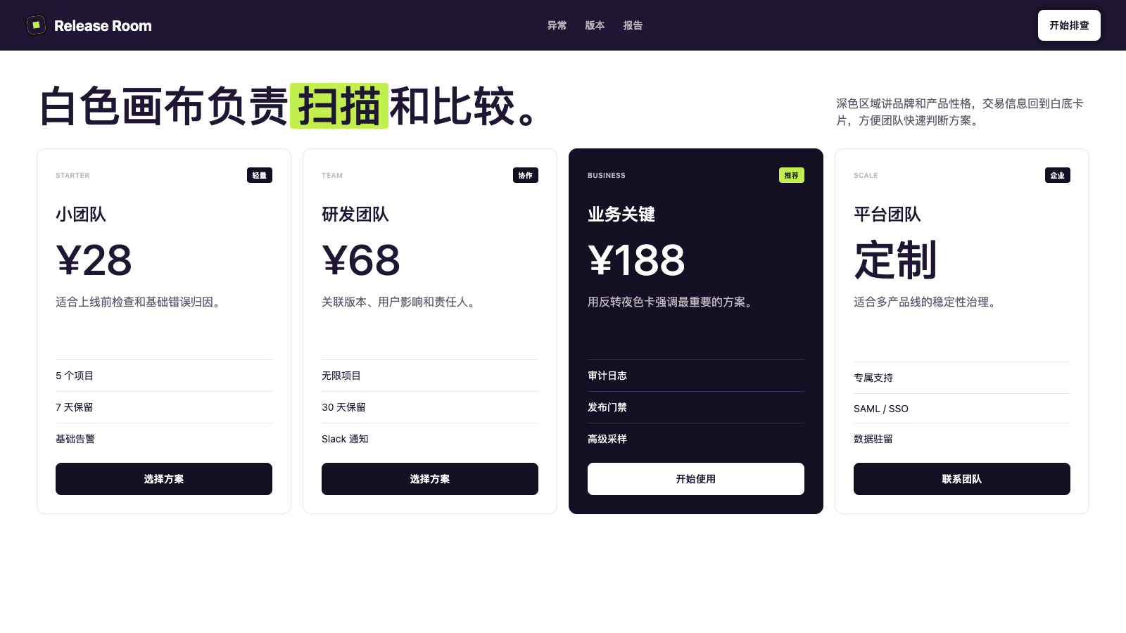
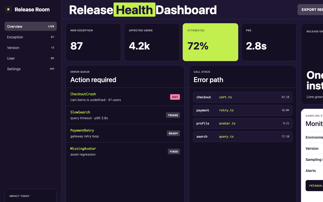

适合发布巡检、故障看板和工程协作页,紫黑底配青柠高亮、贴纸色块和等宽明细,让技术流程更有个性。
设计语言样张
---
version: alpha
name: "Sentry"
description: "Sentry 的 DESIGN.md 中文参考模板,保留原始 design token 与专业术语,覆盖 color system、typography、layout、components、motion 与 interaction states。"
language: zh-CN
sourceLanguage: en
---

## 概览
Sentry 的 design language 读起来像穿着皮夹克的 debugging console。Home 与 product surface 坐落在 near-black violet midnight(`{colors.surface-canvas-dark}` / `{colors.surface-night}`)之上,铺有 starfield texture,并散落 floating sticker-style mascot:astronaut、monster、traffic cone;它们打破 observability product 的严肃感。Headline 使用 chunky proprietary display sans,最重要的 keyword 被 lime-green highlight chip(`{colors.accent-lime}`)包裹,像是 copy 本身被 developer 在自己的 console output 上做了 redline 标记。

Palette 被刻意收窄:deep midnight 作为 dominant canvas,electric lime 作为 primary attention-grabber,hot pink(`{colors.accent-pink}`)作为 secondary punctuation,violet-mid(`{colors.accent-violet-mid}`)用于 tag chip 与 hairline stroke。White 有两个角色:dark 上的 text,以及 pricing、contact 和 content-heavy page 的 canvas,因为 developer 需要扫描 dense table。“Single primary CTA” 会根据 context 视觉反转:light surface 上是 filled black-violet(`{colors.primary}`)+ white type,dark surface 上是 filled white + dark type。无论 polarity 如何,button 始终读作最强 UI affordance。

Typography 清晰分为三个 family:custom display sans 用于 hero 与 section opener(chunky、near-condensed、略 playful),Rubik 用于每个 UI text role(body、caption、eyebrow cap、button label),Monaco 用于 code。Button 与 eyebrow 几乎总是 uppercase,并带 0.2px tracking lift,让它们有 console output 的利落节奏。

**Key Characteristics:**
- Two-polarity canvas system:deep violet midnight(`{colors.surface-canvas-dark}`)用于 marketing hero 与 product feature page,white(`{colors.surface-canvas-light}`)用于 pricing、contact 和 dense reference content;系统从不模糊两者。
- Lime keyword highlight(`{colors.accent-lime}`)被当作 typographic device,而不是 color swatch;它包裹 display headline 中的单个词,在阅读流中形成 syntax highlight。
- Sticker illustration system:带 hand-drawn outline 的 floating mascot character 出现在 section junction,绝不放进 card;它们在 dense info block 之间创造 rhythm 和 personality。
- `{typography.button-cap}` 与 `{typography.eyebrow}` 中的 uppercase eyebrow + button cap 带稳定的 0.2px tracking lift,形成品牌的 “developer console” cadence。
- Single-primary CTA hierarchy:每页只有一个 filled button,在 light 上读作 `{colors.primary}`,在 dark 上读作 `{colors.on-primary}`;outlined 与 ghost variant 降级。
- Card surface 跟随 canvas:dark section 嵌套 dark card(`{colors.ink-deep}` + subtle hairline),light section 嵌套带 `{colors.hairline-cloud}` border 的 white card;chrome 保持一致,只翻转 polarity。
- Pricing page color rhythm 是 cream-white tier 加一个 dark inverted “featured” tier(`{colors.surface-night}`),避免常见 accent-bordered featured pattern。

## Colors

> **Source pages:** home (`/welcome/`), product/error-monitoring, contact/enterprise, pricing.

### Brand & Accent
- **Midnight Violet** (`{colors.primary}` — `#150f23`): 系统 primary action color 与最深 surface tone。用于 light surface 上的 filled primary button、code-block background,以及最强 dark card。
- **Ink Violet** (`{colors.ink-deep}` — `#1f1633`): 比 primary 略抬高,是 marketing hero canvas,也是 light surface 上的默认 body-text color;一个 token 同时承担 background 与 ink。
- **Electric Lime** (`{colors.accent-lime}` — `#c2ef4e`): Signature highlight color。作为 syntax-highlight chip 包裹 headline keyword(`{rounded.xs}` corner、无 padding-y、12px padding-x)。也用于 squiggly footer divider stroke。绝不作为 button background。
- **Hot Pink** (`{colors.accent-pink}` — `#fa7faa`): Secondary punctuation color,用于 sticker outline、chart point 和 supporting accent;绝不用于 button,也绝不用于 body size type。
- **Violet Link** (`{colors.accent-violet}` — `#6a5fc1`): 当 underline 之外还需要 emphasis 时使用的 inline link color。
- **Deep Violet** (`{colors.accent-violet-deep}` — `#422082`): Contact form 上的 select-dropdown fill;也用于 dark section 内的 spotlight card。
- **Mid Violet** (`{colors.accent-violet-mid}` — `#79628c`): Tag-chip fill,以及 dark surface 上的 faint accent。

### Surface
- **Dark Canvas** (`{colors.surface-canvas-dark}` — `#1f1633`): Hero、product、feature-page background。承载最深 atmospheric weight。
- **Night** (`{colors.surface-night}` — `#150f23`): Dark canvas 上的 card、code block,以及 “featured” pricing tier。
- **Light Canvas** (`{colors.surface-canvas-light}` — `#ffffff`): Pricing、contact 与 dense-reference page background。
- **Surface Press Light** (`{colors.surface-press-light}` — `#f0f0f0`) and **Press Stronger** (`{colors.surface-press-stronger}` — `#efefef`): Dark surface 上 inverted button 的 pressed/active fill。
- **Hairline Violet** (`{colors.hairline-violet}` — `#362d59`): Dark card 上的 1px border。
- **Hairline Cool** (`{colors.hairline-cool}` — `#cfcfdb`): Text input 与 form field 上的 1px border。
- **Hairline Cloud** (`{colors.hairline-cloud}` — `#e5e7eb`): Light canvas 上的 pricing-table divider 与 pricing-card border。

### Text
- **On Primary** (`{colors.on-primary}` — `#ffffff`): Dark canvas 上的所有 text,以及 filled dark button 上的所有 CTA label。
- **Ink** (`{colors.ink}` — `#1f1633`): Light canvas 上的 body text;与 dark canvas 同 hex,复用为 type。
- **Ink Press** (`{colors.ink-press}` — `#1a1a1a`): 保留给 inverted button 的 pressed/active state。
- **On Dark Muted** (`{colors.on-dark-muted}` — `rgba(255,255,255,0.72)`): Dark canvas 上的 secondary text、caption 与 table cell value。
- **On Dark Faint** (`{colors.on-dark-faint}` — `rgba(255,255,255,0.18)`): Translucent surface-on-dark,用于 ghost button fill 与 dimmed nav item。

### Semantic Colors
- **Focus Ring** (`{colors.ring-focus}` — `rgba(59,130,246,0.5)`): Translucent blue focus ring,是系统中唯一 blue,保留给 form field 的 keyboard focus。

## Typography

### Font Family

Display tier 是 proprietary geometric sans,具有 chunky、near-condensed proportion 和略 subversive personality(closing aperture、optical-stress letterform)。不可用时,使用更重 weight 的 **Rubik** fallback,以保持视觉连续性。

UI tier 是 **Rubik**,Google Fonts 上的 open-source Hebrew/Latin sans,带 system fallback(`-apple-system, system-ui, Segoe UI, Helvetica, Arial`)。Rubik 处理所有 body、caption、button 与 eyebrow role。

Code tier 是 **Monaco**,带 Menlo 与 Ubuntu Mono fallback,用于 code block、install snippet 和 inline token。

### Hierarchy

| Token | Size | Weight | Line Height | Letter Spacing | 用途 |
|---|---|---|---|---|---|
| `{typography.display-hero}` | 88px | 700 | 1.2 | 0 | Marketing hero headline(单行注意力焦点) |
| `{typography.display-large}` | 60px | 500 | 1.1 | 0 | Dark surface 上的 section opener |
| `{typography.heading-xl}` | 30px | 500 | 1.2 | 0 | Light surface 上的 page title(如 “Pricing plans for dev teams of all sizes”) |
| `{typography.heading-lg}` | 27px | 500 | 1.25 | 0 | Sub-section heading、大型 card title |
| `{typography.heading-md}` | 24px | 500 | 1.25 | 0 | Card title、in-page section heading |
| `{typography.heading-sm}` | 20px | 600 | 1.25 | 0 | Compact card title、list-group title |
| `{typography.body-lg}` | 16px | 400 | 2.0 | 0 | Marketing-paragraph body,用于 hero subtext 的 airy、two-line-leading variant |
| `{typography.body-strong}` | 16px | 600 | 1.5 | 0 | Emphasized body run、lead sentence |
| `{typography.body-md}` | 16px | 500 | 1.5 | 0 | Default UI body、table cell、form label |
| `{typography.eyebrow}` | 15px | 500 | 1.4 | 0 | 大 heading 上方的 section eyebrow,all-caps |
| `{typography.button-cap}` | 14px | 700 | 1.14 | 0.2px | Filled button label(uppercase) |
| `{typography.button-cap-light}` | 14px | 500 | 1.29 | 0.2px | Ghost / outline button label(uppercase) |
| `{typography.caption}` | 14px | 400 | 1.43 | 0 | Footer text、fine print、helper copy |
| `{typography.micro-cap}` | 10px | 600 | 1.8 | 0.25px | Status label、badge text、micro-eyebrow |
| `{typography.code}` | 16px | 400 | 1.5 | 0 | Code block content |
| `{typography.code-strong}` | 16px | 700 | 1.5 | 0 | Highlighted code keyword |

### Principles
- **Two leading worlds。** Marketing copy 在 `{typography.body-lg}` 上使用 2.0 line-height,极其 airy,留出 generous breathing room。Functional UI copy 在 `{typography.body-md}` 上使用 1.5 line-height,更 dense,更接近 console output。这个选择是刻意的:marketing 读起来像 prose,product 读起来像 log。
- **Caps with tracking。** 所有 button label 和 eyebrow 都是 uppercase,并带 0.2px tracking。这是品牌 typographic signature,把 console-prompt cadence 应用到 UI affordance。
- **Headlines as syntax。** Hero display 的结构允许单个 keyword 被 `{colors.accent-lime}` highlight chip 包裹,同时不破坏阅读顺序。把 lime chip 当作 glyph-level decoration,而不是独立 component。

### Font Substitutes
Rubik 是 Google Fonts 上的 open-source 字体,是 hero display 之外所有内容的 safe default。对于 proprietary display sans,合适的 open substitute 包括 **Space Grotesk**(heavier weights)、**Archivo**(semi-condensed weights),或 heavier ends 的 **Hubot Sans** optical-size axis;它们都带有相同的 chunky、near-condensed silhouette。替换时将 line-height 下调 0.05,因为 proprietary face 在大尺寸上 leading 更紧。

## Layout

### Spacing System
- **Base unit**: 8px
- **Tokens**: `{spacing.xxs}` 2px · `{spacing.xs}` 4px · `{spacing.sm}` 8px · `{spacing.md}` 12px · `{spacing.lg}` 16px · `{spacing.xl}` 24px · `{spacing.xxl}` 32px · `{spacing.section}` 96px
- **Section padding**: Desktop 上 major page band 之间使用 `{spacing.section}` 96px;mobile 上折叠到 `{spacing.xxl}` 32px–48px。
- **Card internal padding**: Pricing card 与 large feature card 使用 `{spacing.xxl}` 32px;compact tag/badge group 使用 `{spacing.lg}` 16px。
- **Form field padding**: `{spacing.sm}` 8px vertical,`{spacing.md}` 12px horizontal,直接匹配 text-input token。

### Grid & Container
- Marketing page 使用 wide centered container,并带 generous outer gutter;max width 约 1152px(提取的 breakpoint 之一),内部 content 在 12 个 conceptual column 上 flex。
- Pricing 在 desktop 拆成 4-tier card row,中等宽度折叠为 2-up,mobile 为 1-up。
- Contact form 在单个 light-canvas panel 内使用 2-column field layout(first/last name side-by-side)。
- Breakpoint 阶梯为 1440 → 1152 → 992 → 768 → 640 → 576;详见 Responsive Behavior。

### Whitespace Philosophy
Dark canvas 对 whitespace 的吸收方式不同于 light。Dark surface 上,品牌在 band 之间慷慨拉开 `{spacing.section}`,让 floating mascot 与 starfield texture 有呼吸空间。Light surface(pricing、contact)上 whitespace 收紧,因为用户需要 scanning、comparing、acting,content density 更优先。经验规则:hero 与 feature surface 要 spacious,transactional surface 要 dense。

## Elevation & Depth

| Level | Treatment | 用途 |
|---|---|---|
| 0 | Canvas 上 flat,无 shadow | 默认 surface,dark 或 light |
| 1 | `box-shadow: rgba(0,0,0,0.08) 0 2px 8px 0` | Dark canvas 上的 inverted button(light fill 从 dark surface 上抬起) |
| 2 | `box-shadow: rgba(0,0,0,0.1) 0 10px 15px -3px, rgba(0,0,0,0.1) 0 4px 6px -4px` | Light canvas 上的 floating card、modal |
| 3 | `box-shadow: rgb(21,15,35) 0 0 8px 6px` | Dark hero 上 primary CTA 周围的 glow halo;dark color 自身成为 shadow,在 button 周围形成 canvas vignette |
| 4 | `box-shadow: rgba(0,0,0,0.18) 0 0.5rem 1.5rem` | Dark canvas 上 pressed inverted button |

### Decorative Depth
Sentry 的 depth 不来自 drop shadow,而来自 hero canvas 上的 **starfield texture**(低 opacity 的 subtle white-on-violet pinprick)、**floating sticker mascot**(手绘 outline 与 saturated fill,无 shadow 地叠在 canvas 上方),以及 footer 上方的 **lime squiggly divider**。这些 illustrative element 承担了 flatter design system 中 shadow stack 的工作:告诉眼睛一个 section 在哪里结束,另一个在哪里开始。

## Shapes

### Border Radius Scale

| Token | Value | 用途 |
|---|---|---|
| `{rounded.xs}` | 4px | Badge、status pill、lime keyword highlight chip |
| `{rounded.sm}` | 6px | Text input、search box |
| `{rounded.md}` | 8px | Primary 与 inverted button、code block、select dropdown |
| `{rounded.lg}` | 10px | Generic div、container block |
| `{rounded.xl}` | 12px | Pricing card、feature card、navigation pill chrome |
| `{rounded.xxl}` | 18px | Image container、大型 hero illustration |
| `{rounded.full}` | 9999px | Avatar、circular icon button |

### Photography Geometry
站点不使用传统 photography,而是用 **illustrated sticker 与 product UI screenshot** 承担大致等价的几何角色。Product UI mock 位于 `{rounded.xxl}` 18px container 中,常在 dark canvas 上略微 off-axis 倾斜,无 border。Sticker mascot 完全没有 container,直接叠在 canvas 上,常 overlap section boundary 来打破 grid。Avatar treatment(在 customer-logo strip 中)是简单 greyscale wordmark,不是照片。

## Components

> **不记录 hover state。** 下方每个 spec 只展示 Default 与 Pressed/Active state。Variant 是 front-matter `components:` block 中的正式 entry。

### Buttons

**`button-primary`** — Light surface 上的 dominant CTA。
- Background `{colors.primary}`、text `{colors.on-primary}`、type `{typography.button-cap}`(uppercase,14px / 700,0.2px tracking)、padding `{spacing.md} {spacing.lg}`(12px 16px)、rounded `{rounded.md}`。在 dark hero surface 上,添加 level-3 glow halo 来强调。
- Pressed state 存在于 `button-primary-pressed`:background 翻转为 `{colors.surface-press-stronger}`,text 翻转为 `{colors.ink-press}`。Button 在 press 时实际交换 polarity。

**`button-inverted`** — Dark canvas 上的 dominant CTA;视觉 hierarchy 相同,但 polarity-flipped。
- Background `{colors.on-primary}`(white)、text `{colors.ink-deep}`,同样使用 `{typography.button-cap}`、rounded `{rounded.md}`。
- `button-inverted-pressed` 中的 pressed:background 降到 `{colors.surface-press-light}`,text 切到 `{colors.ink-press}`。

**`button-ghost-on-dark`** — Dark canvas 上的 secondary CTA(如 “Get Started” 旁的 “Get Demo”)。
- Translucent fill `{colors.on-dark-faint}`、text `{colors.on-primary}`、type `{typography.button-cap}`、padding `{spacing.sm}`(8px)、rounded `{rounded.xl}`。Translucent fill 让 canvas texture 透出。

**`button-violet-token`** — Product nav 中 inline 使用的 pill-shaped tag/category button。
- Background `{colors.accent-violet-mid}`、text `{colors.on-primary}`、type `{typography.button-cap-light}`、padding `{spacing.sm} {spacing.lg}`(8px 16px)、rounded `{rounded.xl}`,1px hairline border 使用略深 violet。

**`button-disabled`**
- Background `{colors.hairline-cloud}`、text `{colors.on-dark-muted}`,其他与 `button-primary` 相同。

### Cards & Containers

**`card-pricing`** — Pricing page 上的 standard tier card。
- Background `{colors.surface-canvas-light}`、text `{colors.ink-deep}`、padding `{spacing.xxl}` 32px、rounded `{rounded.xl}` 12px、1px `{colors.hairline-cloud}` border。顶部 headline 使用 `{typography.heading-md}`,price 使用 `{typography.display-large}`,feature list 使用 `{typography.body-md}`,primary CTA 固定在 card 底部。

**`card-pricing-featured`** — Dark inverted “featured” tier(Sentry 使用 Business tier 作为 featured)。
- Background `{colors.surface-night}`、text `{colors.on-primary}`,其他结构与 `card-pricing` 相同。Inversion(而不是 accent-bordered light card)是品牌 distinctive choice;featured tier 读起来像品牌声音,而不是 marketing decoration。

**`card-feature-dark`** — Dark surface 上的大型 feature-band card,用于锚定 product feature explanation。
- Background `{colors.ink-deep}`、text `{colors.on-primary}`、padding `{spacing.xxl}` 32px、rounded `{rounded.xxl}` 18px。常承载 UI mock、27px headline 与 16px body。

**`card-spotlight-violet`** — 带 deeper violet fill 的 accent feature card,用于 “Sentry-only” capability band。
- Background `{colors.accent-violet-deep}`、text `{colors.on-primary}`、padding `{spacing.xxl}`、rounded `{rounded.xxl}`。Deep violet 读作 feature highlight,但不会脱离品牌 purple family。

**`code-block`** — Code/install snippet。
- Background `{colors.surface-night}`、text `{colors.on-primary}`,以 `{typography.code}` 渲染。Padding `{spacing.lg}` 16px、rounded `{rounded.md}`。在 dark canvas 上 code block 只从 canvas 上轻微抬起,只有略深 fill 区分它。

### Inputs & Forms

**`text-input`** — Contact-form 的 first/last/email 等 field。
- Background `{colors.surface-canvas-light}`、text `{colors.ink-deep}`、type `{typography.body-md}`、padding `{spacing.sm} {spacing.md}`(8px 12px)、rounded `{rounded.sm}` 6px、1px `{colors.hairline-cool}` border。
- `text-input-focused` 中的 focus state:fill 相同,但增加 inset shadow `rgba(0,0,0,0.15) 0 2px 10px inset`,表达向内按压的 depth。

**`select-violet`** — Dark contact panel 内使用的 dropdown variant。
- Background `{colors.accent-violet-deep}`、text `{colors.on-primary}`、type `{typography.body-md}`、padding `{spacing.sm} {spacing.lg}`、rounded `{rounded.md}`。它不模仿 plain text input,因此很有辨识度,读起来像刻意设计的 brand surface。

### Navigation

**`nav-bar-light`** — Light page(pricing、contact、docs)上的 standard top nav。
- Background `{colors.surface-canvas-light}`、text `{colors.ink-deep}`、type `{typography.body-md}`。左侧 logo wordmark 约 145×32px,中部 primary nav item 带 dropdown caret,右侧是 `Get Demo` ghost + `Get Started` filled `button-primary` 组合。Padding `{spacing.lg} {spacing.xl}`(16px 24px)。

**Top Nav (dark variant)** — 用于 home page;结构相同但 polarity inverted,位于 `{colors.surface-canvas-dark}` 上。右侧 button 变为 `button-inverted`。

**Mobile nav** — 在 768px breakpoint 以下折叠为 hamburger toggle;dropdown caret 变为 full-width accordion item。

### Pills, Badges, and Highlight Chips

**`pill-neutral-dark`** — Dark surface 上的小型 status / category pill。
- Background `{colors.surface-night}`、text `{colors.on-primary}`、type `{typography.caption}` 12px、padding `{spacing.xs} {spacing.sm}`(4px 8px)、rounded `{rounded.xs}` 4px。

**`chip-lime-keyword`** — Signature inline highlight,用来包裹 hero display headline 中的单个词。
- Background `{colors.accent-lime}`、text `{colors.ink-deep}`、type 匹配周围 `{typography.display-hero}`、rounded `{rounded.xs}` 4px、padding `0 {spacing.md}`(12px horizontal,0 vertical,让 chip 贴合 cap-height)。

### Signature Components

**Sticker Mascot Layer** — Illustrated character(astronaut、cartoon monster、traffic cone、debugging avatar),使用 hand-rendered outline 与 saturated `{colors.accent-pink}` / `{colors.accent-lime}` fill。Mascot 放在 section junction,常以自身高度 30–40% overlap section boundary,无 container 或 shadow。它们作为 decorative section marker 与 brand personality carrier,绝不放进 card,也绝不作为 button。

**Lime Squiggly Footer Divider** — Hand-drawn `{colors.accent-lime}` squiggle line,约 3px stroke,以 full container width 位于 footer 上方。用充满个性的 flourish 替代原本的 1px hairline divider。

**Starfield Hero Texture** — 以极低 opacity 叠加在 hero canvas 上的 faint white-on-violet pinprick pattern。不用显性装饰也能为 dark canvas 增加 atmospheric depth。实现为 background image,而不是 repeating CSS。

**Window-Chrome UI Mock** — Product UI screenshot 被框在 `{rounded.xxl}` container 中,常以 ±2–3 度 off axis 倾斜,位于 dark feature page 上并 overlap section boundary。Chrome 本身只是带 subtle hairline 的 rounded image;content 是真实 product UI。

**`link-on-dark`** — Dark surface 上 body copy 内的 inline link。Default text 是 `{colors.on-primary}`,用 `{typography.body-md}` 渲染并带 persistent underline;underline 是全部 affordance,没有 color change。与 copy flush 对齐,无 padding,除继承的 `{rounded.xs}` 外无额外 rounded corner。

**`link-on-light`** — Light surface 上 body copy 内的 inline link。Shape contract 与 `link-on-dark` 相同,但 text 为 `{colors.ink-deep}`。用于 pricing、contact 和 docs surface。

**`footer-light`** — Light-canvas template(pricing、contact、docs)上的 site-wide footer。
- Background `{colors.surface-canvas-light}`、text `{colors.ink-deep}`、type `{typography.caption}`、padding `{spacing.xxl} {spacing.xl}`(32px 24px)。顶部是 lime squiggly divider,见 Signature Components。承载三到四列 link group、右下角 horizontal strip 中的 social icon,以及最底部 `{typography.caption}` 的小型 legal/copyright row。

## Do's and Don'ts

### Do
- 将 `{colors.accent-lime}` 保留给 display headline 内的 keyword-highlight chip 和 footer squiggle divider;不要把它用作 button background,也不要作为 body text。
- 每个 `button-primary` 都搭配 `{typography.button-cap}`,uppercase 并带 0.2px tracking;这个 cadence 是品牌的一部分,不是 stylistic option。
- 将 dark canvas(`{colors.surface-canvas-dark}`)与 light canvas(`{colors.surface-canvas-light}`)视为两个完整世界:前者负责 marketing/feature page,后者负责 transactional page,不要折中混合。
- 使用 sticker mascot 打破 section boundary,让它们 overlap、tilt、float;把它们限制在 card 里会抽掉个性。
- Featured pricing column 使用 `card-pricing-featured`(dark inverted tier),而不是 accent-bordered light tier。
- Functional UI surface 的 body line-height 默认 1.5,marketing surface 默认 2.0;差异是刻意的。

### Don't
- 不要在 `{colors.accent-lime}` 与 `{colors.accent-pink}` 之外引入额外 accent color;添加 teal、orange 或 yellow 会稀释 violet-and-lime signature。
- 不要给 dark canvas 上的 card 添加 drop shadow;depth 来自 texture 与 illustration,而不是会弄脏 violet 的 light-on-dark shadow。
- 不要在 marketing hero 之外使用 `{typography.display-hero}`(88px);即使 sub-page 也应封顶在 `{typography.display-large}`(60px)。
- 不要把 body text 设为 `{colors.accent-lime}`;它是 chip color,不是 type color,在 body size 下会破坏 contrast。
- 不要把 `{colors.primary}` button 软化成 brand-violet;near-black 才是重点,不论 canvas polarity 如何,它都读作最权威 action。
- 不要把 illustrated mascot 放进 card 或 constrained container;它们的工作是打破 grid,而不是占据 grid。

## Responsive Behavior

### Breakpoints

| Name | Width | 关键变化 |
|---|---|---|
| 4K / Wide | ≥ 1440px | 完整 4-tier pricing row,hero illustration 以 full scale 位于 headline 旁 |
| Desktop | 1152–1440px | 默认 content max-width 为 1152px,所有 4-tier pattern 保持 |
| Laptop | 992–1151px | Pricing 折叠为 2-up row,nav 保持 horizontal |
| Tablet | 768–991px | 2-column feature grid 折叠为 1-up;nav 仍 horizontal 但压缩 |
| Mobile Large | 640–767px | 出现 hamburger nav;hero display 从 88px 降到约 56px |
| Mobile | 576–639px | 全部 single-column;section padding 从 96px 折叠到 32–48px |
| Small Mobile | 1–575px | Compact mode;sticker mascot 缩小或完全隐藏,以保留 content priority |

### Touch Targets
- Primary button 在 mobile 上最小达到 44×44px(12px vertical padding × 16px font + line-height ≈ 44px),保持 WCAG AAA touch-target spec。
- Nav 与 feature surface 中的 pill tag 和 badge 即使在 small mobile breakpoint 也保持 32×32px 以上;必要时放大,而不是缩小。
- Mobile contact page 上的 form field 保持 44px minimum height。

### Collapsing Strategy
- **Hero display headline** 沿 breakpoint 阶梯从 88px → 60px → 48px;lime keyword chip 在每一步都保留 padding 与 corner radius。
- **Pricing tiers** 从 4-up → 2-up → 1-up 阶梯折叠。Featured dark tier 始终保持视觉区分,在任何 breakpoint 都不丢失 inversion。
- **Sticker mascots** 会逐步弱化:desktop 上 overlap section boundary;tablet 上移入 section padding 内;small mobile 上多数通过 `display: none` 隐藏,以保证内容可扫描。
- **Top nav** 在 768px 以下折叠为 hamburger;dropdown menu 使用与页面相同的 canvas polarity(hero 上为 dark,pricing 上为 light)。
- **Code blocks** 在每个 breakpoint 都保持 16px Monaco,绝不缩小;overflow 时切换为 horizontal scroll,而不是 wrap。

### Image Behavior
- Product UI mock 按比例缩放;small mobile 上通常锚定到一侧并允许 horizontal overflow,而不是缩小到不可读。
- Sticker mascot 在 mobile breakpoint 缩放到 50–70%,保留个性,同时把屏幕空间让给 content。
- Lime footer squiggle 将 SVG 缩放到 container width,同时保持 stroke width 视觉一致。

## Iteration Guide

1. 一次只关注一个 component。不要重建系统,只扩展它。
2. 直接引用 component name 与 token(`{colors.accent-lime}`、`{button-primary}-pressed`、`{rounded.xxl}`),不要 paraphrase。
3. 编辑后运行 `npx @google/design.md lint DESIGN.md`;`broken-ref`、`contrast-ratio` 与 `orphaned-tokens` warning 会自动标记问题。
4. 新 variant 作为独立 component entry 添加(`-pressed`、`-disabled`、`-focused`),不要埋进 prose。
5. Product UI body 默认使用 `{typography.body-md}`,marketing prose 默认使用 `{typography.body-lg}`;leading 差异是刻意且承重的。
6. 保持 `{colors.accent-lime}` 稀缺:每个 viewport 一个 lime element。Signature 正是因为稀少才成立。
7. Polarize 新 surface 时,选择一个 canvas(`{colors.surface-canvas-dark}` 或 `{colors.surface-canvas-light}`)并坚持到底;不要在单个 page band 中混合两者。


