

01 / 03
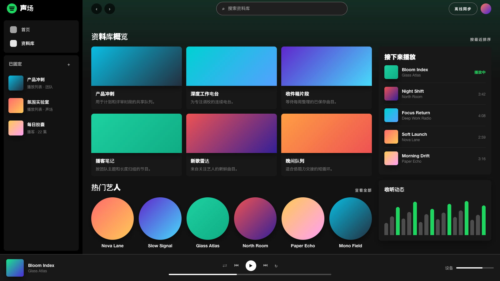
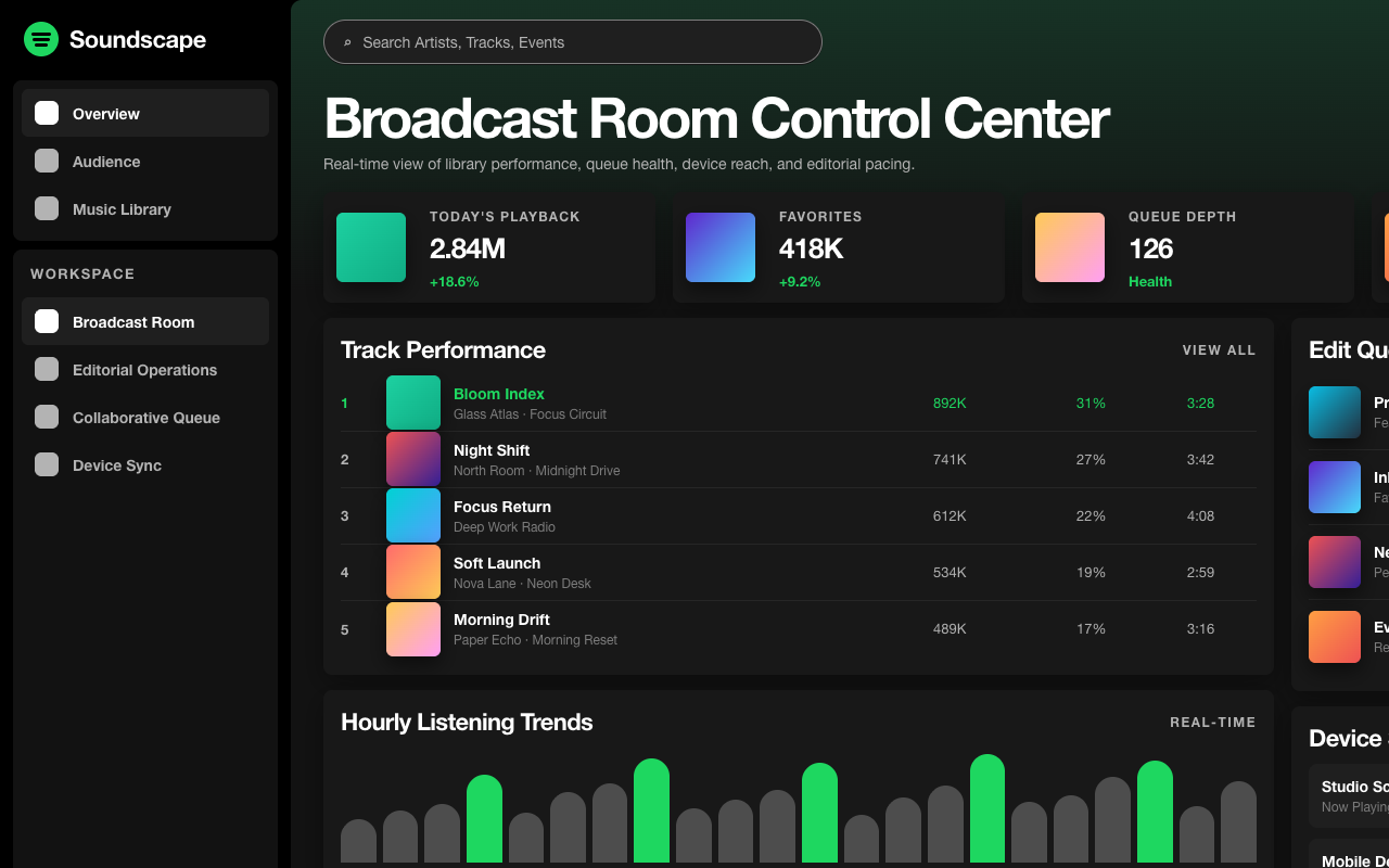

适合音乐、播客和内容订阅产品,近黑播放器界面让内容封面成为主色,绿色只用于播放和激活动作。
设计语言样张
近黑界面退到背景里,封面成为主要色彩来源;绿色只用于播放、激活和主操作。
紧凑播放列表卡片
---
version: alpha
name: "Spotify"
description: "Spotify 的 DESIGN.md 中文参考模板,保留原始 design token 与专业术语,覆盖 color system、typography、layout、components、motion 与 interaction states。"
language: zh-CN
sourceLanguage: en
---

# Spotify 风格的设计系统

## 1. 视觉主题与氛围

Spotify 的 web interface 是一个深色、沉浸式的音乐播放器,把听众包裹在近黑色的环境中(`#121212`、`#181818`、`#1f1f1f`),让 album art 和内容本身成为主要色彩来源。它的设计哲学是“content-first darkness”:UI 退入阴影,让音乐、podcast 和 playlist 发光。每个 surface 都是 charcoal 色阶,形成类似剧场的环境,真正的色彩只来自标志性的 Spotify Green(`#1ed760`)以及 album artwork 本身。

Typography 使用 SpotifyMixUI 和 SpotifyMixUITitle,这两套来自 CircularSp family 的专有字体(Lineto 的 Circular,经 Spotify 定制),并带有覆盖 Arabic、Hebrew、Cyrillic、Greek、Devanagari 和 CJK 的庞大 fallback stack,体现 Spotify 的全球化范围。Type system 紧凑且功能性强:700 (bold) 用于强调和 navigation,600 (semibold) 用于次级强调,400 (regular) 用于 body。Button 使用 uppercase 和 positive letter-spacing(1.4px–2px),形成系统化、label-like 的语气。

Spotify 最有辨识度的是 pill-and-circle geometry。Primary button 使用 500px–9999px radius(full pill),circular play button 使用 50% radius,search input 则是 500px pill。配合 elevated element 上的重阴影(`rgba(0,0,0,0.5) 0px 8px 24px`)和独特的 inset border-shadow 组合(`rgb(18,18,18) 0px 1px 0px, rgb(124,124,124) 0px 0px 0px 1px inset`),最终界面像一台高级音频设备:可触摸、圆润,并为 touch 操作构建。

**Key Characteristics:**
- 近黑色沉浸式 dark theme(`#121212`–`#1f1f1f`):UI 隐到内容后方。
- Spotify Green(`#1ed760`)是唯一 brand accent;从不装饰性使用,始终服务功能。
- SpotifyMixUI/CircularSp font family,支持全球多文字系统。
- Pill button(500px–9999px)和 circular control(50%):圆润且为 touch 优化。
- Button label 使用 uppercase 和宽 letter-spacing(1.4px–2px)。
- Elevated element 使用重阴影(`rgba(0,0,0,0.5) 0px 8px 24px`)。
- Semantic color:negative red(`#f3727f`)、warning orange(`#ffa42b`)、announcement blue(`#539df5`)。
- Album art 是主要色彩来源;UI 本身按 achromatic 设计。

## 2. 色彩体系与角色

### Primary Brand
- **Spotify Green** (`#1ed760`): Primary brand accent,用于 play button、active state 和 CTA。
- **Near Black** (`#121212`): 最深层 background surface。
- **Dark Surface** (`#181818`): Card、container 和 elevated surface。
- **Mid Dark** (`#1f1f1f`): Button background 和 interactive surface。

### Text
- **White** (`#ffffff`): `--text-base`,primary text。
- **Silver** (`#b3b3b3`): Secondary text、muted label、inactive nav。
- **Near White** (`#cbcbcb`): 略亮的 secondary text。
- **Light** (`#fdfdfd`): 接近 pure white,用于最高强调。

### Semantic Colors
- **Negative Red** (`#f3727f`): `--text-negative`,error state。
- **Warning Orange** (`#ffa42b`): `--text-warning`,warning state。
- **Announcement Blue** (`#539df5`): `--text-announcement`,info state。

### Surface & Border
- **Dark Card** (`#252525`): Elevated card surface。
- **Mid Card** (`#272727`): Alternate card surface。
- **Border Gray** (`#4d4d4d`): 深色背景上的 button border。
- **Light Border** (`#7c7c7c`): Outlined button border、muted link。
- **Separator** (`#b3b3b3`): Divider line。
- **Light Surface** (`#eeeeee`): Light-mode button(少见)。
- **Spotify Green Border** (`#1db954`): Green accent border variant。

### Shadows
- **Heavy** (`rgba(0,0,0,0.5) 0px 8px 24px`): Dialog、menu、elevated panel。
- **Medium** (`rgba(0,0,0,0.3) 0px 8px 8px`): Card、dropdown。
- **Inset Border** (`rgb(18,18,18) 0px 1px 0px, rgb(124,124,124) 0px 0px 0px 1px inset`): Input 的 border-shadow 组合。

## 3. Typography 规则

### Font Families
- **Title**: `SpotifyMixUITitle`,fallback: `CircularSp-Arab, CircularSp-Hebr, CircularSp-Cyrl, CircularSp-Grek, CircularSp-Deva, Helvetica Neue, helvetica, arial, Hiragino Sans, Hiragino Kaku Gothic ProN, Meiryo, MS Gothic`
- **UI / Body**: `SpotifyMixUI`,使用相同 fallback stack。

### Hierarchy

| Role | Font | Size | Weight | Line Height | Letter Spacing | 说明 |
|------|------|------|--------|-------------|----------------|-------|
| Section Title | SpotifyMixUITitle | 24px (1.50rem) | 700 | normal | normal | Bold title weight |
| Feature Heading | SpotifyMixUI | 18px (1.13rem) | 600 | 1.30 (tight) | normal | Semibold section head |
| Body Bold | SpotifyMixUI | 16px (1.00rem) | 700 | normal | normal | Emphasized text |
| Body | SpotifyMixUI | 16px (1.00rem) | 400 | normal | normal | Standard body |
| Button Uppercase | SpotifyMixUI | 14px (0.88rem) | 600–700 | 1.00 (tight) | 1.4px–2px | `text-transform: uppercase` |
| Button | SpotifyMixUI | 14px (0.88rem) | 700 | normal | 0.14px | Standard button |
| Nav Link Bold | SpotifyMixUI | 14px (0.88rem) | 700 | normal | normal | Navigation |
| Nav Link | SpotifyMixUI | 14px (0.88rem) | 400 | normal | normal | Inactive nav |
| Caption Bold | SpotifyMixUI | 14px (0.88rem) | 700 | 1.50–1.54 | normal | Bold metadata |
| Caption | SpotifyMixUI | 14px (0.88rem) | 400 | normal | normal | Metadata |
| Small Bold | SpotifyMixUI | 12px (0.75rem) | 700 | 1.50 | normal | Tag、count |
| Small | SpotifyMixUI | 12px (0.75rem) | 400 | normal | normal | Fine print |
| Badge | SpotifyMixUI | 10.5px (0.66rem) | 600 | 1.33 | normal | `text-transform: capitalize` |
| Micro | SpotifyMixUI | 10px (0.63rem) | 400 | normal | normal | Smallest text |

### Principles
- **Bold/regular binary**: 大多数文本要么是 700 (bold),要么是 400 (regular),600 谨慎使用。它通过 weight contrast 而不是 size variation 建立清晰层级。
- **Uppercase buttons as system**: Button label 使用 uppercase + 宽 letter-spacing(1.4px–2px),形成区别于内容文本的系统化 "label" voice。
- **Compact sizing**: 尺寸范围是 10px–24px,比多数系统更窄。Spotify 的 type 紧凑、功能导向,为扫描 playlist 而设计,不是为阅读长文。
- **Global script support**: 庞大的 fallback stack(Arabic、Hebrew、Cyrillic、Greek、Devanagari、CJK)体现 Spotify 覆盖 180+ 市场。

## 4. Component 样式

### Buttons

**Dark Pill**
- Background: `#1f1f1f`
- Text: `#ffffff` or `#b3b3b3`
- Padding: 8px 16px
- Radius: 9999px (full pill)
- Use: Navigation pill、secondary action

**Dark Large Pill**
- Background: `#181818`
- Text: `#ffffff`
- Padding: 0px 43px
- Radius: 500px
- Use: Primary app navigation button

**Light Pill**
- Background: `#eeeeee`
- Text: `#181818`
- Radius: 500px
- Use: Light-mode CTA(cookie consent、marketing)

**Outlined Pill**
- Background: transparent
- Text: `#ffffff`
- Border: `1px solid #7c7c7c`
- Padding: 4px 16px 4px 36px (asymmetric for icon)
- Radius: 9999px
- Use: Follow button、secondary action

**Circular Play**
- Background: `#1f1f1f`
- Text: `#ffffff`
- Padding: 12px
- Radius: 50% (circle)
- Use: Play/pause control

### Cards & Containers
- Background: `#181818` or `#1f1f1f`
- Radius: 6px–8px
- 大多数 card 没有可见 border。
- Hover: background 轻微变亮。
- Shadow: elevated 状态使用 `rgba(0,0,0,0.3) 0px 8px 8px`。

### Inputs
- Search input: `#1f1f1f` background、`#ffffff` text
- Radius: 500px (pill)
- Padding: 12px 96px 12px 48px (icon-aware)
- Focus: border 变为 `#000000`,outline `1px solid`

### Navigation
- Dark sidebar 使用 SpotifyMixUI 14px;active 为 weight 700,inactive 为 400。
- Inactive item 使用 `#b3b3b3` muted color,active 使用 `#ffffff`。
- Circular icon button(50% radius)。
- Spotify logo 位于左上角,使用 green。

## 5. Layout 原则

### Spacing System
- Base unit: 8px。
- Scale: 1px、2px、3px、4px、5px、6px、8px、10px、12px、14px、15px、16px、20px。

### Grid & Container
- Sidebar(fixed)+ main content area。
- 基于 grid 的 album / playlist card。
- 底部 full-width now-playing bar。
- Responsive content area 填满剩余空间。

### Whitespace Philosophy
- **Dark compression**: Spotify 密集编排内容;playlist grid、track list 和 navigation 都保持紧凑间距。Dark background 在元素之间提供视觉休息,因此不需要大面积空白。
- **Content density over breathing room**: 这是 app,不是 marketing site。每个像素都服务于听歌体验。

### Border Radius Scale
- Minimal (2px): Badge、explicit tag。
- Subtle (4px): Input、小型元素。
- Standard (6px): Album art container、card。
- Comfortable (8px): Section、dialog。
- Medium (10px–20px): Panel、overlay element。
- Large (100px): Large pill button。
- Pill (500px): Primary button、search input。
- Full Pill (9999px): Navigation pill、search。
- Circle (50%): Play button、avatar、icon。

## 6. Depth & Elevation

| Level | Treatment | 用途 |
|-------|-----------|-----|
| Base (Level 0) | `#121212` background | 最深层,page background |
| Surface (Level 1) | `#181818` or `#1f1f1f` | Card、sidebar、container |
| Elevated (Level 2) | `rgba(0,0,0,0.3) 0px 8px 8px` | Dropdown menu、hover card |
| Dialog (Level 3) | `rgba(0,0,0,0.5) 0px 8px 24px` | Modal、overlay、menu |
| Inset (Border) | `rgb(18,18,18) 0px 1px 0px, rgb(124,124,124) 0px 0px 0px 1px inset` | Input border |

**Shadow Philosophy**: 对一个 dark-themed app 来说,Spotify 的 shadow 明显偏重。24px blur、0.5 opacity 的 shadow 为 dialog 和 menu 创造戏剧性的“floating in darkness”效果;8px blur、0.3 opacity 则提供更克制的 card lift。Input 上独特的 inset border-shadow 组合带来内凹、可触摸的质感。

## 7. Do's and Don'ts

### Do
- 使用 near-black background(`#121212`–`#1f1f1f`),通过 shade variation 建立 depth。
- Spotify Green(`#1ed760`)只用于 play control、active state 和 primary CTA。
- 所有 button 使用 pill shape(500px–9999px);play control 使用 circular(50%)。
- Button label 使用 uppercase + 宽 letter-spacing(1.4px–2px)。
- Typography 保持紧凑(10px–24px 范围);这是 app,不是 magazine。
- Dark background 上的 elevated element 使用重阴影(`0.3–0.5 opacity`)。
- 让 album art 提供色彩;UI 自身保持 achromatic。

### Don't
- 不要装饰性使用 Spotify Green,也不要把它用于 background;它只服务功能。
- 不要为 primary surface 使用 light background;dark immersion 是核心。
- 不要跳过 button 上的 pill / circle geometry;square button 会破坏识别度。
- 不要使用 thin/subtle shadow;在 dark background 上,shadow 必须偏重才可见。
- 不要增加额外 brand color;green + achromatic gray 已经是完整 palette。
- 不要使用松散 line-height;Spotify 的 typography 紧凑且密集。
- 不要暴露 raw gray border;改用基于 shadow 或 inset 的 border。

## 8. Responsive Behavior

### Breakpoints
| Name | Width | 关键变化 |
|------|-------|-------------|
| Mobile Small | <425px | Compact mobile layout |
| Mobile | 425–576px | Standard mobile |
| Tablet | 576–768px | 2-column grid |
| Tablet Large | 768–896px | Expanded layout |
| Desktop Small | 896–1024px | Sidebar visible |
| Desktop | 1024–1280px | Full desktop layout |
| Large Desktop | >1280px | Expanded grid |

### Collapsing Strategy
- Sidebar: full → collapsed → hidden。
- Album grid: 5 columns → 3 → 2 → 1。
- Now-playing bar: 所有尺寸都保留。
- Search: 保持 pill input,宽度自适应。
- Navigation: mobile 上从 sidebar 转为 bottom bar。

## 9. Agent Prompt Guide

### Quick Color Reference
- Background: Near Black(`#121212`)
- Surface: Dark Card(`#181818`)
- Text: White(`#ffffff`)
- Secondary text: Silver(`#b3b3b3`)
- Accent: Spotify Green(`#1ed760`)
- Border: `#4d4d4d`
- Error: Negative Red(`#f3727f`)

### Example Component Prompts
- "创建 dark card:#181818 background,8px radius。Title 使用 16px SpotifyMixUI weight 700、white text。Subtitle 使用 14px weight 400、#b3b3b3。Hover 时 shadow 为 rgba(0,0,0,0.3) 0px 8px 8px。"
- "设计 pill button:#1f1f1f background、white text、9999px radius、8px 16px padding。14px SpotifyMixUI weight 700、uppercase、letter-spacing 1.4px。"
- "构建 circular play button:Spotify Green (#1ed760) background、#000000 icon、50% radius、12px padding。"
- "创建 search input:#1f1f1f background、white text、500px radius、12px 48px padding。Inset border: rgb(124,124,124) 0px 0px 0px 1px inset。"
- "设计 navigation sidebar:#121212 background。Active item:14px weight 700、white。Inactive:14px weight 400、#b3b3b3。"

### Iteration Guide
1. 从 #121212 开始;所有内容都存在于 near-black darkness 中。
2. Spotify Green 只用于 functional highlight(play、active、CTA)。
3. 所有东西都 pill 化;large 用 500px,small 用 9999px,circular 用 50%。
4. Button 使用 uppercase + wide tracking,形成系统化 label voice。
5. Elevation 使用 heavy shadow(0.3–0.5 opacity);light shadow 在 dark 上不可见。
6. Album art 提供所有色彩;UI 保持 achromatic。


