

01 / 03
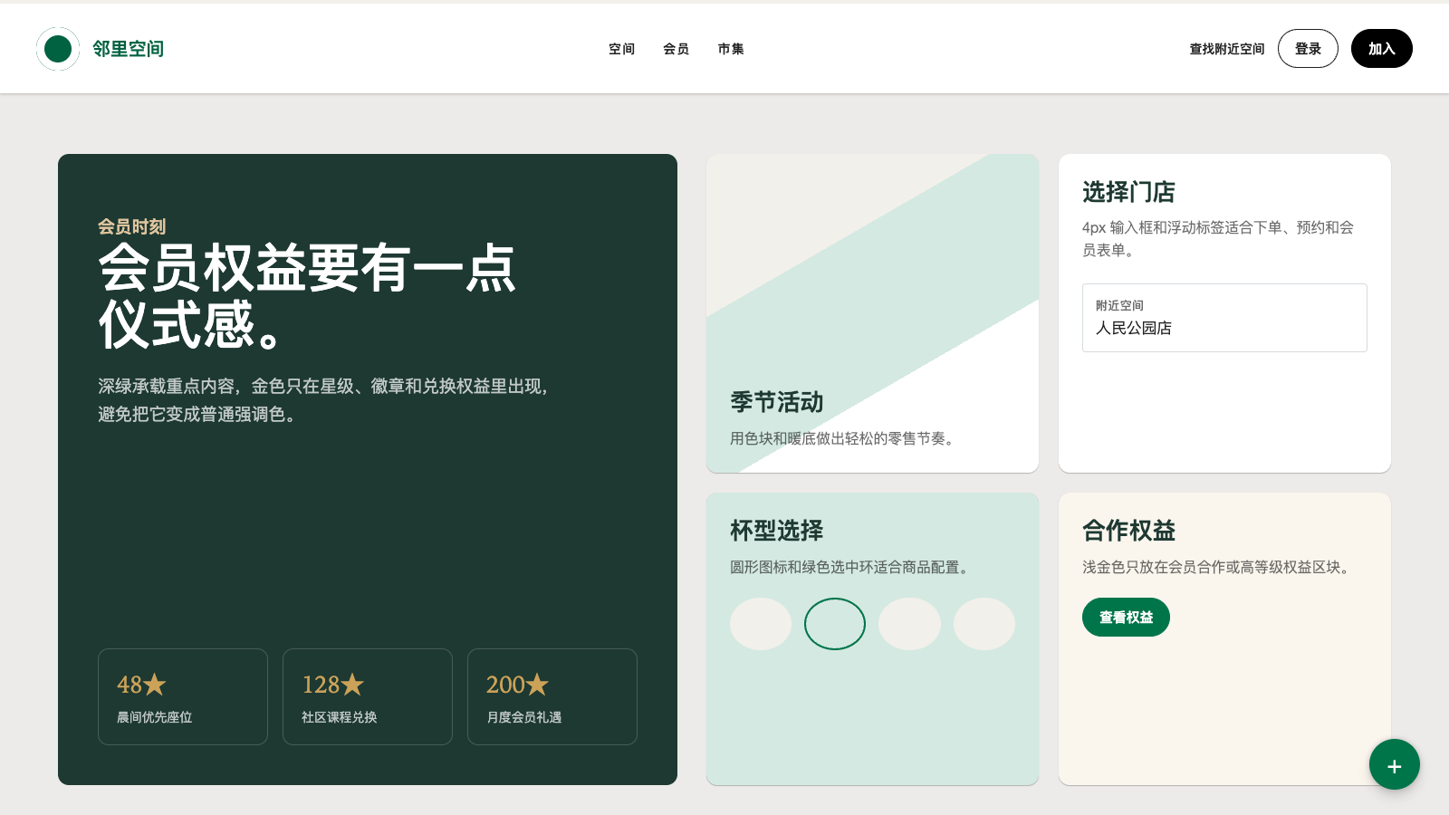
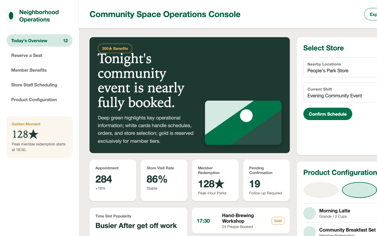

适合会员计划、生活方式零售和社区活动页,暖奶油底、分层绿色、圆角卡片和 pill CTA 显得亲和可靠。
设计语言样张
---
version: alpha
name: "Starbucks"
description: "Starbucks 的 DESIGN.md 中文参考模板,保留原始 design token 与专业术语,覆盖 color system、typography、layout、components、motion 与 interaction states。"
language: zh-CN
sourceLanguage: en
---

# Starbucks 风格设计系统

## 1. 视觉主题与氛围

Starbucks 的设计系统像一个温暖、自信的 retail flagship,把门店围裙的绿色延展到各种表面。画布在 neutral-warm cream(#f2f0eb)与 ceramic off-white(#edebe9)之间切换,这些颜色指向真实门店材料:纸巾、咖啡馆墙面、木质饰面。标志性的 **Starbucks Green**(#006241)负责锚定 hero band、CTA 与 Rewards 体验。绿色被校准成四个层级(Starbucks、Accent、House、Uplift),每一层都映射到特定 surface role;gold(#cba258)只在 Rewards 身份仪式感场景中出现,而不是通用 accent。

Typography 承载了大部分品牌声音。专有 **SoDoSans** 字体几乎覆盖所有表面,并带有紧凑的 -0.16px letter-spacing,读起来自信、友好,而不是严肃的时装杂志感。不同寻常的是,Rewards 页面会在特定 headline moment 切换到温暖 serif("Lander Tall", "Iowan Old Style", Georgia),微妙呼应咖啡馆 chalkboard 的怀旧感;Careers 页面则用手写 script("Kalam", "Comic Sans MS", cursive)表达杯身手写名字的个人触感。三种字体对应三种上下文,系统对它们的使用边界非常克制。

表面通过圆润几何呼吸。所有按钮都是 50px full-pill,卡片是 12px rounded rectangle。“Frap” floating CTA 是一个 56px 圆形下单按钮,填充 Green Accent(#00754A),带有分层 shadow stack(0 0 6px rgba(0,0,0,0.24) base + 0 8px 12px rgba(0,0,0,0.14) ambient),pressed 时通过 scale(0.95) 压缩。这是产品最具标志性的 elevation move。其他层级保持克制:card shadow 只用轻声的 0.14/0.24 alpha,global nav 使用安静的三层 shadow stack。整体感觉像干净的 café signage:清晰、温暖、从不喧哗。

**关键特征:**
- 四层 green brand system(Starbucks / Accent / House / Uplift)分别映射到不同 surface role,而不是单一 “brand green”
- Gold 仅用于 Rewards status moment,绝不作为通用 accent
- warm-neutral canvas(#f2f0eb / #edebe9)替代冷白,呼应咖啡馆材料
- 专有 SoDoSans 搭配紧凑 -0.16px letter-spacing,形成通用品牌声音
- 上下文限定字体切换:Rewards 使用 Lander Tall serif,Careers cup-name 使用 Kalam script
- 全部按钮使用 full-pill(50px radius),scale(0.95) active press 是标志性 micro-interaction
- Floating “Frap” circular CTA(56px、Green Accent fill、layered shadow stack)是产品的标志性 elevation element
- Gift-card surface 以 **photographed physical product** 呈现,每张卡都是独立插画/照片,而不是生成式图形
- 12px card radius 与 whisper-soft shadow 让内容卡保持 flat-plus-hint-of-lift
- rem-based spacing scale 以 1.6rem(约 16px)= --space-3 为锚点,并扩展到 6.4rem(约 64px)

**Color-block 页面节奏:** Cream hero → White content sections → Dark-green(#1E3932)feature band with white text → Cream utility zone → Dark-green(#1E3932)footer with gold / white text。这个 espresso-dark bookend 包裹明亮主体,是 Starbucks 页面节奏的核心。

## 2. 色彩调色板与角色

**分析来源页面:** homepage、rewards、gift cards、product detail(Pink Energy Drink)、product nutrition(Cold Brew)。

### 主色
- **Starbucks Green**(#006241):历史品牌绿,用于 h1、Rewards 页主要 section header,以及需要单一 dominant brand signal 的场景。
- **Green Accent**(#00754A):更亮、更发光的 green,是 primary filled-CTA(“Explore our afternoon menu”、“See the spring menu”)和 floating Frap circular button 的填充色。
- **House Green**(#1E3932):深 near-black brand green,用于 footer surface、feature-band background、reward-status dark surface 与 Rewards hero band。
- **Green Uplift**(#2b5148):secondary mid-dark green,少量用于 decorative accent 与 dark-gradient moment。
- **Green Light**(#d4e9e2):pale mint wash,用于 form-valid tint 与 light green utility surface。

### 辅助色与强调色
- **Gold**(#cba258):几乎只用于 Rewards-status ceremony,包括 Gold-tier callout、partnership badge(SkyMiles、Bonvoy)与 premium accent;绝不是通用 brand color。
- **Gold Light**(#dfc49d):gold-tier section 的 softer gold background wash。
- **Gold Lightest**(#faf6ee):Rewards partnership section 下的 cream-gold surface wash,让 gold accent 回到 warm neutral system。

### 表面与背景
- **White**(#ffffff):primary card 与 modal surface,也用于 gift-card tile fill。
- **Neutral Cool**(#f9f9f9):dropdown menu、form-card wrap 与 quiet utility container 的 subtle cool-gray surface。
- **Neutral Warm**(#f2f0eb):Rewards utility zone 与 hero band 的 warm cream primary page canvas。
- **Ceramic**(#edebe9):稍暖稍深的 cream,用于 zone separator、soft section wash 与 Rewards partnership band。
- **Black**(#000000):保留给 top-of-page CTA strip(“Join now”)和高对比 top-nav sign-in button。

### 中性色与文本
- **Text Black**(rgba(0, 0, 0, 0.87)):light surface 上的 primary heading 与 body text;不是 pure black,因此更适配 warm canvas。
- **Text Black Soft**(rgba(0, 0, 0, 0.58)):light surface 上的 secondary / metadata text。
- **Text White**(rgba(255, 255, 255, 1)):dark green surface 上的 primary heading/body text。
- **Text White Soft**(rgba(255, 255, 255, 0.70)):dark-green surface 上的 secondary text,例如 footer link description 与 caption。
- **Rewards Green**(#33433d):Rewards-page text block 专用 muted slate-green,比 Text Black 更 dusty,能提示 reward surface。

### 语义色与透明阶梯
- **Red**(#c82014):error 与 destructive state。
- **Yellow**(#fbbc05):warning state 与 legacy brand touch。
- **Green Light**(#d4e9e2 at 33% opacity = hsl(160 32% 87% / 33%)):form valid-field tint background。
- **Red Tint**(hsl(4 82% 43% / 5%)):invalid-field tint。
- Black / White alpha ladder 从 rgba(0,0,0,0.06) 到 rgba(0,0,0,0.90),以及 rgba(255,255,255,0.10) 到 rgba(255,255,255,0.90),用于 overlay 与 secondary text。

### 渐变系统
未观察到 structural gradient token。Surface hierarchy 依靠 solid color-block 与五层 cream/green palette,而不是 gradient。

## 3. 字体规则

### 字体家族
- **Primary:** SoDoSans, "Helvetica Neue", Helvetica, Arial, sans-serif,Starbucks 专有 corporate typeface,几乎用于所有 surface。
- **Loading Fallback:** "Helvetica Neue", Helvetica, Arial, sans-serif,SoDoSans 加载前用户看到的字体。
- **Rewards Serif:** "Lander Tall", "Iowan Old Style", Georgia, serif,用于 Rewards 页面特定 headline moment,带来 warm editorial feel。
- **Careers Script:** "Kalam", "Comic Sans MS", cursive,只用于 Careers 页面 “cup name” 装饰触点,呼应 Starbucks 杯身手写名字。

:root 中没有明确启用 OpenType stylistic set。

### 层级

| 角色 | 尺寸 | 字重 | 行高 | 字距 | 备注 |
|------|------|--------|-------------|----------------|-------|
| Display (text-10) | 5.0rem / 80px | 400–600 | 1.2 | -0.16px | 最大 Rewards / hero display |
| Jumbo (text-9) | 3.6rem / 58px | 400–600 | 1.2 | -0.16px | 次级 hero heading |
| Hero Large (text-8) | 2.8rem / 45px | 400–600 | 1.2–1.5 | -0.16px | Landing section headline |
| H1 | 24px | 600 | 36px | -0.16px | Starbucks-Green primary heading |
| H2 | 24px | 400 | 36px | -0.16px | Text Black regular-weight section title |
| Body Large | 19px | 400–600 | 33.25px (~1.75) | -0.16px | Hero intro copy、feature-band body |
| Body (text-3) | 1.6rem / 16px | 400 | 1.5 (24px) | -0.01em | 默认正文 |
| Small (text-2) | 1.4rem / ~14px | 400–600 | 1.5 | -0.01em | Button label、metadata、form label |
| Micro (text-1) | 1.3rem / ~13px | 400 | 1.5 | -0.01em | Active float-label state、caption micro-copy |
| Button Label | 14–16px | 400–600 | 1.2 | -0.01em | 所有 pill-button label |

**Letter-spacing tokens:**
- letterSpacingNormal: -0.01em,默认紧凑,是品牌特征。
- letterSpacingLoose: 0.1em,用于 emphasized caps。
- letterSpacingLooser: 0.15em,用于 uppercase-style label 与极强强调。

**Line-height tokens:**
- lineHeightNormal: 1.5,用于 body。
- lineHeightCompact: 1.2,用于 display / button。

### 原则
- **紧凑 negative tracking(-0.01em)** 几乎全局应用,让 SoDoSans 呈现自信但不拥挤的品牌声音。
- **Hierarchy 主要由 weight 承担,而不是尺寸。** H1 与 H2 都是 24px/36px,通过 600 vs 400 和 Starbucks-Green vs Text Black 区分。
- **Size token 使用 rem,并以 1rem = 10px 为锚点**(root 62.5% trick)。因此 1.6rem = 16px,2.4rem = 24px。
- **上下文限定字体切换**:Rewards 使用 serif,Careers 使用 script,二者都不能混入主购物 surface。
- **Body text 不使用 pure black**,而使用 rgba(0,0,0,0.87) 来匹配 warm-neutral canvas。

### 字体替代方案
SoDoSans 是 Starbucks 专有字体(House Industries 授权),不可公开获取。可用开源替代包括 Inter、Manrope、Nunito Sans。替换时要检查 -0.01em / -0.16px tracking 是否仍然自然,有些字体需要放松到 -0.005em。Lander Tall 可用 Iowan Old Style、Lora 或 Source Serif Pro 替代;Kalam 可直接使用 Google Fonts。

## 4. 组件样式

### 按钮

**1. Primary Filled — "Explore our afternoon menu / Sign up for free"**
- Background: `#00754A` (Green Accent)
- Text: `#ffffff`
- Border: `1px solid #00754A`
- Radius: `50px` (full pill)
- Padding: `7px 16px`
- Font: SoDoSans, 16px, weight 600, letter-spacing `-0.01em`
- Active state: `transform: scale(0.95)` via `--buttonActiveScale`
- Transition: `all 0.2s ease`

**2. Primary Outlined — "Give them a try / Start an order"**
- Background: transparent
- Text: `#00754A` (Green Accent)
- Border: `1px solid #00754A`
- Same radius/padding/active/transition as Primary Filled

**3. Black Filled — "Join now"**
- Background: `#000000`
- Text: `#ffffff`
- Border: `1px solid #000000`
- Radius: `50px`, Padding: `7px 16px`
- Font: 14px, weight 600
- Used on the top-of-page join strip and similar conversion moments

**4. Dark Outlined — "Sign in"**
- Background: transparent
- Text: `rgba(0, 0, 0, 0.87)` (Text Black)
- Border: `1px solid rgba(0, 0, 0, 0.87)`
- Radius: `50px`, Padding: `7px 16px`
- Font: 14px, weight 600

**5. Green-on-Green Inverted — "See the spring menu"**
- Background: `#ffffff`
- Text: `#00754A`
- Border: `1px solid #ffffff`
- Used when the surface behind the button is the dark green House Green band — white button with green 文本 instead of a filled green pill on green bg

**6. Outlined on Dark — "Learn more / Order now"**
- Background: transparent
- Text: `#ffffff`
- Border: `1px solid #ffffff`
- Used on dark-green feature bands for secondary action paired with a white filled CTA

**7. Consent Agree (dark-green variant)**
- Background: `rgb(0, 130, 72)` (a specific variant green used in the cookie-consent module)
- Text: `#ffffff`
- 无边框, `50px` radius, `7px 16px` padding, 14px / weight 400
- Slightly brighter than Green Accent — reserved for the consent-banner Agree action

**8. Frap — Floating Circular Order Button**
- Background: `#00754A` (Green Accent)
- Icon: `#ffffff`
- Size: `5.6rem / 56px` (standard), `4rem / 40px` (mini variant)
- Radius: `50%` (full circle)
- Fixed bottom-right, `-0.8rem` touch offset for extra tap comfort
- Shadow stack: base `0 0 6px rgba(0,0,0,0.24)` + ambient `0 8px 12px rgba(0,0,0,0.14)`
- Active state: ambient shadow fades to `0 8px 12px rgba(0,0,0,0)`
- This is the product's signature elevation element — it floats over every scrolled surface

**9. Full-width Feedback Tab — "Provide feedback"**
- Background: `#00754A`
- Text: `#ffffff`
- Radius: `12px 12px 0px 0px` (top-rounded only)
- Padding: `8px 16px`
- Font: 14px, weight 400
- Positioned fixed bottom-right-inside, attached to the viewport edge

### 卡片与容器

**Content Card (default)**
- Background: `#ffffff` (`--cardBackgroundColor`)
- Radius: `12px` (`--cardBorderRadius`)
- Shadow: `0px 0px.5px 0px rgba(0,0,0,0.14), 0px 1px 1px 0px rgba(0,0,0,0.24)` (`--cardBoxShadow`)
- Used for: feature cards, menu-item tiles, reward-status panels

**Gift Card Tile**
- Background: illustrated photography fills the card (no solid bg)
- Radius: similar to cards (`~12px`, slightly tighter on corners)
- Shadow: lighter than default card — these are treated like physical cards laid on the canvas
- Labeled by category above the card grid (Spring, Thank You, Birthday, Celebration, Mother's Day, Appreciation, Encouragement, Milestones, Anytime)

**Rewards Status Cards (Rewards page signature)**
- Three-column grid: Bronze / Gold / Silver-ish — each a dark-green (`#1E3932`) panel with:
  - Colored gradient/color header ring
  - Numbered "Level" badge
  - Status title in large SoDoSans weight 600
  - Stars / benefits list in white/translucent-white text
  - Bottom "As you earn more stars…" progression caption

**Partnership Card (Rewards)**
- Background: `#faf6ee` (Gold Lightest) warm-cream surface
- Content: partner logos ("SkyMiles", "Bonvoy") centered, with descriptive 文本 below
- Radius and shadow follow default card spec

**Dropdown Menu (Account dropdown, top-nav)**
- Background: `#f9f9f9` (Neutral Cool)
- Menu items at `24px / weight 400` in Text Black
- 无边框 — just background surface shift against white nav

**Modal**
- Padding: `2.4rem` (`--modalPadding`)
- Top padding: `8.8rem` (`--modalTopPadding`) — leaves room for close button / header
- Combined vertical padding: `11.2rem`
- Radius inherits from card spec (`12px`)

### 输入与表单

**Floating Label Input**
- Label floats above the input border when focused/filled
- Desktop label font size: `1.9rem` default, animates to `1.4rem` when active
- Mobile label font size: `1.6rem` default, animates to `1.3rem` active
- Label horizontal offset: `12px` from left
- Active label translate: up to `-12px` with `-50%` Y translation
- Field padding: `12px`
- Form horizontal padding: `1.6rem`
- Validation: valid-field gets `rgba(green-light, 0.33)` tint; invalid-field gets `rgba(red, 0.05)` tint
- Transition: `0.3s option-label-marker-expansion cubic-bezier(0.32, 2.32, 0.61, 0.27)` on checked-input

**Option Icon (checkbox/radio)**
- Padding: `3px` inner
- Uses the checked-input cubic-bezier animation above (a slightly "springy" 2.32 overshoot curve)

### 导航

**Global Nav (top bar)**
- Fixed position with progressive heights: `64px` xs → `72px` mobile → `83px` tablet → `99px` desktop
- Shadow stack: `0 1px 3px rgba(0,0,0,0.1), 0 2px 2px rgba(0,0,0,0.06), 0 0 2px rgba(0,0,0,0.07)` — three-layer soft lift
- Left: Starbucks wordmark logo, offsetting by `99px` (md) / `131px` (lg) from left edge
- Primary links inline in SoDoSans weight 400–600: Menu · Rewards · Gift Cards
- Right: Find a store link + Sign in (outlined) + Join now (black filled)

**Sub-nav (second bar, e.g., Rewards internal)**
- Height: `53px` (global subnav) / `48px` (internal subnav)
- Typically horizontal tab group beneath the global nav

**Mobile Nav**
- Collapses to a hamburger drawer below tablet breakpoint
- Frap floating button persists at bottom-right regardless of nav state

### 图像处理

- **Hero photography**: Product photos (beverages in clear glass with colored backgrounds — coral, sage, warm amber) occupy ~40vw of a split-hero layout; 文本 occupies the other 60vw (`--headerCrateProportion: 40vw` / `--contentCrateProportion: 60vw`)
- **Gift card illustrations**: Each card is a distinct illustrated photograph (painted-feel, hand-drawn-looking, warm color palette). Never generic generated graphics.
- **Rewards ceremony imagery**: Photographs of Starbucks Rewards App screens held in-hand, angled compositions — product-in-con文本 photography.
- **Menu thumbnails**: Square or 4:3 product photography with clean white/cream backdrops, slight soft drop-shadow around the glass.
- **Image fade-in**: `opacity 0.3s ease-in` transition on image load (`--imageFadeTransition`).

### Feature Band (dark-green hero strip)

Full-width `#1E3932` (House Green) band with:
- Left: white headline + subhead + CTA row
- Right: product photography or illustration
- Split ratio ~40/60 or 50/50 depending on section
- White 文本 throughout with `rgba(255,255,255,0.70)` for secondary copy
- CTAs follow Green-on-Green Inverted (white filled) + Outlined on Dark (white outline) pairing

### Expander / Accordion

- Duration: `300ms` (`--expanderDuration`)
- Timing curve: `cubic-bezier(0.25, 0.46, 0.45, 0.94)` — a measured ease-out
- Used for FAQ sections on Rewards and gift page

### Cookie Consent Module

Dark-green modal card at top of page with "Agree" (green-filled) and "Manage preferences" (outlined) buttons. Appears on first visit; dismissible.

### Product Detail Components (PDP signature cluster)

A repeating component cluster used on menu product pages (e.g., `/menu/product/40498/iced` for a drink detail, `/menu/product/.../nutrition` for nutrition facts). These extend the component inventory without changing tokens.

**Size Options Selector**
- Horizontal row of 4 cup-icon buttons (Tall / Grande / Venti / Trenta)
- Each item: cup silhouette icon on top, size name below (16/700 in Starbucks-Green), fluid-ounce caption (13/400 in Text Black Soft)
- Active state: a green circular ring outline (`2px solid #00754A`) around the selected cup icon
- Inactive: no ring, same typography
- Full-width row, equal spacing
- Radius of container: `12px` or flat; individual icons are `50%` circular
- Padding: `16px 24px` internal

**Add-in / Milk Select (outlined rectangle)**
- Background: `#ffffff`
- Border: `1px solid #d6dbde` (Input Border)
- Radius: `4px`
- Full-width in its column
- Floating label above top border: "Add-ins" / "Milk" / "Add-ins" — 13/700 in Text Black, uppercase, `0.325px` letter-spacing
- Value displayed centered (e.g., "Ice", "Coconut", "Strawberry Fruit Inclusions scoop"): 16/400 Text Black
- Chevron-down icon right side in Text Black Soft
- Focus: border shifts to Green Accent (`#00754A`)

**Numeric Stepper**
- Embedded inside an Add-in row when a quantity is required (e.g., Strawberry Fruit Inclusions scoop)
- `−` minus button + count number + `+` plus button, all inline right of the label
- Buttons: circular `32×32px` with `1px solid #d6dbde` border, neutral gray icon
- Count number: 16/700 Text Black centered

**Customize Button**
- Background: `#ffffff`
- Text: `#00754A` (Green Accent)
- Border: `1.5px solid #00754A`
- Radius: `50px` (full pill)
- Padding: `14px 40px` (generously larger than default pills — this is a secondary primary action)
- Label: "Customize" with a gold sparkle ✨ icon inset left
- Used for: entering the drink-customization flow after size/milk selection

**Add to Order Button (PDP)**
- Background: `#00754A` (Green Accent)
- Text: `#ffffff`
- Radius: `50px`
- Padding: `14px 32px`
- Pinned top-right of product card and/or aligned right within the store-availability band
- Same scale(0.95) active behavior as other primary CTAs

**Rewards Cost Pill — "200★ item"**
- Background: transparent
- Border: `1px solid #cba258` (Gold)
- Text: `#cba258` (Gold)
- Radius: `50px` (full pill)
- Padding: `4px 12px`
- Content: "200★ item" where `★` is a small filled star glyph — indicates the Rewards Stars required to redeem this item
- Font: Proxima Nova 13/700 with `0.5px` letter-spacing
- Used only on products that are Rewards-redeemable

**Product Description Band**
- Full-width dark-green band (`#1E3932` House Green)
- Contains top-to-bottom:
  1. Rewards Cost Pill (gold) if applicable
  2. Product description body copy in white (16/400/1.5)
  3. Nutritional summary inline ("140 calories, 25g sugar, 2.5g fat") with info-icon tooltip — 14/700 white
  4. "Full nutrition & ingredients list" outlined-white-on-green pill button
- Padding: `32px` vertical
- Appears beneath the primary product header band

**Ingredients / Nutrition Table**
- Two-column layout on the Nutrition page
- Left column: "Ingredients" header + list or "Not available for this item" placeholder 文本 block with an explanatory paragraph in Text Black Soft 14/400
- Right column: "Nutrition" header + label/value rows
- Each row: nutrient label (Proxima Nova 14/400) on the left, value (e.g., "140 calories", "25g", "205 mg**") on the right, separated by a `1px solid #e7e7e7` hairline below
- Footnote for caffeine/asterisk markers in 13/400 Text Black Soft at the bottom
- Reusable pattern for nutrition facts regulation-compliant tables

**Store Availability Selector**
- Appears on dark-green feature band above the size-options row
- Full-width rounded rectangle with transparent-white interior
- Text: "For item availability, choose a store" in white, 14/400
- Right side: chevron-down affordance + shopping-bag SVG icon in white outline
- Radius: `4px`
- Height: ~48px

**PDP Breadcrumb**
- "Menu / Refreshers / Pink Energy Drink" trail above the product title
- Separator: `/` slash character in Text Black Soft
- Current page is unlinked, prior pages are underlined green-accent links
- Font: 14/400 Proxima Nova
- Appears on all PDP pages

**Back Chevron Link (PDP nutrition / detail sub-pages)**
- "← Back" 文本 link above section headings on the nutrition page
- Text in Green Accent (`#00754A`) 14/700 Proxima Nova
- Left chevron `<` in the same green
- Alternative to full breadcrumb on deep sub-pages

## 5. 布局原则

### 间距系统

Rem-based semantic scale,以 1rem = 10px 为锚点:

| Token | Rem | Pixels | 典型用途 |
|-------|-----|--------|-------------|
| --space-1 | 0.4rem | 4px | 最紧凑 inline padding |
| --space-2 | 0.8rem | 8px | 小 gap、button vertical padding |
| --space-3 | 1.6rem | 16px | 默认值:card padding、outer gutter xs |
| --space-4 | 2.4rem | 24px | Section inner spacing、outer gutter md |
| --space-5 | 3.2rem | 32px | 主要 section 间距 |
| --space-6 | 4rem | 40px | 大 gap、outer gutter lg、header crate |
| --space-7 | 4.8rem | 48px | Section-to-section spacing |
| --space-8 | 5.6rem | 56px | 很大的 breathing space,也是 Frap height |
| --space-9 | 6.4rem | 64px | 最宽 section padding |

**Gutter tokens:**
- --outerGutter: 1.6rem(16px,default / mobile)
- --outerGutterMedium: 2.4rem(24px,tablet)
- --outerGutterLarge: 4.0rem(40px,desktop)

**通用节奏常量:** 1.6rem(16px)在所有页面中反复出现,是默认 outer gutter、card padding baseline 与 text size 3 body,也是系统最常见的 spacing unit。

### 网格与容器
- Column width scale:--columnWidthSmall: 343px / Medium: 500px / Large: 720px / XLarge: 1440px。
- Gift-card grid 使用 3–5-up responsive grid,tile 宽度约 343px。
- Rewards status section 在 lg+ breakpoint 使用 3-up dark-green panel。
- Hero 通过 --headerCrateProportion / --contentCrateProportion 形成 40% image / 60% content 的 asymmetric split。

### 留白理念
Whitespace 传达 “咖啡馆里有充足空间” 的感觉。Section padding 偏 generous(40–64px);内容块之间主要依靠留白,而不是 divider。Cream canvas(#f2f0eb)本身就是 white card 与 green feature band 之间的视觉呼吸。

### 圆角尺度

| 值 | 用途 |
|-------|-----|
| 12px | Cards、modals、menu-item tiles(--cardBorderRadius) |
| 12px 12px 0 0 | Full-width feedback tab,仅顶部圆角 |
| 50px | 所有按钮的 full-pill radius(--buttonBorderRadius) |
| 50% | Circular icons、Frap floating button、avatar thumbnails |
| Specialty | Starbucks-Visa-Card mockup 使用 3.3333%/5.298% elliptical(--svcRoundedCorners) |

## 6. 深度与层级

| 层级 | 处理方式 | 用途 |
|-------|-----------|-----|
| Card | `0 0 0.5px rgba(0,0,0,0.14), 0 1px 1px rgba(0,0,0,0.24)` | Default content cards — a whisper-soft dual-shadow |
| Global Nav | `0 1px 3px rgba(0,0,0,0.1), 0 2px 2px rgba(0,0,0,0.06), 0 0 2px rgba(0,0,0,0.07)` | Triple-layer soft lift on the fixed top bar |
| Frap Base | `0 0 6px rgba(0,0,0,0.24)` | Base halo around the floating circular CTA |
| Frap Ambient | `0 8px 12px rgba(0,0,0,0.14)` | Stacked directional ambient — floats the Frap forward |
| Gift Card | Light drop shadow around illustrated photograph | Physical-card feel for gift tiles |
| Starbucks Card (SVC) | `drop-shadow(0 4px 1px rgba(0,0,0,0.11)) drop-shadow(0 0 2px rgba(0,0,0,0.24))` | Stacked SVG drop shadows for Starbucks Card visuals |

**Shadow philosophy:** Whisper-soft, layered over solid — the system never reaches for a single heavy drop shadow. Instead, it stacks 2–3 low-alpha shadows with different offsets to simulate real-world ambient + direct lighting. The Frap button is the most elevated element on any page.

### 装饰性深度

- **No gradient system** — surfaces are solid color-block
- **Color-block banding** carries perceived depth (dark-green bands read as "recessed feature zones" between cream/white body sections)
- **SVG filter shadows** on Starbucks-Card visuals add a slight 3D physicality without a box-shadow

## 7. 使用准则

### 应该
- 使用 Neutral Warm(#f2f0eb)或 Ceramic(#edebe9)作为 page canvas,而不是 pure white;warm cream 是品牌签名
- 将四层 green 映射到正确角色:Starbucks Green 用于 heading,Green Accent 用于 CTA,House Green 用于 deep band,Uplift 用于装饰
- 在整个 SoDoSans 系统中保持 -0.01em / -0.16px 的紧凑 tracking
- 每个 button 都使用 50px full-pill radius,没有例外
- 将 transform: scale(0.95) 作为通用 button active state
- Gold 只保留给 Rewards-status ceremony moment
- 几乎所有内容使用 SoDoSans;Rewards editorial headline 才切换到 Lander Tall serif;Careers cup-name moment 才使用 Kalam script
- elevation 使用 2–3 层低 alpha shadow,而不是单个重阴影
- 在 shopping surface 上用 Frap circular CTA 作为持续浮动的 order entry
- 让 cream canvas 在 content card 之间呼吸,用 whitespace 而不是 divider 组织节奏

### 不要
- 不要把 pure white 当作 page canvas;warm cream temperature 是品牌基础
- 不要只选一个 brand green;四层 green system 是有意设计的,只用 #006241 会压平品牌
- 不要把 Gold 当通用 accent,它只属于 Rewards signal
- 不要把 button 做成方角;50px pill 是 universal rule
- 不要引入 gradient fill;系统依赖 solid color-block
- 不要通过 size 区分 h1 与 h2;hierarchy 来自 weight + color
- 不要用 pure black 做 body text;rgba(0,0,0,0.87) 才匹配 warm canvas
- 不要跳过 scale(0.95) active feedback,这是标志性 micro-interaction
- 不要堆单个 heavy shadow;始终叠加 2–3 个低 alpha shadow
- 不要把 serif 或 script 引入主购物流程;它们分别属于 Rewards 与 Careers context

## 8. 响应式行为

### 断点

Inferred from component width tokens and progressive nav heights:

| 名称 | 宽度 | 关键变化 |
|------|-------|-------------|
| xs | < 480px | Global nav 64px; hamburger menu; single-column layouts; pill buttons full-width |
| Mobile | 480–767px | Global nav 72px; gift-card grid 2-up; card padding tightens |
| Tablet | 768–1023px | Global nav 83px; gift-card grid 3-up; hero split begins to appear |
| Desktop | 1024–1439px | Global nav 99px; gift-card grid 4-up; full asymmetric hero 40/60 |
| XLarge | 1440px+ | Content caps at `--columnWidthXLarge`; gift-card grid 5-up; extra cream margin |

### 触控目标

- Pill buttons at `7px 16px` padding measure ~32px tall — below 44px WCAG AAA minimum for touch-only surfaces. On mobile, button padding may be visually expanded to meet the minimum.
- Frap floating circular button at `56px` is well above minimum.
- Frap uses `--frapTouchOffset: calc(-1 *.8rem)` to extend tap area 8px beyond visual edge.
- Form float-label inputs grow their label font size on mobile (1.6rem base vs 1.9rem desktop) — easier to tap and read at arm's-length.

### 折叠策略

- **Global nav height scales progressively**: 64 → 72 → 83 → 99px across breakpoints, not a single value
- **Hero split collapses**: 40/60 asymmetric split → stacked (image top, content below) at mobile
- **Gift-card grid**: 5-up → 4-up → 3-up → 2-up → 1-up across breakpoints with adjusted card widths
- **Feature bands**: Stay full-width but 文本 + imagery stack vertically on mobile
- **Outer gutter scales**: 16px → 24px → 40px as viewport grows
- **Rewards 3-column status panels**: Stack to single column on mobile

### 图像行为

- Hero product photography crops tighter vertically on mobile; content becomes the visual anchor
- Gift-card illustrations preserve aspect ratio; card grid reflows
- `opacity 0.3s ease-in` fade-in transition on image load (prevents jarring pop-in)
- Rewards app-in-hand photography scales proportionally; never stretches

## 9. Agent 提示指南

### 快速颜色参考
- Primary CTA:Green Accent(#00754A)
- Primary CTA text:White(#ffffff)
- Brand heading:Starbucks Green(#006241)
- Feature band / footer:House Green(#1E3932)
- Page canvas:Neutral Warm(#f2f0eb)
- Card canvas:White(#ffffff)
- Light surface heading:Text Black(rgba(0,0,0,0.87))
- Light surface body:Text Black Soft(rgba(0,0,0,0.58))
- Dark-green body:Text White Soft(rgba(255,255,255,0.70))
- Rewards accent:Gold(#cba258)
- Rewards text:Rewards Green(#33433d)
- Destructive:Red(#c82014)

### 示例组件提示
1. 创建 Starbucks primary CTA pill:Green Accent(#00754A)背景,white text,SoDoSans 16px weight 600,letter-spacing -0.01em,50px border-radius,7px 16px padding,并用 transform: scale(0.95) 作为 active state。
2. 设计 content card:White(#ffffff)背景、12px border-radius、layered shadow 0 0 0.5px rgba(0,0,0,0.14), 0 1px 1px rgba(0,0,0,0.24),放在 Neutral Warm(#f2f0eb)canvas 上。
3. 构建 Frap floating circular order button:56px diameter,Green Accent(#00754A)fill,white shopping-bag icon,shadow stack 为 0 0 6px rgba(0,0,0,0.24) + 0 8px 12px rgba(0,0,0,0.14),fixed bottom-right,并在 active state 收起 ambient shadow。
4. 构建 dark-green feature band:full-width House Green(#1E3932)背景,左侧 white headline、Text White Soft body 与 CTA row,右侧 product photography;desktop 使用 40/60 split,768px 以下 stacked。
5. 创建 Rewards status card:House Green(#1E3932)panel,12px border-radius,顶部 Bronze / Silver / Gold gradient stripe,title 使用 SoDoSans 24px weight 600 white,benefit list 用 white 与 Text White Soft。
6. 设计 gift-card tile:12px card radius,整面填充 photographed / illustrated gift-card artwork,配 subtle drop shadow,让它像放在 cream canvas 上的实体卡。
7. 创建 PDP header:House Green(#1E3932)band,breadcrumb 使用 14/400 white,product title 使用 SoDoSans 32/700 uppercase white,下面是 product photograph 与 4-up size selector。
8. 构建 customize flow:三个 outlined-rectangle input row,white bg、1px solid #d6dbde、4px radius,floating label 使用 13/700 Text Black uppercase,底部配 outlined green “Customize” pill 与 Green Accent filled “Add to Order” pill。
9. 设计 product description band:full-width House Green(#1E3932),包含 gold-outlined “200★ item” Rewards Cost Pill、white description、nutrition summary 与 outlined-white-on-green pill button。
10. 创建 nutrition facts table:White card 两栏布局,左侧 Ingredients,右侧 Nutrition label/value rows,每行用 1px solid #e7e7e7 hairline 分隔,value 右对齐。

### 迭代指南
1. 一次只聚焦一个组件。
2. 同时引用 color name 与 hex code。
3. 用 “warm cream canvas”、“four-tier green system” 等自然语言搭配精确值。
4. 始终保留 50px pill 与 scale(0.95) active state。
5. 检查 green 是否映射到正确角色:Green Accent for CTA、Starbucks Green for heading、House Green for band。
6. 不要引入 gradient;系统是 color-block。
7. 全局保持 SoDoSans tracking 为 -0.01em / -0.16px。

### 已知缺口
- SoDoSans 是 Starbucks 专有字体,公开实现时可使用 Inter 或 Manrope,并记录替换。
- Lander Tall 同样是定制字体,可用 Iowan Old Style、Lora 或 Source Serif Pro 替代。
- 除少数记录值外,很多 per-component animation timing 没有完整捕获。
- Form error-state 的 border weight 与 icon placement 没有穷尽。
- Careers-page 专属组件与 Starbucks Visa Card / SVC mockup 仅由 token 暗示,没有完整展开。


