
01 / 03
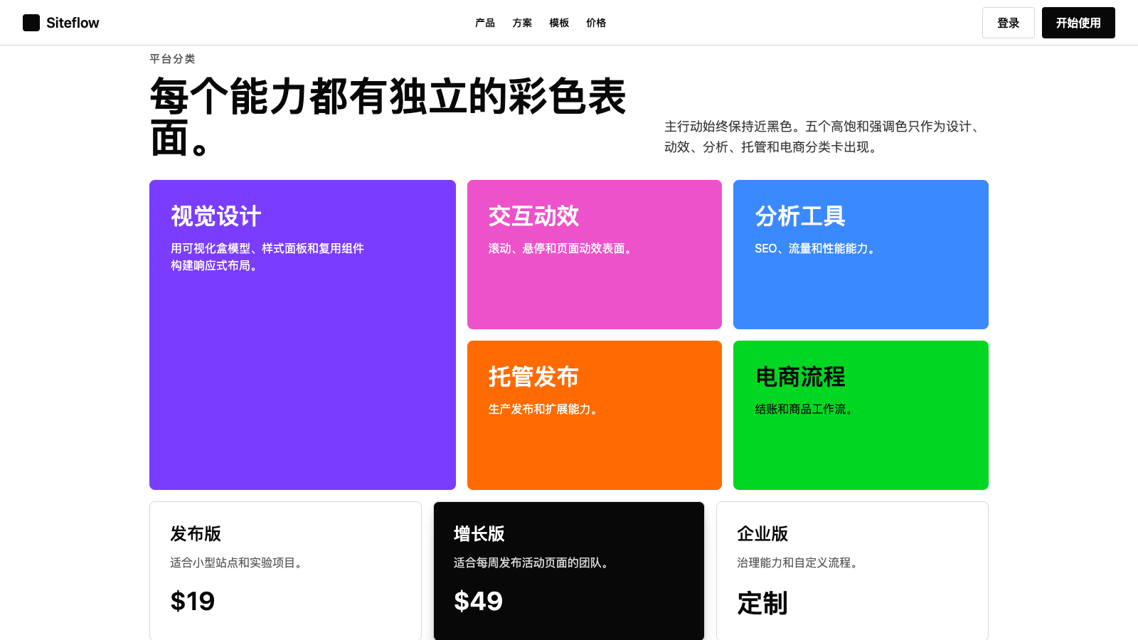
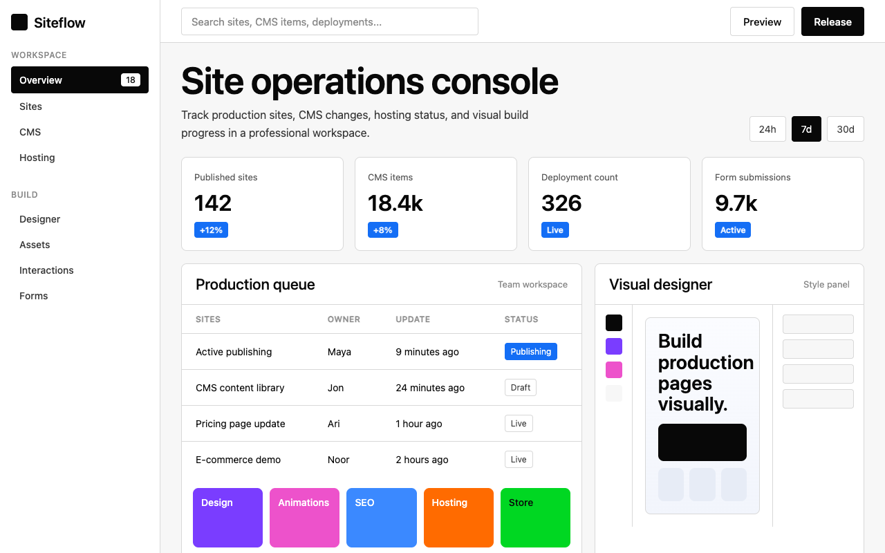

适合建站、设计工具和营销官网,黑白主系统搭配多色产品类别,突出可视化搭建能力。
设计语言样张
---
version: alpha
name: "Webflow"
description: "Webflow 的 DESIGN.md 中文参考模板,保留原始 design token 与专业术语,覆盖 color system、typography、layout、components、motion 与 interaction states。"
language: zh-CN
sourceLanguage: en
---

## 概览
Webflow 将自己定位为可视化网页开发平台;它的营销界面读起来是自信的专业产品,而不是科技创业公司。默认页面是慷慨的白色画布(`{colors.canvas}`),用 deep near-black `{colors.primary}`(`#080808`)承载品牌 primary CTA、typography 和 ink。在这个克制的 primary 周围,品牌叠加五段 chromatic accent system:`{colors.accent-purple}` `#7a3dff`、`{colors.accent-pink}` `#ed52cb`、`{colors.accent-blue}` `#3b89ff`、`{colors.accent-orange}` `#ff6b00`、`{colors.accent-green}` `#00d722`,分别映射到平台的产品类别(design、CMS、hosting、ecommerce 等)。这些 accent 作为 product-category grid 内的整卡填充出现,而不是按钮颜色;品牌 primary CTA 始终保持 near-black。

Type 是第二个决定性声音。专有 `WF Visual Sans Variable` family 承载每个 display、body 和 label role,weight 为 500 / 600;品牌从不超过 semibold,也不低于 regular。Hero display 为 80 px / weight 600 / `-0.8 px` tracking,自信但不喊叫。15 px weight 500、`1.5 px` positive tracking 的 uppercase eyebrow 标记每个 section header。

Shape system 很克制。Button 使用紧凑的 `{rounded.sm}` 4 px radius,既不是 pill 也不是 square;品牌因此读起来像工程化产品。Card 提升到 `{rounded.md}` 8 px。Pill(`{rounded.full}` 9999 px)只保留给 circular icon container。Featured card 上的 layered drop-shadow 增加适度 elevation,但从不显得笨重。

**Key Characteristics:**
- Two-colour conversion hierarchy:每个 primary CTA 使用 `{colors.primary}` near-black,每个 secondary 使用白底细线。Chromatic accent 只作为 category card 的整面填充,绝不作为 button background。
- 品牌 signature 是 **five-stop chromatic category palette**:purple / pink / blue / orange / green,每个都绑定到一种 product surface,并以满饱和度用作 card fill。
- Hero typography 为 80 px weight 600,带 `-0.8 px` tracking:克制、自信,绝不 billboard-loud。
- WF Visual Sans Variable 是 single family;品牌不为 body / display 使用独立 sans。WFVisualSans-Mono / Inconsolata 只出现在 technical caption。
- Button geometry 紧凑,使用 `{rounded.sm}` 4 px;card 使用 `{rounded.md}` 8 px。品牌从不使用 pill CTA。
- Featured card 上使用 layered multi-offset drop-shadow,这是品牌唯一的层级提示。

## Colors

### Brand & Accent
- **Ink Black** (`{colors.primary}` — `#080808`): 品牌 primary conversion colour。用于每个 primary CTA、每个 heading、每个 wordmark。比纯黑更深沉,读起来更有品牌感。
- **Accent Purple** (`{colors.accent-purple}` — `#7a3dff`): 五个 chromatic category accent 之一,用于 design / build product surface。
- **Accent Pink** (`{colors.accent-pink}` — `#ed52cb`): Magenta accent,用于 animation / interaction product surface。
- **Accent Blue** (`{colors.accent-blue}` — `#3b89ff`): Bright cyan-blue,用于 SEO / analytics product surface。
- **Accent Blue Deep** (`{colors.accent-blue-deep}` — `#006acc`): 更深的 blue,用于 emphasis link。
- **Accent Blue Info** (`{colors.accent-blue-info}` — `#146ef5`): Badge-info blue。
- **Accent Orange** (`{colors.accent-orange}` — `#ff6b00`): 用于 hosting / infrastructure product surface。
- **Accent Green** (`{colors.accent-green}` — `#00d722`): 用于 ecommerce / status-success surface。
- **Accent Yellow** (`{colors.accent-yellow}` — `#ffae13`): 用于 warning / collaboration product surface。
- **Accent Red** (`{colors.accent-red}` — `#ee1d36`): 用于 error / destructive state。

### Surface
- **Canvas** (`{colors.canvas}` — `#ffffff`): 默认页面背景。
- **Hairline** (`{colors.hairline}` — `#d8d8d8`): 1 px solid border,用于 input border、card chrome、divider line。

### Text
- **Ink** (`{colors.ink}` — `#080808`): 默认 text 与 heading。
- **Ink Strong** (`{colors.ink-strong}` — `#222222`): Near-black 强调色。
- **Body** (`{colors.body}` — `#363636`): 默认正文段落颜色。
- **Body Mid** (`{colors.body-mid}` — `#5a5a5a`): 中等强调的 secondary text,用于 footer line、caption。
- **Mute** (`{colors.mute}` — `#898989`): 低优先级文字。
- **Mute Soft** (`{colors.mute-soft}` — `#ababab`): 最浅 text role,用于 placeholder text、fine print。

### Semantic Colors
- **Info Blue** (`{colors.accent-blue-info}` — `#146ef5`): Info badge / notification。
- **Success Green** (`{colors.accent-green}` — `#00d722`): Success indicator。
- **Warning Yellow** (`{colors.accent-yellow}` — `#ffae13`): Warning state。
- **Error Red** (`{colors.accent-red}` — `#ee1d36`): Validation / destructive。

## Typography

### Font Family
一个 proprietary family 承载所有 typographic role:**WF Visual Sans Variable**(带 `Arial` system fallback)。存在 400 / 500 / 550 / 600 weight;品牌从不使用 700 / 800 / 900。Monospace variant **WFVisualSans-Mono**(带 `Inconsolata` fallback)处理少见的 technical caption 和 code-style label。Mono variant 启用 OpenType feature `"ss02"`、`"ss10"`、`"zero"`,用于 styled zero glyph。

### Hierarchy

| Token | Size | Weight | Line Height | Letter Spacing | 用途 |
|---|---|---|---|---|---|
| `{typography.display-xxl}` | 80px | 600 | 83.2px | -0.8px | Hero 主标题。 |
| `{typography.display-xl}` | 56px | 600 | 58.24px | 0 | 次级 hero display。 |
| `{typography.display-lg}` | 44.8px | 600 | 46.6px | 0 | Section 标题。 |
| `{typography.display-md}` | 32px | 500 | 41.6px | 0 | Card cluster 标题。 |
| `{typography.display-sm}` | 24px | 500 | 31.2px | 0 | Sub-section display。 |
| `{typography.display-xs}` | 20px | 500 | 28px | 0 | Inline display 微标题。 |
| `{typography.eyebrow-uppercase}` | 15px | 500 | 19.5px | 1.5px | Section 上方的 UPPERCASE eyebrow tag。 |
| `{typography.eyebrow-uppercase-sm}` | 12px | 500 | 12px | 0.6px | 小型 uppercase metadata。 |
| `{typography.body-lg}` | 28.8px | 400 | 46.08px | -0.288px | Lead 段落。 |
| `{typography.body-md}` | 16px | 400 | 25.6px | -0.16px | 默认正文。 |
| `{typography.body-md-strong}` | 16px | 500 | 25.6px | -0.16px | 加强调的 inline body。 |
| `{typography.body-sm}` | 14px | 400 | 22.4px | 0 | Secondary 正文。 |
| `{typography.body-sm-strong}` | 14px | 500 | 22.4px | 0 | 加粗 caption / nav-link。 |
| `{typography.caption}` | 12.8px | 550 | 15.36px | 0 | Badge label(品牌 signature 550 weight)。 |
| `{typography.caption-mono}` | 12px | 400 | 18px | 0 | Mono code caption。 |
| `{typography.button-md}` | 16px | 500 | 25.6px | -0.16px | Button label。 |

### Principles
- **Weight ceiling 为 600。** 品牌从不使用 700+。它要自信,而不是喧哗。
- **Display size 使用 negative tracking。** 80 px 时为 `-0.8 px`,并按比例缩放。Tight kerning 是品牌声音的一部分。
- **Uppercase eyebrow 标记每个 section。** 15 px / weight 500 / `1.5 px` positive tracking 是品牌 signature label style。
- **整个系统使用 single family。** 没有独立 display 与 body face,由 variable axes 完成工作。

### Font Substitutes
WF Visual Sans Variable 是 proprietary。Open-source substitute:
- **Display + body**:*Inter* weights 400 / 500 / 600,并启用 `font-feature-settings: "ss01"`,是最接近的 stylistic match。
- **Mono**:*Inconsolata*(已记录 fallback)或 *DM Mono*。

## Layout

### Spacing System
- **Base unit**: 4 px(精细 padding 中频繁出现 0.4 / 0.8 sub-multiple)。
- **Tokens**: `{spacing.xxs}` 2 px · `{spacing.xs}` 4 px · `{spacing.sm}` 8 px · `{spacing.md}` 12 px · `{spacing.lg}` 16 px · `{spacing.xl}` 20 px · `{spacing.2xl}` 24 px · `{spacing.3xl}` 32 px。
- **Section padding**: hero / content band 使用 `{spacing.3xl}` 32 px gutter,并带宽裕的 vertical spacing。
- **Card interior padding**: feature 与 pricing card 使用 `{spacing.3xl}` 32 px。

### Grid & Container
- Marketing container 很宽(实际接近 edge-to-edge,只保留 `{spacing.3xl}` gutter)。
- Category card grid:desktop 为 2 / 3-up,并使用混合尺寸(部分较大的 feature card 跨 2 column)。
- Pricing tier grid:desktop 为 3-up,mobile 为 1-up。

### Responsive Strategy

#### Breakpoints

| Name | Width | 关键变化 |
|---|---|---|
| Mobile | < 479px | Hero 堆叠;所有 grid 为 1-up。 |
| Mobile-Large | 479–767px | 与 Mobile 相同。 |
| Tablet | 768–991px | Grid 为 2-up。 |
| Desktop | ≥ 992px | 使用完整 multi-up grid。 |

#### Touch Targets
Button 渲染约 44 px(12 px vertical padding + 25.6 px line-height),满足 WCAG AAA。

#### Collapsing Strategy
- Nav:desktop 为 full link row,mobile 为 hamburger。
- Category card grid:desktop 为 2 / 3 / 4-up,mobile 降为 1-up。
- Pricing tier:desktop 为 3 / 4-up,mobile 为 1-up。

#### Image Behavior
- Category card:full-bleed solid colour fill(无 photography)。
- Product screenshot:`{rounded.md}` card chrome 内的 16:9。
- Marketing surface 中没有 portrait imagery。

## Elevation & Depth

| Level | Treatment | 用途 |
|---|---|---|
| Level 0 — Flat | 无 shadow,无 border。 | Default band。 |
| Level 1 — Hairline | `{colors.canvas}` 上使用 1 px solid `{colors.hairline}` border。 | Default card chrome 与 input border。 |
| Level 2 — Layered Drop | 带 subtle warm offset 的 multi-stop layered shadow:`0 84px 24px rgba(0,0,0,0), 0 54px 22px rgba(0,0,0,0.01), 0 30px 18px rgba(0,0,0,0.04), 0 13px 13px rgba(0,0,0,0.08), 0 3px 7px rgba(0,0,0,0.09)`。 | 需要明显抬升感的 featured card。 |
| Level 3 — Layered Drop Strong | Level 2 的更深版本,final offset opacity 为 `0.12`。 | Pricing / modal-level emphasis。 |
| Level 4 — Heavy Modal | 极重 multi-stop,final stop 为 `0 24px 24px rgba(0,0,0,0.26), 0 6px 13px rgba(0,0,0,0.29)`。 | Modal / dialog surface。 |

### Decorative Depth
- Chromatic category card(full-saturation purple / pink / blue / orange / green fill)通过与 white canvas 的纯 colour contrast 提供 visual depth。
- Layered shadow recipe 是品牌唯一真正的 atmospheric effect;它们是 individual opacity 很低的 5-stop drop-shadow stack。

## Shapes

### Border Radius Scale

| Token | Value | 用途 |
|---|---|---|
| `{rounded.none}` | 0px | Full-bleed band。 |
| `{rounded.xs}` | 2px | Tight inline pill。 |
| `{rounded.sm}` | 4px | 品牌 canonical button + badge + 小元素 radius。 |
| `{rounded.md}` | 8px | Card chrome 与 feature / category card。 |
| `{rounded.full}` | 9999px | 仅用于 circular icon container。 |

## Components

### Buttons

**`button-primary`** — canonical near-black CTA。
- Background `{colors.primary}`(`#080808`)、text `{colors.on-primary}` white、label `{typography.button-md}`(16 px weight 500)、padding `{spacing.md} {spacing.xl}`、shape `{rounded.sm}` 4 px。

**`button-secondary`** — white outline CTA。
- Background `{colors.canvas}`、text `{colors.ink}`、1 px solid `{colors.hairline}` border,typography + padding + shape 相同。

**`button-text-arrow`** — long-form section 中使用的带下划线 text-link CTA,并带 arrow。
- Background `{colors.canvas}`、text `{colors.ink}`、无 border、body 使用 `{typography.button-md}`、padding `{spacing.xl}` 0。

**`button-icon-circular`** — 用于 carousel control 的圆形 icon button。
- Background `{colors.canvas}`、ink icon、shape `{rounded.full}`。

### Cards & Containers

**`card-feature`** — canvas 上的 canonical feature card。
- Background `{colors.canvas}`、text `{colors.ink}`、1 px solid `{colors.hairline}`、padding `{spacing.3xl}`、shape `{rounded.md}`。Featured 时常提升到 Level 2 shadow。

**`card-feature-dark`** — near-black 上的反色 feature card。
- Background `{colors.primary}`、text `{colors.on-primary}`、padding `{spacing.3xl}`、shape `{rounded.md}`。

**`card-pricing`** — pricing-tier card。
- Background `{colors.canvas}`、text `{colors.ink}`、hairline border、padding `{spacing.3xl}`、shape `{rounded.md}`。Featured tier 使用 layered shadow。

### Inputs & Forms

**`text-input`** — canonical text input。
- Background `{colors.canvas}`、text `{colors.ink}`、1 px solid `{colors.hairline}`、body 使用 `{typography.body-md}`、padding `{spacing.md} {spacing.lg}`、shape `{rounded.sm}`。

### Navigation

**`nav-bar`** — sticky top nav。
- Background `{colors.canvas}`、text `{colors.ink}`、padding `{spacing.lg} {spacing.3xl}`。

**`nav-link`** — `nav-bar` 内的链接项。
- Text `{colors.ink}`,使用 `{typography.body-sm-strong}`。

**`footer`** — footer band。
- Background `{colors.canvas}`、text `{colors.body-mid}`、padding `{spacing.3xl} {spacing.3xl}`。Body 使用 `{typography.body-sm}`。

### Signature Components

**`hero-band`** — white hero band。
- Background `{colors.canvas}`、text `{colors.ink}`、padding `{spacing.3xl} {spacing.3xl}`。Headline 使用 `{typography.display-xxl}`(80 px weight 600)。

**`hero-band-dark`** — 反色 near-black hero band(用于部分 campaign page)。
- Background `{colors.primary}`、text `{colors.on-primary}`,padding / headline scale 相同。

**`content-band`** — canvas 上的 standard content band。
- Background `{colors.canvas}`、text `{colors.ink}`、padding `{spacing.3xl} {spacing.3xl}`。Section headline 使用 `{typography.display-lg}`。

**`category-card-purple`** — 整卡 purple category card。
- Background `{colors.accent-purple}`、text white、padding `{spacing.3xl}`、shape `{rounded.md}`。

**`category-card-pink`** — 整卡 pink category card。
- Background `{colors.accent-pink}`、text white、padding `{spacing.3xl}`、shape `{rounded.md}`。

**`category-card-blue`** — 整卡 blue category card。
- Background `{colors.accent-blue}`、text white、padding `{spacing.3xl}`、shape `{rounded.md}`。

**`category-card-orange`** — 整卡 orange category card。
- Background `{colors.accent-orange}`、text white、padding `{spacing.3xl}`、shape `{rounded.md}`。

**`category-card-green`** — 整卡 green category card(在较浅 green 上使用 ink text 保持可读性)。
- Background `{colors.accent-green}`、text `{colors.primary}`(ink)、padding `{spacing.3xl}`、shape `{rounded.md}`。

**`badge-info`** + **`badge-info-soft`** — solid blue 或 soft outline 的信息 badge。
- Filled:bg `{colors.accent-blue-info}`、text white。Soft:bg canvas、text `{colors.accent-blue-info}`。两者都使用 `{typography.caption}`(12.8 px weight 550),即品牌 signature 550-weight caption。

### Examples (illustrative)

> Auto-derived kit-mirror demonstration surface(`scripts/derive-examples-block.mjs`)。每个 `ex-*` entry 都引用 brand-native primitive,让 downstream consumer(`/preview-design`、`/generate-kit`)能一致 re-skin 同一组 10 个 surface。`TO_FILL` marker 表示 primitive 缺失,需要在 LLM judgment pass 中解决。

**`ex-pricing-tier`** — 默认 Pricing tier card。复用 feature-card chrome,并使用 brand canvas-soft surface。
- 属性:`backgroundColor`, `textColor`, `borderColor`, `rounded`, `padding`

**`ex-pricing-tier-featured`** — Featured / highlighted tier,使用反色 surface(light mode 中 dark fill + light text,dark mode 中 light fill + dark text)。
- 属性:`backgroundColor`, `textColor`, `rounded`, `padding`

**`ex-product-selector`** — What's Included summary card,改用于 SaaS / B2B vertical(不是 literal product gallery)。
- 属性:`backgroundColor`, `rounded`, `padding`

**`ex-cart-drawer`** — Subscription summary,改用于 SaaS / B2B(每个 add-on 一行 line item,不是 literal cart)。
- 属性:`backgroundColor`, `rounded`, `padding`, `item-divider`

**`ex-app-shell-row`** — App Shell 示例中的 sidebar nav row。Active state 使用 brand primary 作为 indicator。
- 属性:`backgroundColor`, `activeIndicator`, `rounded`, `padding`

**`ex-data-table-cell`** — 默认 data-table th + td chrome。Header 使用 mono-caps eyebrow typography;body 使用 body-sm。
- 属性:`headerBackground`, `headerTypography`, `bodyTypography`, `cellPadding`, `rowBorder`

**`ex-auth-form-card`** — Sign-in / sign-up card。复用 feature-card chrome,内部放置 text-input primitive。
- 属性:`backgroundColor`, `rounded`, `padding`

**`ex-modal-card`** — Modal dialog surface,与 feature-card 使用相同 chrome,并带 elevated shadow。
- 属性:`backgroundColor`, `rounded`, `padding`

**`ex-empty-state-card`** — 空状态 illustration frame。
- 属性:`backgroundColor`, `rounded`, `padding`, `captionTypography`

**`ex-toast`** — Toast notification surface,使用 feature-card shape + medium shadow。
- 属性:`backgroundColor`, `rounded`, `padding`, `typography`

## Do's and Don'ts

### Do
- 将 `{colors.primary}`(`#080808`)保留给每个 primary CTA、每个 heading 和每个 wordmark。Near-black 是转化颜色。
- 将五个 chromatic accent(purple / pink / blue / orange / green)用作整面填充的 category card,而不是 button background。
- Hero headline 使用 `{typography.display-xxl}` weight 600,并带 `-0.8 px` tracking。
- 所有 typographic role 都配合 proprietary WF Visual Sans family。
- Button 使用 `{rounded.sm}` 4 px,card 使用 `{rounded.md}` 8 px。品牌从不使用 pill CTA。
- Featured card 使用 layered multi-stop drop-shadow,这是品牌有辨识度的 elevation recipe。

### Don't
- 不要把 button-medium weight 提升到 700+。品牌 weight ceiling 是 600。
- 不要把 chromatic accent 用作 button background。它们是 surface fill,不是操作动作。
- 不要把 CTA 渲染为 pill。品牌 button geometry 是紧凑的 4 px rectangle。
- 不要引入第六种 accent colour。5-stop palette 就是系统。


