
01 / 03

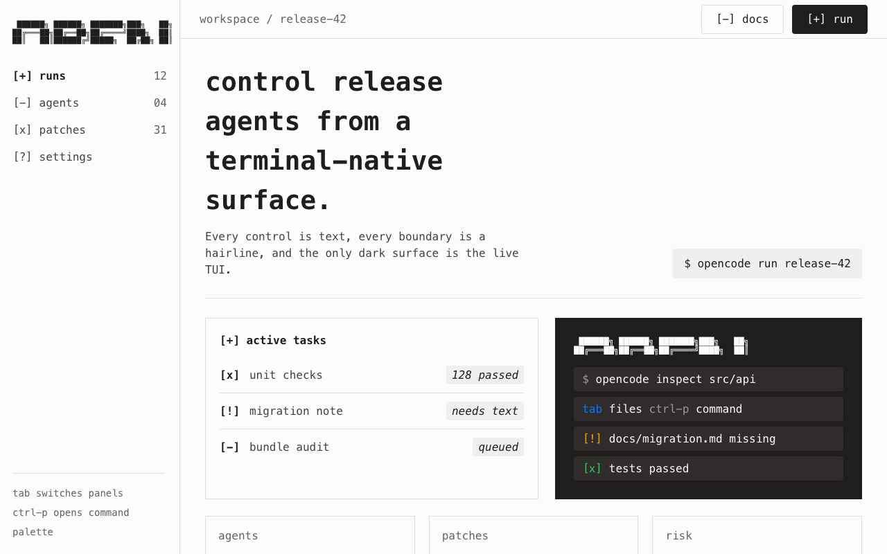
适合 CLI、开源工具和工程说明页,暖奶油画布、全站等宽字体、ASCII 标记和深色 TUI 卡片形成低调终端感。
设计语言样张
品牌语言来自 Berkeley Mono、ASCII 标记和 manpage 式文本块;语义色只在终端 mockup 内作为状态信号。
 ██████╗ ██████╗ ███████╗███╗   ██╗
██╔═══██╗██╔══██╗██╔════╝████╗  ██║
██║   ██║██████╔╝█████╗  ██╔██╗ ██║
$ opencode tui
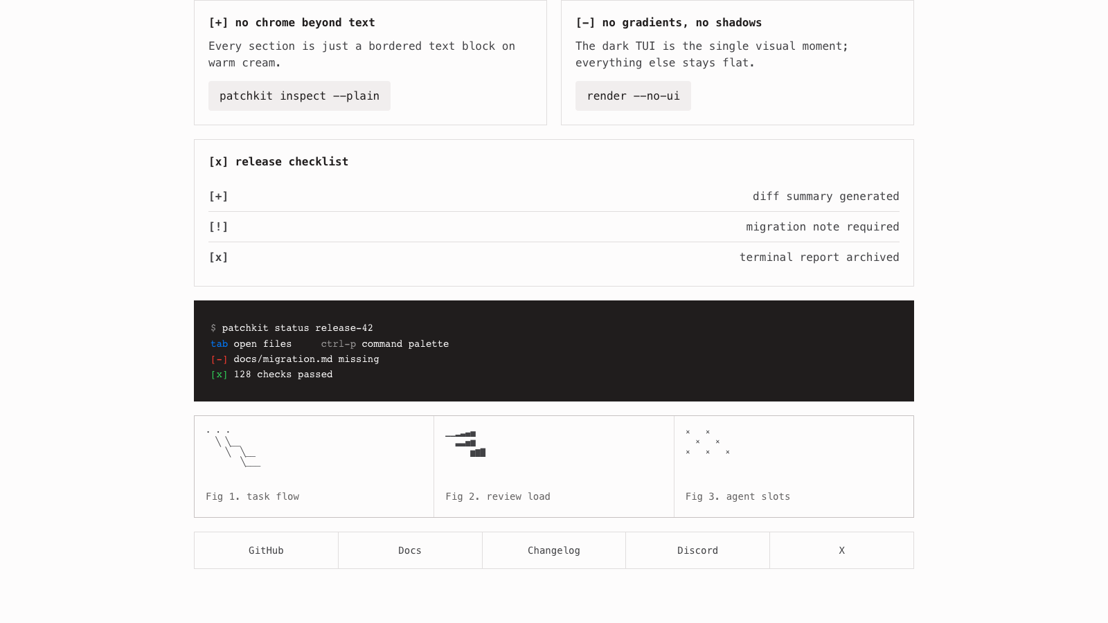
奶油画布上只有 1px 边框和等宽文字。
图标被 bracket marker 替代。
暗色面只服务终端语境。
---
version: alpha
name: "OpenCode"
description: "OpenCode 的 DESIGN.md 中文参考模板,保留原始 design token 与专业术语,覆盖 color system、typography、layout、components、motion 与 interaction states。"
language: zh-CN
sourceLanguage: en
---

## 概览
OpenCode 的 marketing site 完全由 Berkeley Mono 渲染:从 38px hero headline 到 14px footer fine print,页面上的每个词都使用同一个 monospaced face。Visual identity 就来自这一项 typographic decision:页面读起来像 manpage 或 static-site README,并用 bracketed `[+]` / `[-]` / `[x]` ASCII marker 代替 icon 或 bullet,nav 顶部的 wordmark 则渲染为 block-pixel ASCII art。没有任何 sans-serif,没有 display face,没有 italic,也没有 decorative ornament;这个系统距离 1990s 的 `whatis` page 只差一个 font 和一个 weight,只是以现代 resolution 渲染。

Chrome 很 austere:warm cream canvas(`{colors.canvas}`,带 faint blush 的 `#fdfcfc`)、nearly-black ink(`{colors.ink}`,`#201d1d`),以及用于 body、metadata、disabled text 的 4-tier neutral gray ladder。Card 并不作为 raised surface 存在;section 只是带 hairline border(`{colors.hairline}` 1px)的 text block,直接位于 canvas 上,彼此之间留出 `{spacing.section}`(96px)的空气。整个系统唯一的 “visual” moment 是 full-bleed dark hero card(`{colors.surface-dark}`,true near-black),它 mock up OpenCode TUI 本身:一个 terminal frame,带 `tab` / `ctrl-p` keybinding hints、一行 “Build” command line,以及渲染为 pixel-block ASCII title 的 OpenCode wordmark。

Semantic palette 对 brand-marketing site 来说很不寻常:它带有完整 Apple Human Interface Guidelines accent ramp,包括 `{colors.accent}`(Apple Blue `#007aff`)、`{colors.danger}`(`#ff3b30`)、`{colors.warning}`(`#ff9f0a`)、`{colors.success}`(`#30d158`),以及它们的 hover / active deepenings。尽管如此,marketing surface 本身只在 dark hero TUI mockup 内把这些颜色作为 syntax-highlight stand-in 使用。更大的 palette 属于 in-product TUI;marketing page 大多保持 monochrome。

**Key Characteristics:**
- 每个 text role 100% 使用 Berkeley Mono typography;chrome 中没有任何 sans-serif fallback。
- Warm cream `{colors.canvas}`(#fdfcfc)是唯一 body background;section 之间没有 surface alternation。
- 单一 dark surface(`{colors.surface-dark}`,#201d1d)专门保留给 hero TUI mockup。
- 每个 interactive element 使用 4px radius(`{rounded.sm}`);section 本身是带 1px hairline border 的 sharp rectangle。
- ASCII bracket marker(`[+]`、`[-]`、`[x]`)作为 feature list 与 FAQ row 中的 bullet glyph。
- Primary nav 与 hero TUI 内使用 block-pixel ASCII wordmark;brand identity 就是它自己的 ASCII art。
- 每个 section 之间保持 96px `{spacing.section}` rhythm,没有 decorative divider;只有 thin 1px `{colors.hairline}` rule 分隔 content block。

## Colors

> **Source pages:** `/` (home), `/zen`, `/enterprise`. The chrome palette is identical across all three.

### Brand & Accent
- **Ink** (`{colors.primary}` / `{colors.ink}` — `#201d1d`): 品牌唯一 “color”。用于 headline、body text、primary CTA fill、nav link 与每个 solid icon。它把 nearly-black 当作 brand color,而不是 pure black,以保证 warm cream canvas 上的 type 可读。
- **Ink Deep** (`{colors.ink-deep}` — `#0f0000`): Primary CTA 的 pressed-state。带 faint red undertone,与 canvas 的 warm cast 匹配。
- **Cream** (`{colors.canvas}` — `#fdfcfc`): 品牌 signature warm white。用于每个 page body、每个 card surface、on-primary text color,以及 dark 上的 ASCII wordmark fill。

### Surface
- **Canvas Cream** (`{colors.canvas}` — `#fdfcfc`): 每个 page body、每个 card。
- **Soft Surface** (`{colors.surface-soft}` — `#f8f7f7`): Text-input default background、testimonial row fill、alternating row tint。
- **Surface Card** (`{colors.surface-card}` — `#f1eeee`): Install-snippet pill、disabled button fill、slightly-elevated section row。
- **Surface Dark** (`{colors.surface-dark}` — `#201d1d`): Hero TUI mockup background 与 home page 上的 dark CTA pill。它与 `{colors.ink}` 相同,品牌用同一个 near-black 同时承载 text 与 dark surface。
- **Surface Dark Elevated** (`{colors.surface-dark-elevated}` — `#302c2c`): Hero TUI mockup 内的 prompt-row,比 dark surface 本身亮一档。
- **Hairline** (`{colors.hairline}` — `rgba(15,0,0,0.12)`): 1px section divider。Translucent warm tint 匹配 cream canvas 的 undertone。
- **Hairline Strong** (`{colors.hairline-strong}` — `#646262`): Tab strip bottom rule 与更强的 inline divider。

### Text
- **Ink** (`{colors.ink}` — `#201d1d`): Headline、body text、primary nav link、light surface 上的 button text。
- **Charcoal** (`{colors.charcoal}` — `#302c2c`): Pure ink 过重时使用的 slightly softer body。
- **Body** (`{colors.body}` — `#424245`): Default paragraph text 与 FAQ answer。
- **Mute** (`{colors.mute}` — `#646262`): Tab label(default state)、metadata、footer link text、in-list secondary annotation。
- **Stone** (`{colors.stone}` — `#6e6e73`): Least-emphasis utility text、breadcrumb separator。
- **Ash** (`{colors.ash}` — `#9a9898`): Disabled text 与 dark TUI mockup 中的 secondary annotation,同时也是 TUI mockup secondary color。

### Semantic Colors
完整 Apple Human Interface Guidelines semantic ramp 随系统提供。在 marketing page 上,这些颜色主要出现在 hero TUI mockup 内,作为 syntax-highlight stand-in;在 in-product TUI 中,它们承载常规语义。

- **Accent** (`{colors.accent}` — `#007aff`): Primary informational signal、in-product link color、TUI command highlight。
- **Accent Hover** (`{colors.accent-hover}` — `#0056b3`): Pressed informational link。
- **Accent Active** (`{colors.accent-active}` — `#004085`): Deeply-pressed informational state。
- **Danger** (`{colors.danger}` — `#ff3b30`): Destructive confirmation、error state。
- **Danger Hover** (`{colors.danger-hover}` — `#d70015`): Pressed destructive。
- **Danger Active** (`{colors.danger-active}` — `#a50011`): Deeply-pressed destructive。
- **Warning** (`{colors.warning}` — `#ff9f0a`): Caution callout。
- **Warning Hover** (`{colors.warning-hover}` — `#cc7f08`): Pressed caution。
- **Warning Active** (`{colors.warning-active}` — `#995f06`): Deeply-pressed caution。
- **Success** (`{colors.success}` — `#30d158`): Positive confirmation、in-TUI success indicator。

## Typography

### Font Family
**Berkeley Mono** 是系统中每个 text role 使用的 proprietary monospaced face。它包含 400(regular)、500(medium)与 700(bold)weight,并通过长 monospace stack fallback:IBM Plex Mono → ui-monospace → SFMono-Regular → Menlo → Monaco → Consolas → Liberation Mono → Courier New。

Single-font decision 就是品牌。没有 display face,没有 body sans,没有 italic alternative,也没有任何地方 fallback 到 proportional font;即使 legal copyright row 也使用 14px Berkeley Mono。这是 marketing-tools 类别中最激进的 typographic restraint:OpenCode 的 identity 是“marketing page is a man page”。

### Hierarchy

| Token | Size | Weight | Line Height | Letter Spacing | 用途 |
|---|---|---|---|---|---|
| `{typography.display-xl}` | 38px | 700 | 1.5 | 0 | Hero headline(“The open source AI coding agent”) |
| `{typography.heading-md}` | 16px | 700 | 1.5 | 0 | Section label(“What is OpenCode?”、“FAQ”、“Built for privacy first”) |
| `{typography.body-md}` | 16px | 400 | 1.5 | 0 | Body copy、paragraph text、list-row text、install-snippet code |
| `{typography.body-strong}` | 16px | 500 | 1.5 | 0 | Inline emphasis、primary nav link、tab-label active |
| `{typography.body-tight}` | 16px | 500 | 1 | 0 | 无 breathing room 的 compact label |
| `{typography.link-md}` | 16px | 400 | 1.5 | 0 | Body prose 中的 inline anchor link |
| `{typography.button-md}` | 16px | 500 | 2 | 0 | 系统中的每个 button label |
| `{typography.caption-md}` | 14px | 400 | 2 | 0 | Footer link text、badge label、copyright row、chart caption |

### Principles
Hierarchy 几乎完全由单一 face 上的 size 与 weight contrast 构建。Display headline(38px / 700)与 heading-md label(16px / 700)共享同一 weight,差异只是 size。Body 与 link 共享 size、weight 与 line-height;只有 context 区分它们。Button 有意使用较高 line-height(2.0),让 label 在 4px-radius rectangle 内显得 calm、spaced。

### Font Substitutes
Berkeley Mono 是 paid commercial font。在 body size 上能将 metrics 近似到约 3% 以内的 open-source substitute 包括:
- **JetBrains Mono**:stroke contrast 与 x-height 最接近;使用 weights 400 / 500 / 700。
- **IBM Plex Mono**:文档 font stack 中的 official secondary fallback;counter 略更 open,但匹配 line-height behavior。
- **Geist Mono**:具有相似 geometric construction 的 modern alternative。

替代时,通过保持 body 的 `lineHeight: 1.5` 与 button 的 `lineHeight: 2` 来保留 line-height behavior;很少需要调整 weight。

## Layout

### Spacing System
- **Base unit:** 8px(tight inline gap 可使用更细的 1 / 2 / 4px step)。
- **Tokens (front matter):** `{spacing.xxs}` (1px) · `{spacing.xs}` (4px) · `{spacing.sm}` (8px) · `{spacing.md}` (12px) · `{spacing.lg}` (16px) · `{spacing.xl}` (24px) · `{spacing.xxl}` (32px) · `{spacing.section}` (96px)。
- **Universal section rhythm:** 集合中的每个 page 都用 `{spacing.section}`(96px)作为 major content block 之间的 vertical gap。这是系统中最大的 spacing token,也是 home、`/zen` 与 `/enterprise` page 上的 dominant layout cue。
- **Section internal padding:** Section 内的 content row 使用 `{spacing.lg}`(16px)vertical,无 horizontal padding;text 从 section 左边缘 flush 开始。

### Grid & Container
- **Max width:** Body section 使用约 960px content column;dark hero TUI mockup 在约 1100px outer content frame 内 full-bleed。
- **Two-column split:** `/enterprise` 将左侧 text block(约 360px wide)与右侧对齐 form column(约 480px wide)配对。Home page 是 single-column reading。
- **Footer:** Desktop 上为 5-up horizontal link row(GitHub / Docs / Changelog / Discord / X),tablet 折叠为 2-up,mobile 折叠为 1-up。

### Whitespace Philosophy
Whitespace 是 structural 且 generous。Section 彼此相隔 96px,中间没有 decorative divider;`{colors.hairline}` 1px rule 是唯一 separation signal。Section 内部 content 左对齐贴近 column edge,没有 internal indentation;bullet 使用 ASCII bracket prefix(`[+]` / `[-]`),而不是基于 indentation 的 layout。结果是页面更像 printed code listing,而不是 styled marketing layout。

## Elevation & Depth

| Level | Treatment | 用途 |
|---|---|---|
| 0 — Flat | 无 border,无 shadow | Body section、list row、hero text block、footer 的默认层级 |
| 1 — Hairline rule | 1px solid `{colors.hairline}`(translucent warm tint) | Section divider、major content block 之间 |
| 2 — Hairline strong | 1px solid `{colors.hairline-strong}` | Tab strip bottom rule、in-list emphasized divider |
| 3 — Inverted dark | `{colors.surface-dark}` fill | Hero TUI mockup、dark CTA pill;系统唯一 “elevated” surface 使用 color,而不是 shadow |

系统中没有 drop shadow。没有元素 lift,也没有元素 float。一个元素被读作位于另一个元素“上方”的唯一方式,是 hero mockup 中使用的 dark surface。

### Decorative Depth
Depth 来自 typography density 与单一 dark TUI mockup,而不是 CSS effect:
- **ASCII block-pixel wordmark**:OpenCode brand name 被渲染为 5-row monospaced character cell block,用于 primary nav,并作为 hero TUI mockup 的 centerpiece。
- **Hero TUI mockup**:Full-bleed `{colors.surface-dark}` rectangle,包含 faux terminal interface:ASCII wordmark、显示 Build command line 的 `tui-prompt-row`,以及底部边缘以 `{colors.ash}` 显示的 `tab switch agent` / `ctrl-p commands` keybinding hints。
- **Chart tiles**:Home page “open source AI coding agent” stat block 中的三个 thin-line ASCII chart,在 cream canvas 上以 `{colors.body}` 绘制 abstract dotted / sparse-line plot。Caption 位于下方,使用 `{typography.caption-md}`(`Fig 1. 150K GitHub Stars`、`Fig 2. 850 Contributors`、`Fig 3. 6.5M Monthly Devs`)。

## Shapes

### Border Radius Scale

| Token | Value | 用途 |
|---|---|---|
| `{rounded.none}` | 0px | Section、hero TUI mockup、primary nav、footer、list row,也就是所有不是 button 的 container |
| `{rounded.sm}` | 4px | 每个 interactive element:primary CTA、secondary CTA、text input、install snippet、badge、prompt row |
| `{rounded.full}` | 9999px | Testimonial 中的 avatar circle |

Radius vocabulary 只有两个值:interactive element 使用 4px,其他一切使用 0px。Testimonial row 中的 avatar circle 是系统里唯一 fully-rounded element。

### Photography Geometry
没有 photography。Visual element 仅限于:
- Nav 与 hero TUI mockup 中的 **ASCII block-pixel wordmark**。
- Stat-block section 内的 **Inline ASCII chart**:abstract sparse-line 与 dotted plot,不含具体 data point。
- `/zen` testimonial row 内的 **Avatar dots**(约 32px):`{rounded.full}` flat colored circle。
- **In-product icons**(kbd、A+、⊕、↻、K、Z)渲染为 small monospaced character glyph,而不是 bitmap 或 SVG。

## Components

> 根据 system policy,**不记录 hover state**。每个 spec 只覆盖 Default 与 Active / Pressed。

### Buttons

**`button-primary`** — 通用 OpenCode CTA。
- Background `{colors.primary}`、text `{colors.on-primary}`、type `{typography.button-md}`、padding `4px 20px`、height 约 36px、rounded `{rounded.sm}`(4px)。
- 用于 “Download”(top nav)、“Get started with Zen”、“Send”(enterprise contact form)、“Subscribe”(newsletter footer)、“Read docs →”。
- Pressed state 位于 `button-primary-active`,background 降为 `{colors.ink-deep}`。

**`button-secondary`** — Outlined alternative。
- Background `{colors.canvas}`、text `{colors.ink}`、1px solid `{colors.hairline-strong}` border、type `{typography.button-md}`、padding `4px 20px`、rounded `{rounded.sm}`。
- Lower-emphasis CTA,在两个 action 配对时出现在 primary fill 旁边。

**`button-tab`** + **`button-tab-active`** — Install-tab strip。
- Default:transparent background、text `{colors.mute}`、type `{typography.button-md}`、padding `8px 16px`、rounded `{rounded.none}`。
- Active:surface 相同,text `{colors.ink}`,并用 2px `{colors.ash}` bottom underline 表示 selection。
- 用于 home page 上 install-method tab strip(`curl` / `npm` / `bun` / `brew` / `yay`)。

**`button-disabled`**
- Background `{colors.surface-card}`、text `{colors.ash}`、rounded `{rounded.sm}`。

### Badges & Chips

**`badge-news`** — News / announcement strip 中的 small dark chip。
- Background `{colors.surface-dark}`、text `{colors.on-dark}`、type `{typography.caption-md}`、padding `2px 8px`、rounded `{rounded.sm}`。
- 在 home page hero headline 上方与 body copy inline 放置,作为 “News” / “Beta” / “Live now” tag。

**`badge-section-label`** — Bracketed section header。
- Background transparent、text `{colors.ink}`、type `{typography.heading-md}`、rounded `{rounded.none}`。
- 渲染为 1px `{colors.hairline}` rule 上方的 bare `**Heading**` line,没有 chip background;但 text 的读取方式(“[+]”、“[x]”、`What is OpenCode?`)让它发挥 label component 作用。

### Inputs & Forms

**`text-input`** + **`text-input-focused`**
- Default:background `{colors.surface-soft}`、text `{colors.ink}`、1px solid `{colors.hairline}`、type `{typography.body-md}`、padding `8px 12px`、height 约 40px、rounded `{rounded.sm}`。
- Focused:background 切换为 `{colors.canvas}`,border 变为 1px solid `{colors.ink}`(canvas 的 flat focus signal,无 halo、无 glow)。
- 用于 `/enterprise` 上每个 contact-form field(Full name、Role、Company、Company email、Phone number),以及 home page footer 的 newsletter email field。

**`textarea`**
- Background `{colors.surface-soft}`、text `{colors.ink}`、1px solid `{colors.hairline}`、type `{typography.body-md}`、padding `12px`、rounded `{rounded.sm}`。
- `/enterprise` 上 “What problem are you trying to solve?” multi-line textarea。

**`install-snippet`** — Home page signature install code block。
- Background `{colors.surface-card}`(`#f1eeee`)、text `{colors.ink}`,以 `{typography.body-md}` 渲染(已经是 monospaced 的 Berkeley Mono),padding `12px 16px`、rounded `{rounded.sm}`。
- 包含 literal `curl -fsSL https://opencode.ai/install | bash` command,右侧边缘带 small copy-icon。位于 install-method tab strip 下方。

### Cards & Containers

**`hero-tui-mockup`** — Home page signature TUI preview。
- Container:full-bleed `{colors.surface-dark}`(约 near-black)、padding `64px 32px`、rounded `{rounded.none}`。
- Contents(top → bottom):居中的 ASCII block-pixel “OPENCODE” wordmark,颜色 `{colors.on-dark}`;一个 `{component.tui-prompt-row}`,展示带 model selector text 的 “Build” command line;底部使用 `{colors.ash}` 的 `tab switch agent  ctrl-p commands` keybinding hint row。

**`tui-prompt-row`** — TUI mockup 内的 inset command line。
- Background `{colors.surface-dark-elevated}`(`#302c2c`)、text `{colors.on-dark}`,使用 `{typography.body-md}`,padding `8px 12px`、rounded `{rounded.sm}`。
- 渲染 inline command(`Build  Claude Opus 4.5  OpenCode Zen`),带 leading vertical pipe,model name 被 styled 为 bracketed token。

**`list-row`** — 带 ASCII bracket bullet 的 feature / benefit row。
- Background `{colors.canvas}`、text `{colors.body}`,使用 `{typography.body-md}`,padding `8px 0`。
- 每行以 `[+]` / `[-]` / `[x]` ASCII marker 开头,后接 bold label 与 regular description,例如 `[+] LSP enabled    Automatically loads the right LSPs for the IDE`。Bracket marker 是 text content 的一部分,不是独立 icon。

**`faq-row`** — 带 bracket toggle 的 FAQ entry。
- Background `{colors.canvas}`、text `{colors.ink}`,使用 `{typography.body-md}`,padding `12px 0`,并带 1px `{colors.hairline}` bottom rule。
- 每行以 `+` / `−` ASCII marker 开头,表示 expand / collapse state。始终渲染为 plain text row;没有 chevron icon,也没有 animated accordion chrome。

**`testimonial-row`** — `/zen` peer-quote row。
- Background `{colors.surface-soft}`、text `{colors.body}`,使用 `{typography.body-md}`,padding `16px 20px`、rounded `{rounded.sm}`。
- Layout:左侧 32px avatar circle(`{rounded.full}`),第一行是 `{typography.body-strong}` 的 name + role + company,第二行是 `{typography.body-md}` `{colors.body}` 的 quote。

**`chart-tile`** — Stat-block sparse-line chart。
- Background `{colors.canvas}`、text `{colors.body}`,使用 `{typography.caption-md}`、rounded `{rounded.none}`、padding `16px`。
- 包含一个 inline SVG / CSS-drawn ASCII-style sparse-line plot(dotted、abstract,不是具体 data point),下方有 `{colors.mute}` 的 `Fig N. <stat label>` caption。

### Navigation

**`primary-nav`**
- Background `{colors.canvas}`、text `{colors.ink}`,使用 `{typography.body-strong}`、height 约 56px、rounded `{rounded.none}`,并带 1px `{colors.hairline}` bottom rule。
- Layout(desktop):左侧 block-pixel ASCII OpenCode wordmark(约 120×24px),center-right 为 nav links cluster(“GitHub [150K] · Docs · Zen · Go · Enterprise”),最右侧是 `{component.button-primary}` “Download” CTA,带 small download glyph。

**Top Nav (Mobile)**
- ASCII wordmark 保持在左侧,nav link 折叠为右侧 hamburger drawer。Download CTA 在每个 breakpoint 都保持可见。

### Footer

**`footer-section`**
- Background `{colors.canvas}`、text `{colors.body}`,使用 `{typography.caption-md}`、padding `32px 0`,并带 1px `{colors.hairline}` top rule。
- Top row:5-column horizontal link grid(GitHub [150K] · Docs · Changelog · Discord · X),每项渲染为 centered cell,并由 1px `{colors.hairline}` vertical rule 分隔。
- Bottom row:左侧 `©2026 Anomaly` copyright,右侧 `Brand · Privacy · Terms · English ▼` utility cluster,全部使用 `{typography.caption-md}` `{colors.mute}`。

### Inline Elements

**`link-inline`** — Body-prose anchor link。
- `{colors.ink}` text 带 underline。它是品牌唯一 link affordance;即使 body paragraph 内的 link 也使用 ink color,而不是 `{colors.accent}` blue。Apple Blue 保留给 in-product TUI。

## Do's and Don'ts

### Do
- 每个 text role 都用 Berkeley Mono 渲染。Single-font decision 就是完整 identity。
- 将 `{colors.canvas}`(`#fdfcfc`)保持为唯一 body background。不要引入 gray section band。
- 使用 ASCII bracket marker(`[+]`、`[-]`、`[x]`、`+`、`−`)作为 bullet、toggle 与 section glyph。它们是品牌唯一 iconography。
- 每个 landing page 只把 dark `{component.hero-tui-mockup}` 作为 hero centerpiece 锚定一次。绝不要把 dark surface 用于 body content。
- 将 `{colors.accent}`(Apple Blue)与其余 semantic ramp 保留给 in-TUI state;marketing chrome 保持 monochrome。
- 每个 interactive element 使用 `{rounded.sm}`(4px),每个 container 使用 `{rounded.none}`(0px)。
- Content section 按 `{spacing.section}`(96px)rhythm 堆叠,section 之间只使用 1px `{colors.hairline}` rule。

### Don't
- 不要引入 sans-serif body font、display face 或 italic style。Berkeley Mono 承载一切。
- 不要添加 drop shadow、gradient 或 atmospheric background。系统是 flat-on-cream。
- 不要用 SVG icon 替换 ASCII bracket marker。Bracket 就是 icon。
- 不要在 marketing CTA 上使用 semantic accent ramp(`{colors.accent}`、`{colors.warning}`、`{colors.danger}`、`{colors.success}`)。它们属于 in-product TUI。
- 不要给 card 添加 24px+ internal padding。List row 使用 8px vertical;FAQ row 使用 12px。
- 不要把 OpenCode wordmark 渲染为 vector logo。它始终是 block-pixel ASCII。
- 不要用 photography 或 illustration 填充 hero TUI mockup。它是 text-only,并且始终展示 faux terminal command line。

## Responsive Behavior

### Breakpoints

| Name | Width | 关键变化 |
|---|---|---|
| desktop-large | 1280px+ | 默认:960px content column、5-up footer link grid |
| desktop | 1024px | Layout 相同;nav 保持 horizontal |
| tablet | 850px | Footer 折叠为 2-up grid;`/enterprise` two-column form 堆叠 |
| tablet-narrow | 768px | Primary nav 变为 hamburger drawer;Download CTA 保持可见 |
| mobile | 640px | 全部 single-column;hero display 从 38px 降到约 28px;section padding 收紧 |

### Touch Targets
所有 interactive element 在约 36–40px height range 内满足 WCAG AA。`{component.button-primary}` 约 36px 高,带 20px horizontal padding。`{component.text-input}` 与 `{component.textarea}` 约 40px 高。Install-method strip 中的 `{component.button-tab}` row 根据 label length 约 32–36px,但通过 inline padding 扩展到完整 44px tappable cell。Footer link 使用 `{typography.caption-md}`(14px),但获得约 28px line-height(caption-md 为 2.0)加 8px vertical padding,形成舒适的约 44px tappable row。

### Collapsing Strategy
- **Primary nav:** Desktop horizontal cluster → 768px 的 tablet-narrow hamburger drawer。Dark “Download” CTA 在所有宽度保持可见。
- **Hero TUI mockup:** 每个 breakpoint 都保持 full-bleed dark surface;ASCII wordmark 按比例缩放,keybinding-hint row 在 narrow screen 上可 wrap 为两行。
- **Install snippet + tab strip:** Desktop fixed-width pill → mobile full-width pill;如果 label overflow,tab strip 横向滚动。
- **Footer:** 5-up horizontal link grid → tablet 上 2-up → mobile 上 1-up(每个 link 变为 full-width row)。
- **`/enterprise` two-column layout:** Desktop 50/50 → tablet 堆叠为 single-column,form 位于 text block 下方。
- **Section padding:** `{spacing.section}`(96px)desktop → 64px tablet → 48px mobile。
- **Hero headline:** Desktop 上 `{typography.display-xl}`(38px),mobile 缩放到约 28px,line-height 保持 1.5。

### Image Behavior
除 favicon 与 OG share image 外,系统中没有 raster image。每个 visual element,包括 wordmark、chart、icon,都以 type 或 inline SVG 渲染,因此缩放时无需考虑 aspect-ratio。

## Iteration Guide

1. 一次只聚焦一个 component。拉取它的 YAML entry,并确认每个 property 都能 resolve。
2. 直接引用 component name 与 token(`{colors.ink}`、`{component.hero-tui-mockup}`、`{rounded.sm}`),不要 paraphrase。
3. 编辑后运行 `npx @google/design.md lint DESIGN.md`;`broken-ref`、`contrast-ratio`、`orphaned-tokens` warning 会自动标记问题。
4. 将新 variant 作为独立 component entry 添加(`-active`、`-disabled`),不要埋在 prose 里。
5. 默认 body 使用 `{typography.body-md}`;emphasis 使用 `{typography.body-strong}`;`{typography.display-xl}` 严格保留给 page-top hero headline。
6. 保持 `{colors.surface-dark}` 稀缺;每页最多一个 full-bleed dark mockup。Dark surface 是 narrative device,不是 chrome treatment。
7. 引入新 component 时,先问它是否能用现有 ASCII-bracket + 4px-radius + Berkeley-Mono vocabulary 表达,再添加新 token。系统的强度在于它几乎从不需要新 token。

## Known Gaps

- **Mobile screenshot 未捕获**:responsive behavior 根据 desktop evidence 与 breakpoint stack,综合 OpenCode mobile pattern(hamburger drawer、single-column、footer accordion)。
- **Hover state 未记录**,遵循 system policy。
- **In-product TUI screenshot** 除 marketing hero mockup 外不在 captured set 中;实际 `opencode` terminal interface(完整 keybinding、panel、status bar)未在本文记录。
- **`/go` page** 未提取;Go SDK 的 marketing page 可能共享同一 chrome,但引入了上文未记录的 code-sample block。
- **Form validation state styling**(success / error inline message)未出现在 captured surface 中。