

01 / 03

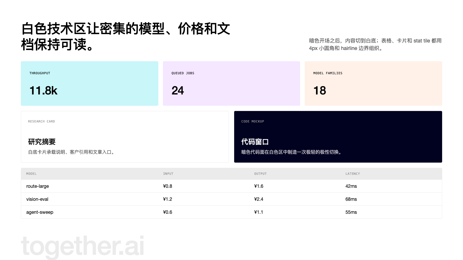
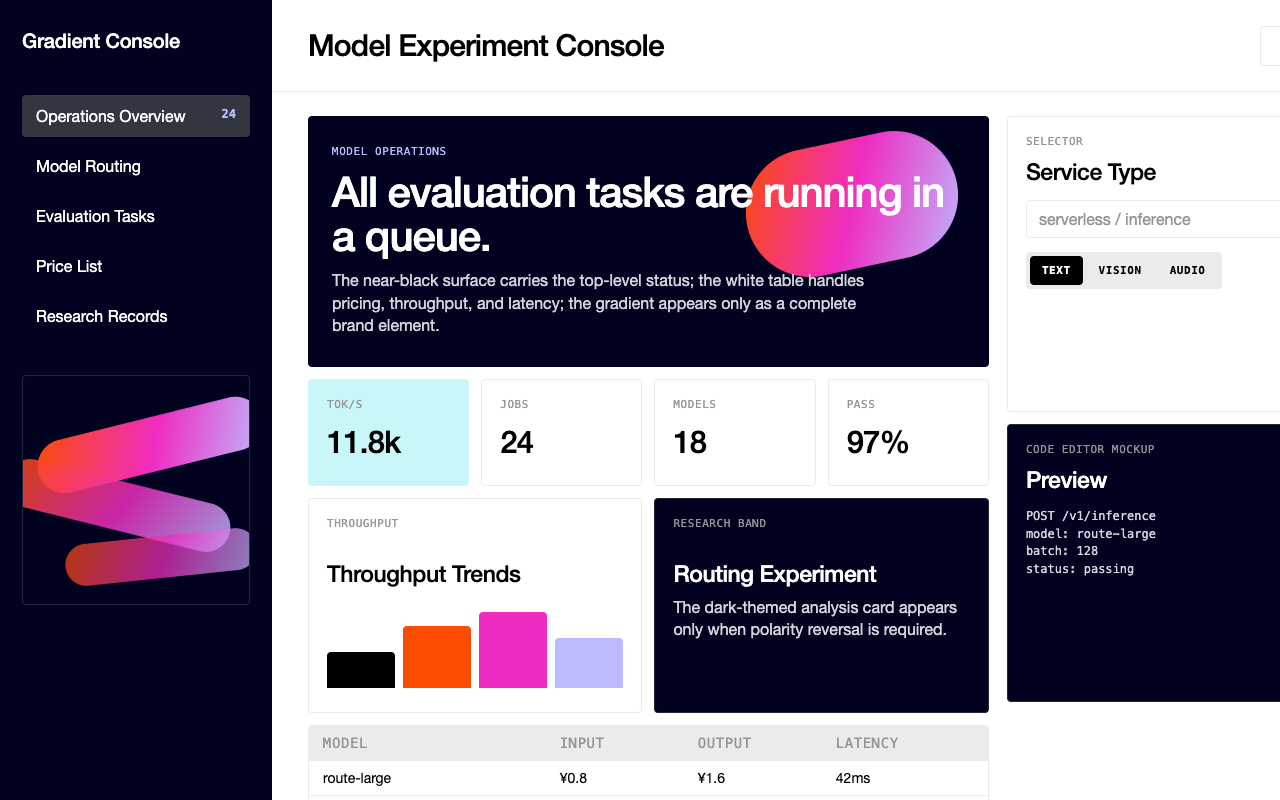
适合模型实验、研究平台和算力工作台,近黑 hero、亮白内容区和橙紫蓝渐变让技术信息更有辨识度。
设计语言样张
近黑画布承载高层级叙事,三色渐变只作为一个大尺度品牌物出现,按钮和标签全部使用 uppercase mono。
---
version: alpha
name: "Together AI"
description: "Together AI 的 DESIGN.md 中文参考模板,保留原始 design token 与专业术语,覆盖 color system、typography、layout、components、motion 与 interaction states。"
language: zh-CN
sourceLanguage: en
---

## 概览
Together AI 是 AI cloud-infrastructure platform:model inference、GPU cluster、fine-tuning,以及让 “the AI native cloud” 能交付给 developer team 的所有 plumbing。品牌 web surface 精准传达这种姿态:顶部 near-black hero,中间是一条长长的 white technical content ribbon,以及一个反复出现的 brand chrome:three-color orange-magenta-periwinkle gradient ribbon。它独自完成 “we are not just another grey enterprise SaaS” 的全部表达。没有其他 illustration system。Gradient 就是品牌。

Type 是第二个决定性声音。两个 face 承载每个页面:custom geometric display sans(提取为 `The Future`)用于 headline 与 body,设置 weight 500,并带 tight、slightly-negative letter-spacing,让 64px hero type 感觉像被 poured 到页面上,而不是 typed;uppercase monospace eyebrow(`PP Neue Montreal Mono`)则标记每个 section、每个 button 与每个 cell header。Headline 使用 sentence-case;所有 technical label 都是 uppercase mono。这种 contrast 是品牌的 tonal joke:平台严肃到会用 monospace label,也现代到不会把 headline 放进 monospace。

Surface aggressive alternation:hero / research / “Grounded in cutting-edge research” 使用 `{colors.canvas-dark}`(`#010120`)band;随后 product、pricing、testimonial 使用 `{colors.canvas}`(white),`{colors.hairline}` 只保留给 table-header row 与 toggle background。Pastel `{colors.accent-mint}` tinted stat tile 打破中段 white。Card 全部 lightly rounded(`{rounded.sm}` 4 px)并带 hairline border,从不使用 shadow 漂浮。

**Key Characteristics:**
- 单一 black `{colors.primary}` CTA pill 承载 pricing、footer、sign-in 中的每个 conversion target。Mint `{colors.accent-mint}` 与 white pill variant 只保留给 hero context。
- Three-color brand gradient(`{colors.accent-orange}` → `{colors.accent-magenta}` → `{colors.accent-periwinkle}`)就是完整 decorative system;它作为 hero ribbon graphic 使用,绝不在其他地方缩减为 swatch。
- 到处使用 `{typography.mono-caps-eyebrow}` / `{typography.mono-caps-button}` 的 all-caps mono eyebrow 与 button label,包括 section title、model row header、pricing table 中的 “ON-DEMAND” label。
- Card chrome 轻微圆角 `{rounded.sm}` 4 px;pricing-tab pill 内有一个更紧的 `{rounded.xs}` 3.25 px;`{rounded.full}` 只用于 floating chat-launcher orb。
- Dual surface mode:交替使用 `{colors.canvas-dark}` 与 `{colors.canvas}` band;没有中间灰。唯一 soft surface `{colors.hairline}` 只用于标记 table-header row。
- 每个页面最底部都有 massive `together.ai` wordmark banner,使用 `{typography.display-xxl}`,并 tint 到几乎融入 canvas 的 `{colors.hairline}`,作为 “we are here” sign-off,同时也是 footer separator。

## Colors

### Brand & Accent
- **Ink Black** (`{colors.primary}` — `#000000`): 单一 primary CTA color。Black pill 承载 “Sign in”、“Contact sales”、“Get started now” 与每个 footer CTA。
- **Brand Orange** (`{colors.accent-orange}` — `#fc4c02`): Three-color brand gradient 的一端。出现在 hero ribbon graphic 中;绝不单独作为 UI fill。
- **Brand Magenta** (`{colors.accent-magenta}` — `#ef2cc1`): Gradient 第二段。
- **Brand Periwinkle** (`{colors.accent-periwinkle}` — `#bdbbff`): Gradient 第三段;也作为部分 stat tile 的 soft fill。
- **Brand Mint** (`{colors.accent-mint}` — `#c8f6f9`): 位于 gradient 之外的 pastel cyan,用于 hero secondary-CTA pill 与 `stats-card-tinted` tile。

### Surface
- **Canvas** (`{colors.canvas}` — `#ffffff`): 默认 product / pricing / docs background。
- **Hairline / Canvas Soft** (`{colors.hairline}` — `#ebebeb`): 品牌唯一 soft surface tone,用于 data-table header row、toggle-pill rail,以及 table row 之间的 1 px divider。
- **Canvas Dark** (`{colors.canvas-dark}` — `#010120`): 品牌 dark hero surface;出现在 `hero-band-dark` 与 `research-band-dark`。
- **Hairline** (`{colors.hairline}` — `#ebebeb`): Light surface 上的 1 px divider,包括 table row、card chrome、badge border。
- **Hairline on Dark** (`{colors.surface-dark-soft}` — `#26263a`): `{colors.canvas-dark}` surface 上的 1 px divider 与 badge background;由品牌 translucent-white-on-dark hairline pre-blended 而来。
- **Surface Dark Soft** (`{colors.surface-dark-soft}` — `#313641`): Dark-band card 内使用的略亮 dark fill。

### Text
- **Ink** (`{colors.ink}` — `#000000`): Light surface 上的每个 heading 与 body paragraph。
- **Body** (`{colors.body}` — `#999999`): Secondary text,包括 caption、table cell secondary value、footer link text。由品牌 translucent-black 40% body color pre-blended 而来。
- **Body Muted** (`{colors.body}` — `#999999`): Light surface 上 all-caps mono-eyebrow text color 也复用这个 token;没有单独 “mute” tone,品牌保持 secondary text 与 caption text 一致。
- **On Dark** (`{colors.on-dark}` — `#ffffff`): `{colors.canvas-dark}` surface 上的所有 text。

### Semantic Colors
品牌在 public surface 中不维护单独 error / success palette;validation cue 根据 context 使用 primary black 或 brand gradient。这里没有记录明确的 error red、success green 或 warning yellow;采用 framework defaults 是合适的。

### Brand Gradient
品牌 signature decoration 是由 `{colors.accent-orange}` → `{colors.accent-magenta}` → `{colors.accent-periwinkle}` 构成的 three-stop gradient,它作为唯一 decorative chrome(hero ribbon graphic)使用。把 gradient 当作一个 unified object:不要裁成单一 colour,不要重排 stops,也不要添加第四个 stop。它用于 large scale,绝不缩小到 icon size。

## Typography

### Font Family
两个 family 承载整个系统:

1. **Custom geometric display sans**(提取为 `The Future`)用于每个 headline、lead paragraph、body、非 uppercase 的 button label,以及 inline link。Working pair 是 weights 400 与 500;该 face 从不出现 bold(700)或更重。Tight negative letter-spacing(64 px display 上 `-1.92 px`,16 px body 上 `-0.16 px`)赋予它 slightly-condensed、poured-on-the-page 的感觉。
2. **Uppercase mono caption face**(提取为 `PP Neue Montreal Mono`)用于每个 eyebrow、button label、table-header cell 与 pricing-table tab。11–16 px 使用 weight 500;始终 uppercase;positive letter-spacing(`0.05 – 0.55 px`)。Mono 承载品牌 technical voice:所有写着 “PRICING”、“INFERENCE”、“MODEL”、“GPU”、“GA-DEC '25” 的 label 都用这个 face。

### Hierarchy

| Token | Size | Weight | Line Height | Letter Spacing | 用途 |
|---|---|---|---|---|---|
| `{typography.display-xxl}` | 64px | 500 | 70.4px | -1.92px | Hero headline(“Build what's next on the AI Native Cloud”)。 |
| `{typography.display-xl}` | 40px | 500 | 48px | -0.8px | Section headline(“The Together AI Platform”、“Start building on Together AI”)。 |
| `{typography.display-lg}` | 28px | 500 | 32.2px | -0.42px | Sub-section headline 与 stat-tile big number。 |
| `{typography.display-md}` | 22px | 500 | 25.3px | -0.22px | Card title、research-card heading。 |
| `{typography.body-lg}` | 18px | 400 | 23.4px | -0.18px | Section headline 下方的 lead paragraph。 |
| `{typography.body-lg-strong}` | 18px | 500 | 23.4px | -0.18px | Lead paragraph 内的 emphasis run。 |
| `{typography.body-md}` | 16px | 400 | 20.8px | -0.16px | Default body paragraph。 |
| `{typography.body-md-strong}` | 16px | 500 | 20.8px | -0.16px | Bolded inline body。 |
| `{typography.caption}` | 14px | 400 | 19.6px | 0 | Fine print、footer secondary text。 |
| `{typography.caption-strong}` | 14px | 500 | 19.6px | 0 | Bolded caption。 |
| `{typography.mono-caps-button}` | 16px | 500 | 16px | 0.08px | Primary button label,uppercase mono。 |
| `{typography.mono-caps-eyebrow}` | 11px | 500 | 11px | 0.55px | Section eyebrow、table-header cell label。 |
| `{typography.mono-caps-label}` | 11px | 500 | 15.4px | 0.055px | Text context 内的 inline tag label。 |
| `{typography.mono-caption}` | 10px | 400 | 14px | 0.05px | Mono fine print(code editor mockup 内)。 |

### Principles
- **Two-face contrast 就是 voice。** Display sans 用于 narrative;uppercase mono 用于 technical label。不要让 mono 承载 paragraph,也不要让 display sans 承载 button label。
- **Negative letter-spacing 只用于 display sans。** Mono face 使用 small positive tracking;反过来就是错误。
- **Headline 保持 sentence-case。** 每个 uppercase moment 都属于 mono face。混入 all-caps display 会弄浑 contrast。

### Font Substitutes
两个 primary face 都是 proprietary。Open-source substitute:
- **Display sans**:启用 `font-feature-settings: "ss01"` 的 *Inter*(400 / 500)最接近;display size 上将 letter-spacing 收紧约 0.6%,以接近品牌 compressed feel。*Geist* 是第二选择,但读起来略宽。
- **Uppercase mono eyebrow**:11 px、weight 500 的 *JetBrains Mono* 或 *Geist Mono*,配合 `text-transform: uppercase`,并把 tracking 提升到 `0.04em` 后可匹配品牌 voice。

## Layout

### Spacing System
- **Base unit**: 4 px。几乎每个捕获值都是 4 的倍数,只有两个例外(7.2 px、55.2 px),它们是 gap-multiplier derivative,不是 layout decision。
- **Tokens**: `{spacing.xxs}` 2 px · `{spacing.xs}` 4 px · `{spacing.sm}` 8 px · `{spacing.md}` 12 px · `{spacing.lg}` 16 px · `{spacing.xl}` 20 px · `{spacing.2xl}` 24 px · `{spacing.3xl}` 32 px · `{spacing.4xl}` 44 px · `{spacing.5xl}` 48 px · `{spacing.6xl}` 55.2 px · `{spacing.section}` 80 px。
- **Section padding**: Desktop 上 marketing band 使用 `{spacing.section}` 80 px top / bottom。Hero 与 “research” dark band 保持 80 px rhythm;pricing table 收紧到 `{spacing.5xl}`,以保证 dense data 可读。
- **Card interior padding**: Research card 与 testimonial card 使用 `{spacing.2xl}` 24 px interior;stat-card tile 使用 `{spacing.3xl}` 32 px,给 big number 留出 breathing room。
- **Inline gap**: Button + nav row 的 sibling 间距使用 `{spacing.md}` 12 px;chip group 使用 `{spacing.sm}` 8 px。

### Grid & Container
- **Max width**: Desktop container 约 1280 px;不会渲染超过这个宽度。Desktop 上 content 使用 `{spacing.3xl}` 32 px horizontal gutter 居中,mobile 上使用 `{spacing.lg}` 16 px。
- **Column patterns**:
  - Research / testimonial grid:desktop 3-up,mobile 1-up。
  - Stats tile grid:desktop 3-up,mobile 1-up。
  - Article-card grid:desktop 2-up,mobile 1-up。
  - Pricing data table:full-width,mobile 上 model row 堆叠。
  - Hero:desktop 上 50 / 50 split(headline left,ribbon graphic right);mobile 堆叠,并让 graphic 位于上方。

### Whitespace Philosophy
Surface contrast 完成大部分 separation。Dark band 结束 → 80 px breathing room → 下一个 light band 开始。Band 内部,headline 与 lead paragraph 靠得较近(之间 `{spacing.lg}` 16 px),然后在 supporting visual 或 CTA cluster 前留出更宽 gap。Pricing data table 内部,品牌让 row 保持 tight(`{spacing.md}` 12 px vertical),让 table 读起来更像 sheet,而不是 marketing component。

### Responsive Strategy

#### Breakpoints

| Name | Width | 关键变化 |
|---|---|---|
| Mobile | < 479px | Hero 堆叠;nav 折叠为 hamburger;所有 multi-col grid 降为 1-up。 |
| Mobile-Large | 479–767px | 与 Mobile 相同;部分 table 启用 horizontal scroll。 |
| Tablet | 768–991px | Article grid 变为 2-up;testimonial grid 只有 container > 900 px 时保持 3-up,否则 1-up。 |
| Desktop | 992–1279px | Full 3-up research grid、2-up article grid、hero 50/50 split。 |
| Desktop-Large | ≥ 1280px | Container 限制在 1280 px;band color 保持 edge-to-edge,content 居中。 |

#### Touch Targets
Mono-cap button label 设置为 16 px;结合 `{spacing.xs}` 4 px top / bottom 与 24 px horizontal padding,primary pill 渲染高度约 32 px。在 mobile viewport 上,button height 通过 touch row 内额外 vertical padding 膨胀到 ≥ 44 px,满足 WCAG AAA。Circular icon button(`button-icon-circular`)在所有 viewport 至少渲染为 44 × 44 px。

#### Collapsing Strategy
- **Nav**: Desktop 上为 full link row + black “Sign in” pill + “Get started” pill。Mobile 折叠为 logo + hamburger;menu 作为 full-overlay drawer 打开,同一 link list 垂直堆叠。
- **Hero**: Desktop 上 headline left + gradient ribbon right(50 / 50)。Mobile 上 headline 堆叠在较小 scale ribbon 上方,绝不在下方。
- **Research band**: Desktop 上 4-up grid,tablet 降为 2-up,mobile 降为 1-up。Card chrome 保持一致。
- **Pricing data table**: Desktop 上 full-width 且显示所有 column。Tablet 上 sub-tab row 启用 horizontal scroll。Mobile 上 cell row 将 model-name 堆叠在 price block 上方。
- **Footer wordmark banner**: Fluidly scale;giant `together.ai` wordmark 无论 viewport 如何都保持 edge-to-edge。

#### Image Behavior
- **Hero ribbon graphic**: 渲染为 SVG,随 hero container fluid scale;绝不 crop,绝不 reposition。
- **Testimonial portraits**: Square 或 4:5 portrait,顶部 hard-cropped;整个 grid 保持一致 square framing。
- **Article thumbnails**: 16:9 landscape,填满 card top,只有 image 使用 `{rounded.sm}` corner。
- **Logo bar**: Customer logo 渲染为 grayscale SVG,并放在 wrapping flex row 中。

## Elevation & Depth

| Level | Treatment | 用途 |
|---|---|---|
| Level 0 — Flat | 无 shadow,无 border。 | Light surface 上大多数 card 依赖 hairline border,而不是 shadow。 |
| Level 1 — Hairline | `{colors.canvas}` card 上 1 px solid `{colors.hairline}`。 | Testimonial card、article card、data-table row。 |
| Level 2 — Hairline on Dark | `{colors.canvas-dark}` card 上 1 px solid `{colors.surface-dark-soft}`。 | Research-band card、on-dark badge。 |
| Level 3 — Soft Drop | `rgba(1, 1, 32, 0.1) 0px 4px 10px 0px`,几乎不可察觉并带 brand dark-navy tint 的 shadow。 | Floating element(chat-launcher orb,或 sticky-bottom nav row 出现时)。 |

### Decorative Depth
- **Gradient ribbon as depth**: Hero 的 three-stop gradient ribbon 是页面唯一真正 atmospheric effect。它通过 layered translucent shape 循环暗示 depth,同时不离开 brand palette。
- **Code editor mockup as section-depth break**: Otherwise-white product band 内的 dark code-editor surface 作为 one-step lift,呼应 hero 的 polarity flip。
- **Wordmark banner as terminal depth**: 底部 giant `together.ai` letters 技术上位于 `{colors.canvas}` 内,但 tint 向 `{colors.hairline}`,读起来像 faint stencil,为页面提供最终 “you have arrived” sign-off。

## Shapes

### Border Radius Scale

| Token | Value | 用途 |
|---|---|---|
| `{rounded.none}` | 0px | Hero / research full-bleed band;footer wordmark banner。 |
| `{rounded.xs}` | 3.25px | Pricing page 中略紧的 sub-tab 与 outline button。 |
| `{rounded.sm}` | 4px | 品牌 canonical radius,用于 button、badge、card、data-table row、stat tile。 |
| `{rounded.md}` | 8px | “Full-stack cloud” section 内的 feature-tab pill,以及较大的 pricing-tab container。 |
| `{rounded.full}` | 9999px | Floating chat-launcher orb(`button-icon-circular`)。系统中唯一 fully-pill shape。 |

### Photography Geometry
- **Hero ribbon**: SVG gradient,free-form,无 aspect-ratio constraint。
- **Customer logos**: Vector,以一致高度(约 24 px)渲染为 grayscale,位于 wrapping flex row 中。
- **Testimonial portraits**: 1:1 square crop,hard-edge corners,无 avatar pill。
- **Article thumbnails**: 16:9,只有 image 顶部使用 `{rounded.sm}` 4 px top-corner radius;card chrome 保持 square。

## Components

### Buttons

**`button-primary`** — 承载每个 primary CTA 的 black pill。
- Background `{colors.primary}`、text `{colors.on-primary}`,label 使用 `{typography.mono-caps-button}`(uppercase mono,16 px / 500 / 0.08 px tracking),shape `{rounded.sm}` 4 px,padding `{spacing.xs} {spacing.2xl}`。无 shadow。

**`button-secondary-mint`** — Hero secondary CTA pill。
- Background `{colors.accent-mint}`、text `{colors.ink}`,typography 与 shape 和 `button-primary` 相同。只出现在 hero context。

**`button-secondary-white`** — Hero 内与 `button-secondary-mint` 搭配的 white pill。
- Background `{colors.canvas}`、text `{colors.ink}`,typography 与 shape 相同。始终紧邻 mint 或 primary button。

**`button-ghost-on-dark`** — Dark hero / research surface 上使用的 translucent button。
- Background `{colors.surface-dark-soft}`、text `{colors.on-dark}`、shape `{rounded.sm}` 4 px。用于 dark band 上的 “Read more” / “Watch the announcement” affordance。

**`button-outline`** — Pricing page 与 feature toggle 中使用的 white-on-white outline button。
- Background `{colors.canvas}`、text `{colors.ink}`、1 px solid `{colors.hairline}` border、shape `{rounded.xs}` 3.25 px。

**`button-icon-circular`** — 每个页面右下角的 floating chat-launcher orb。
- Background `{colors.primary}`、white icon、shape `{rounded.full}`。系统中唯一 fully-pill shape。

### Cards & Containers

**`research-card`** — Dark “Grounded in cutting-edge research” band 上的 4-up grid card。
- Background `{colors.canvas-dark}`、text `{colors.on-dark}`、1 px solid `{colors.surface-dark-soft}` border、padding `{spacing.2xl}`、shape `{rounded.sm}` 4 px。内部包含 mono eyebrow tag + display headline + body paragraph。

**`testimonial-card`** — “AI natives build on Together AI” 的 3-up card。
- Background `{colors.canvas}`、text `{colors.ink}`、padding `{spacing.2xl}`、shape `{rounded.sm}` 4 px。内部包含 1:1 portrait crop + display-md name + body quote + mono caption stat row。

**`article-card`** — “What's new at Together AI” 的 2-up article card。
- Background `{colors.canvas}`、text `{colors.ink}`、padding `{spacing.2xl}`、shape `{rounded.sm}` 4 px。内部包含顶部 16:9 image + mono eyebrow tag + display-md title + body summary + mono caption byline。

**`code-editor-mockup`** — Product band 内的 dark code-preview surface。
- Background `{colors.canvas-dark}`、text `{colors.on-dark}`,body 使用 `{typography.mono-caption}`,padding `{spacing.2xl}`、shape `{rounded.sm}` 4 px。Window chrome 保持 minimal;没有 traffic-light dots,没有 title bar。

**`stats-card-tinted`** — White middle band 上的 pastel-tinted stat tile(mint、peach、periwinkle)。
- Background `{colors.accent-mint}`(或 sibling accent tint)、text `{colors.ink}`,big number 使用 `{typography.display-xl}`,label 使用 `{typography.mono-caps-eyebrow}`,padding `{spacing.3xl}`、shape `{rounded.sm}` 4 px。

### Inputs & Forms

**`text-input`** — Startup-accelerator application form 上的 form input。
- Background `{colors.canvas}`、text `{colors.ink}`、1 px solid `{colors.hairline}` border,body 使用 `{typography.body-md}`、shape `{rounded.sm}` 4 px。

### Navigation

**`nav-bar`** — Sticky top nav。
- Hero band 上 background 为 `{colors.canvas-dark}`,用户滚过 hero 后切换为 `{colors.canvas}`。Dark 上 text `{colors.on-dark}`,white 上 `{colors.ink}`。Layout:左侧 logo,中间 link row,右侧 “Contact sales” + “Sign in”。

**`nav-link`** — `nav-bar` 内居中的 link row。
- Text `{colors.on-dark}`(scroll 后为 `{colors.ink}`),使用 `{typography.body-md}` 400 weight。Link sibling 间距为 `{spacing.2xl}` 24 px。

**`footer`** — 底部 4-column nav。
- Background `{colors.canvas}`、text `{colors.ink}`、padding `{spacing.section} {spacing.3xl}`。Eyebrow label 使用 `{typography.mono-caps-eyebrow}`;link row 使用 `{typography.body-md}`。

### Signature Components

**`hero-band-dark`** — 打开每个 product / marketing page 的 dark navy hero。
- Background `{colors.canvas-dark}`、text `{colors.on-dark}`、padding `{spacing.section} {spacing.3xl}`。Headline 使用 `{typography.display-xxl}`(sentence case,绝不 all-caps)。Eyebrow 使用 `{typography.mono-caps-eyebrow}`。Two-column layout:左侧 headline + CTA cluster,右侧 gradient ribbon SVG。

**`research-band-dark`** — 承载 “Grounded in cutting-edge research” 4-up card grid 的 dark navy band。
- Background `{colors.canvas-dark}`、text `{colors.on-dark}`、padding `{spacing.section} {spacing.3xl}`。Section headline 使用 `{typography.display-xl}`,后接 `research-card` grid。

**`feature-tab-pill`** — “Full-stack cloud” section 内的 tab pill row。
- Background `{colors.canvas}`、text `{colors.ink}`,label 使用 `{typography.body-md-strong}`,padding `{spacing.md} {spacing.2xl}`、shape `{rounded.md}` 8 px。Tab group 位于 `{colors.hairline}` rail 上。

**`pricing-sub-tab`** — Pricing-page model table 内的 secondary tab row(TEXT / VISION / IMAGE / AUDIO / VIDEO)。
- Background `{colors.canvas}`、text `{colors.ink}`,label 使用 `{typography.body-md}`,padding `{spacing.sm} {spacing.lg}`、shape `{rounded.xs}` 3.25 px。

**`data-table-row`** — Pricing serverless-inference table 内的 model row。
- Background `{colors.canvas}`、text `{colors.ink}`、1 px solid `{colors.hairline}` bottom border、padding `{spacing.md} {spacing.lg}`。内部包含 model icon + model name(display sans)+ input cost cell + output cost cell。

**`data-table-header`** — Table header row。
- Background `{colors.hairline}`、text `{colors.body}`,使用 `{typography.mono-caps-eyebrow}`(uppercase mono),padding `{spacing.md} {spacing.lg}`。

**`toggle-pill-group`** — Fine-tuning table 上方的 “Standard Pricing / Wholesale Pricing” segmented control。
- Background `{colors.hairline}` rail,单个 pill 为 `{colors.canvas}`(inactive)或 `{colors.primary}`(active),label 使用 `{typography.mono-caps-button}`,shape `{rounded.sm}` 4 px,rail padding `{spacing.xs}`。

**`badge-neutral`** — Light surface 上的 inline tag pill。
- Background `{colors.hairline}`、text `{colors.ink}`,body 使用 `{typography.body-md}`,1 px solid `{colors.hairline}` border,padding `{spacing.xxs} {spacing.sm}`、shape `{rounded.sm}` 4 px。

**`badge-subtle-on-dark`** — Dark hero / research surface 上的 inline tag pill。
- Background `{colors.surface-dark-soft}`、text `{colors.on-dark}`,body 使用 `{typography.body-md}`,padding `{spacing.xxs} {spacing.sm}`、shape `{rounded.sm}` 4 px。

**`footer-wordmark-banner`** — 每个页面底部 massive `together.ai` wordmark。
- Background `{colors.canvas}`,wordmark colour `{colors.hairline}`(faint stencil tint),使用 `{typography.display-xxl}` 并 fluidly scale 到 viewport width。Edge-to-edge,square corners。作为最终 page sign-off。

### Examples (illustrative)

> Auto-derived kit-mirror demonstration surfaces(`scripts/derive-examples-block.mjs`)。每个 `ex-*` entry 都引用 brand-native primitive,让 downstream consumer(`/preview-design`、`/generate-kit`)能一致地 re-skin 同一组 10 个 surface。`TO_FILL` marker 表示缺失 primitive,需要在 LLM judgment pass 中解决。

**`ex-pricing-tier`** — Default Pricing tier card。复用 feature-card chrome,并使用 brand canvas-soft surface。
- Properties: `backgroundColor`, `textColor`, `borderColor`, `rounded`, `padding`

**`ex-pricing-tier-featured`** — Featured / highlighted tier,polarity-flipped surface(light mode 中 dark fill + light text,dark mode 中 light fill + dark text)。
- Properties: `backgroundColor`, `textColor`, `rounded`, `padding`

**`ex-product-selector`** — What's Included summary card,re-purposed for SaaS / B2B vertical(不是 literal product gallery)。
- Properties: `backgroundColor`, `rounded`, `padding`

**`ex-cart-drawer`** — Subscription summary,re-purposed for SaaS / B2B(每个 add-on 一行 line item,不是 literal cart)。
- Properties: `backgroundColor`, `rounded`, `padding`, `item-divider`

**`ex-app-shell-row`** — App Shell example 内的 sidebar nav row。Active state 使用 brand primary 作为 indicator。
- Properties: `backgroundColor`, `activeIndicator`, `rounded`, `padding`

**`ex-data-table-cell`** — Default data-table th + td chrome。Header 使用 mono-caps eyebrow typography;body 使用 body-sm。
- Properties: `headerBackground`, `headerTypography`, `bodyTypography`, `cellPadding`, `rowBorder`

**`ex-auth-form-card`** — Sign-in / sign-up card。复用 feature-card chrome,内部使用 text-input primitive。
- Properties: `backgroundColor`, `rounded`, `padding`

**`ex-modal-card`** — Modal dialog surface,与 feature-card 使用相同 chrome,并带 elevated shadow。
- Properties: `backgroundColor`, `rounded`, `padding`

**`ex-empty-state-card`** — Empty-state illustration frame。
- Properties: `backgroundColor`, `rounded`, `padding`, `captionTypography`

**`ex-toast`** — Toast notification surface,feature-card shape + medium shadow。
- Properties: `backgroundColor`, `rounded`, `padding`, `typography`

## Do's and Don'ts

### Do
- 将 `{colors.primary}`(`#000000`)保留给每个 primary CTA。每个 visible viewport 一个 black pill;这种一致性就是品牌完整 conversion story。
- 每个 section eyebrow 与 button label 都设置为 `{typography.mono-caps-button}` / `{typography.mono-caps-eyebrow}`,即 uppercase mono、positive tracking。
- Brand gradient(`{colors.accent-orange}` → `{colors.accent-magenta}` → `{colors.accent-periwinkle}`)只在 hero scale 使用。Gradient 是 brand chrome,绝不要缩小到 icon size。
- Page surface 按 `{colors.canvas-dark}` → `{colors.canvas}` → `{colors.canvas-dark}` rhythm 循环;dark-light contrast 比任何 shadow 更能承载 elevation。
- 全系统使用 `{rounded.sm}` 4 px 作为 canonical card / button radius;`{rounded.full}` 保留给单一 floating chat-launcher orb。
- 每个长页面底部都以 `{typography.display-xxl}` 渲染 giant `together.ai` wordmark banner,并 tint 到 `{colors.hairline}`,让它读作 stencil,而不是 heavy footer title。

### Don't
- 不要引入第五个 accent colour。Three-stop gradient + mint pill 就是完整 decorative palette;新 accent 会削弱品牌。
- 不要把 body paragraph 设置为 mono face。Mono 只用于 label;long-form mono 会像 console log,不像 marketing copy。
- 不要在 left-aligned display headline 下方 center-align body paragraph。品牌在 copy stack 内保持 text-block alignment 一致。
- 不要在 light-surface card 上添加 soft drop-shadow。品牌用 hairline 与 surface contrast 承载 elevation;soft shadow 只属于 floating chat-launcher orb。
- 不要把 brand gradient 降级为 single-colour fill,不要重排 stops,也不要添加第四个 stop。Gradient 是 fixed object。
- 不要把 primary button shape 改成 full pill `{rounded.full}`。品牌 CTA shape 是 slightly-rounded rectangle,绝不是 full pill。
- 不要用 all-caps mono 设置 headline。每个 all-caps moment 都属于 mono face;每个 headline 都属于 sentence case 的 display sans。